New Zealand Landscape Value Study

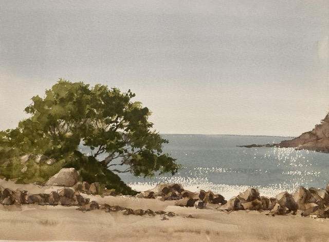
A deceptively simple watercolor landscape value study was the precursor to this painting. Tuesday is teaching day so decisions had to be made and I plumped for this beach scene. It’s good for practice as there are obvious large shapes and clear values.

First a Small Landscape Value Study

Watercolor landscape value study
Landscape Value Study

Break the scene into big value shapes

The first thing was to break down the scene into a few large value shapes. These were the sky, the sand, the sea, the trees, and the rocks. A couple of these have multiple values in but I chose the average value in order to paint the study.

Sketch the shapes and identify the values

This is probably the most important part of the value study and it involves no painting at all! First I sketched the rough shapes in a small rectangle – probably about 4”x6”. Then Using my trusty Paul Centore value scale I first *estimated* what the value was for each shape. After taking a stab at the value I then brought in the value scale to check how close I was. If I’m within a step I’m pretty happy. It’s surprising how quickly you get better at this and the key to it is making a guess first rather than bringing in the scale immediately.

Note the values on the sketch

This is only a value study so we can mark it up however we want. I pencil in the value inside the shape so I can remember. So the sky and the sand were about a value 8. The sea was a 6 and the trees and rocks varied between a 5 and a 2. All these numbers went in the sketch.

Finally Paint the Value Study

And now we get to paint something. We’ve done a lot of the hard work here so it’s a case of mixing the value and painting it in the shape. I try and keep the value washes as even as possible so there aren’t stripes or brush marks. It keeps the values separated so we can judge how the composition is working. I usually do value studies in a sketchbook or on cheap student paper but this time I broke out the Fabriano Artistico. It’s not really needed as we’re not doing any edge work or blending but I had a small piece handy.

Some shapes have multiple values

The trees and the rocks have multiple values which show the form as the light hits them. In these shapes I used two values – a wash of the lighter value and then a much darker value on the shadow side to make them appear three dimensional.

There’s not a lot of detail in there. A few brush marks on the rocks brings everything together.

Assess the result

After I was done I stood back and assessed how the composition was working. In this case everything looked good. The value arrangement hung together and I was ready to go to the next stage. In particular I liked the way the sea was a mid value between the sky and the darks of the trees and rocks and tied the painting together. Another thing that I think worked well was the broad treatment of the rocks. I had used just two values and put in the shadows very broadly with a little softening of the edges. This simple treatment was surprisingly enough to make the rocks read well. Also the broad painting gives the study some energy and visual life.

Next Steps

In another post I’ll talk through the next stage which is mixing the colors. There are a couple of surprises in there which can catch you out. I have been caught unawares painting beach scenes quite recently and learned a few lessons which came in handy with this painting.

Asaro Head Study

It’s been a while since I’ve done any portrait painting. Getting warmed up by doing some Asarohead practice. Very useful to have the planes clearly shown. A bit like painting a very complicated cube.

Online Asaro Head

There’s a great online 3D head by William Nguyen at Artstation. It’s not an exact Asaro head but has the main planes and is very similar. You can rotate it using the mouse and the lighting moves around the head so you can pause the video at the exact pose and lighting setup you need.

How Important are Value Studies?

Vermont town value study
Vermont Town Value Study. Michele Clamp. Watercolor

How important are value studies? I have to admit that I have only recently started doing them as part of the process. A few years ago I tried to do them but found scaling up to the real painting very difficult. So I stopped. But over the past year I’ve finally found them useful.

After the Marlborough at dusk struggle to a triumph I’m spurred on to another New England street scenes. I really enjoy these but they are hard to design and hard to paint. When they come off though they make really good paintings (IMO of course). Today was value study and color study day. Here is the photo reference:

Vermont town reference image

This is from a visit a few years ago and the strong light and tower caught my eye but, as you can see it’s not an obvious choice for a painting. But if we can make a decent value sketch out of it we may have a chance.

First was some noodling on the ipad. I find this great for trying out ideas. You can work in a small range of values and add new layers if you want to try something out. If it doesn’t work just delete the layer. So what did we find?

Yeah I think there’s something there. I added in some of the buildings on the right hand side to give some balance to the left. I also ruthlessly pushed those dark trees to a lighter value both to push them back and to provide some contrast with the foreground tower and car. The thing I like the most is the pattern of light off the roofs and the car which I need to remember to retain in the final painting.

Ok so far so good – onto some paint value studies. Pretty small with minimal drawing and trying to keep to around 4 values throughout the whole thing.

This is the same sketch at different stages. I was in two minds whether to include the dormer window on the left hand roof so took a photo half way through. I’ve compressed the scene widthways a little so things aren’t too stretched out and made the central car a little more prominent. I think we’re still looking good.

Finally I tried out a very rough color sketch. This was just to try out some colors as the photo colors are not very inspiring but I still want to retain a sense of the hard sunlight.

Watercolor color study for Vermont town

This is teeny – around 2”x4” but I wanted to see if a blue sky would work with some rich browns for the buildings. I’m still in two minds but it looks promising.

Next time – onto a big version!

Marlborough at Night – Value Sketch

Marlborough at Night – Value Sketch

Starting to think about the next ‘big’ painting. This is a night view of Marlborough which is going to be challenging to say the least. I’m working up to it with some studies and starting small (3”x5”) with a sketch. This is to work out the value relationships and how the different areas relate to each other. So far so good.