Rose oil value study in week 1 of Paul Foxton’s workshop. I did a little more work on this study. The right hand rose needed some work on form and more contrast and I sharpened up edges here and there. Don’t think I went too far but it’s close.
Watercolor paintings, tutorials, and videos
Rose oil value study in week 1 of Paul Foxton’s workshop. I did a little more work on this study. The right hand rose needed some work on form and more contrast and I sharpened up edges here and there. Don’t think I went too far but it’s close.

A value study in preparation for tomorrow’s Paul Foxton workshop.

Trying out a value study for one of next sessions classes. Not sure if I’m feeling it yet.
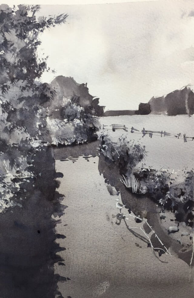
I’m continuing with value studies from my lucky dip photo bag. This one I applied my simplifying technique of stripping everything back to a few value shapes and finally a single detail shape with the bulk of the contrast. This detail shape can be a pretty odd shape and, in this scene, includes the foreground trees as well as the bushes on the other side of the bank. They’re contiguous in 2d if not in 3d.
I think this worked out quite well. It’s not meant to be a finished painting but I think I could work this one up if I wanted to. Onwards!
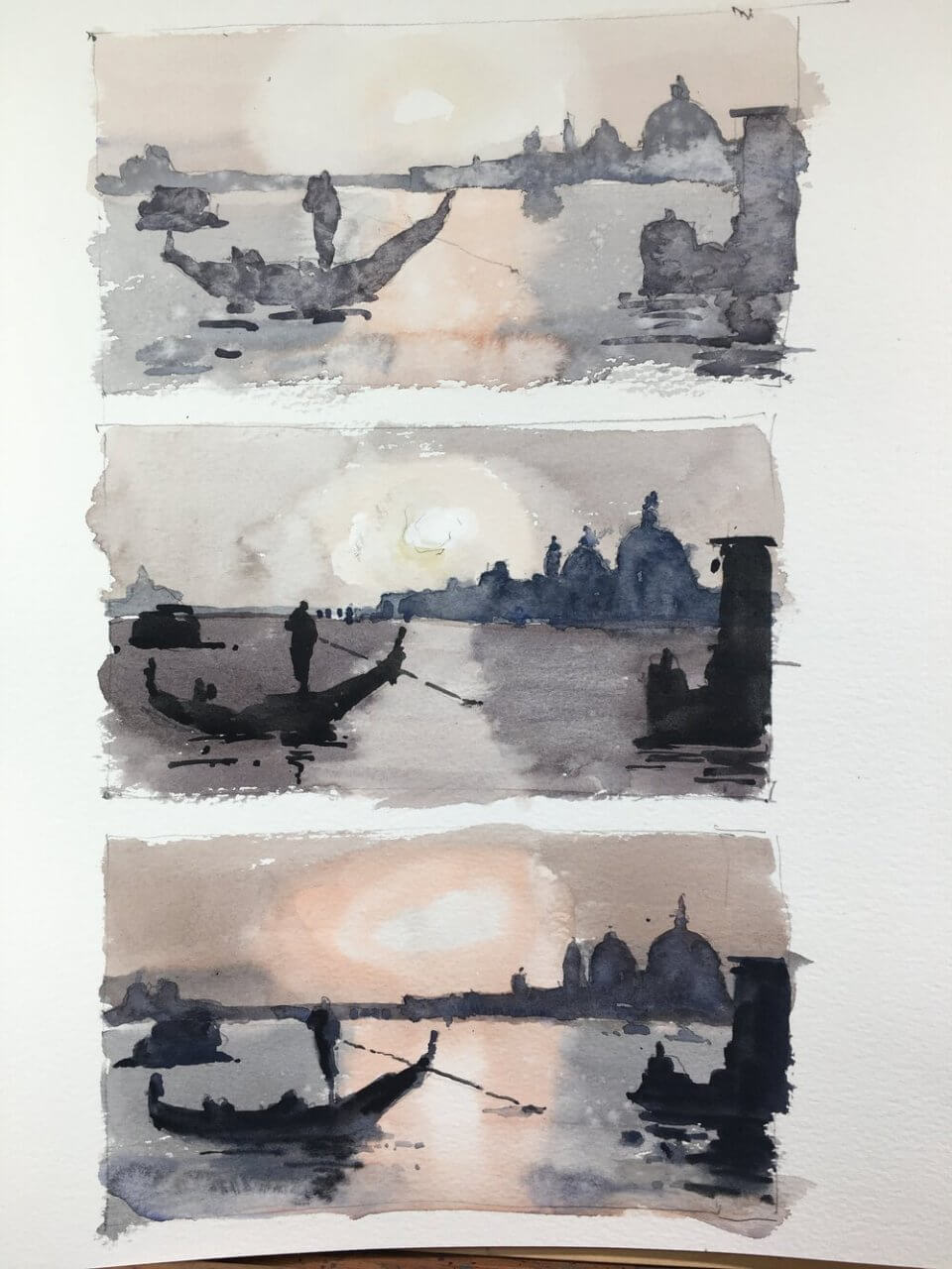
The plan behind venice and watercolor value studies is the following. Take a reference and paint it three times. The middle one is painted as closely to the actual value range in the reference as possible. The top one is shifting and compressing the value range to the top i.e. lighter than the reference. And similarly the bottom one is shifting and compressing the value range to the bottom i.e. darker.
The first goal with these studies was to see whether we could shift the values but still keep the value relationships. If the relationships are good then the scene will read correctly. And I think they all do. None of them are great paintings but you can see they all represent the same thing.
The second goal was to change the feel of a painting by shifting the values. I thought the lighter one might have a more misty, ethereal feel. And the darker one would be more moody. Well I don’t think I succeeded here. Maybe I’m over simplifying the process. But it definitely an exercise worth doing.
Wasn’t really feeling it for this one. Let’s hope I can pull something out of the bag for tomorrow’s class. In any case it was good practice for value studies. I’ve also included a larger version below. Again I’m not really happy with it – just one of those days I suppose.

A lot of you will know of Joseph Zbukvic. His value handling (amongst many other things) is spectacular.

Yes well we’re all depressed now aren’t we? He actually uses quite a narrow range of values here but expertly implemented.