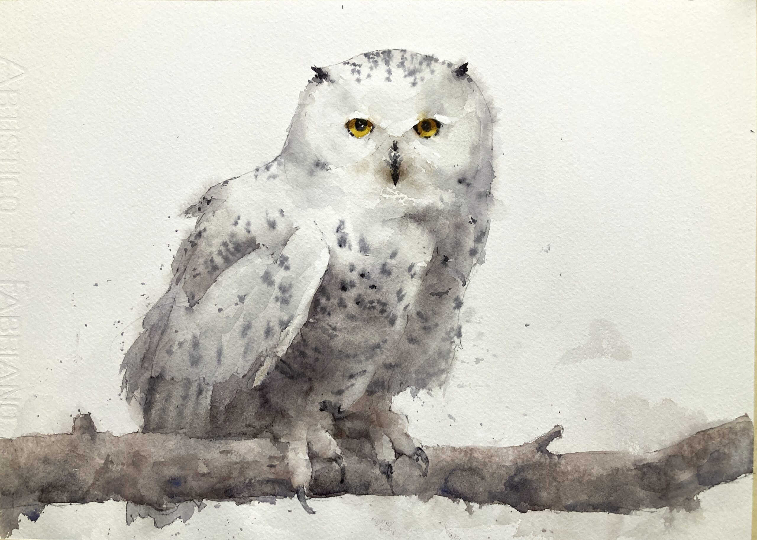
Spent an exhausting afternoon painting this snowy owl. Intense but great fun. This will probably be the third class in the series of six classes starting Jan 4th. There are still a few spaces for those who would like to sign up.

Watercolor paintings, tutorials, and videos
Spent an exhausting afternoon painting this snowy owl. Intense but great fun. This will probably be the third class in the series of six classes starting Jan 4th. There are still a few spaces for those who would like to sign up.
See how to paint this loose elephant watercolor in this step-by-step tutorial with real-time video. Complete with reference images.

I was thinking the other day that I’d never painted elephants before so why not remedy that and make a new tutorial at the same time? They have such wonderful shapes (those ears! tusks!) that I was reallly keen to dive in and have a go.
I picked the reference image from Pixabay and chose one that had some really strong lights and darks. This allows us to paint loosely but also use those strong darks to define the form. I think they came out really well. I learned a lot about elephants and will definitely paint them again at some point.
My full materials list is here but these are the main things used in this tutorial.

The full video recording for this painting. It has all the gory details and my thought processes and decisions as I go along. Apologies for the sound quality towards the end – my ceiling fan got very noisy and cuts in now and again.

This is the reference I chose. I’ve overlaid a grid onto the photo to make it easier for people to get the proportions right. For this type of painting the drawing is *really* important so if you need to use a grid go right ahead.

I’m working on a 11″x15″ piece of Fabriano Artistico 140lb cold press watercolor paper. I usually buy large 22″x30″ sheets and tear them into quarters. It’s a little more work but it is the most cost effective way to buy good quality watercolor paper. Using standard hardware store masking tape I tape a piece of paper to a lightweight drawing board. I also use a mechanical pencil for all my watercolor drawing. I don’t want to put any shading in here as it will show through when we start to paint. A mechanical pencil is ideal as it always has an even width line and never needs sharpening.
For the drawing itself I started by carefully working out the height to width ratio for the elephants. I found that elephants are actually a lot taller than you’d think and it’s really easy to make them too stumpy in the leg. In fact, even after I did some careful measuring, you can see that my elephants’ legs are still a little too short but I don’t think this matters in the end result.
Once the height and width are worked out we have good reference points to put in the main drawing. I concentrate on the angles and making sure each end point of each line is in the right place with regard to everything around it. For instance that little left knobble of the eye in the right hand elephant is almost level with the point of the ear. Another one might be that the vertical of the left leg is also hits that eye if I extend it upwards. Checking a couple of reference points every time you put a line in can ‘magically’ make the drawing work.


Before we start to paint we’re going to work out our main values and colors. Ideally we’d be doing this as we go and purely using our eyes and color perception. And if you do this enough over a period of years you can probably train yourselves eventually to do that 🙂 But it will be a hit and miss experience and using a couple of tools can accelerate the process of improving our visual perception enormously.
The first tool is an accurate value scale. I really like the Paul Centore value scale (buy here from eBay) (recommend by Paul Foxton and others). It has 20 Munsell neutral accurate steps and a wipe clean surface (more important than you’d think). We can use it on a printed reference and on our paintings themselves to check results.
The second tool is fancily called a ‘color isolator’ (hat tip again to Paul Foxton). This is just a piece of gray card (mid value 5) with a half inch square cut out of it. We can use this on a reference to cut out any distracting surrounding colors to check what it actually there. It can be really surprising how surroundings affect our color perception. You can make one of these yourselves by downloading the image above and printing it on an inkjet or laser printer. Cut out the middle square and you’re good to go.


If you have a printed reference and a value scale we can check the values directly on the reference. We have a strong set of lights and darks so we’re first going to estimate the rough value of the light side of the elephants. I always first have a guess as to the value before bringing in the value scale to check. When you start doing this you’ll be wildly wrong but it’s amazing how quickly you can get surprisingly close to the correct value. I estimated the value on the head of the right elephant to be around a mid value 5 with the left hand one to be a little lighter. And when I brought in the value scale the values were indeed a 5 and a 6. So this is what we’ll aim for on the light side of the elephants.
The shadow side of the elephants is really dark. It’s pretty much as close to black as we can get. We’ll probably not go quite that dark but it’s good to know we need a few value steps difference between the light and shadow side.


Now here is a shameless plug for my ChromaMagic tool. It is really useful if you don’t have a printed reference and also helps use hone our color perception. If you load up a reference image and click anywhere on it it will tell you the value, the hue (orange,red,green), and the chroma (how intense the color is). If you use it the same way as the value scale i.e. by having a guess first and then clicking on the photo to check it can help to teach us to recognize the values in front of us.

Fabulous tool to find the color and value in *any* reference photo. Basic version is free to use.

Ok so we know our main values. We only really need two main ones – the light and the dark. Let’s now think about our colors. Again we only really need two – one for the light side of the elephants and one for the dark. The dark is almost black and we’ll mix this with a combination of ultramarine and burnt sienna. The lighter one is a little trickier so we’ll do some practice swatches first on our student paper to work out the best mix.
Our color isolator can help us here to identify the color. We know it’s a mid value and when isolating the color we can see it’s quite a gray brown. ChromaMagic can also tell us this and the nice thing about ChromaMagic is that it can tell us exactly what kind of brown it is.

If we look at the highlighted color in the bottom right panel we can see it’s a value 5 (which we knew already). We can see it’s a kind of orange (5YR means a mid Yellow-Red i.e. orange) but it’s not a bright orange. The color is mid way between gray (on the left hand side) and bright orange/brown (on the right). So we know it’s a pretty grayed out brown.


We can mix this color a couple of ways. First we could take an existing brown like burnt sienna. Out of the tube it’s too bright and orangey. We can mix in a little black to gray it out and it will bring our color to the exact one we want. Be careful to balance the amount of water and black you add in. We want enough water to keep the value at a five but not too much that we make it too light.
We can get to this color another way but using burnt sienna and ultramarine blue. Mixed together in roughly equal parts they make a pretty neutral gray. But if we lean the mix towards burnt sienna we get a nice grayed out brown.

With this value 5 mix we’re going paint the light parts of the elephant really loosely. I find it easiest to put the color on with one brush and then soften the edges with another clean, damp brush. I first put on the color roughly in the area of the elephant. The only care I take is to keep away from the tusks as they are lighter than everything else.

While the paint is still wet I come in with my clean, damp, brush and soften the edges and pull the color out into the background a little. Mostly of the color is where the elephant should be but some makes its way through the edges. It will feel really odd but don’t worry – it can look really messy at this stage and still be ok.

Before the paper dries I put some texture and value variation in. I drop in some blue gray color and also maybe use a water spray bottle to add in some texture. Again don’t worry that the edges are soft – when we put in the shadows everything will come into focus.

I repeat the process for the right hand elephant. At the end of it you should have a couple of very blurry edged elephants that are all roughly the same value. Let this stage dry thoroughly. We need the next layer to have some sharp edges so the paper needs to be dry.

This is where the magic happens. We’re now going to mix up a dark (probably value 2 or 3) brownish gray and put in the darks. Using a fairly thick mix of ultramarine and burnt sienna I take a look at the reference and identify where the major darkest shapes are. I start with the right hand elephant and that big, dark shadow on the left. Most of the edges are hard here but some are soft where the form is rounded (around the eye and on the ear). I soften the transition from light to dark by, again, using a clean damp brush to graduate the pigment. It won’t look like much to start with but as you move through the dark shapes the elephant will begin to appear.


You can see in these two screenshots the elephant’s face beginning to appear. There are only a few dabs of dark on the right hand side to just suggest the shadows around the eye and ear.


Some parts of the elephant are slightly darker than the lightest parts and I adjust the values a little here. In particular the legs and bottom of the trunk are slightly darker. A wash of the same brown over these areas will shift that value slightly darker. The only thing to be careful of here is to keep those darkest values really dark and separate from everything else.
I repeat the process for the left hand elephant and we’re pretty much done!

At the very end I step back and take a look. The overall pattern of lights and darks is fine and I make a few very slight value changes around the eyes and face. These subtle marks can make all the difference but only if the major value shapes are right.
A lemon watercolor can seem hard but my demo shows you how you can paint them with only a few colors.

The yellows of lemons are so attractive and cheery but they can be tricky to paint convincingly. However, with some careful observation and a couple of ‘tricks’ it can be much easier.

My full materials list is here but these are the main things used in this tutorial.


I start off with an outline pencil drawing using a mechanical pencil. I prefer the mechanical pencils as you get a uniform line every time and it never needs sharpening. Also, if you carry it around in your bag, you don’t get graphite over everything which gets very annoying after a while.
The reference image has a grid on it and, if you’re not confident in your drawing please use the grid. I generally grid up the photos into quarters and size the reference to be approx 9″x12″ or 11″x14″. This makes it easier to grid up your paper without doing any convoluted math.
If this were an oil painting we could happily draw the grid on the canvas in the knowledge that the opaque paint would cover it up later. With watercolor we can’t do this as it’s a transparent medium. I find that even if the graphite lines are very very faint they still leave a faint mark when you erase them which we don’t want. To avoid this and still benefit from the grid I put a dot where the grid lines cross. This gives me a reference dot which is useful but doesn’t show up after we’ve put the paint on.


A lot of the basic skills in watercolor painting involve seeing and mixing colors of the right value. To help us with this I’ve adopted two tools used by many other people but in particular Paul Foxton (whose workshops and classes I highly recommend).
A good accurate value scale is a great investment and they’re really quite cheap so there’s not much of an outlay. I recommend the Paul Centore value scale (buy here from eBay) which has 20 steps and has highly accurate neutral grays.
The other thing is the rather grandly titled ‘color isolator’. This is just a piece of gray card or paper colored to a mid value with a half-inch square cut from the middle. When we place this over a reference image the gray gives us a buffer between the color we want to see and everything else around it. The mid-value gray also gives us a hint as to the value. If you download the image above you can print this on your own printer. At a pinch painting a piece of card with a value 5 gray and cutting a hole in it would also work well.

I run online zoom courses regularly for both beginners and more advanced students. Please check out my workshop page.


Using our color isolator and value scale we can work out two important colors and values: one for the part of the lemon in the light and one for the part of the lemon in the shadow.

Using the color isolator and the value scale together we can work out the two important values. In this case we have around an 8.5 value in the light and a value 6 in the shadow. These two values are enough to create a convincing lemon. The only other thing is the highlight which is so light we can leave white paper for.


If you don’t have a printed reference the ChromaMagic tool can tell you the color of any region of your reference. Just download the reference photo and go to chromamagic.com and load it up using the button in the top right corner. Clicking on any region of the reference will display the exact color of that pixel. It uses the Munsell System to show the color which is extremely useful for us painters. The Munsell system separates each color into hue (red, orange, green etc), value (light and dark), and chroma (how gray the color is) which makes it more straightforward for us to mix the right colors.
Fabulous tool to find the color and value in *any* reference photo. Basic version is free to use.
Give it a try now! The best way to use it is to have a guess first before clicking on the reference. Your color perception skills can improve in an extremely short time by guessing first then using ChromaMagic to check your guess.


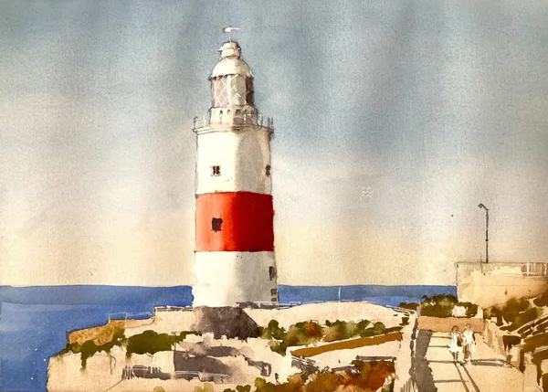
See how to paint a lighthouse in this step by step lighthouse watercolor tutorial. Includes access to the ChromaMagic color tool.
It’s a bit of a guilty pleasure but I just love painting a lighthouse. Luckily here in New England we have a lot to choose from. Lighthouse paintings have a lot of things I like about painting with watercolor. I love the sunlight on white walls and how they curve into shadow. I also really love hos the white looks against the blue sky, And the small details of windows and railings just give enough interest to make the painting convincing.
If you’re looking for an easy subject to paint in watercolor then lighthouses are a great option. They’re easy to draw and are fairly simple to make convincingly three-dimensional. In this subject the foreground is a little trickier (although I really enjoyed painting it). If you’re at the beginning of your painting journey then simplifying or leaving out the foreground might be a a good option.

Here is the reference I’ve chosen. It’s from pixabay.com and was drawn to the strong sunlight and the red and white stripes on the lighthouse itself. The foreground has quite a lot of detail which I’ve simplified and kept to just a few values.

I started with a line pencil drawing. There is no shading on here as we’ll be putting in light and shadow with paint. I aim to put in just enough detail to outline everything important but not go overboard with every single little thing. This was trickiest in the foreground as there is a lot going on there. I tried to keep the lines that separated regions of light and dark and keep everything else to a minimum

If you’ve been painting for a while then you’ve probably heard or read people saying that good values are the key to a good painting. You’re not going to hear me say anything different – if you can get a good handle on your values then you’re well on your way to a successful painting. To help us with this I recommend a couple of different things. The first is a good (as in accurate) value scale. I recommend Paul Centore’s one pictured above. It’s laminated and has 20 steps from darkest to lightest. It’s great for watercolor and oil or acrylic painting.


If you have a printout of the reference you can use the value scale to first estimate, and then measure the values of the sky. Even though the value scale is gray and the sky is blue squinting your eyes can take the color out of a scene and make it easier to measure.


We realize that people don’t always have printed reference handy so here at Clamp Watercolor Towers we have built a tool that can tell you the value of any region of a photo just by clicking on it. Additionally it will tell you the exact color and chroma of a color so you know exactly what your color is. From the screenshots ChromaMagic says that the sky is a value 8 at the top and a fairly bright blue. At the bottom it is still a value 8 but now it’s a much grayer blue. Find out more about ChromaMagic here and try it out now here. You’ll need to download the reference photo and load it up into the tool using the ‘load file’ button.
Fabulous tool to find the color and value in *any* reference photo. Basic version is free to use.

I paint in the sky using a cobalt blue wash that fades out as it goes towards the horizon. I change the color by first adding in a little water as I go down the page. At the bottom I add in a little cadmium yellow orange to neutralize the blue a little and make it grayer. I actually made this sky a little too light – it’s more like a value 9 rather than an 8. But never fear! We can darken this a little later to correct this. We just need to wait until the first wash is completely dry before tacking it.

We’re now going to paint the lighthouse. Or at least the main values – the details will come later. If you have a printout and a value scale you can measure the value of the shadow side or you can use ChromaMagic with the reference photo.


The white part of the lighthouse is around a value 6 in the shadow. The red band, however is much darker in the shadow – around a 2 or 3. And in the light the color goes to a value 7 orange color – quite a big swing in value there. We’ll need to get this right to make sure the lighthouse reads correctly.

I put the value 6 grey on the whole of the shadow side of the lighthouse. The gray is mixed using burnt sienna and cerulean blue (ultramarine blue can also be used). The transition from shadow to light is softened with a clean damp brush to make the lighthouse look round.

I mix a mid value 5 red for the mid part of the red band. I use damp brush to soften the transition out into the light and hit that value 8 we found earlier. This is used to carry the mid value into the shadow side. It won’t be dark enough for the shadow yet but we can layer on a darker color later.

While I’m waiting for the red strip to dry I put in a wash of a mid-value blue (ultramarine with a dash of lemon yellow) for the sea. I also use a fairly thick mix of ultramarine and burnt sienna to start putting in some details and windows.
After that I mix up a dark red value 3 mix of vermillion, permanent rose, burnt sienna and just a *touch* of black if I need to hit that value 3. I try not to use black if I can avoid it to keep that dark red rich and vibrant. After softening the transition from shadow to light you can see how that color really sings out.

The foreground looks complicated but we’re going to simplify as much as we can. The base layer is just a light wash (probably around value 9) of burnt sienna with a little yellow ochre. This goes over the whole foreground regardless of any detail drawn in.


The green foliage in the foreground is pretty dark – probably around a 4 or even darker. I mix an olive green using lemon yellow and black and add just enough water to get it to the right value. I then roughly put in the foliage and try and leave the edges choppy to suggest vegetation.
At this point I adjust the sky color and layer over another wash of blue which fades out to orange at the horizon. This brings the sky value more in line with the reference and *really* brings out the white on the lighthouse!!!
I continue to add in more foreground detail for the foliage and the shadows. This is all pretty rough. It just has to suggest what’s there as the main attraction of the painting is the lighthouse itself.

For the final touches I use a little of Dr Ph. Martin’s Bleed-Proof White paint to add in some railings and detail on the lighthouse window. A little gray to indicate the lamppost and I’m done!!!
Well I hope you enjoyed that. Not everything went to plan but most things could be fixed. As usual if you do have a go at this scene I’d love to see what you do!
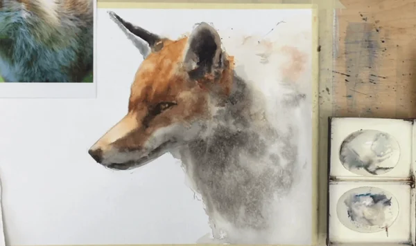
See how to make a watercolor fox easy with this step by step watercolor tutorial and video. Complete with reference image and color tips.
It’s been a number of years since I’ve done a red fox watercolor painting and I thought ‘why not have another go?’ Watercolor animals can be tricky to paint and I’ve discovered that making a good drawing helps enormously. If you want to have a go at this painting I recommend using the grid reference to give you the best shot at getting the proportions right.

The screenshots below are taken from the full youtube video. This takes you through the whole process in real time and should allow you to paint along.


Let’s get started. I first started with a pencil outline drawing. There’s no shading in here as we’re going to put all the light and shadows in with paint. I did try and get the shape of the snout and ears right. These are important to convey the character of the animal and are quite subtle. Any small discrepancies can change the whole feel of the painting. I also put in the position of the eye and a lighter line separating the light part of the snout from the shadow. This will be an important part of the painting which will give the fox three dimensionality and also give a feeling of sunlight. If you’re looking for an easy way paint a fox getting the drawing right can be half the battle.

A little planning helps enormously when painting in watercolor. Everything goes so fast once you start putting paint to paper. If you can work out some wrinkles ahead of time your paintings will benefit hugely. Figuring out the main values in your subject is one of the the first things to do. an accurate value scale is invaluable here and I recommend the Paul Centore value scale available from eBay
The other tool (which you can make yourself) is a ‘color isolator’. This is just a piece of card or paper colored a mid-value gray. It has a 1/2 inch square cut out of the middle. The gray helps us separate the color we’re looking at from it’s surroundings (hence isolator!!!) and the mid value helps us estimate how light or dark our color is. If you have a printer you can download the image below and print it out and make one yourself.


Now we can estimate the main values of our red fox. At the very minimum we need to know a value for the light side of the head a value for the shadow side of the head. If we get these two values right then we’ll be in great shape to make our fox look three dimensional. Our fox has a value 8 on the snout, a 6 on the head, a 3-4 in the shadow part of the snout and around a 5-6 on the shadow part of the white fur. Let’s keep these in mind as we do our painting.

We’re going to start the painting with the light orange values on the head. We know the lightest value is an 8 and it goes to a 6 on the top part. This color is very close to burnt sienna and adding in a little of our orangey-red makes it bang on.

We put the color on the head and make it slightly lighter on the snout. I use a second, clean, damp, brush to soften the edges where it transitions into the white fur. The top of the head is a little too light at this stage but we can always come back and darken that later.

We now mix a light gray for the white fur of the fox. Most of the white fur is in shadow so it’s going to be a blue-gray and we know it’s around a mid-value. I mix up a gray with ultramarine blue and burnt sienna and add just enough water to make it a value 6 on our value scale.

I paint in the gray over all the shadow part of the white fur and, again, soften the edges with a damp brush.

When the light colors are dry we can start to put in the shadows. The shadow size of the snout is quite dark – around a 3. I mix up a value 3 with burnt sienna and a little ultramarine blue and paint it onto the shadow side of the snout. Beware! It will look really dark and it will feel wrong!! If you’ve measure and mixed things carefully, however, it will all work out in the end. One thing we do have to take care with however, is to use our damp brush to soften the transition between the light and the shadow areas. We don’t want this to be too harsh a transition. A little softness here will make things look a lot more believable.


A similar dark brown value gets put onto the nose and the lineof the mouth. Again the edges are softened to make the transitions less harsh. A little dark color is also put around the eye to make it recede.
This next piece usually brings the whole thing alive. We’re going to paint the eye. In this reference this is quite tricky. The surround of the eye is really dark but the eye itself is only a little lighter. Here is a close up to show you.

You can see that only part of the eye is very dark (at the top where the pupil likely is) and the rest is the same value as the surrounding fur.


The ears are now painted in a similar dark brown (burnt sienna and ultramarine) value. At this point I thought the top of the head was too light (it should have been a value 6 and was more like an 8). I mixed up some more burnt sienna/vermillion paint and made that area darker. The extra paint also allowed me to add in a few stripes on the fur to show few of the modulations on the head.


We’re almost finished now. Things were looking pretty good but the white fur looked a little light in value. This is always a scary bit as correcting this can look too dark when the paint first goes on. I mixed up some neutral gray (around a value 5 or so) and painted over the whole area of the white fur. While the paint was wet I dropped in some darker paint where the fur was darker and used my spray bottle to add some texture. Thankfully this all worked out and it definitely improved the painting.
The final changes were just to darken inside the right ear a little and the whole thing was finished.

Well I think it came out pretty well in the end. Shadows on white fur are always a little scary as the paint we have to use always looks darker than we thing we need. But some careful measurements and observation and all turns out well.
I hope you enjoyed the demo. If you try it or have any questions I’d love to see what you do. It’s been a lot of fun painting this cute fox watercolor and I think a wolf watercolor will be on the cards in the coming weeks.

Want to see how I transformed my color skills? Try out the ChromaMagic app.
Brand new interface and lots of new features!


The original free version will always be available. But, seriously, the app is so good I’m not going back.
I’ve made some downloadable Munsell color charts and wheels available based on the ChromaMagic data.
Have you ever looked at a scene or a photo reference and thought ‘What is that color?’ As artists our color perception is crucial in knowing what we see and how we translate it onto canvas or paper. ChromaMagic was developed to help us quickly sharpen our skills in color perception and improve our paintings. It can show you the three Munsell components of color for any color in a photo reference and display them in the relevant color chart.
ChromaMagic uses the Munsell Color System to define color. As artists it is a wonderful way to define and mix color. Munsell classifies color into 3 components of hue, value and chroma. If you’re new to this way of thinking about color it can take a little while to get into the swing of things. But it is well worth it. I can personally say that it transformed my paintings almost overnight.

When you first load up the ChromaMagic tool it has a color wheel photo displayed in the photo area. At the top on the left is the full photo and, on the right, is a zoomed in region. To load up your own photo click the black button on the top right.

Click anywhere on either the left or right photo regions to select a color. The zoom panel on the right will center on that pixel and display a red cross-hair on the selected color.
Below the photo are 3 representations of that color. On the left are rectangles displaying the exact color and also the nearest Munsell chip color. On the right is the color highlighted in the relevant color chart.


This reference is one I have used in a beginners class. It’s great for honing your skills identifying and mixing colors. See the link for a full step by step watercolor tutorial and video.


I’ve come a cropper with beach paintings many a time. Finally, with the help of ChromaMagic, I could work out and learn where my colors were wrong. The result was that my paintings were much more successful.