A simple watercolor pear and apple setup is an ideal starting point for a beginner. In a series of easy steps I take you through the process including a video of the whole process.
Introduction
In this pear painting tutorial we’ll be doing a watercolor pear painting but also a watercolor apple. This is a great general watercolor painting tutorial but an especially good beginner painting tutorial. I liked the combination of the two fruits with their very different colors. Watercolor apple paintings are fine but I just wanted something a little more interesting. In fact adding in an extra fruit can provide context and make for an easier painting.
Sign up for updates on classes and free livestreams
I’ve broken the process into a multi step tutorial and, even though it seems like a lot should only take a couple of hours to finish. We will do a careful drawing, identify and mix our colors, and then paint the subjects in layers. Fruit paintings can seem easy but paintings of fruit can still teach us a lot about color and form. It’s well worth learning or honing your skills on a humble apple, pear or orange painting. Watercolor apples or watercolor paintings of pears on their own are great but even better to combine the two! We will be working from a pixabay reference but if you can, do some still life painting with the subjects right in front of you.
I was originally just going to do a pear tutorial but in hindsight the addition of the apple gives us a better painting and also more practice in values. If you’re looking for guidance on how to paint fruit in watercolor I hope this will get you on your way. It was more fun to do than I thought and I really like the result. I hope you do too. If you’re looking for more info on how to paint in watercolor tutorials I have a special watercolor tutorial page with more subjects.
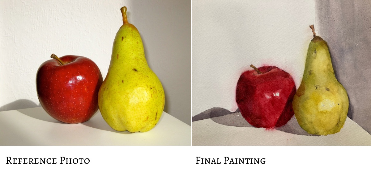
Fruit Painting Reference Photo
Here is the reference photo we’ll be using. It’s a simple setup but we’ll take the opportunity to really try and get accurate color and form. Painting watercolor fruit is great practice for the fundamentals. The shapes are straightforward to draw and we can use layering and softening watercolor techniques to establish the form.
Reference for watercolor pear watercolor apple
If you can it’s a good idea to print this out and have it in front of you. My inkjet printer can print on 4×6 glossy paper which is great for getting intense color.
A Mechanical Pencil and Kneadable Eraser are Good for Watercolor Drawings.
We want to create a painting as close as possible to our reference. (Well not always of course but for learning it’s a really good place to start). I recommend using a mechanical pencil when drawing for watercolor paintings. They never need sharpening and the leads last for ages. If you need to erase anything a kneadable eraser is good as it doesn’t leave any residue on the paper. Some erasers leave an oily trace and can affect how the paint is absorbed by the paper so it’s something to watch out for.
Start with a Careful Drawing of the Fruit
Drawings of fruit can seem simple but there’s still some complexity there. Apples seem uniform but they’re not just spheres. They have knobbles and bumps and slightly misshapen bits. Pears have a very characteristic shape but they too have some asymmetry and individualism. So we need to observe the reference carefully and make sure we get everything in proportion relative to everything else.
Sign up for updates on classes and free livestreams
Use Relative Measurements and Comparisons When Drawing Fruit
Pencil drawing for watercolor pear watercolor apple
We want to have a clean drawing with not too many sketchy lines. So I always start with marking out the envelope of the subjects. Lightly mark in the top and bottom of the pear and the left and right positions. I use relative measurements to get the proportions right. In this case the width of the pear is just over half its height so I make sure the marks reflect that. When drawing the apple I again put in the top and bottom relative to the pear and then mark in the left and rightmost positions. Once those are in it’s pretty straightforward to ‘join the dots’ and create a believable outline. The final marks are for the cast shadows on the ground and lines for the horizontal. Once it’s done you should have something similar to the reference. Again for fruit watercolor painting we don’t want too many graphite lines showing through. We want the paint to do the work. Some people don’t like to see any drawing marks showing through but I quite like the effect.
Painting and Drawing Fruit are Great Practice Subjects
Fruit are a great subject if you’re looking for drawing ideas. Their shapes are relatively simple and even a lone apple drawing can be fun to do. If you group different fruits together with some strong lighting you can get some really interesting compositions. Also you don’t have to always paint your drawings. You can then either leave it as a line drawing or put some shading in in graphite or maybe even colored pencils. For something a little different I often spend time in the evenings doing digital drawing on my ipad with its Apple Pencil. The principles are the same and it’s a good way to spend the odd 10 or 15 minutes or so.
Identify the Colors in Preparation for the Watercolor Pear Painting
Color isolator – print on paper or thin card and cut out the central square with a knife.
We’re not quite ready to dive in and paint anything yet. I know this might be agonizing but we’re going to study the reference and really try and identify the colors. For this it’s best to have a printout of the reference and a tool called a ‘color isolator’. This is just a piece of gray paper or card with a half inch square cut in the middle. Our brains constantly fool us into misidentifying colors when we’re painting and the surroundings of a subject will affect that enormously. If you place the color isolator over a region of the reference you’ll be able to see that color much more easily.
But wait – don’t use it yet!
Hold your horses! The absolute best way to learn and get better at watercolor painting and color mixing is to try and identify a color first. Try and first guess what the hue (red, yellow, orange etc) is. Next try and estimate the value (how light or dark it is on a scale from 1 (black) to 10 (white). Finally (and this is the tough one) – how bright/saturated is the color or is it closer to gray. This last one is called chroma and can often be glossed over when we’re mixing colors.
Guess First – Then Check
Getting ready to use the isolator – but have a guess first!!
So go ahead and have a guess first. Then when you’ve guessed, bring in your color isolator, put it over the region you’re looking at, and see how close you were. Very often – and especially in shadows – you will be surprised. Especially on light objects the shadows can get pretty dark and be a really surprising color. Don’t worry at all about getting it wrong at first. You’ll get much more accurate surprisingly quickly and your paintings will benefit greatly.
Identify the 2 Main Colors in the Watercolor Pear
So back to the pear! If we look at this we can see a lot of colors but we don’t need to find them all. In fact we only really need to find two colors. The first one is the color of the pear in the light, and the second is the color of the pear in the shadow. Watercolor painting helps us a lot here as we can use water to blend each color and fade it out in a gradient to achieve all the intermediates.
Color isolator for light side of pear
The first color in the light is very yellow. It’s very light and bright and you can see that by the contrast with the color isolator. This is designed to be a mid-value gray so you can see immediately whether you’re in the top half of the value scale or the bottom half.
The dark color may be a little surprising. Using the color isolator as before we can see it’s a mid-value and it’s a kind of olive green color. We now need to work out how to mix these.
Using the color isolator on the shadow side of the pear
Sign up for updates on classes and free livestreams
Mix the Colors of the Watercolor Pear.
The light color of the pear is almost exactly my lemon yellow pigment. Use a piece of scrap paper and put a small swatch down. Compare it to the color we’re trying to match. On my reference it’s almost exact but just a little too green. I want to push it slightly more orange so I take a very small amount of my orangey red (Vermillion) and mix it into my yellow. Yes! Perfect match!
The darker color can be mixed a number of ways but they way I’ll describe may surprise you. We want a mid-value olive green. It so happens that if you add black to lemon yellow it turns it a beautiful olive green. If we take some lemon yellow and add in just enough black (you’ll have to experiment with this) we’ll get exactly the right color. In hindsight I may have needed a little blue in there but it is very close.
Record Your Swatches on Your Scrap Paper
Finished Color Swatches with Notes
The way I usually proceed with a painting is to identify colors and record them as swatches on a piece of paper. You don’t have to do this. You can mix and paint as you go along. However, I like to know what kind of colors I’m working with before I start. If my swatches look good together I know that the painting will work color wise. But it’s up to you. If you do mix swatches ahead of time and then go back I recommend you note down next to your swatch which pigments you used. After a pretty short while you’ll get used to various ways of mixing and you probably won’t need this but it’s good to have a record when you start.
Mix the Colors of the Watercolor Apple
So onto the apple! It’s the same procedure and now we’ve had practice with the pear this should be an easy watercolor apple! We’re going to mix the light side of the apple and the dark side with the help of the color isolator. Again, have a guess before you use it. It’s the process of estimating, then checking, that let’s us learn and correct our mistakes. Painting an apple in watercolor (or any fruit) is made so much easier if we’ve done some of the thinking work ahead of time.
Looking at the light side of the apple
Again you may be surprised by these colors. Who knew how unpredictable an apple and pear could be!! The light side of the apple isn’t very light at all. In fact it’s a mid-value red. In my reference the red is in between my two reds (an orangey red and a pinkish red). Mixing them together and adjusting the proportions should get us the right value. In fact it’s a useful thing to remember that the value of most reds straight from the tube are around a mid value. Bright colors are hard to judge the value of and intuitively we see bright colors as lighter than they are. Good to have that tucked away in your brain for future reference.
The Dark Side of the Moon – Sorry Apple
The dark side of the apple is really dark. In fact it’s almost black right on the left hand side. We won’t mix that one but something that’s just a little lighter. This is a very dark maroon red. Again starting with a pinkish red (permanent rose or something similar) we need to work out how to take it darker.
Burnt sienna won’t cut it as it’s too light. But a combination of burnt sienna and black will probably work. I know we’ve used black to make shadow colors both times in this demo but this isn’t a hard and fast rule. Adding black to colors ‘deadens’ them. What this means in technical terms is that black reduces chroma i.e. takes the brightness out of the color. Sometimes we don’t want this but in this case we know exactly what color we want and black + permanent rose should get you very close.
Shadow Colors
The apple and the pear cast shadows and these are very important in the painting to show where they are in space. Again using the color isolator (or use a value scale if you have one) estimate and check the value. On my reference it’s just about a mid-value (around a 6). My go to combination for grays is often a combination of burnt sienna and ultramarine blue. These are complements (brown is a dark orange) and so will mix together to produce either a neutral gray or a brownish or bluish grey. Mix these together and add just enough water to get the right value on the reference. I tend to go by consistency of the paint on the palette for this. A mid-value is the consistency of light cream so just a touch more water should get us what we need.
Phew!!!!
At the end of all this (I promise we’re going to paint something soon) your swatches should look something like this.
Finished Color Swatches
And finally we paint!!!!
All this prep will be worth it. In fact we’ve done a lot of the hard work already. We now get to paint! We’re going to do this in two layers – the first for the light colors and the next for the darker ones.
The First Layer – the light values
pear color paint
So how to paint a pear? In this first layer we’re going to paint the whole of each fruit in the light color. Both the apple and the pear watercolor painting will be very flat at this point. We want this to be really even so we can layer over the darker color later. Mix up your colors and paint the watercolor pear shape and the apple shape.
Take care when you paint your apple watercolor that the light color is the right value – it’s likely darker than you think. I know I’ve said this already but I’ve been bitten many times by this. When putting the paint down try and not go back into areas you’ve already painted too much. This tends to disrupt the natural dispersion of the pigment on the paper and creates nasty stripes and an uneven look. The painting will look flat. Don’t worry! Don’t try and make it look three dimensional at this point. Flat is good at this stage.
The Finished First Layer – Yes it looks flat but not for long
The second Layer – the shadows
Wait until the first layer is dry. Use a hairdryer if you have one handy or, alternatively, go and have a cup of tea as you deserve it.
To put in the shadow we need to remember to only put color in the darkest areas to start with. Keep in your mind where the lights are. For the pear painting they’ll be in the middle of the pear and for the apple painting they’ll be mostly on the right hand side.
Fade your darks colors into the light
Second layer – starting to put the shadows in. Not so flat now!
The shadows on the watercolor pear are darkest at the edges (especially on the left) and fade gradually into the light. In watercolor painting this involves a technique that can be tricky to get the hang of. It involves two stages. The first is just to put the color down in the darkest areas. Work quickly here as we need to keep the paint wet to keep working with it. I often use a second round brush to do the fading as I can keep the other brush full of pigment to put the paint where I need it. Some people find it easier to use a flat brush to fade the color out. Try both and see which you prefer
Once the color is down take a clean damp brush (take a little water off on a paper towel) and wet the paper next to the color but only overlap the brush very slightly with the wet pigment. The wet paper will draw the pigment out and the color will fade naturally. The trick here is to let the paper do the work. Try not to coax the pigment out too much with the brush. You’ll need to keep a clean brush here so keep washing it (and dabbing the water off) every few seconds or so. It takes practice so have a look at the video so you can get the idea.
Sign up for updates on classes and free livestreams
Apple Watercolor Painting – Shadow Colors
Do this again on the apple for the shadow on the left hand side. Use a clean, damp, brush to wet the paper so the pigment naturally blends out. Once that is dry put in the other shadow on the apple on the right side. This one has a hard edge as it’s the shadow cast by the pear so no blending here.
Assess how the apple and pear look
We’ve really done all the hard work here. If you’ve mixed your colors to the right values you should have a feeling of three dimensionality in your fruit.
Paint in the cast Shadows
Using the neutral gray paint in the cast shadows. There is some slight variation within these but not too much so an even wash will be good.
Add in the stalks
The stalks are put in with burnt sienna. There is some light and shadow here but the main color is very close to burnt sienna. We can add in some slightly darker color as a final touch.
Final Touches
Getting close now – deepened the shadows
I’m hoping you have something pretty impressive by now. If not check your colors again. Were the lights the right color? Were the shadows dark enough? Did the shadow color fade out gradually enough or did you end up with hard lines? If you’ve not gone dark enough in the shadows now is the time to correct that. Mix up the same shadow color but with slightly more water so it’s a little lighter and repeat the shadow process.
At this point it’s good too add in some very subtle shading with the shadow colors. The pear has some areas where the value changes slightly. These really help to show the form and give a realistic appearance. Look carefully at the reference and your painting. Are there areas where the pear is slightly darker? In my painting I needed to darken the left hand shadow side and also slightly darken the right and the upper, thinner part. This needs to be done with a watered down (i.e. lighter) version of the shadow color. Be careful here. If you lose the distinction between the light and shadow sides of the fruit you’ll lose all the form. It’s easily done and I speak from experience.
Final Final Touches for the Watercolor Pear and Apple
Michele Clamp Watercolor Pear and Apple Painting
At the end I decided to add in a very light grey wash over the foreground. This really helped to place the fruit in space. This was a very light wash – it will feel almost too light when it goes down – but adds a subtle value change that works well.
I hope you enjoyed this and if you try this tutorial I’d love to see what you do. The pear especially was especially satisfying to paint. I think a full painting of pears will go on my todo list.
Full Video Demo For the Watercolor Pear and Apple
I videoed the whole process for this painting. I also have more videos on my youtube channel and you can also access them on this page. There are a lot of subtleties that I find hard to describe in text that are well worth watching the video for. It’s real-time so it’s not short but shows the full thing warts and all.
So I hope I managed to answer the question of how to paint an apple in watercolor. Please let me know in the comments or via the contact form if you liked it.
Other Watercolor Tutorials
I obviously paint in my own style but there are some other great examples of pear paintings out there. If you’re looking for another watercolor pear tutorial there is a lovely Anna Mason pear tutorial and she has a wonderful fresh, colorful style. Watercoloraffair.com also has a number of great tutorials worth taking a look at.