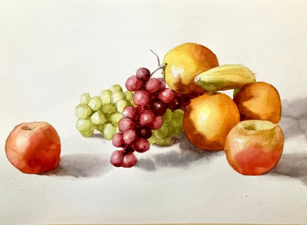
Want to know how to paint this watercolor still life? Follow along with the step-by-step watercolor still life tutorial and create your own version.
Is Still Life an Easy Option for Watercolor?
Still life painting might seem like an easy option when choosing something to paint. In some ways it is. For example things stay where you put them, you can arrange objects the way you want and have control over the lighting. However, I find that you need to increase your observational skills and really nail the values and colors for the result to be convincing. In this post I take you through this fruit watercolor painting. We start with making some value and color swatches. This helps us think through our color choices ahead of time. We then go through the painting in layers from light to dark. In between each layer we let things dry so we don’t disturb the color when the next layer goes down.
Fruit is an ideal subject if you’re looking for still life painting ideas. Most people will have fruit in the pantry and they are lovely bright colors which are always fun to paint. I think this tutorial is suited for all levels but, if you’re looking for a watercolor still life for beginners, you might be interested in my apple and pear tutorial.
Sign up for updates on classes and free livestreams
Watercolor Materials Needed.
My full list of materials is here but these are the things you will need for this still life watercolor painting.
11″x15″ 100% cotton watercolor paper. I use Fabriano Artistico 140lb cold press.
Size 10 and 12 round watercolor brushes. My favorites are Escoda Reserva.
Mechanical pencil
Kneaded eraser
Masking tape
Reference photo (see below)
Artists quality paint in the following colors
Lemon yellow
Vermillion or an orangey red like naphthol red, cad red light, or pyrrole red
Yellow ochre
Permanent rose or a pinkish red (permanent alizarin or quinacridone red)
Burnt sienna
Ultramarine blue
Cobalt blue
Black. I use lamp black but ivory black is fine.
A white palette for your paints and mixing
Paper towels
Water pot
Still life Reference Photo
Fruit Still Life Photo Reference
This is the pixabay photo reference we’re going to use. I chose this for a couple of reasons. First the lighting is quite strong and from the side. This gives us a clear separation of light and dark on all of the fruit. This also gives us some nice rich cast shadows on the oranges. Secondly, the background is plain and white. When I’m painting still life in watercolor I like to keep the paintings light and airy. A dark background gives a very different feel and mood.
Sign up for updates on classes and free livestreams
Color Mixing Preparation for our Watercolor Still Life
Before we start on our main painting we’re going to do some analysis and prep. I like to work out the main colors for the objects ahead of time and do some color swatches. Watercolor is a fast moving medium and, when we’re in the middle of a painting, we might not have time to stop and think about colors. Doing some prep beforehand almost always helps with this and results in a better painting.
Pay Attention to Values and Colors
Watercolor still life color swatches
These are my color swatches for the light and shadow sides of most of the fruit. I treat the light and shadow colors as independent. Sometimes a shadow color will just be a darker version of the light color but often it has very subtle hue shifts. Paying attention to these will result in a more convincing watercolor painting.
Colors are Different in the Light and Shadow
While mixing these colors I pay attention to the values on the light and shadow sides. These values will vary depending on the local color of each fruit. For instance a red apple is often around a mid value on the light side (see the watercolor pear and apple tutorial for an example of this). In contrast a banana will have a very high value in the light – probably around a 9 (0 = black, 10=white). In this reference the fruit are mostly around an 8 or 9 in the light. When we look at the shadows they go from a 5 down to a 3 and the colors are quite rich or high in chroma.
Use ChromaMagic to Help Identifying Colors
ChromaMagic for Still Life Watercolor
If you have a printed reference a color isolator can help identifying the different colors. This is just a piece of mid-value grey card with a 1/2″ square cut out. Placing it over different areas of the photo helps enormously in judging colors without surrounding areas leading us astray. At the end of this post is another reference and some guidance on how to practice this.
Alternatively you can load the reference photo into ChromaMagic and click on different areas to show you the colors. I always like to make a guess myself before clicking and checking how close I am. It’s the best way to get better at seeing color accurately and you’ll be surprised how fast you improve.
First do a Pencil Drawing
Still life watercolor drawing
I first spend time doing a fairly careful line drawing of the setup. I start by lightly marking out the topmost, bottommost and left and right regions of the setup. This helps me get the proportions correct and makes sure everything is placed correctly on the paper. I then go in and start drawing the fruit. I pay careful attention to when and how the fruits intersect and make sure things line up horizontally and vertically.
The grapes were a pain to draw. I didn’t go overboard with accuracy here but made sure enough shapes were down to give a convincing representation and that they made some interesting shapes. One thing I didn’t draw in were the cast shadow shapes. These will have mostly very soft edges and any graphite lines would probably show through. As I didn’t want this, and the shapes are pretty simple, I left them out and will put them in directly with paint.
The First Layer – Light Values
Now I have to warn you that this first stage will result in something very unimpressive. We’re going to start with just the lightest values on the fruit but paint over the whole fruit including the shadow side. This will result in something very flat. But that’s good! That’s exactly what we want! In subsequent layers we’ll go darker and darker and the painting will become more and more three dimensional. It’s almost like magic! Keep the faith at this stage. Keep the washes light and try and make them as even as possible. Don’t be tempted to try and make things look realistic at this point.
Still Life Watercolor First WashesPainting the lightest color for all the fruitKeep going through all the fruitThe oranges go slightly darker
Moving from left to right I paint in the lightest values and colors on each of the fruit. This isn’t going to be a loose painting so I don’t lose any edges between the fruits but keep them nice and crisp. For the light highlights on the fruit I leave a little region of white paper showing and soften the edges a little with a clean, damp brush.
I darken the oranges a little with a slightly darker orange to start to give them shape. I make sure the edges are softened with a damp brush as they fade out into the light.
Second Layer – Mid Values
Wait for everything to dry before moving onto the next stage. We don’t want our next layer to disturb anything we’ve already put down. This stage we’ll start to see things take shape. When you’re done you’ll start to see things look more three dimensional.
Second layer mid values on the shadow sidesGray cast shadows have soft edgesOrange shadows are brownThe right apple has two different colors in the shadowSecond layer – mid values on the shadow side
Again working from left to right we refer back to our color swatches and see that we have mid to dark values on the shadow sides. The left apple is around a value 5 red and the oranges go right down to a value 3 brown in the shadows. I paint the mid values on the shadow sides of the fruit and use a clean damp brush to soften the transition between light and shadow. This helps show the round form of the fruit. Don’t worry about making them look like fruit right now. Aim to soften those edges to make them look round.
Paint the Grape Shadows – They’re Fiddly!
Leave parts of the previous layer showing in the lightPaint the grape shadows inThe green grape shadows are pretty lightShadow of the banana is quite brown
These grapes look great when they’re done but they’re fiddly! Try to resist painting each one individually. If you can join shadow shapes together and paint them as one do so! We aim to leave a little of the light side of the grape showing and soften the edge with a damp brush to make them look round. It’s the same procedure that we did for the apples and oranges but just at a smaller scale!
Green Grapes Have Light Shadows
The green grapes are a little deceptive. Their shadows are much lighter than for the purple ones so be careful with your mixing. Again, if you want to check the values have a look in ChromaMagic and it will tell you exactly how dark they are.
Add Some Cast Shadows
Using a mixture of burnt sienna and ultramarine I add in some cast shadows under and next to the fruit. I make sure to soften all of the edges with a clean, damp brush.
We’re Almost Done!
Well I hope you have something that’s looking pretty good by now! We’re almost done and we’ve done most of the hard work. All we have to do now is put in the darkest darks and a few details. These are the things that really bring the painting to life and make it look convincing.
Add the dark cast shadow on the orangeDarken the crevices in the green grapesModify the shadow on the right appleGo a little darker in the cast shadows
Some of our shadows aren’t quite dark enough yet. We’re going to go through the fruit again and try and hit the correct value for each shadow. This is the point where you will want to make things look as convincing as possible. Depending on how your first two layers went you might have big adjustments to make or smaller ones. You’ll have to compare your painting to the photo and judge.
Paint And Adjust the Cast Shadows
In mine I first painted on the dark cast shadow on the oranges. These are pretty dark brown and I made careful comparisons to the reference to make sure I got them as close as possible. I also modified and deepened the shadow on the right apple just to take it a shade darker.
Darken the cast shadows near the fruitDarken and add some green to the banana shadow
I adjust the shadows on the banana and the cast shadows under the fruit. The banana shadow has a little green in it so I blend the green color into the brown while the paint is wet.
Sign up for updates on classes and free livestreams
Smaller Touches – The Super Darks!
Darkest darks in the crevices
We’re looking pretty good now but there’s still some darks we’ve missed. The crevices of the grapes go right down to a value 1 or 2 so I mix up a very dark value for the purple grapes and add small darks where there isn’t much light. I do the same for the green ones but, as the grapes themselves are lighter, I don’t go quite as dark.
Final Details
Final adjustments and details
The final touches are to add the stalks on the grapes and the apples and to darken a few of the purple grapes even further. A few tweaks to the shadows and we’re done!
Final Painting
Fruit Watercolor Still Life by Michele Clamp
Here’s the final thing. I’m pretty happy on the whole. Looking at it a couple of days later I could probably go a little darker in the shadows on the green grapes but there’s not much else I would change.
Bonus Video Still Life Watercolor
As a bonus here is a video of another still life on my youtube channel that follows a similar method.
Bonus Color Matching Exercise
This exercise is to give you practice in assessing and mixing colors. I always find these quite revealing and fun to do.
Still life color matching reference
Here we have the photo reference. I’ve chosen this for a number of reasons. First it has clearly defined areas of light and dark – no wishy-washy flat lighting. Second the shapes are very clear – the apple, lime, and bananas all have clearly defined edges. Finally the colors are nice and bright. There’s nothing gray and muted about this setup.
A good learning photo does not make a good painting
Now all of these reasons are because I want to get across how to identify and mix color. If I were choosing a setup for a ‘real’ painting I would not choose this. Everything is a bit plainly stated and matter of fact. There’s no nuance, subtlety, or atmosphere here. But what isn’t great for a painting is perfect for learning! And the technique I’m going to describe can translate easily into any painting you like.
The numbered squares are the colors we’ll match
You’ll notice that I’ve marked out a series of numbered squares on the photo. Before we start painting we’ll go through each of these and try and identify and mix the color as accurately as we can. This will feel laborious to start with. And it will take a long time – much longer than you think. But every one of these swatches that you make is worth it. We will go through the hard work of identifying the colors we’ll need ahead of time. The final painting itself will be made easier and we’ll paint it relatively quickly.
A color isolator is a very useful tool for color identification
Gray color isolator
I strongly recommend you have a color isolator handy if you’re painting from a printed photo reference. This is just a small (say 3″x5″) piece of mid-gray card with a 1/2″ square cut out of the middle. I have a number of these handy and there’s always one close to the easel.
Your brain lies to you about color
One of the many problems we face as painters is that our brains are constantly translating what we see into what it thinks we need. If we look at a white cup in shadow our brains helpfully disregard the shadow and will be insistent that what we’re seeing is white. In practice of course it’s likely a dark blue gray and, if we want to paint it so it reads realistically, that’s the color we should paint it. We have to constantly remind ourselves that we can’t trust that little brain voice and think and look harder.
Context also makes seeing color harder
The other problem we have when identifying color is that what is around a shape affects how we see it. A mid-value gray can look lighter than it is next to black. But when it’s put next to white paper it will look darker than it is. This is where the color isolator helps us.
Use the isolator as a learning tool not a crutch
The color isolator is very useful but we need to be conscious that it’s a learning tool not something we need to rely on. So we need to use it in the following multi-step way
Look at the color you’re trying to match and identify it. e.g. it’s a mid-value bright pinkish red.
Use the color isolator by placing it over the color and see how close you are.
If you’re correct (or close) pat yourself on the back and have a biscuit.
If you’re wrong try and imprint in your memory why you were wrong so you’ll be closer next time.
The first step is the hardest! Thinking – it takes soooo much effort. But it’s really worth it. And you’ll be amazed how quickly you get a lot better at seeing color. And maybe more importantly you’ll start to learn which types of colors you get consistently wrong. For me (and I suspect most of us) it’s shadow colors and especially shadow colors of light objects. After a while when you come across these when you’re painting a little alarm will go off in your head reminding you to pay extra attention to these regions.
Color match each swatch
watercolor color matching swatches
Here’s my version of these swatches. You can see that I’ve put test swatches by each box until I’m satisfied that I’ve got it as close as I can. Only then do I put the final color in the box. And you can see that some of these colors are very different to what we consider a fruit color. Number 2, for example is the shadow on the bananas. It’s a sludgy dark green. Not bananaish at all! And the shadow sides of both the apple and the lime are really quite dark even though they are still identifiably green and red.
I’m going to be making some more videos on how I go about this. It’s hard to describe in text and much easier to show and learn from a video. I warn you that the process feels awkward at first but has huge rewards. And you’ll be going around identifying colors everywhere you go!
Livestreams and Videos
If you’re interested in this process (and have I mentioned how much it’s helped me? 🙂 I livestream paintings and techniques. If you want to know when these are coming up please sign up on my mailing list. I’d love for you to join me.
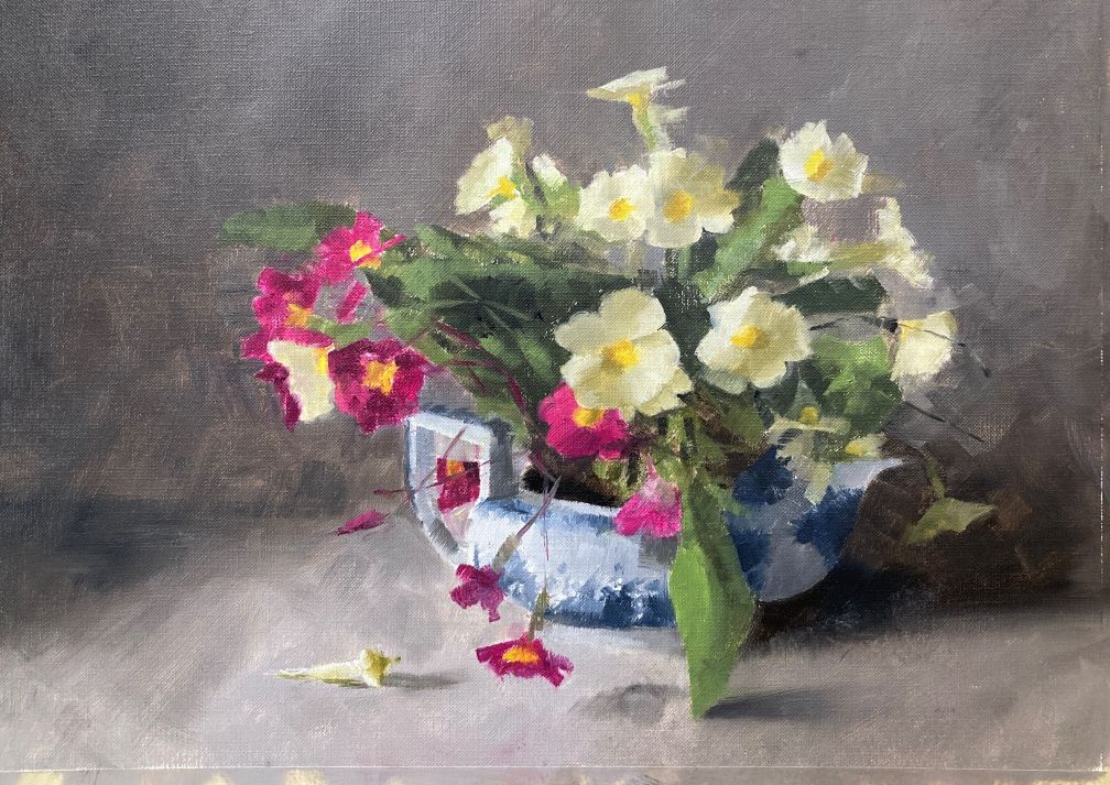
Alla prima primroses were the subject for oil painting today. A very complicated subject and an exhausting painting session. Almost 6 hours to get this to an almost finished state. This was done as part of a Paul Foxton workshop and this was the final subject.
Mixing colors Takes Time
I spent a good portion of the time just mixing the colors. It took around 1.5 hours to mix up colors for the light and shadow sides of the flowers, the leaves, the teapot and the background colors. I dialled back the chroma quite a bit from last week’s study as I thought the yellow flowers were too bright. Definitely a good decision.
Sign up for updates on classes and free livestreams
Small Oil Study
Here is the study for reference:
Alla prima primroses oil study
This was an 8×10 study and was blocked in quite quickly and with only a little drawing. I thought it came out well but wanted a slightly quieter feel to it. I also went larger – 11″x15″ for the final thing. It’s a busy subject and needed a bit more elbow room so took the plunge and went larger. This is always a bit of a risk as relationships can take on more or less impact as you scale up or down.
In Progress Shot
Here is the painting part way through. We spent quite a bit of time on the central 3 flowers. These are the main stars of the show and we wanted to make sure we had the values nailed down here. I think they just about work. Yellow flowers are always tricky especially the shadow colors. We also made sure the values of the teapot were better than the study. The white of the spout in the shadow is really quite dark and we wanted to ensure it really looked like it was in shadow.
alla prima primroses – progress shot
Alla Prima Primroses – Studio Shot
oil painting station studio shot
This is a shot of my easel in the studio. Some people have asked whether I have trouble with distorted drawing as I have my board at an angle. To be honest I keep it like that as I mostly work in watercolor and I’m used to it. I do stand up a lot and I don’t think I get any distortion from the angle. One day I’ll try the vertical easel and see how that feels.
Sign up for updates on classes and free livestreams
Want to paint this watercolor boat painting? Follow the step by step instructions (including video at the end) and see how easy this can be!
I just can’t resist painting boats in watercolor. The colors, the details, the sun and shadow – all come together to make painting these watercolor boats so much fun. In this watercolor boat tutorial I break down all the steps and show you how you can paint this scene. Boat watercolor paintings can seem daunting but if you take things slowly it’s amazing how they come together.
Sign up for updates on classes and free livestreams
Watercolor Materials Needed
Mechanical pencil
Watercolor paper (I like Fabriano Artistco 140lb cold press)
Size 10 round sable or synthetic sable
Permanent rose
Vermillion/pyrrole red/naphthol red
Ultramarine blue
Cobalt blue/cerulean blue
Yellow ochre
Lemon yellow
Burnt Sienna
Black
Value Scale
Color isolator
Palette/paper towels/water pot
Small spray bottle of water
Watercolor Boat Drawing
Watercolor fishing boats drawing
The drawing for this painting is pretty important. Sometimes I won’t put much detail into a drawing and just indicate the main shapes. For instance a landscape with trees can be pretty sparse in the drawing. All the detail and texture goes in by eye with just paint. But for this scene there is a lot going on and we want to indicate the position of a lot of different things.
Using a Grid Helps With Drawing Accuracy
I did this drawing by eye but, if you’re not confident with your drawing, you can grid up your paper lightly with pencil and draw it square by square. That way you can be sure you’re getting everything in the right place. It’s not a foolproof method but it gives you far less room for error. I’ve included a gridded up version of the reference below.
Fishing boat reference photo with grid
The aspect ratio of the photo is the same as for a 10″x14″ piece of watercolor paper. If you mark your paper into quarters on each side and join them up to make a 4×4 grid you can transfer the drawing more easily onto your paper.
Take Some Time to Make a Plan for Your Painting
Before we dive into the painting it always helps to take a few minutes and plan out what you’re going to do. It can be hard to do this – we want to jump straight in and get those brushes moving and paint splashing around. But a few minutes thought at the start always makes for a better painting. We can spot possible problem areas and make sure we know roughly how we’re going to proceed.
Which Direction is the Light Coming From?
I first make note of where the light is coming from and where the shadows fall. In this case the sun is on our right and the shadows are falling on the left. This is always good to keep in the back of your mind. If the reference is unclear in some areas you can work out how the lights and darks should fall even if you can’t make it out from the photo.
Sign up for updates on classes and free livestreams
Where are the Lights and Darks?
The next thing I do is note where my lightest lights are and my darkest darks. Once we’ve located these then we know that everything else has to fall somewhere between those areas. In this case our lightest light is the white hull on the left boat. The darkest darks are in the shadow underneath the boats and possibly inside the cabins. I keep this in mind. Nothing else can be darker or lighter than these areas.
Where are the Main Shapes and Values?
This one is trickier but it pays off giving it some thought. Even though there’s a lot of detail going on in this photo I like to break it down into 4 or 5 main value shapes. In this case I would estimate (or measure using our value scale) the value of the following areas
The sand
The sky
The sea
The hulls of the boats (in light and shadow)
The cabins of the boats (in light and shadow)
This may seem like a lot to work out ahead of time but getting those big value shapes right is an enormous help getting a scene to hang together and getting it to be convincing.
Identify a Few of the Colors
Watercolor Color Swatches
Doing some test mixes of a few of the main colors can also be a good idea. It’s much easier to do this before the painting. When you’re in the middle of the painting there’s so much going on it’s hard to stop and think about this. It’s a bit like prepping for a recipe. Getting all the ingredients measured out ready ahead of time makes putting a meal together much easier. (Not that I ever really do that – but I should!) In this painting I mixed as I went along but it’s a better idea to try out your color mixes at the start. If you think you can’t remember how you mixed your colors then putting a pencil note next to the swatch is a good idea. It’s doesn’t have to be anything complicated – just a list of the colors is enough.
Watercolor Boat Painting – Finally we Paint!
Paint the cabins in the lightest valueContinue with the light colorsMore light colors
So let’s start painting. We’re going to paint this in layers and build up the painting from light to dark. We’re first going to block in all the shapes with their lightest colors. Once those are dry we can go back in and add in the darks. This way of working takes a bit of getting used to. As we’re starting with the light colors of all the shapes things won’t start to look three dimensional until quite late on in the painting.
I have many more step-by-step tutorials and videos!
If we put in too much value variation in the early stages then the darks won’t make as much impact when we put those in. In these early stages try and match the color and value as best you can to the reference. And, most importantly, keep these early washes even. Don’t be tempted to try and make things look right at this stage. It takes a bit of faith but once you get used to it it will all make sense.
Keep Going With the Light Values
The hull of this boat is a stronger colorWork your way across all the different parts of the boats
Keep going across all of the main shapes of the boats. One thing to remember is that we’re putting in the light value of each different shape but these values may vary from shape to shape. For instance, the hull of the red boat is a bright orange-red in the light. The actual value of this is around a 5 i.e. mid-way down the value scale. If we compare this to the beige area above we can see that it’s a little darker. The beige area in the light is around a 7 but it’s still in the light.
Similarly the red stripe on the left hand boat is around a 4 (i.e. darker than a mid-value) in the light. If you have a value scale and a printout of the reference you can measure the values directly. If the color is distracting (and it can be with bright colors like these) squint your eyes and it becomes easier to judge value.
Use the ChromaMagic Tool to Measure Color
chromamagic for fishing boat watercolor painting
Alternatively you can load up the reference in ChromaMagic and click on different areas. It will show you the three components of the color – hue, value and chroma. The color notation is part of the Munsell way of measuring color. It is incredibly useful in painting and makes color very straightforward to analyze.
Paint in the Sea in the Background
Add the sea in a fairly dark blue
The sea in the background goes in next. This is a fairly dark blue and helps to tie the boats in the scene and give us some depth.
As you can see at this point the painting isn’t looking three-dimensional. Don’t panic! This is exactly how it should be looking at this point.
Paint in the Sand Around Your Watercolor Boats
Add a wash for the sand
Next we’re going to put in the sand. I really like this bit as we get to put in some texture with our spray bottle. One thing to be careful of – sand isn’t yellow. Or rather it is yellow but a very grayed out low chroma yellow. In this scene it’s a kind of beige so make sure you add in some black to your mix to take out some of the brightness. I’ve made the mistake of painting sand far too bright in color many times. Again mixing a swatch of color beforehand helps a lot as does using ChromaMagic for checking the chroma.
Sign up for updates on classes and free livestreams
Use a Spray Bottle to Add Texture
While your sand wash is still wet take a spray bottle of water and lightly spritz the surface. If the paper is the right level of dampness the water will add small sparkles and splodges in the paint. It adds some interest and texture to the foreground. This can take a bit of practice to get right. If the paper is too wet the water will just disperse and disappear. If the paper is too dry the water won’t do anything at all.
Watercolor Boat Painting – Add the Sky
Start the watercolor skySmooth the edges of the clouds
Note: I’ve got the order slightly wrong here. I’ve already put in some of the darks on the boats before doing the sky. The order doesn’t really matter. You can put in the sky before the shadows and everything should work out fine.
Let’s put in some sky now. The reference photo doesn’t really have much in the way of clouds and I didn’t really want a big expanse of blue up there. So I’ve invented some cloud shapes. You have a lot of freedom here. Put in some blue around wherever you fancy the clouds to be. While the paint is wet take a clean (very clean) damp brush and soften the edges of the clouds. The blue pigment will diffuse out into the damp areas of paper making lovely soft and convinving clouds.
Watercolor Boat Painting – Second Layer Darks
Add shadows on the cabins and the hullsAdd a lighter shadow on the white hull
Now this bit is where the painting starts to come to life. We’re going to put in the shadow sides of the objects and make them look three-dimensional. Adding in these contrasting areas also helps the visual impact of the scene and it will make the image more interesting as well as more realistic.
Don’t Add Color in the Light!
We’ve already painted in the light sides of our objects so we won’t be putting any color in there at all. We’re just going to paint in the shadow colors on mostly the left sides. Make sure your colors are at least a couple of shades darker than your light sides and things will start to take shape. When you get to the insides of the cabins we’re even darker as very little light is getting in there – you don’t need to paint things – just a few dark shapes at different angles will suggest a lot of detail.
Be careful with the shadow on the white hull. We don’t want to go too dark here and keeping that shadow light will really suggest strong sun.
Add a Cast Shadow to Anchor the Boats to the Ground
Finally add some cast shadows on the sand and right at the bottom of the boats. This will make the boats convincingly anchored to the ground.
The Magic Bit – Details on Your Watercolor Boat Painting
Details – masts and rigging
By this point you should have something that’s looking pretty three-dimensional. This next bit really adds sparkle and interest to your watercolor boat painting! We’re going to put in some lovely details. Put in the masts and rigging with a small synthetic brush. Make sure they’re not too dark – a mid value gray is plenty dark enough here. The other thing to take care with is not to make your lines too continuous. Leave a few gaps here and there as it will make the masts more convincing than if you carefully paint them in one continuous line.
Masts are put in lightly – not too dark
Continue with the masts and smaller details. Add in a few lines for the railings and the ropes holding the buoys. A few light lines on the white hull will also suggest their structure. I hope everything is looking really good by now!
Flags and Signs
Final details in your watercolor boat – flags and signs
We’re right at the end now. A few red marks for the flags will add a pop of color. The signs on the boat go in with an almost black background. The lettering is suggested with a little opaque white.
Final Thoughts on This Watercolor Boat Painting
If you tried this painting I hope it turned out well. I would love to see your results – please feel free to send them to me. I have also videoed the whole process and you can paint along with the full painting.
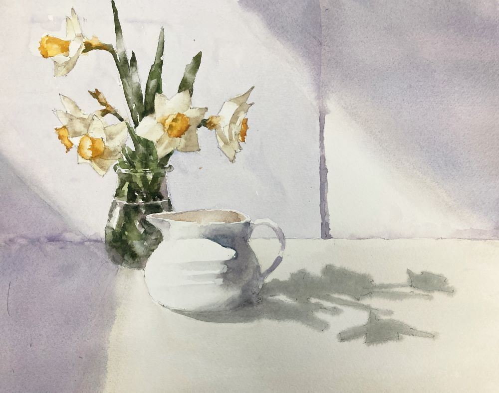
Watercolor daffodils have been on the docket to paint for a while since the snow has departed. Yesterday’s version wasn’t successful and I pushed it to a mess. But today’s is much better. I’ll leave it on the easel and look at it with fresh eyes tomorrow.
Light and Shadow Were The Main Subject
The main star of the show isn’t really the daffodils but the creamer and the shadows. But I wanted to have the flowers in there for some value contrast and those wonderful subtle shades on the petals. The leaves especially give a strong dark vertical which sets off the very light values in the flowers, the creamer and the surface. The background shadows were a huge challenge. My first version had them far too dark and the washes were grubby and uneven. I vacillated a lot about the color of those back shadows. I didn’t want them to be too dominant but also didn’t want a dull grey back there. In the end I think the slight purple worked well.
Daffodils are Surprisingly Hard to Paint Well
I have to say daffodils are not the easiest of flowers. The colors of the petals are very low chroma and can be hard to mix in watercolor. But I think these work pretty well. I would have liked a little more contrast in the petals between light and shade but didn’t want to destroy the delicacy. But anyway – there’s plenty more in the garden so lots of opportunity to practice
Other Examples of Watercolor Daffodils
It is daffodil season and, although these are the first of this season I’ve had some pretty good success previously. Here are a couple of previous versions:
Daffodils with Paul Foxton
Watercolor daffodils in coffee pot
Both these paintings were from sessions with Paul Foxton. He’s a great fan of painting daffodils and it’s always worthwhile taking one of his workshops.
Find out about the Munsell color system and how easy it is to use. Includes access to free pdfs and the online Munsell tool ChromaMagic.
ChromaMagic 3.0 – Now with new palette mode and mixing recipes
Want to see how I transformed my color skills? Try out the ChromaMagic app.
Brand new interface and lots of new features!
ChromaMagic 3.0 Palette Mode with sunflowersChromaMagic 3.0 Mixing modeChromaMagic 3.0 value mode
How I Discovered the Munsell Color System
If there’s one thing that took my painting to the next level it was understanding and using the Munsell color system. I’d known about it for a long time but hadn’t really studied it in detail. To be honest I’d looked at it and thought ‘oh that looks far too complicated for my needs’. Reader, I was wrong. If I’d used this way of thinking about color years ago I would be far more advanced in watercolor painting than I am. There are a number of different color standards out there but Munsell is definitely the best one to study for painting.
Sign up for updates on ChromaMagic
My Color Was All Wrong
Just before I really got into Munsell I’d been flailing around trying to work out why my color wasn’t working in my paintings. I knew something was wrong and I kind of knew what it was but I didn’t know how to fix it. My problem was that color wasn’t really working in my paintings. They were all coming out really garish and the colors weren’t working in harmony. I tried various things – really trying to get the values right, graying down all my colors so they were more muted, really trying to simplify shapes. A lot of ‘really trying’ but not a lot of ‘really working’.
Munsell to the Rescue
I knew my color wasn’t working and I knew that I wasn’t really seeing color as value. But I’d missed a big part of color and that’s where Munsell came to the rescue.
Munsell is Increasingly Popular Amongst Artists
A growing number of people are using or starting to use Munsell. Off the top of my head these include Kathy Speranza, Graydon Parrish, Anthony Waichulis, and Richard Murdock. But I want to give a shout-out to Paul Foxton. He introduced me to Munsell through his website and his fabulous YouTube videos. Especially if you’re an oil painter I highly recommend you check him out.
Sign up for updates on classes and free livestreams
What we’ll cover about the Munsell System
In this post we’ll be learning about color as defined by the Munsell color system. This breaks down colors into three components – hue, value, and chroma. We’ll be defining each one and seeing how they look on a color wheel and in individual Munsell color charts. We’ll then look at how we can use this to really sharpen our perception of color. This, rather than the application of paint to paper, was the thing that is transformational about Munsell.
History of Munsell Color
I won’t go into detail about how the Munsell color theory came about. There are some great pages elsewhere that can tell you much more than I can. They also have a set of Munsell color project stories about how different people have used Munsell.
What is the Munsell System?
Munsell gives us a straightforward, reproducible and easily learned way to think about color. It breaks color into three components and we can classify any color according to those components. This Munsell color notation lets us define almost any color we want. To see how this notation system works let’s start with the first (and easiest) component.
Munsell System First Component – Hue
In the Munsell color system hue is the first component. At its simplest this is the name of the color. Red, Yellow, Blue, Purple etc. There’s a slight wrinkle in the way Munsell denotes these that can feel a little weird to begin with. Instead of saying red – in Munsell it is R. Yellow is Y, green is G, blue is B and purple is P.
So far so good. The intermediate hues which we might call orange, yellowy green, pink etc are denoted as follows:
Orange YR (Yellow Red)
Yellowish green GY (Green yellow)
Greenish blue BG (Blue green)
Purplish blue PB (purple blue)
Pinkish purple RP (red purple)
It takes a while to get used to this (especially the orange = YR) but becomes second nature pretty quickly. If we put them all in order we get
R – YR – Y – GY – G – BG – B – PB – P – RP
Munsell hue notation
I keep this Munsell color order in my head. The hues flow naturally from one to another so it’s good to memorize it. Let’s have a look at these main hues on a wheel.
Munsell Color Wheel – 10 Hues
10 hue Munsell color wheel
You’ll notice that this differs from the traditional painters wheel. The traditional painters wheel is organized around the ‘primaries’ (red yellow blue) and the secondaries (orange, green,purple) and has the primaries opposite the secondaries.
Each Hue is Divided into Four
Now these main hues aren’t really enough for us to describe the colors we see. So Munsell color theory breaks each of these main hues into 4 and gives them numbers.
2.5Y 5Y 7.5Y 10Y
Munsell hue components for yellow
Each hue ranges from 2.5 to 10 and the hue changes slightly from each number to the next. So we end up with 40 different hues. Now, this seems like a lot. But in practice you really only need to remember the 10 main ones and just estimate whereabouts in that hue we are. For instance consider this color :
Example Munsell Chip
We can immediately see it’s an orange so we’re in the YR hue. But is it a reddish orange (and so maybe 2.5YR) or is it a yellowish orange (in which case we’d be maybe 7.5YR or 10YR)? That’s pretty easy to estimate so we can work out which part of the wheel we’re in quite quickly. In this case it’s leaning slightly more towards yellow than orange so we’re likely to be 7.5YR or 10YR (it is actually 7.5YR)
Painting From Nature is Concentrated in a Small Part of the Hue Wheel
In practice when painting (especially painting from nature) we spend a lot of time in a fairly small part of the wheel. The reds, oranges, yellows and greenish yellows and parts of blue are where we spend 90% of our time. If you’re painting flowers or a lot of manufactured things then we can venture into the turquoises (BG) and purples (P and RP).
So how do all of these hues look on the wheel?
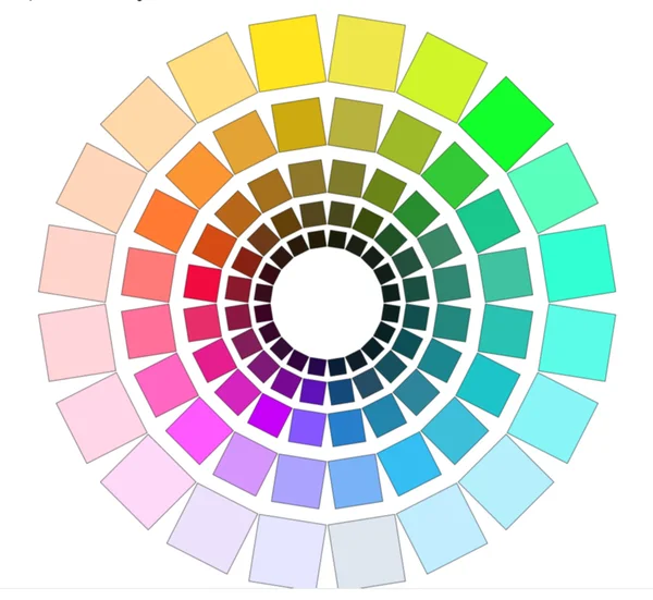
Munsell Color Wheel – 40 Hues
Munsell Color System – 40 hue color wheel
Isn’t that pretty?
Munsell Color System Second Component – Value
So we have our hues but of course we don’t just work with these very bright colors. In the Munsell Color System value is the next component. That is to say how light or dark the color is.
Munsell Value Scale – Dark = 0, Light = 10
Munsell measures value in 11 steps where black = 0 and white = 10. For our colors that means we’ll have values ranging from 1 to 9. This is what they look like in gray.
Munsell Value Scale
We can change all our hues to have different values. Here’s what the color wheel looks like if we darken (value 4) or lighten (value 8) our hues.
Munsell Color Wheel – dark values (value 4)Munsell Color Wheel – light values (value 8)Munsell Color Chart Hue Wheels
Pretty cool yes?
Munsell Color System Final Component – Chroma
Now this bit can take a bit of time to get your head around. We can’t describe all the colors we see just by hue and value. There’s one vital piece missing and it makes a very important difference.
If you look at all the wheels we’ve seen so far the colors are all very bright. Even on the dark wheel they have a lot of intensity to them. But a lot (and it’s a LOT) of the color we see around us isn’t that bright. Let’s bring out an example:
Scene with low chroma colors
Look at the sunlit beach, the beautiful blue sky, the intense blue sea. Surely all the colors in this will be as bright as we can make them? But no. I’ve isolated a few areas and extracted the colors. They’re pretty muted. In fact the brightest color in the whole thing is the sky (top right swatch) and even that isn’t close to maximum intensity. And this is a pretty intense scene! Imagine what a grey overcast day would do to colors.
Munsell uses Chroma to Describe How Saturated or Intense a Color is.
Hmm. So we need a way of describing how intense or saturated our color is. And Munsell quantifies this and calls this chroma. Chroma in color can be low or high. A low chroma color (chroma 2) is very desaturated and grayed out. A high chroma color (e.g. 12 and above) is very bright and saturated. And chroma 0 colors have no color at all and are completely gray. The chroma of color is easy to overlook but Munsell makes it easy to consider. Let’s see some more examples!
Sand is Not Bright Yellow!
Sand and sea chroma strips
For the bottom three colors in the beach scene I’ve taken the strip of colors at the same value from the relevant Munsell card. Each of these strips has colors at different chromas but the same value. In each case the colors are way down the chroma scale. Two are chroma 2 and the other is chroma 4. And yet they look pretty vibrant in the photo! We obviously need to pay attention to chroma.
Munsell Notation System
We have our three components of color but how do we represent them? The hue we represent by the number and the hue letter or letters. This means things like 10R, 2.5YR, 5PB. The value and chroma follow afterwards separated by a slash. So a high chroma mid-value orange could be something like 2.5YR 5/12. A low chroma low value blue would be something like 5PB 2/4. It takes a bit of getting used to how this color notation works but it’s so useful to be able to precisely define colors that it’s worth it.
Now let’s say we have a bright red color (5R) at a value 5. If it’s a bright color (i.e. high chroma) it might have a chroma 12 say. If it’s a dull color it might have a chroma 2. But both these colors have the same value. We can keep the value the same and change the chroma. Let’s see some examples and check:
Munsell chroma strip for 10R value 6
Black and white version of Munsell chroma strip 10R value 5
This can be a bit weird to get straight. It’s easy to think ‘oh I’m making this color grayer then it must be darker’. Not necessarily! We can absolutely keep the value the same and reduce the chroma. And a lot of time we need to if we want convincing color. Let’s see some charts to see how this works.
Full Munsell Color Chart – 5R
This is the full range of values and chromas for one of our hues 5R. I know it looks like a lot of information but these get very familiar very quickly. We have chroma going left to right (high chroma on the right) and value going up and down (high value at the top).
Munsell Color System – Munsell Chart 5R
Now the first thing you notice about this is that it’s not rectangular! The highest chromas are in the middle and there are fewer high chroma colors as we go higher or lower in value. This is typical – high and low values have maximum chromas around 2 or 4. And the shape of these charts is not the same for each hue! Some colors have their highest chromas at a high value. For instance here is the 5Y chart:
Full Munsell Hue Chart – 5Y
Munsell Color System – Munsell Chart 5Y
Wow. So the brightest yellow we can get has the highest value! And as it gets darker it goes green!!! Yellow is a weird one I admit. Mostly the charts have their highest chroma around a mid value.
If we look at a few more charts we’ll notice something else. The highest chroma we can get varies between the hues. If we look at purple for instance we can get really high chromas but a blue only reaches an 8! Seems counterintuitive as blue and purple are pretty close on the color wheel but there it is!
Munsell chart 5BMunsell chart 5P
Recap of the Three Components of Color
So for any color we come across we can define it in terms of 3 components – hue, value, chroma. We could do it in any order – hue, chroma, value or chroma, value, hue – but it’s generally easiest to go hue, value, chroma.
Hue – the name of the color Value – how light or dark the color is Chroma – how saturated or gray the color is
The conversion from screen colors (rgb) to Munsell notation is freely available online. The ChromaMagic team has generated a pdf from these that is available to download. If you sign up for these you’ll also gain access to the fantastic ChromaMagic Munsell tool described below.
ChromaMagic – Munsell Color System Online
ChromaMagic Munsell Tool
It can be really useful as a learning tool and a checking tool to see which Munsell chips match different parts of a photo. The ChromaMagic tool is free to use and lets you upload your own photo to see the diffrerent Munsell notations. See here for signups and access.
Munsell Color System Book
The gold standard for Munsell colors is the Munsell color book (or the Munsell book of color). It is fabulous, contains 40 color charts with removable chips, and costs an eye-watering amount of money. I managed to buy mine second hand from ebay. The person selling it was a Canadian gemologist who was retiring and I was happy to take it off his hands. If you’re feeling flush then this is definitely the thing to get.
However, if you’re just getting into Munsell or just want to try it and see if you like it (you will!) there are other options. None of these are perfect but they will get you on your way.
Munsell Student Book
This is a great little book and has lots of exercises and history and stuff which is well worth going through. But the main reason for buying this is it has a set of Munsell charts for a subset of the hues. It has charts and chips for all the 5 hues (5Y,5YR,5Y,5GY,5G,5BG,5B,5PB,5P).
However, for these charts to be really useful you need some intermediate hues as well. I find that if you have the 5 hues and the 10 hues you can get a pretty good match to most colors. The 5 charts in the student book aren’t quite enough to work with. But it will get you a long way and definitely be useful. Again older versions sometimes come up on ebay and can be pretty cheap.
Paul Centore Book
Paul has done a lot of work producing a number of products that are very useful to us Munsellites. His value scale is well worth getting even if you have no interest in Munsell color. He’s also worked at getting the best printed version of Munsell color charts and has produced a binder of all 40 charts. The caveat is that printing will never get you perfect matches to paint colors.
The big Munsell color book has painted chips and they are guaranteed to be accurate. I’ve compared Paul’s chips to the Munsell book chips and they’re very close. And for the price it’s a really good option. The only thing is you can’t remove the chips like you can in the big book and the student book. You could laminate the pages and cut out the chips by hand but that may be overkill.
Munsell Color Tree
Now I don’t own one of these but I have seen one at a workshop. It looks very cool but it does only have the 5 hues (5R, 5Y etc). I would suggest the student book or the Paul Centore book would be more useful. I will probably end up getting one though 🙂
Print Your Own Chips
I wouldn’t recommend this and there’s a catch-22 here. You need to cailbrate your printer to get anywhere near usable accuracy. I tested a page just with the default printer settings and the hue was off by a couple of charts which is huge. After calibrating (my printer is an Epson 7750) I got very close (as close as the Centore book) but here’s the thing. You need the real chips to compare to to make sure your printer is doing the right thing. And if you have the real chips then you don’t need the printed version.
How to Work with Munsell
Okay enough of the theory and charts and stuff. How do we actually use this to make our paintings better? This is the way I look at it and the way I use it. I use Munsell to analyze what I see and improve my color perception. When I start a new painting I identify a set of colors that will make up the painting, work out their Munsell colors and mix up swatches for each color. This may sound like a lot of work but even with a fairly complicated painting I don’t mix up too many colors. It’s usually around 6 or 7.
How to Identify a Color
If you’re working from a screen with a photo I would recommend using the online ChromaMagic tool. I prefer to work from a printout but either one will work. Of course photos don’t make the best paintings but for learning they’re the best method. If you’re working from life there are a lot more variables in play but practicing the process with printed or screen references will transfer over to real scenes.
Color Isolator
gray color isolator
If you’re working with a printout and chips a color isolator is a handy tool. This is just a piece of value 5 card with a 1/2 inch square cut out. When placed over a section of a photo the gray surround isolates the region from its surroundings. This removes the effect of any surrounding colors and makes it easier for us to judge the color.
How to Practice Seeing Color Accurately
Take your reference and either load it up into ChromaMagic or print it out and have your isolator and chips handy. Follow the 4 steps for a variety of regions on your reference. You’ll soon find that some colors are much easier to match than others.
Pick a spot on your reference.
First estimate the hue.
Estimate the value.
Estimate the chroma
Check your estimates!!! This is the bit that really improves your skills. Once you’ve made your guess check it with your chips or ChromaMagic. You’ll probably be off and maybe quite a lot off when you first start. But the immediate feedback will improve your guesses really quickly. It’s the ability to guess and check in quick succession that hones your skills. You can use your own references for this but I’ve put together a set of exercises that will take you through a range of the hues, values and chromas.
(Note: As an Amazon Associate I earn from qualifying purchases.I get commissions for purchases made through links in this post.)