Enough with the apples. Let’s get back to some watercolor. I’m really enjoying the street scenes recently. They need a lot of tweaking to design them into something that works. But you also have to keep the sense of place in there. And also make a decent painting out of them. It’s tricky – but rewarding.
So this is the reference image
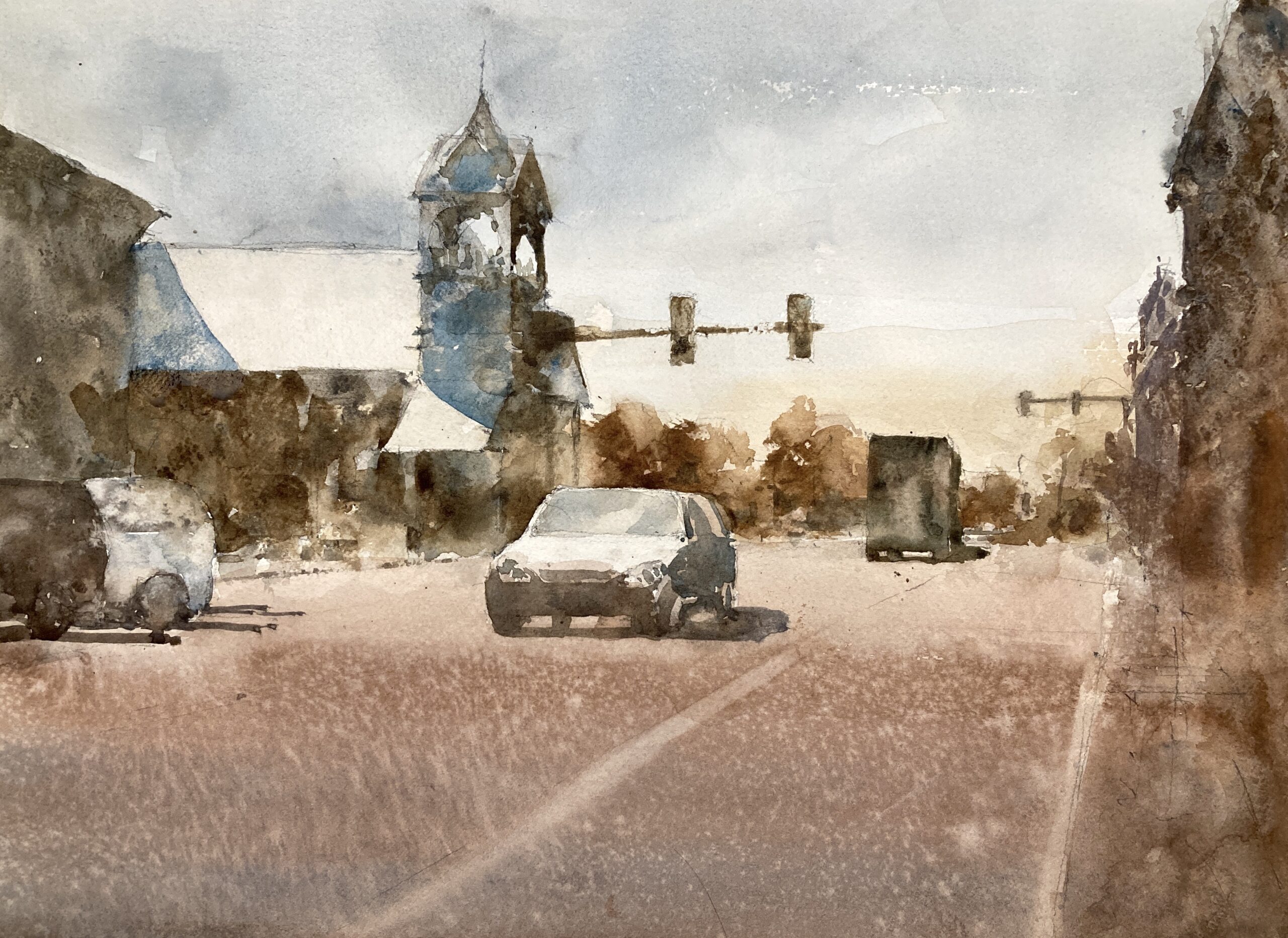
The tower is great of course. But there’s a lot of space in there not doing a whole lot. I toyed with keeping this in – maybe a wider format – and making it more of the subject. But after noodling with some value studies in paint and on the ipad I plumped for compressing the road and keeping the tower and the car as central. Of prime importance are the light roofs leading down to the car. Great arrangement of darks and lights.
Those three lights and the car on the left hand side hold everything together. Well that’s the plan. The initial washes went in ok. Some light and dark but I’ve still got half the value scale to play with so a long way to go.
Vermont Main Street watercolor by Michele Clamp
Well here he is finished. I managed to screw up at the last minute (not telling where) but on the whole I’m pretty happy with this. Time will tell of course.
Vermont Town Value Study. Michele Clamp. Watercolor
How important are value studies? I have to admit that I have only recently started doing them as part of the process. A few years ago I tried to do them but found scaling up to the real painting very difficult. So I stopped. But over the past year I’ve finally found them useful.
After the Marlborough at dusk struggle to a triumph I’m spurred on to another New England street scenes. I really enjoy these but they are hard to design and hard to paint. When they come off though they make really good paintings (IMO of course). Today was value study and color study day. Here is the photo reference:
This is from a visit a few years ago and the strong light and tower caught my eye but, as you can see it’s not an obvious choice for a painting. But if we can make a decent value sketch out of it we may have a chance.
First was some noodling on the ipad. I find this great for trying out ideas. You can work in a small range of values and add new layers if you want to try something out. If it doesn’t work just delete the layer. So what did we find?
Digitally altered version 1Digitally altered version 2Digitally altered version 3
Yeah I think there’s something there. I added in some of the buildings on the right hand side to give some balance to the left. I also ruthlessly pushed those dark trees to a lighter value both to push them back and to provide some contrast with the foreground tower and car. The thing I like the most is the pattern of light off the roofs and the car which I need to remember to retain in the final painting.
Ok so far so good – onto some paint value studies. Pretty small with minimal drawing and trying to keep to around 4 values throughout the whole thing.
Watercolor value study – with windowWatercolor value study with window
This is the same sketch at different stages. I was in two minds whether to include the dormer window on the left hand roof so took a photo half way through. I’ve compressed the scene widthways a little so things aren’t too stretched out and made the central car a little more prominent. I think we’re still looking good.
Finally I tried out a very rough color sketch. This was just to try out some colors as the photo colors are not very inspiring but I still want to retain a sense of the hard sunlight.
This is teeny – around 2”x4” but I wanted to see if a blue sky would work with some rich browns for the buildings. I’m still in two minds but it looks promising.
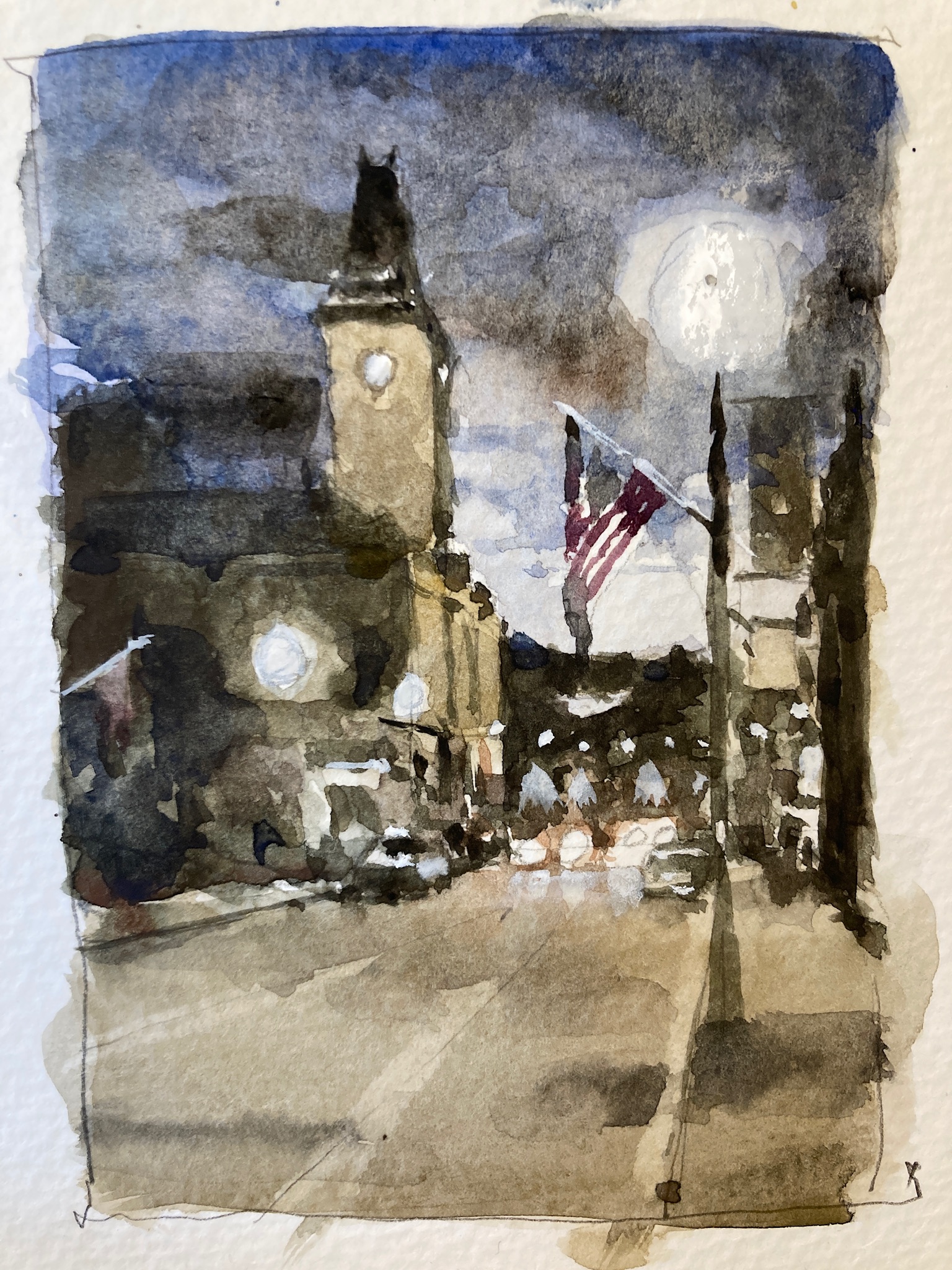
Starting to think about the next ‘big’ painting. This is a night view of Marlborough which is going to be challenging to say the least. I’m working up to it with some studies and starting small (3”x5”) with a sketch. This is to work out the value relationships and how the different areas relate to each other. So far so good.
Well the luck had to run out some time and this will remain unfinished and in the reject pile. I was mostly interested in the light on the buildings and wanted to keep the color muted. Neither of those things really worked out. The light doesn’t pop and the color is just drab. I’d like to do the scene justice at some point so it will remain in the to do pile.
Watercolor of St Mary’s Church, Cambridge for day 7 of the 30 in 30. Phew this is getting intense! Maybe something a little simpler tomorrow. It’s hard to assess the results when you’re in the midst of this challenge so I’ll just carry on and take a breather at the end. Pretty happy although I rushed to finish. (Edit: It looks a little wonky as my photo is slightly off)
Well you can’t win them all. Struggled for 3 1/2 hours on this and it isn’t really quite finished but I’d had enough. Just couldn’t get those darks to work. Anyway – tomorrow is another day.