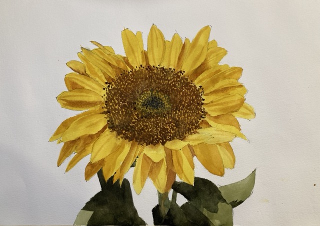
An easy sunflower watercolor painting. If you want ideas for watercolor painting this is a great choice. Learn here how to do it.
A sunflower watercolor painting is one of the easier flowers to paint. Not trivial by any means but I’ve really enjoyed previous sunflower paintings and wanted to try something a little different this time. Watercolor flowers are deceptively hard. So many forms, intense colors and subtle value changes. It’s a challenge at the best of times. If you want to make sunflower painting easy then the best thing to do is have a plan! A little time thinking is never wasted!
But I always love painting sunflowers in watercolor. Sunflower art looks great on the wall and cheers up any decor. I don’t actually have any original sunflower paintings up on the wall at the moment – must remedy that.
So let’s get started on our easy sunflower painting! Let the watercolor sunflower tutorial commence!
Sign up for updates on classes and free livestreams
Materials for Your Simple Watercolor Painting
You don’t need a huge watercolor painting set for this painting. You’ll need some watercolor paper and I usually use Fabriano Artistico but any 100% paper will work well. The paper for watercolor painting is crucial so, if you can, don’t skimp on this part. Brushes are also important and the best are made of Kolinsky sable but there are some good synthetics on the market these days. These include the Princeton Aqua Elites and the Escoda Verstil brushes. Also, recently I’ve been using the Silver Black Velvet brushes which have a good feel to them.
Brushes for watercolor painting
We’ll need some paint of course. I like tube paints and any artists quality brand is fine. The colors we’ll need are :
Lemon yellow
Burnt sienna
Ultramarine Blue
An orangey red like vermillion/pyrrole red/naphthol red
Black.
Other things we’ll need are a mechanical pencil for the drawing, a palette with good areas for mixing, a water pot and some paper towels. Other things that come in useful in my watercolor painting kit are a kneaded eraser, a spray bottle to keep the paint wet and for occasional texture, and some masking tape to tape down the paper to stop it curling.
How to Start a Watercolor Painting
The best way to begin a watercolor painting is to hold off painting for a while and make a plan! Seriously, all the thinking you can do ahead to time will pay off in spades. There is so much to think about when you’re in the middle of some watercolor technique that if we can do some thinking beforehand we should. A little planning should make our sunflower painting easy (or at least easier!).
So our main plan is:
Make an outline drawing of the petals and the leaves
Make some color swatches for the light and shadow side of the petals and leaves. Also make some color swatches for the central darker parts.
Put a first wash over all the petals in the light petal color
Put a first wash over the central parts
Paint all the seeds in the central part
Paint the leaves
Paint the shadows on the petals
Finishing touches.
This layering technique is pretty common in but there are other techniques for watercolor painting. If you want to learn watercolor painting painting in layers is a good place to start. As we only work on one layer at a time we can break things down into sections and concenrate on that. Time is always precious in watercolor as we only have so long before the paint dries and we can’t work with it.
Trying a different painting style
Loose watercolor painting is my usual style. A lot of simplification and lost edges and general sploshiness. It’s not an easy watercolor style (are there any?) and even though it looks free and easy it involves a lot of decisions and good brushwork. But today we’re going to be doing something different. This watercolor sunflower painting is going to be crisp and precise and hopefully result in a sharp focused but still interesting image. If you’re interested in how to paint loose sunflowers in watercolor take a look at another of my sunflower paintings.
I do have a few more sunflower watercolor paintings in the archives if you want to compare this to previous work. This sunflower painting is from a few years ago and I’ve done a couple more in class demo tutorials. Somewhat different in style but they have a certain charm I think. Not as loose in style as one of my favorite painters Charles Reid but one day maybe…
Sign up for updates on classes and free livestreams
More drawing required for a tight painting
I spent a little more time on the drawing than usual. We’re not going for a completely realistic sunflower drawing but I made sure all the petals were outlined and all edges defined. The middle part of the flower (all those seeds!) I left empty and planned to paint freehand. Successful easy watercolor sunflower paintings depend on the lovely irregularity in the petals. They look uniform at first sight but they point out at all sorts of odd angles – we need to capture that.
Planning the colors.
This watercolor sunflower didn’t have too many colors to match. There was the light and shadow sides of the petals, The light and shadow of the central seed part and the leaves. And keeping the colors simple was going to help keep the form in the final painting. Here are my swatches for the various colors.
Watercolor easy painting color swatches
Painting the petals
First a complete wash of the light yellow petal color over all of the petals. Painting straight through all the petal joins and trying to keep the wash even with no streaks or stripes. I softened slightly around the inner edge to avoid any harsh lines later.
Painting the sunflower center
The next step was to put in the lighter color of the central portion. This was a value 6 wash of burnt sienna over the whole central part. I let this dry then spent a good week or so (ok maybe 20 minutes) carefully painting in a mix of burnt sienna and ultramarine to outline the seeds. I left small regions of the underlying wash showing through to show the lighter parts of the seeds. Took forever (have I mentioned that?) and made me remember why I don’t paint like this often. But the result worked – the central part definitely had a look of a sunflower.
The leaves
At this point I had a choice. To go in and paint the shadows on the petals or to tackle the leaves. I decided on the leaves. They have fairly dark portions on them and I wanted something to relate to when the rest of the petals went in. So in they went. Just two colors – the lighter green (black, lemon yellow and a little cobalt blue) for the regions in sun and a darker mix with more black and less water for the shadow portions.
The petal shadows
Now this bit was the hardest and the part where I would be most likely to ruin everything. I carefully looked at the value and the color of those shadows on the petals. They weren’t for the most part all that dark. Maybe a value 7 or 6 in the darkest part. They were also very orange – no blue or grey in there. So I tested a mix of burnt sienna and a little vermillion with enough water to give me a value 7. Yup that seems to be ok.
The shadows went in in layers. I left some regions just with the one layer for the lighter parts and then went in again with another layer of color for the darker parts. It wasn’t the greatest job – a little streaky in places. But the colors were good and if I try this again I’d have a better idea of how to do it.
Sign up for updates on classes and free livestreams
Final touches and is this sunflower watercolor painting a success?
Only a few things left to do now. A few little dots around the central part for the seeds that were poking out, darkened the leaf shadows a little, and put a few light lines on some of the petals. Fairly happy with the result I think.
Watercolor sunflowers are a good subject if you’re starting to paint flowers. The colors are fairly straightforward and there is a strong contrast between the central part and the petals. Both of these help us get a convincing representation in paint.
Finally…
I hope you enjoyed this beginner watercolor painting and it showed you how you can make painting a watercolor sunflower easy. If you are looking for more lessons in watercolor painting I have more tutorials and some real-time demos on my youtube channel. Please subscribe to my channel if you’re interested to see new ones when they’re released.
And Before You Go…
Here are a few screenshots of a slightly more loose set of sunflowers. The process is very similar though. The early washes go in flat and then more detail and interest is added as the painting progresses. If you’re keen on painting sunflowers in watercolor you can adapt this technique to pretty much any flower.
how to paint sunflowers in watercolor
Sign up for updates on classes and free livestreams
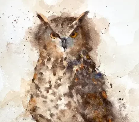
It occurred to me that I hadn’t painted an owl watercolor in a good while. I wanted to do something that was more loose and sploshy than usual. Teaching demos tend to make my painting tighten up quite a bit and I needed to shake things out a bit. I’ve painted a variety of owls before – barn owls, saw-whet owls (a favorite), and this one – a horned owl (eagle owl?).
Painting a watercolor owl (in fact any bird) is often scarier than other paintings. The drawing has to be accurate without getting into much detail and the markings can obscure the underlying form of the bird. Watercolor painting is unpredictable at the best of times and with owls doubly so. But I’d decided on an owl so an owl watercolor painting it should be.
Sign up for updates on classes and free livestreams
Drawing out
I roughly marked the paper (Fabriano Artistico 140lb cold pressed) into quarters. This allowed me to get the proportions roughly right without having to put graphite grid lines all over the paper. Not really necessary but I wasn’t taking any chances. I lightly drew in the main form but with no detail in the feathers.
Planning and first washes
horned owl watercolor first washes
Before even putting brush to paper I planned out the values. The light was coming from the left so the right side of the bird was in shadow. I mentally made a note of this and kept this in mind as the painting progressed. When painting loosely in layers, and with such a lot of patten in the feathers it can be easy to lose track of the values as you paint.
As I was aiming for a loose painting I started with a very loose wash of mainly burnt sienna with a touch of ultramarine. I kept away from the face but pulled the paint out through the edges of the bird. This is very light and will only show slightly in the final thing. It also takes some of the glare of the white paper away, softening the effect. As the first, very loose layer was still damp I put in a darker wash over the shadown side of the bird. This started to show the form but was still very light and nowhere near the final value.
Building the form
horned owl watercolor building the form
Again while the paper was still damp I built up the form further on the shadow side. There’s a lot of feather pattern in there so my marks were choppy but soft and I took care to leave lighter areas. I used my spray bottle a little to add some texture and dropped in slightly thicker, darker paint to darken some areas. At this point I was chugging along and fairly happy.
Face and Feathers
horned owl face and feathers
The next stage was starting to add some detail. I went into the face and added the eyes, making sure they had shadow at the top where the ‘horns’ were. Adding the pattern to the feathers I started to falter a little. I wanted everything to be loose and soft but probably rushed this piece a little and my confidence started to wane.
Press on regardless
Horned owl press on regardless
Well I’ve started so I may as well finish this. More color in the feathers and more darks to make sure the shadow side really looks like it’s in shadow. I added some color to the feathers and added some more darks around them to make sure they stood out. A little more work on the feet and the rock and I was almost done.
Sign up for updates on classes and free livestreams
Final touches
Horned owl watercolor by Michele Clamp
Still not very happy at this point. Standing back I noticed the shape of the head was a little off. Some softening and modification to the sides of the head and I was a little happier. As a last resort I added some paint splashes. So am I happy with it? Hmm – not really. It does have the looseness I like but I lost something along the way. Never mind – there’s always tomorrow.
As I’ve said on a number of occasions watercolor birds are hard even though I do a fair amount of bird art. A little disappointed I have to say. Some of my best work has been of owls. We have one of my early ones up on the wall and I’m not sure I’ve ever surpassed it.
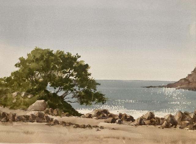
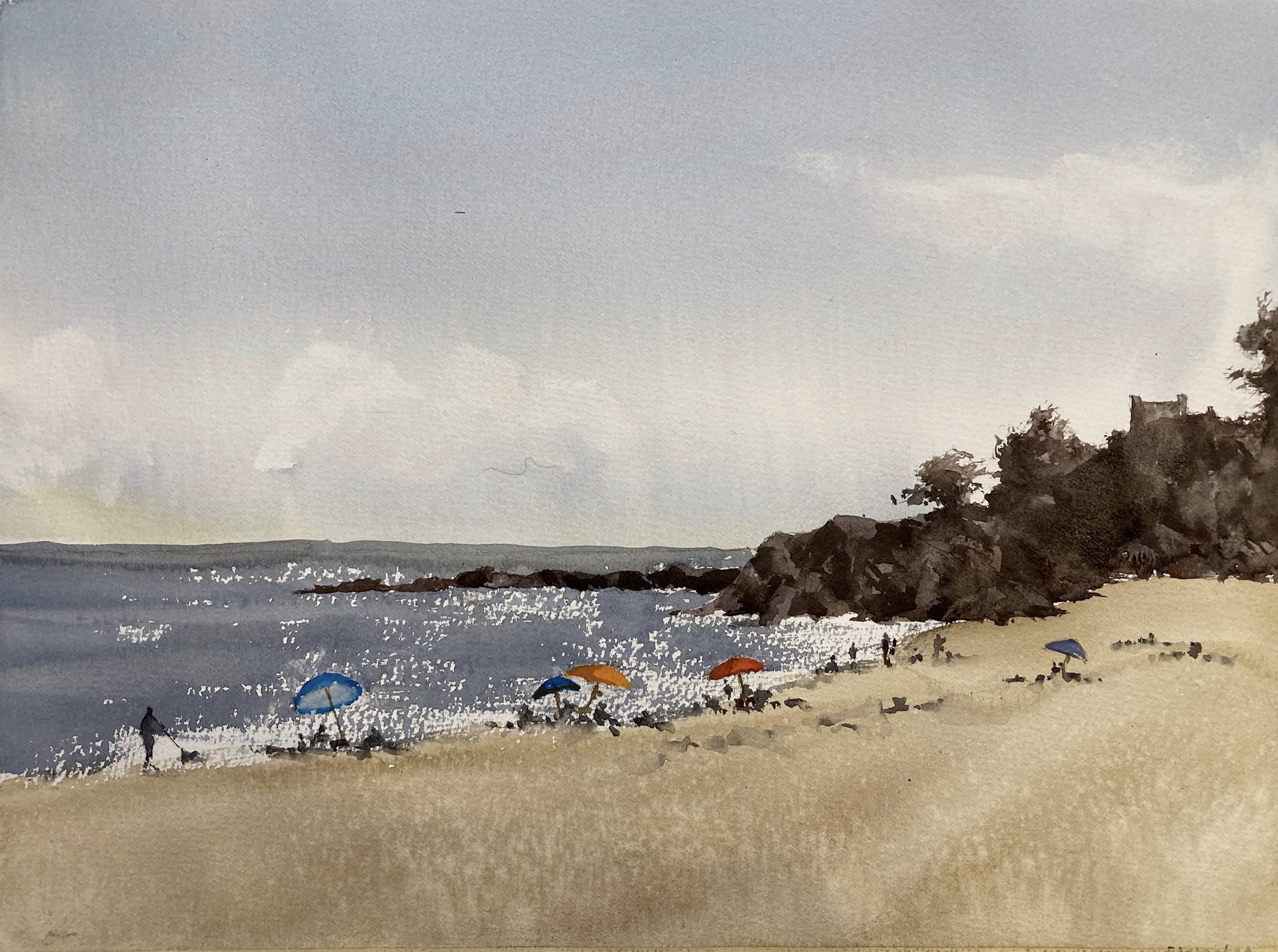
A deceptively simple watercolor landscape value study was the precursor to this painting. Tuesday is teaching day so decisions had to be made and I plumped for this beach scene. It’s good for practice as there are obvious large shapes and clear values.
First a Small Landscape Value Study
Landscape Value Study
Break the scene into big value shapes
The first thing was to break down the scene into a few large value shapes. These were the sky, the sand, the sea, the trees, and the rocks. A couple of these have multiple values in but I chose the average value in order to paint the study.
Sketch the shapes and identify the values
This is probably the most important part of the value study and it involves no painting at all! First I sketched the rough shapes in a small rectangle – probably about 4”x6”. Then Using my trusty Paul Centore value scale (buy from eBay) I first *estimated* what the value was for each shape. After taking a stab at the value I then brought in the value scale to check how close I was. If I’m within a step I’m pretty happy. It’s surprising how quickly you get better at this and the key to it is making a guess first rather than bringing in the scale immediately.
Note the values on the sketch
This is only a value study so we can mark it up however we want. I pencil in the value inside the shape so I can remember. So the sky and the sand were about a value 8. The sea was a 6 and the trees and rocks varied between a 5 and a 2. All these numbers went in the sketch.
Finally Paint the Value Study
And now we get to paint something. We’ve done a lot of the hard work here so it’s a case of mixing the value and painting it in the shape. I try and keep the value washes as even as possible so there aren’t stripes or brush marks. It keeps the values separated so we can judge how the composition is working. I usually do value studies in a sketchbook or on cheap student paper but this time I broke out the Fabriano Artistico. It’s not really needed as we’re not doing any edge work or blending but I had a small piece handy.
Some shapes have multiple values
The trees and the rocks have multiple values which show the form as the light hits them. In these shapes I used two values – a wash of the lighter value and then a much darker value on the shadow side to make them appear three dimensional.
There’s not a lot of detail in there. A few brush marks on the rocks brings everything together.
Assess the result
After I was done I stood back and assessed how the composition was working. In this case everything looked good. The value arrangement hung together and I was ready to go to the next stage. In particular I liked the way the sea was a mid value between the sky and the darks of the trees and rocks and tied the painting together. Another thing that I think worked well was the broad treatment of the rocks. I had used just two values and put in the shadows very broadly with a little softening of the edges. This simple treatment was surprisingly enough to make the rocks read well. Also the broad painting gives the study some energy and visual life.
Next Steps
In another post I’ll talk through the next stage which is mixing the colors. There are a couple of surprises in there which can catch you out. I have been caught unawares painting beach scenes quite recently and learned a few lessons which came in handy with this painting.
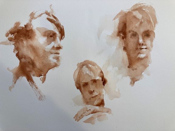
Watercolor portrait sketches are something I haven’t done in a while. A lot of other watercolor painting but very rarely faces. Portrait painting takes the difficulties of watercolor to another level. Getting the facial features right, the skin color, how the light reflects off the planes of the face – everything needs to be right. And that doesn’t even touch on how hard it is to get a good likeness.
Portraits over zoom are great!
Today was the life session courtesy of the Newton Watercolor Society. We had our wonderful model Andrea who I think I’ve painted before at a Charles Reid workshop. I was pleasantly surprised how successful it was to paint at home from the screen image. Almost made me forget I wasn’t actually in front of the model. Of course there are differences. You have one point of view (although everybody has the same view which is nice) and the camera does odd things with the exposure and the color. But on the whole I got a lot out of it.
My Portrait Skills need some work
Now you may be wondering from my portrait results where the other two models were. Actually these three faces are all of the same person. I’ve managed to not only paint people who look nothing like each other but also are of completely different ages and indeed gender. Obviously need a little practice here.
The Process
I was working on Fabriano Artistico 140lb cold press paper and worked entirely with burnt sienna. Using a round brush I initially washed in the main values leaving the paper white for the light parts of the face. Initally I just put shadow in the eye areas and around the mouth and left any details until later. We only had a time of 15 minutes per portrait so things had to go fast. This meant any detailed treatment of the eyes or hair had to be skipped over. I worked wet in wet mostly – partly due to time and partly to not end up with any hard edges. It was extremely enjoyable and the time just whizzed by. On the whole I’m pretty happy although I obviously need to work on doing more observation of those fine feature distinctions.
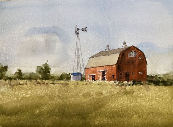
I had a good session painting a barn watercolor this week. Starting with a value study is a great path to a successful painting. I chose to do a watercolor painting of this old barn as it had clear areas of different values that show the form and make the scene look three dimensional. This was a session on values so there wasn’t much finesse in the final study we did. My painting hand was itching to have another go at it so I did a quick sketch this afternoon. A watercolor barn is a great subject for learning how values create form with paint. If you’re looking for watercolor painting ideas it’s a good place to start.
This was never going to be a finished piece as the paper was a bit damaged where the printer ink got smeared on it which actually frees you up a bit as it’s not as precious. Quite happy with this. If I were to do it again I’d take a little more care on the sky and tone down the blue a little. I was trying to cover up the nasty smear but to no avail.
Below I outline what we did in the lesson:
First a Value Study
Barn landscape watercolor study
We started by practicing mixing up values. Knowing how to mix the right consistency of paint for a middle value is one of the most valuable skills to have. With watercolor it’s pretty much impossible to know how the paint will look just by looking at a mix on the palette. We have to judge by the consistency of the paint and it takes a bit of practice. Well worth it though. We used pretty much 3 values to paint this value study. The forms and the light are all there and it reads well visually. We’re good to go with the color version!
How not to paint a barn watercolor
How not to paint a barn in watercolor
This was me demonstrating how I used to paint before I discovered how important values are. I’ve pretty much identified the colors – sky blue, grass green, barn red – but none of the values are right. The sky is too dark, the grass too light and there’s no difference between the light and the shadow side of the barn.
Values First – Color Second
Where I went wrong is that I focused too much on color and not enough (if at all) on value. If the value is right then you have a lot of leeway with the color. The next version paid much more attention to the value.
Barn watercolor color study
This was our final study of the day. Keeping the areas pretty simple but really trying to nail the values. The sky is still blue but much paler. The grass is now a much more realistic green and now a darker value. The shadow side of the barn has a much better contrast with the light side and shows the form.
Everyone did really well with this. This is a beginner’s class so people are very new to watercolor. It’s a lot to take in but so fundamental and rewarding when it works.
I always enjoy it when I do a barn painting. A scene out in the country with farm buildings is always a pleasure for a watercolor artist. If there’s a wall or a fence around to include so much the better. It’s true that a barn painting like this is not the most original of subjects but it’s great for teaching and has a timeless quality that is always a pleasure.
Demo Video Available
I have a number of real-time demo videos on my youtube channel (and you can access them from this site here).
A similar barn painting (also part of a lesson) can be watched below:
Online Watercolor Classes
I run weekly watercolor classes regularly. If you would like to join me please check out my teaching page.
Available Original Barn Art
The original painting is also available from ugallery who are offering a number of my paintings online
I was pretty happy with yesterday’s sketch but wanted to get closer on the colors. The sand especially was a little too *pow* for me so back to the color swatches to get closer. The changes I made were to push the sky a little more towards green, the water a little darker and the sand with way less chroma. It’s still the same color which is mostly yellow ochre with a little permanent rose. But to take the chroma down I added some lamp black and a little water to bring the value back to where I wanted it.
Here’s today’s and yesterday’s side by side.
Now personally I prefer today’s version. However other members of the household prefer yesterday’s.
It was definitely worthwhile doing the same scene twice. It takes the pressure off when you’re doing the first one and you can experiment with a few things that you might not otherwise.