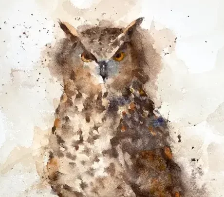
It occurred to me that I hadn’t painted an owl watercolor in a good while. I wanted to do something that was more loose and sploshy than usual. Teaching demos tend to make my painting tighten up quite a bit and I needed to shake things out a bit. I’ve painted a variety of owls before – barn owls, saw-whet owls (a favorite), and this one – a horned owl (eagle owl?).
Painting a watercolor owl (in fact any bird) is often scarier than other paintings. The drawing has to be accurate without getting into much detail and the markings can obscure the underlying form of the bird. Watercolor painting is unpredictable at the best of times and with owls doubly so. But I’d decided on an owl so an owl watercolor painting it should be.
Sign up for updates on classes and free livestreams
Drawing out
I roughly marked the paper (Fabriano Artistico 140lb cold pressed) into quarters. This allowed me to get the proportions roughly right without having to put graphite grid lines all over the paper. Not really necessary but I wasn’t taking any chances. I lightly drew in the main form but with no detail in the feathers.
Planning and first washes
horned owl watercolor first washes
Before even putting brush to paper I planned out the values. The light was coming from the left so the right side of the bird was in shadow. I mentally made a note of this and kept this in mind as the painting progressed. When painting loosely in layers, and with such a lot of patten in the feathers it can be easy to lose track of the values as you paint.
As I was aiming for a loose painting I started with a very loose wash of mainly burnt sienna with a touch of ultramarine. I kept away from the face but pulled the paint out through the edges of the bird. This is very light and will only show slightly in the final thing. It also takes some of the glare of the white paper away, softening the effect. As the first, very loose layer was still damp I put in a darker wash over the shadown side of the bird. This started to show the form but was still very light and nowhere near the final value.
Building the form
horned owl watercolor building the form
Again while the paper was still damp I built up the form further on the shadow side. There’s a lot of feather pattern in there so my marks were choppy but soft and I took care to leave lighter areas. I used my spray bottle a little to add some texture and dropped in slightly thicker, darker paint to darken some areas. At this point I was chugging along and fairly happy.
Face and Feathers
horned owl face and feathers
The next stage was starting to add some detail. I went into the face and added the eyes, making sure they had shadow at the top where the ‘horns’ were. Adding the pattern to the feathers I started to falter a little. I wanted everything to be loose and soft but probably rushed this piece a little and my confidence started to wane.
Press on regardless
Horned owl press on regardless
Well I’ve started so I may as well finish this. More color in the feathers and more darks to make sure the shadow side really looks like it’s in shadow. I added some color to the feathers and added some more darks around them to make sure they stood out. A little more work on the feet and the rock and I was almost done.
Sign up for updates on classes and free livestreams
Final touches
Horned owl watercolor by Michele Clamp
Still not very happy at this point. Standing back I noticed the shape of the head was a little off. Some softening and modification to the sides of the head and I was a little happier. As a last resort I added some paint splashes. So am I happy with it? Hmm – not really. It does have the looseness I like but I lost something along the way. Never mind – there’s always tomorrow.
As I’ve said on a number of occasions watercolor birds are hard even though I do a fair amount of bird art. A little disappointed I have to say. Some of my best work has been of owls. We have one of my early ones up on the wall and I’m not sure I’ve ever surpassed it.
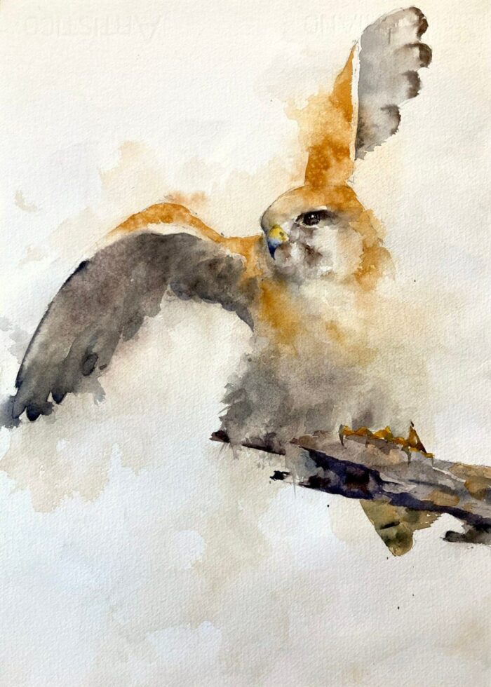
A fabulous nankeen kestrel watercolor from a Dave Nightingale photo reference. The bird’s pose is spectacular and makes for a fantastic painting.
Birds Are a Great Subject for Loose Watercolor Painting
Even though the photo is fantastic we don’t want to transcribe it exactly. There is a lot of movement in the photo and we want to capture that in the kestrel watercolor painting. A good way to do this is not to paint the whole bird rigidly with sharp lines. If we keep a lot of the edges soft and roughly defined we can then just emphasize the important ones. This gives visual interest to the painting. It also allows us to suggest movement and prioritize the edges that we feel are important to the watercolor. In this image the face is obviously important and we’ll keep that sharp. But other areas can almost be lost completely.
[activecampaign form=10 css=1]
Start By Painting No Edges At All
I started the painting by putting in a light wash of all the colors and softening all the edges. This means that you paint completely through the drawn outline. It feels wrong when you first start doing this but the result is so effective that it’s worth pushing through the discomfort.
The only thing you need to be careful of is to *really* soften all the edges. Especially when you’re painting out into the background. Leaving a hard edge out there and letting it dry will be really distracting when you put in the rest of the kestrel.
Kestrel Watercolor – Put In Some Edges – But Not Too Many
The next stage is to start adding some definition to the bird. But only in some places. Stand back and pick and choose where you want to add color. Less is more here. Overdefining things can destroy the whole effect. In this painting I decided not to define the belly area of the kestrel at all. I just it fade away into the background and it gives a lovely airy, floating effect.
The Face is Crisp and Sharp
The final thing was the face. Some crisp, dark lines for the eyes and beak. And lastly the branch and feet. Not too much detail in here – it’s easy to overdo feet and give them too much contrast.
Final Thoughts on the Nankeen Kestrel Watercolor Painting
This nankeen kestrel watercolor turned out really well. I didn’t video this one but I have a couple of video demos showing a similar technique:
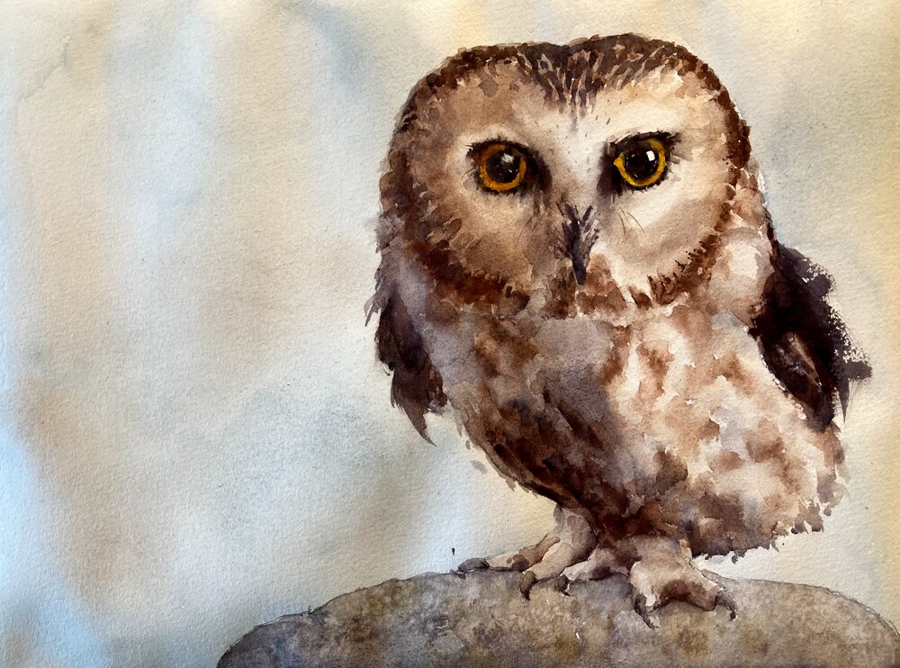
A saw-whet owl watercolor is a great subject for painting. Big eyes, fluffy feathers – what’s not to like!
So let’s paint an owl I said. I love painting owls I said. They’re really fun! Oh boy, oh boy what a toughie. I’d forgotten how hard all those delicate markings were and this almost ended up in the bin. But I continued on he finally came together. Just have faith and all will be well!
Introduction and Materials for your Saw-Whet Owl Watercolor
I’m working on a quarter-sheet (11×15) piece Fabriano Artistico paper. It’s 140lb cold press which is the most common type of watercolor paper. It’s great for painting on, takes paint well and allows you to easily soften edges and work wet into wet.
Colors used:
Ultramarine blue
Burnt Sienna
Yellow Ochre
Vermillion
Cadmium lemon
Quite a limited palette for this painting. But there’s a lot of contrast in the reference photo so we don’t need to overdo it with the color palette.
Start With an Outline Drawing
owl watercolor drawing
I start with an outline drawing. I use a mechanical pencil with HB lead. Not too soft as we don’t want the graphite to smudge. The drawing has just enough detail that we know where to put the paint but not so much that it doesn’t give us some leeway.
Guess and Check the Values using a Value Scale
Judging values using a value scaleThe Lightest values on the right
Using a value scale (I like this one from Paul Centore available from eBay) I first estimate the values for different parts of the reference. The light is coming from the right so we know that the darkest values are on the left.
First paint the shadow side of the owl
We’ve measured the values so we know what value the shadow side should be. I mix up a mix of ultramarine and burnt sienna to the right value and put it over the whole of the shadow (i.e. left) side of the bird. Yes it looks dark!!!! Keep the faith – we’ve measured it and we know it’s right! It just looks dark next to the white paper. You’ll start questioning yourself at this point but trust the process and it will work out.
Yes the shadow side looks dark!Soften the edges
Start to Put the Dark Markings In
Preferably while the shadow color is still wet start to put in the darker feathers on your owl watercolor. Using a fairly thick mix of burnt sienna drop in color into the shadow side. Also take the markings out into the light side. Try and keep some of the edges soft. You can soften them by taking a clean damp brush and wetting the paper right next to the wet color. The wet color will slowly seep into the paper you just dampened and make a beautiful soft edge. One of the best things about watercolor!
We can now see that our original gray wash wasn’t too much at all! Now the dark brown feathers are in it all starts to make sense.
Burnt sienna for the dark feathers in your owl watercolorBurnt sienna watercolor for the head markings
Put in the Wings with a Few Flicks
Paint on dry paper to get flicks
Owl Watercolor – Use a Darker Mix for the Eyes
Use a darker mix around the eye for your owl watercolorThe iris is orange and yellow
Now comes the best part! When we put in the eyes our owl watercolor will really come alive. We use a darker (and less runny) mix for this using burnt sienna and ultramarine. You may also want to use a slightly smaller brush for this slightly more fiddly work. Although if your round brush has a good point to it that will work well too.
We put in the pupil using the dark and make sure to leave a small piece of white paper showing. This will be our highlight. We leave the iris white (we can put that in later) and outline the eye in the same dark mix. As we don’t want a hard edge around the eye we quickly take a damp brush and soften the area around the eye. This makes it look like the eye is in shadow.
Wow what a difference yes! I always love this part!
When the dark part is dry mix up a lighter yellowy orange color (a red and a yellow or some cadmium orange) and put in the iris.
[activecampaign form=10 css=1]
Paint in the Beak for your Owl Watercolor
Owl Watercolor Beak
The beak is a slightly bluer mix of the ultramarine and burnt sienna. Make it darker on the left (where it is in shadow) than it is on the right. If you can soften the join where it meets the white feathers so much the better.
Owl Feet Have Subtle Shading
owl watercolor feet
Now I have to admit something here. Bird feet are not my strong point and I always dread getting to this part. The way I’ve found to deal with them is to try and treat them as one big shape. If I don’t get too involved in the detail of talons and claws and such they come out much better. Just a wash of burnt sienna as a base color and a slightly darker mix to add in some shadows should get us most of the way there. A slightly darker mix still for the talons and we’re done. Phew!!!
We’re Almost Done!!!
Painting the Rock is Much Less Stressful!
A flat wash to start for the rockWater spray and paint splatter for texture
Painting the rock is another favorite bit of mine. Start by just a flat wash over the whole rock. While it’s still wet spray some water and splatter some paint in. It will give the wash a mottled texture that really does look like an old rock. And it’s fun!
Finally – Some Flicky Wings to Give Some Character
Drybrush gives the wings some character
I decided to depart slightly from the reference and liven up the wings a bit. Using a fairly dark mix of our trusty ultramarine and burnt sienna (slightly more burnt sienna to make it on the brown side) I used a flicky action with the brush to emphasize the wings. You have to take the plunge and have confidence with this technique. There are no second chances. But I think it definitely looks better this way.
Full Video of the Whole Process
You can see a video of the full painting below. I also have more videos on my youtube channel and you can also access them here.
Finally….
I hope you enjoyed this painting and thank you for reading/watching. After a slightly shaking start I really liked the way he turned out. I run online zoom classes regularly and if you would like to be notified of upcoming classes or new videos please sign up for my mailing list.
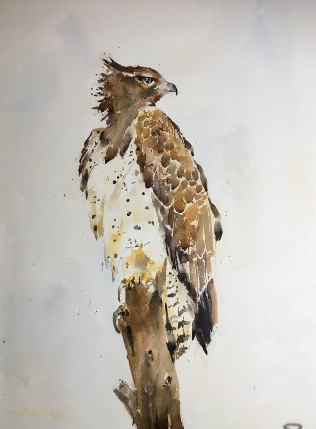
I’ve been working larger on the last couple of paintings. Having seen my sunflowers up on the wall at Post Road Art and visiting the North East Watercolor Exhibition I can certainly afford some more paper real estate.
Going large has it’s own problems. Getting too tight and detailed is one. Not using a big enough brush and ending up with lots of little dabby strokes is another. Also the larger space allows you to put in much stronger color. In fact it needs it otherwise things look very washed out.
So this eagle looks pretty good to me. I may revisit and soften up some edges but it’ll depend what it looks like in the morning.
Edit: Great news! This won the People’s Choice award at Marlborough’s Post Road Art Center Open Exhibit. A nice Christimas present for me and I’m sure I’ll be stocking up on supplies from them with the prize money. Many thanks to all who voted and Randi et al at the Center.