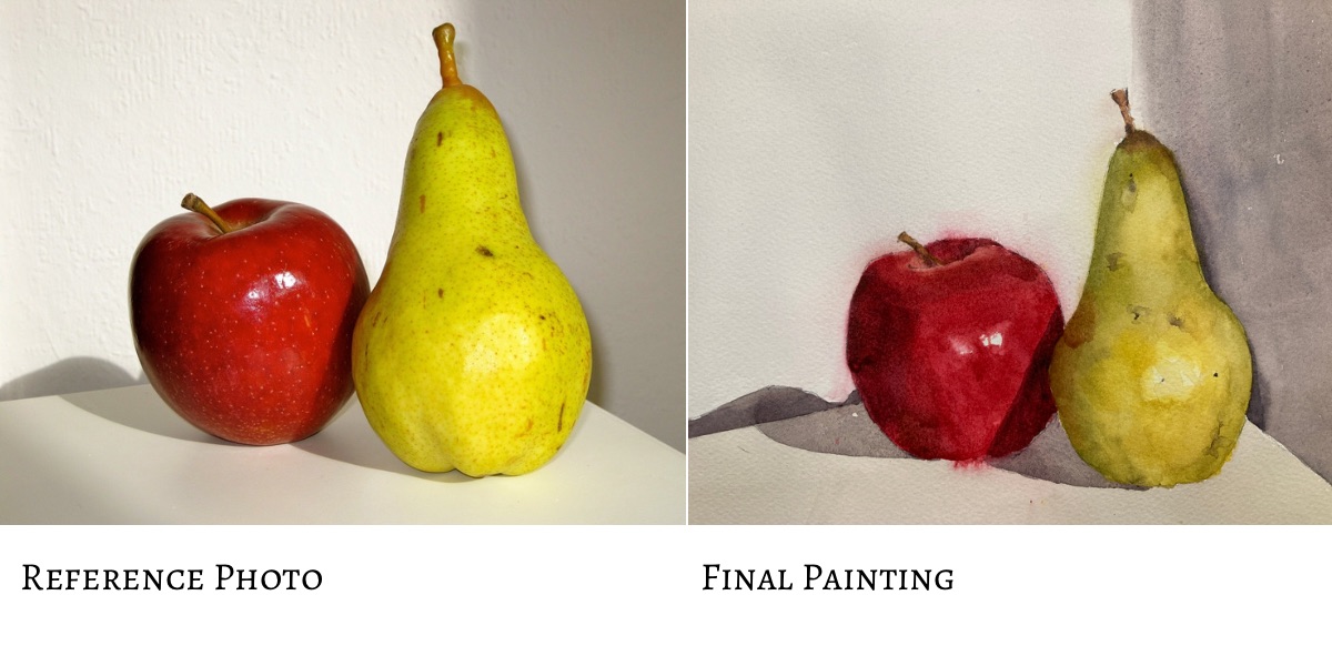
A simple watercolor pear and apple setup is an ideal starting point for a beginner. In a series of easy steps I take you through the process including a video of the whole process.
Introduction
In this pear painting tutorial we’ll be doing a watercolor pear painting but also a watercolor apple. This is a great general watercolor painting tutorial but an especially good beginner painting tutorial. I liked the combination of the two fruits with their very different colors. Watercolor apple paintings are fine but I just wanted something a little more interesting. In fact adding in an extra fruit can provide context and make for an easier painting.
Sign up for updates on classes and free livestreams
I’ve broken the process into a multi step tutorial and, even though it seems like a lot should only take a couple of hours to finish. We will do a careful drawing, identify and mix our colors, and then paint the subjects in layers. Fruit paintings can seem easy but paintings of fruit can still teach us a lot about color and form. It’s well worth learning or honing your skills on a humble apple, pear or orange painting. Watercolor apples or watercolor paintings of pears on their own are great but even better to combine the two! We will be working from a pixabay reference but if you can, do some still life painting with the subjects right in front of you.
I was originally just going to do a pear tutorial but in hindsight the addition of the apple gives us a better painting and also more practice in values. If you’re looking for guidance on how to paint fruit in watercolor I hope this will get you on your way. It was more fun to do than I thought and I really like the result. I hope you do too. If you’re looking for more info on how to paint in watercolor tutorials I have a special watercolor tutorial page with more subjects.
Fruit Painting Reference Photo
Here is the reference photo we’ll be using. It’s a simple setup but we’ll take the opportunity to really try and get accurate color and form. Painting watercolor fruit is great practice for the fundamentals. The shapes are straightforward to draw and we can use layering and softening watercolor techniques to establish the form.
Reference for watercolor pear watercolor apple
If you can it’s a good idea to print this out and have it in front of you. My inkjet printer can print on 4×6 glossy paper which is great for getting intense color.
A Mechanical Pencil and Kneadable Eraser are Good for Watercolor Drawings.
We want to create a painting as close as possible to our reference. (Well not always of course but for learning it’s a really good place to start). I recommend using a mechanical pencil when drawing for watercolor paintings. They never need sharpening and the leads last for ages. If you need to erase anything a kneadable eraser is good as it doesn’t leave any residue on the paper. Some erasers leave an oily trace and can affect how the paint is absorbed by the paper so it’s something to watch out for.
Start with a Careful Drawing of the Fruit
Drawings of fruit can seem simple but there’s still some complexity there. Apples seem uniform but they’re not just spheres. They have knobbles and bumps and slightly misshapen bits. Pears have a very characteristic shape but they too have some asymmetry and individualism. So we need to observe the reference carefully and make sure we get everything in proportion relative to everything else.
Sign up for updates on classes and free livestreams
Use Relative Measurements and Comparisons When Drawing Fruit
Pencil drawing for watercolor pear watercolor apple
We want to have a clean drawing with not too many sketchy lines. So I always start with marking out the envelope of the subjects. Lightly mark in the top and bottom of the pear and the left and right positions. I use relative measurements to get the proportions right. In this case the width of the pear is just over half its height so I make sure the marks reflect that. When drawing the apple I again put in the top and bottom relative to the pear and then mark in the left and rightmost positions. Once those are in it’s pretty straightforward to ‘join the dots’ and create a believable outline. The final marks are for the cast shadows on the ground and lines for the horizontal. Once it’s done you should have something similar to the reference. Again for fruit watercolor painting we don’t want too many graphite lines showing through. We want the paint to do the work. Some people don’t like to see any drawing marks showing through but I quite like the effect.
Painting and Drawing Fruit are Great Practice Subjects
Fruit are a great subject if you’re looking for drawing ideas. Their shapes are relatively simple and even a lone apple drawing can be fun to do. If you group different fruits together with some strong lighting you can get some really interesting compositions. Also you don’t have to always paint your drawings. You can then either leave it as a line drawing or put some shading in in graphite or maybe even colored pencils. For something a little different I often spend time in the evenings doing digital drawing on my ipad with its Apple Pencil. The principles are the same and it’s a good way to spend the odd 10 or 15 minutes or so.
Identify the Colors in Preparation for the Watercolor Pear Painting
Color isolator – print on paper or thin card and cut out the central square with a knife.
We’re not quite ready to dive in and paint anything yet. I know this might be agonizing but we’re going to study the reference and really try and identify the colors. For this it’s best to have a printout of the reference and a tool called a ‘color isolator’. This is just a piece of gray paper or card with a half inch square cut in the middle. Our brains constantly fool us into misidentifying colors when we’re painting and the surroundings of a subject will affect that enormously. If you place the color isolator over a region of the reference you’ll be able to see that color much more easily.
But wait – don’t use it yet!
Hold your horses! The absolute best way to learn and get better at watercolor painting and color mixing is to try and identify a color first. Try and first guess what the hue (red, yellow, orange etc) is. Next try and estimate the value (how light or dark it is on a scale from 1 (black) to 10 (white). Finally (and this is the tough one) – how bright/saturated is the color or is it closer to gray. This last one is called chroma and can often be glossed over when we’re mixing colors.
Guess First – Then Check
Getting ready to use the isolator – but have a guess first!!
So go ahead and have a guess first. Then when you’ve guessed, bring in your color isolator, put it over the region you’re looking at, and see how close you were. Very often – and especially in shadows – you will be surprised. Especially on light objects the shadows can get pretty dark and be a really surprising color. Don’t worry at all about getting it wrong at first. You’ll get much more accurate surprisingly quickly and your paintings will benefit greatly.
Identify the 2 Main Colors in the Watercolor Pear
So back to the pear! If we look at this we can see a lot of colors but we don’t need to find them all. In fact we only really need to find two colors. The first one is the color of the pear in the light, and the second is the color of the pear in the shadow. Watercolor painting helps us a lot here as we can use water to blend each color and fade it out in a gradient to achieve all the intermediates.
Color isolator for light side of pear
The first color in the light is very yellow. It’s very light and bright and you can see that by the contrast with the color isolator. This is designed to be a mid-value gray so you can see immediately whether you’re in the top half of the value scale or the bottom half.
The dark color may be a little surprising. Using the color isolator as before we can see it’s a mid-value and it’s a kind of olive green color. We now need to work out how to mix these.
Using the color isolator on the shadow side of the pear
Sign up for updates on classes and free livestreams
Mix the Colors of the Watercolor Pear.
The light color of the pear is almost exactly my lemon yellow pigment. Use a piece of scrap paper and put a small swatch down. Compare it to the color we’re trying to match. On my reference it’s almost exact but just a little too green. I want to push it slightly more orange so I take a very small amount of my orangey red (Vermillion) and mix it into my yellow. Yes! Perfect match!
The darker color can be mixed a number of ways but they way I’ll describe may surprise you. We want a mid-value olive green. It so happens that if you add black to lemon yellow it turns it a beautiful olive green. If we take some lemon yellow and add in just enough black (you’ll have to experiment with this) we’ll get exactly the right color. In hindsight I may have needed a little blue in there but it is very close.
Record Your Swatches on Your Scrap Paper
Finished Color Swatches with Notes
The way I usually proceed with a painting is to identify colors and record them as swatches on a piece of paper. You don’t have to do this. You can mix and paint as you go along. However, I like to know what kind of colors I’m working with before I start. If my swatches look good together I know that the painting will work color wise. But it’s up to you. If you do mix swatches ahead of time and then go back I recommend you note down next to your swatch which pigments you used. After a pretty short while you’ll get used to various ways of mixing and you probably won’t need this but it’s good to have a record when you start.
Mix the Colors of the Watercolor Apple
So onto the apple! It’s the same procedure and now we’ve had practice with the pear this should be an easy watercolor apple! We’re going to mix the light side of the apple and the dark side with the help of the color isolator. Again, have a guess before you use it. It’s the process of estimating, then checking, that let’s us learn and correct our mistakes. Painting an apple in watercolor (or any fruit) is made so much easier if we’ve done some of the thinking work ahead of time.
Looking at the light side of the apple
Again you may be surprised by these colors. Who knew how unpredictable an apple and pear could be!! The light side of the apple isn’t very light at all. In fact it’s a mid-value red. In my reference the red is in between my two reds (an orangey red and a pinkish red). Mixing them together and adjusting the proportions should get us the right value. In fact it’s a useful thing to remember that the value of most reds straight from the tube are around a mid value. Bright colors are hard to judge the value of and intuitively we see bright colors as lighter than they are. Good to have that tucked away in your brain for future reference.
The Dark Side of the Moon – Sorry Apple
The dark side of the apple is really dark. In fact it’s almost black right on the left hand side. We won’t mix that one but something that’s just a little lighter. This is a very dark maroon red. Again starting with a pinkish red (permanent rose or something similar) we need to work out how to take it darker.
Burnt sienna won’t cut it as it’s too light. But a combination of burnt sienna and black will probably work. I know we’ve used black to make shadow colors both times in this demo but this isn’t a hard and fast rule. Adding black to colors ‘deadens’ them. What this means in technical terms is that black reduces chroma i.e. takes the brightness out of the color. Sometimes we don’t want this but in this case we know exactly what color we want and black + permanent rose should get you very close.
Shadow Colors
The apple and the pear cast shadows and these are very important in the painting to show where they are in space. Again using the color isolator (or use a value scale if you have one) estimate and check the value. On my reference it’s just about a mid-value (around a 6). My go to combination for grays is often a combination of burnt sienna and ultramarine blue. These are complements (brown is a dark orange) and so will mix together to produce either a neutral gray or a brownish or bluish grey. Mix these together and add just enough water to get the right value on the reference. I tend to go by consistency of the paint on the palette for this. A mid-value is the consistency of light cream so just a touch more water should get us what we need.
Phew!!!!
At the end of all this (I promise we’re going to paint something soon) your swatches should look something like this.
Finished Color Swatches
And finally we paint!!!!
All this prep will be worth it. In fact we’ve done a lot of the hard work already. We now get to paint! We’re going to do this in two layers – the first for the light colors and the next for the darker ones.
The First Layer – the light values
pear color paint
So how to paint a pear? In this first layer we’re going to paint the whole of each fruit in the light color. Both the apple and the pear watercolor painting will be very flat at this point. We want this to be really even so we can layer over the darker color later. Mix up your colors and paint the watercolor pear shape and the apple shape.
Take care when you paint your apple watercolor that the light color is the right value – it’s likely darker than you think. I know I’ve said this already but I’ve been bitten many times by this. When putting the paint down try and not go back into areas you’ve already painted too much. This tends to disrupt the natural dispersion of the pigment on the paper and creates nasty stripes and an uneven look. The painting will look flat. Don’t worry! Don’t try and make it look three dimensional at this point. Flat is good at this stage.
The Finished First Layer – Yes it looks flat but not for long
The second Layer – the shadows
Wait until the first layer is dry. Use a hairdryer if you have one handy or, alternatively, go and have a cup of tea as you deserve it.
To put in the shadow we need to remember to only put color in the darkest areas to start with. Keep in your mind where the lights are. For the pear painting they’ll be in the middle of the pear and for the apple painting they’ll be mostly on the right hand side.
Fade your darks colors into the light
Second layer – starting to put the shadows in. Not so flat now!
The shadows on the watercolor pear are darkest at the edges (especially on the left) and fade gradually into the light. In watercolor painting this involves a technique that can be tricky to get the hang of. It involves two stages. The first is just to put the color down in the darkest areas. Work quickly here as we need to keep the paint wet to keep working with it. I often use a second round brush to do the fading as I can keep the other brush full of pigment to put the paint where I need it. Some people find it easier to use a flat brush to fade the color out. Try both and see which you prefer
Once the color is down take a clean damp brush (take a little water off on a paper towel) and wet the paper next to the color but only overlap the brush very slightly with the wet pigment. The wet paper will draw the pigment out and the color will fade naturally. The trick here is to let the paper do the work. Try not to coax the pigment out too much with the brush. You’ll need to keep a clean brush here so keep washing it (and dabbing the water off) every few seconds or so. It takes practice so have a look at the video so you can get the idea.
Sign up for updates on classes and free livestreams
Apple Watercolor Painting – Shadow Colors
Do this again on the apple for the shadow on the left hand side. Use a clean, damp, brush to wet the paper so the pigment naturally blends out. Once that is dry put in the other shadow on the apple on the right side. This one has a hard edge as it’s the shadow cast by the pear so no blending here.
Assess how the apple and pear look
We’ve really done all the hard work here. If you’ve mixed your colors to the right values you should have a feeling of three dimensionality in your fruit.
Paint in the cast Shadows
Using the neutral gray paint in the cast shadows. There is some slight variation within these but not too much so an even wash will be good.
Add in the stalks
The stalks are put in with burnt sienna. There is some light and shadow here but the main color is very close to burnt sienna. We can add in some slightly darker color as a final touch.
Final Touches
Getting close now – deepened the shadows
I’m hoping you have something pretty impressive by now. If not check your colors again. Were the lights the right color? Were the shadows dark enough? Did the shadow color fade out gradually enough or did you end up with hard lines? If you’ve not gone dark enough in the shadows now is the time to correct that. Mix up the same shadow color but with slightly more water so it’s a little lighter and repeat the shadow process.
At this point it’s good too add in some very subtle shading with the shadow colors. The pear has some areas where the value changes slightly. These really help to show the form and give a realistic appearance. Look carefully at the reference and your painting. Are there areas where the pear is slightly darker? In my painting I needed to darken the left hand shadow side and also slightly darken the right and the upper, thinner part. This needs to be done with a watered down (i.e. lighter) version of the shadow color. Be careful here. If you lose the distinction between the light and shadow sides of the fruit you’ll lose all the form. It’s easily done and I speak from experience.
Final Final Touches for the Watercolor Pear and Apple
Michele Clamp Watercolor Pear and Apple Painting
At the end I decided to add in a very light grey wash over the foreground. This really helped to place the fruit in space. This was a very light wash – it will feel almost too light when it goes down – but adds a subtle value change that works well.
I hope you enjoyed this and if you try this tutorial I’d love to see what you do. The pear especially was especially satisfying to paint. I think a full painting of pears will go on my todo list.
Full Video Demo For the Watercolor Pear and Apple
I videoed the whole process for this painting. I also have more videos on my youtube channel and you can also access them on this page. There are a lot of subtleties that I find hard to describe in text that are well worth watching the video for. It’s real-time so it’s not short but shows the full thing warts and all.
So I hope I managed to answer the question of how to paint an apple in watercolor. Please let me know in the comments or via the contact form if you liked it.
Other Watercolor Tutorials
I obviously paint in my own style but there are some other great examples of pear paintings out there. If you’re looking for another watercolor pear tutorial there is a lovely Anna Mason pear tutorial and she has a wonderful fresh, colorful style. Watercoloraffair.com also has a number of great tutorials worth taking a look at.
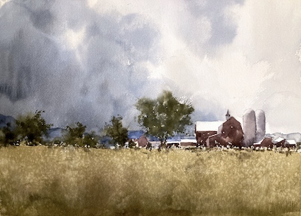
The Vermont Landscape is quite special in this region. Fields and farms and wonderful skies. I’ve painted this farm once before and wanted to do another version with a slightly different feel. I recently took part in a Dan Marshall challenge of a Colorado landscape. It had a wonderful stormy sky so I took inspiration from that.
Sign up for updates on classes and free livestreams
Reference Photos are Often Not Perfect – so Change Them!
Vermont Farm Reference Photo
The original reference photo had a rather uninspiring almost cloudless blue sky so that came out and I put in some dramatic clouds and gave them some interesting shapes. I wanted to keep the bright sunlight on the roofs so I kept the sky clearer to the right so the whole thing read well. Doing this also helped focus the painting on the farm as center of interest. I went back and forth about the road. Sometimes roads can help a composition but, in this case, I couldn’t make it work without it looking a little hackneyed. So out it went. I ended up with a composition I like. Most of the detail is in a band across the middle with large areas above and below with relatively little going on.
A Value Study can Often Help Solve Problems
I didn’t do a value study this time. In most cases this really helps. If a painting doesn’t work in black and white and in a 5×7″ format it’s unlikely to work on a larger scale and in color. But in this case I’d had a warm up with the previous landscape. I’d also painted this subject before and so knew my way around it. So I took a chance and it paid off.
Portraying the Character in a Vermont Landscape
The sky is the main character in this work. The farm buildings still in sunlight contrast with the approaching storm clouds. I felt that this highlights the vulnerability of humans and our abilities to control our environment with the sheer power of earth’s climate whims. The buildings are put in broadly with broad strokes of color and minimal detail. The sky is, in contrast, painted wet in wet in multiple layers.
Landscape Video Demo
I often video my paintings for teaching purposes but in this case I didn’t. If you’re interested in the nitty gritty please have a look on my youtube video channel or have a look at the videos on my site. I’ve included a landscape done in a similar manner below.
Sign up for updates on classes and free livestreams
Just a quickie today. I’m working on a flower class coming up in a couple of weeks. Trying a very simplified and somewhat tight bloom to show people how to show the form on a flower. Getting there. I like the image a lot but the process might need work.
Sign up for updates on classes and free livestreams
Painting a watercolor toucan was the subject today. Exotic tropical birds are often highly colorful which is very attractive but can pose some problems in paint. Each color needs to be modified as the from turns from the light into the shadow. This means a lot of close observation and a lot of mixing. However, for this reference I decided to simplify the colors a little. There was a lot of pretty bright green and yellow in the reference. I chose to tone down the green and also move the greenish yellow more towards orange. The aim was to have more unified color scheme. I also decided to ditch the jungle of foliage. For another painting this could have been fun to do but I wanted to focus in on the toucan bird and not have anything competing with it.
Sign up for updates on classes and free livestreams
First make a plan
The plan for this bird watercolor was to proceed along the same lines as a previous cardinal watercolor painting. I wanted to start by putting down lots of regions of soft edged misty color and not pay too much attention to the edges. As the painting progresses more and more edges are put in until the bird magically appears from the mist. It’s a fun way to paint and I really like the resulting effect. It’s a technique very well suited to bird art and you can end up with an almost abstract painting at the end.
Materials for your Watercolor Toucan
It’s pretty much essential to work on good 100% cotton watercolor paper for this. The paper can take a lot of working and also keeps damp for a fair while. This allows us to work into the paint wet-in-wet and soften edges as we go. It is possible to use cheaper paper but I wouldn’t recommend it unless you have a lot of experience under your belt. Trust me – I’ve learned this the hard way. My favored paper is Fabriano Artistico 140lb cold press but any cold press 100% cotton paper is fine. Arches can be a good choice for this. It is slightly more absorbent than the Fabriano and so stays damp for longer. This gives us more time to think as we’re painting without that panic that we have to get everything done at top speed.
A couple of good brushes are needed. I use Escoda reserva sizes 12,10 and 8. They point well and hold a lot of water. However a good synthetic (Princeton Aqua Elite, Black Velvet or Escoda Versatil) is fine and there isn’t so much sticker shock.
For paint I use mainly Da Vinci with a sprinkling of Holbein, Winsor and Newton, Daniel Smith and a couple of others. Any artists quality paint is good and some student paint is also fine (Cotman or Lukas Studio work well). My colors are lemon yellow, cadmium orange, vermillion, permanent rose, burnt sienna, cerulean blue, ultramarine and lamp black.
We can work without stress on preliminary sketches
loose watercolor toucan preliminary sketch 1loose watercolor toucan preliminary sketch 2Loose prelinary sketches to see what’s possible
These two sketches were just to get the brushes warmed up and to play with the colors and the shapes. I mostly wanted to see how much detail I could lose but still keep the essence of the bird. It turned out that the chinstrap was a big focal point. A surprise was that keeping the beak too sharp really detracted from the rest so I made a note to be careful about keeping a lot of that beak soft.
Keep the Drawing simple
loose watercolor toucan drawing
As we’re going to be working loosely on this watercolor bird I don’t want too much graphite showing through. So the drawing was kept light and only the most essential lines put in. I lightly outlines the beak, the eye, the rough shape of the body and the legs and feet. For the feet I just drew in the main shape and didn’t bother noodling around drawing individual claws. They’re not the main focus and will just distract the viewer.
First washes – go nuts with those edges
This first bit is lots of fun and is really hard to go wrong here. I took the main colors (mostly lemon yellow for the chest and beak and a mix of ultramarine/burnt sienna for the body) and just sploshed some paint in the rough area they should be. Use a big brush for this – we don’t want little dibby dabby lines at this point.
Paint the yellow areas looselyblend the colors with a damp brush
Once the paint dabs were down I thoroughly cleaned my brush, loaded it up with water and softened all the hard edges of the paint. Don’t be afraid of painting through the edges here. In fact really try and pull that paint through the outline of the bird into the background. Keep loading up with water and soften anything that looks like a hard edge – it should look nothing like a bird at this point!!
Careful of the eye area
The only thing to be careful of is the eye area. We want to keep that area nice and crisp so try and keep dark paint away from that area. If, by chance, you do paint over it by mistake you can probably take a piece of paper towel and lift the paint off while it’s wet.
Slosh in some dark mixes for the body area
Blend thedarks out through the outline.Add some contrasting color into the darks
With my mix of ultramarine and burnt sienna I started putting in marks rough where the body was going to be. Again I pulled that color out through the edges of the bird into the background. Even pull it through the feet – these are fairly dark anyway and we can paint over them later. If you want to splatter some darks inot the wet paint go ahead. It will add some texture and visual interest. Just keep those edges soft! There shouldn’t be a hard line to be seen.
Sign up for updates on classes and free livestreams
Wait a bit
Now is a good time to take a quick break and let the paper dry a little. It’s probably quite wet from all that sloshing and we need it to be almost dry for the next step.
Now the edges of Your Watercolor Toucan!
This to me is the magical part. We’re going to go in with some thicker paint (ultramarine and burnt sienna) and start putting in some edges. My aim is to put in as few edges as possible but still have it read as a toucan. I’m always surprised how few you really need.
Start to add edges in some areasKeep adding edges so the bird starts to take shape
I start by identifying what I think are the main areas of contrast to put in. The chin-strap around the beak is an obvious one as is the edge of the black feathers next to the yellow chest feathers. But you don’t need to outline the whole thing. Try just putting some paint in a couple of areas (soften the other side) and see how it reads. Our brains will often fill in the gaps. And if you feel it’s too harsh use a clean brush and soften it back again. We can always add hard edges but it’s tough to remove them once they’re down and dry.
More edges – but just enough
The body and face take shape. Keep the eye crisp
I go around the bird adding in edges where I need them. It turned out in this one that it really didn’t need many at all. It can be hard to stop but better to stop too early rather than too late.
Details and Form in your Watercolor Toucan
Add in some detail for the feet and beak
This final bit is where it all comes alive. We can put in the eye (with a little shadow around it), some color and shadow on the beak and some shadow on the yellow chest feathers. A little color and shadow for the feet and we’re pretty much done. This bit looks like the fancy bit but, as with a lot of painting, the main work is done ahead of time. These pieces are just icing and no amount of fiddling at this stage will fix mistakes made earlier.
Stand back and assess
When the details are in then take a breather, stand back and see if the whole thing hangs together. There may be odd bits that stand out too much or don’t stand out enough. But don’t noodle too long. It’s tempting to fiddle for ages but less is definitely more here. It’s so easy to ruin something that’s working with unnecessary detail.
Watercolor Toucan – the Verdict
I’m pretty happy with this toucan watercolor. I like the shapes, there’s just the right amount of definition, and the bird has some dignity to him. It’s very different from my previous work and doesn’t look like a slightly cartoonish illustration.
Sign up for updates on classes and free livestreams
Watercolor Toucan Video
The full recording is viewable below.
While you’re here
I like to do video demos and classes and if you want to be notified of any upcoming streams please subscribe to my youtube channel or sign up for my mailing list. I also frequently update my shop page with original artwork if you’d like to own a painting for your wall.
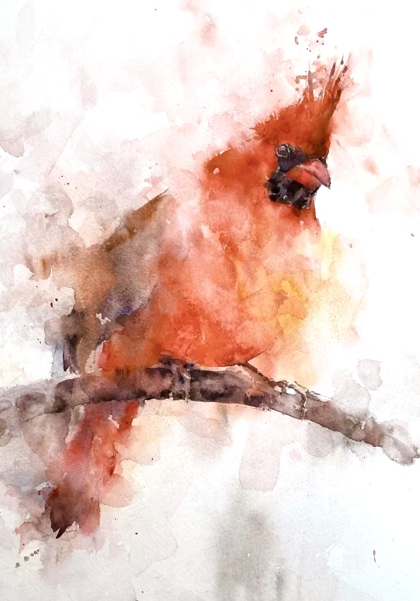
A watercolor cardinal bird is a fantastic way to paint loosely and expressively. In fact any bird watercolor lends itself to this technique and is great fun to boot. In this post I will take you through painting this easy watercolor cardinal and I hope you’ll be able to follow the process. If you’re looking for cardinal painting ideas this is a great technique to try.
Sign up for updates on classes and free livestreams
Draw only the necessary parts
Red cardinal watercolor drawing
Working on 140lb cold press Fabriano Artistico paper (here is my full materials list) I first drew out just the essentials. Some detail in the head and light marks where the wings and breast feathers would be. The feet and perch were just outlined and I was careful not to draw in every claw and wrinkle. In particular in this cardinal watercolor painting I left the belly and the back drawn in very lightly. These are areas that won’t need much definition and we’ll likely leave these loosely defined.
Go nuts and paint through the edges.
Bird art gives us watercolor painters a great opportunity to exploit the sploshiness of watercolor. Whether you’re just painting a study or for fun, or trying to produce an original watercolor painting as a gift it’s a great technique. For the first washes I kept the paint fairly light and made sure I didn’t leave any hard edges. This meant putting down some dabs of paint and then using a clean damp brush I softened those edges and really pulled that paint through the outline of the bird.
First layer loose washesDrop in some different colors
We’re painting a red cardinal and I just adore this color. I mixed my two reds together to get this – some vermillion and some permanent rose. If you don’t have vermillion then another orangey red like cad red light or naphthol red will do. Similarly another pinkish red like quinacridone red can be substituted for permanent rose.
Fight the instinct to keep within the lines
It’s really hard once you have a drawing down to paint through those lines. Try and fight that! Pull that paint out into the background. You should be using fairly light value paint and softening all the edges with water so it will dry back far lighter. In later stages we’ll go back in and define some of those lines but for now you have a lot of leeway. In the end our cardinal watercolor will benefit from this layer as it softens the effect of the edges we will put in next.
Sign up for updates on classes and free livestreams
But keep away from the face
The only part of the drawing I keep an eye on is the face. I want the contrast to be nice and crisp in here so I’m careful to not put paint in this area. If it does happen don’t panic! If the paint is still wet a few dabs with a paper towel will lift most of it off.
Put in some face detail
Painting the face – leave some gaps and fill with a damp brushPutting the darks in the face
When doing a bird painting I often leave the face detail to quite late along in the process. For a loose watercolor, however I want to put in some detail quite early. This gives me a chance to assess how much detail I want in the rest of the painting. I want everything to be suggested and soft unless absolutely necessary. If we don’t have some detail to compare to there’s a risk of tightening up everything too much
Some darks to start to define the form
Finishing the face
Now we get to put in some darks on the rest of the bird and define some edges. I want to put in the bare minimum here so I’m not outlining the whole bird. I pick and choose where some contrast is needed and am constantly squinting and standing back to assess each mark. Less is definitely more here! As soon as the form of that bird appears you’ve probably done enough. If you’re experimenting however you can push it as far as you want. In some ways you have to overstep that mark to learn how little you can get away with. Yes, you’ll mess up a painting or two but it’s a great learning experience.
Redefine the body shape
Adjusting the edges to improve the body shape
I wasn’t too happy with the shape of the bird at this point. A cardinal bird has an almost triangular shape to the head so I went back in with some of the darker red and extended the head and shoulder regions. Much better! I also made a slight adjustment to the tail and bottom area so he actually looked like he was perched. Yes we’re doing loose watercolor but it doesn’t mean everything is forgiving. Sometimes those small marks make a difference.
Watercolor Cardinal Final details
Adjusting the details – shadows and formFinal details – adding the tufts!
We’re almost done now. A little more definition went in the head and around the eye. Also a little more shadow under his wing and on the perch. I left the feet pretty loosely defined. I’ve been bitten before on many occasions by putting too much detail on the feet in a bird painting. The feet are almost never the focal point for birds and today is no exception. A final few flourishes on his head with a little splatter for interest and he was done.
The verdict
As always there were a few sticky moments but we pulled through. I almost always enjoy a watercolor cardinal painting. The shapes are so great and the colors wonderful. It had just the right amount of looseness but enough detail in the right areas. Pretty happy! In fact every year I keep meaning to print some Christmas cards from some of my back catalog. Cardinals are perfect for this and, as it’s only February, I might have a fighting chance of doing it before next winter.
If you like this style of painting I have another real-time walkthrough and video of a toucan. Also some more examples of my loose watercolor birds are this kestrel and these bee-eaters.
Watercolor Cardinal Painting Video Recording
I recorded the whole process on my youtube channel and you can also view it below. If you would like to see more demos please subscribe or see all of the videos on the website here. I hope you enjoyed this watercolor bird painting tutorial. If you try it I would love to hear from you.
Sign up for updates on classes and free livestreams
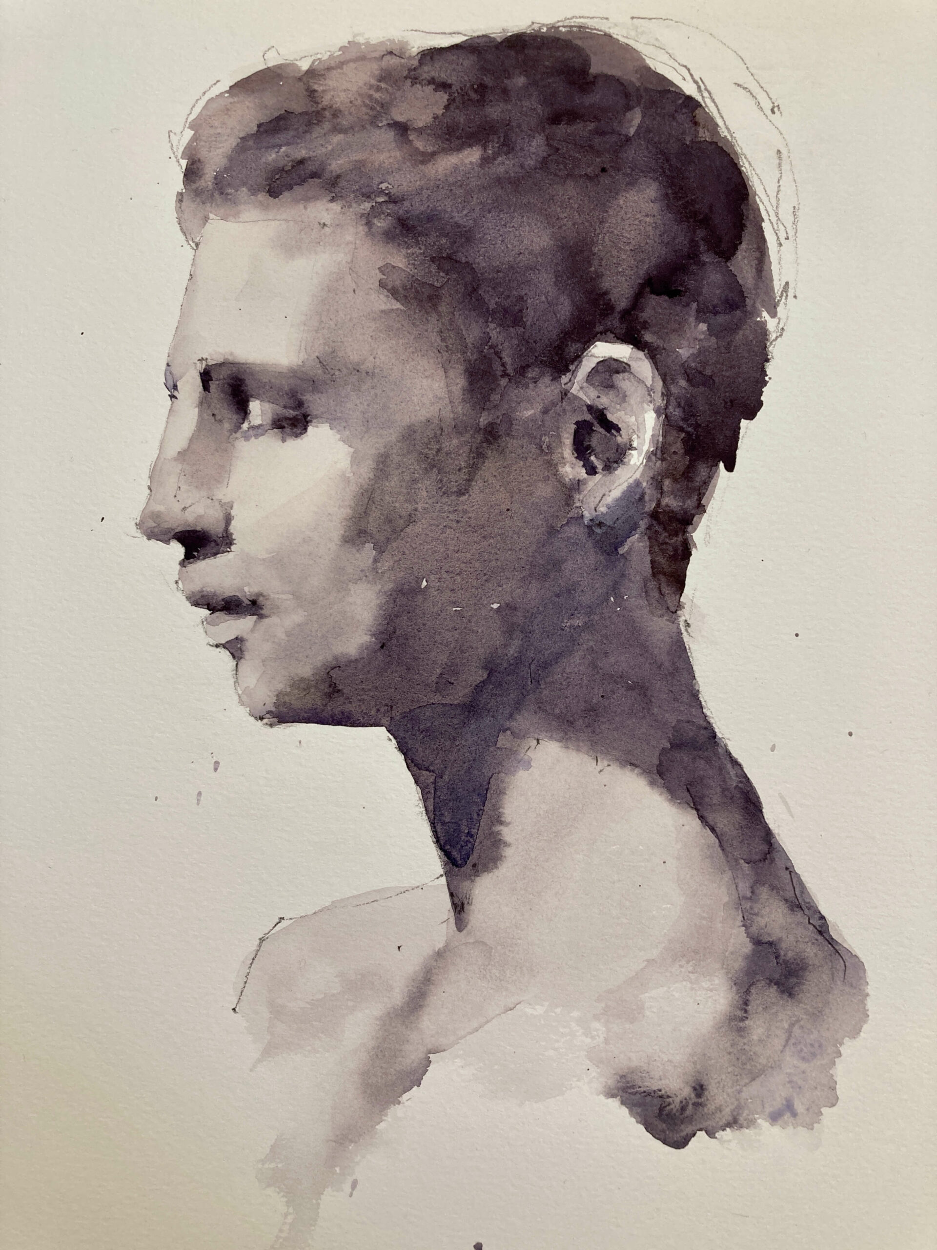
Today’s class was on watercolor portraits. Portrait painting is probably one of the hardest subjects and when you’re using watercolor there is nowhere to hide your mistakes. Having said that it is enormously rewarding and seeing a face come alive through paint is a magical experience.
A Value Scale is one of the best tools for improving your painting
We were concentrating on values for this lesson and spent the first 30 minutes practicing painting value swatches. An accurate value scale is a necessity for this and the best one I’ve found is one from Paul Centore (buy here from eBay). I highly recommend you get one if you’re serious about getting your values right. It’s durable and wipe clean and it’s a step value scale with half values which not many scales have. Even though it’s grayscale you can also use it for assessing color value. Squinting or half closing your eyes will take the color out of a swatch to make it easier to assess value. If you’re really serious about color a Munsell book is the best thing but it’s expensive and you can get a long way with just this. If you want to know more about Munsell see this post. I also have an online tool ChromaMagic to help you see color more accurately.
Sign up for updates on classes and free livestreams
The best easy watercolor exercise to get better at mixing values or tones
This is a simple and easy beginner watercolor exercise and of all the watercolor exercises it reaps the most rewards. After only one week my value mixing ability improved 10 fold. Not bad for 10 minutes work a day! Before that it was a mixture of guesswork and luck whether I’d get a value right or not. If you feel your value work needs improvement I highly recommend this. Even a few sessions will have a big effect.
We focus purely on value here. It’s not a technique as such and you don’t have to worry about drawing complex shapes or how you apply the paint. No fancy gradients or washes here – it’s values all the way.
Exercise Steps:
I suggest you start with a mid value 5 and work on that before moving to others. In fact being able to mix a mid value reliably and reproducibly helps you mix all the others.
Draw a 1 inch square box on some practice paper (you don’t need the good watercolor paper for this).
Mix together ultramarine and burnt sienna with a damp brush. Keep the water to a minimum at this point. Only include enough so the paint is fluid but not runny.
Add some water so the paint is about the consistency of light cream. Paint a test dab on your student paper. Wait a few seconds so the paint has time to dry a little (it will lighten as it dries). Then bring in your value scale right next to the test dab and move squares along until you identify the right value.
How close is your value to the value 5 you’re aiming for? If it’s too dark your paint needs a little more water. If it’s too light you need a little less.
Clean your palette and mix again and try another test dab. Repeat until you get it bang on. The first time you do this it will take a few goes but you’ll get a lot faster surprisingly quickly.\
When you feel you have the right value fill in your square box
Repeat with a new box 3 or 4 times.
Another great exercise to improve values is to paint a simple white cube. I describe this on my tutorials page here.
Watercolor Value Scale Exercise
Paint consistency is the key
The key to getting this right is remembering the consistency of the paint on your palette. If you’ve been painting for a while you’ll know that how the paint looks on the palette bears no resemblance to how it will look on the paper. The consistency is pretty much the only thing we can use. When I mix the consistency of a value 5 is of light cream. Not heavy cream (that’s a 4 or a 3), and not milk (that’s a 7), and not water (that’s a 9). When you’ve hit the right consistency try and remember how that paint feels on the palette. Push it around a bit so you get a feel for how it moves.
White paper affects how we perceive value
When you first start to do this you’ll probably be surprised how dark a mid value looks on the paper. As usual we watercolor painters are at a disadvantage here. We work on white paper and pretty much any value you put down looks dark. Try and impress on your memory how that mid value looks next to white paper. This will stop you from having washed out watercolor paintings that are all up the top end of the value scale. (Unless you want to do that of course – but now you can do it intentionally) The paintings and scenes you create will have more contrast and impact and if you work with the full value range from white to black you have more room for the different values to show form.
Practice on values from the rest of the scale
When you’ve mastered the mid value try a few others – a 7 and a 3 are good to have knowledge of. If you can mix those three reliably you can easily modify to get the intermediate values. A little more water (and it can be surprisingly little) to go lighter and a little less (or more pigment) to go darker.
Colors have value too
Munsell Student Color Book
Of course you don’t have to stick to black and white. Colors have value too and you could easily try mixing colors at different values. If you wish to try this I recommend buying a copy of the Munsell student color book. It contains paint chips in a range of hues of different value and chroma. You can use these to mix paint to and exact match. I haven’t found the need to do this too much. Doing the exercise in grayscale also helps you when you move to color – it really sharpens up your perception of what you see in front of you.
Sign up for updates on classes and free livestreams
Back to the watercolor portrait – identify the value areas
So we’d done some value practice – swatches of values 1,3,5,7, and 9. Time to move onto the portrait. Before even drawing the sketch we did some analysis of the values in the face. I like to print out a reference and draw on it with a pen so I don’t forget what I’ve found. We broke down the face into different value areas. The highest values were on the forehead and the cheek and the front of the nose. The darkest values were in the hair, underneath the brow and under the nose. Other areas were the shadow on the cheek and neck and more subtle values on the temple and the skin around the mouth. There were many other finer values in the details of the facial features and in the hair which we didn’t identify. We wanted to get a broad idea of how the light fell on the form and left these to be dealt with in the actual painting.
Test yourself – guess and check the values
We’re still not painting yet! This may seem like a lot of thinking to do ahead of time and I know we all like to get stuck in and get those brushes moving. However, a little planning goes a long way, and it always results in a better painting. Try it and see!
So for each value area we took a good look and had a guess at the value. This is the most important part. Try not to just use your value scale to measure the values directly. It’s the iterative process of taking a guess and using the value scale to see how close you are. The immediate feedback you get nudges you to get better each time. And you get better incredibly quickly.
After we’d guessed and checked each value area we wrote down the number in each area. The forhead and cheek were around a 9, the cheek and neck shadow were a 4 (surprisingly dark!), the hair was around a 1 and the subtle temple, mouth, and side of the nose areas were around a 6.
Finally some painting
Finally! Well we’ve done most of the hard work now. We practiced mixing the values and we’ve practiced measuring the values. All we need to do now was put the paint on the paper.
First the lightest tones.
Using a size 12 round brush we mixed a gray to the lightest value – 9. Everything else in the painting will be darker than this so we put in a wash over the full face. Even a value 9 looks surprisingly dark on the paper – we were both surprised by this. But we’d done our homework and knew that’s what it should be so down it went.
Next the shadows
We could progress from here to the next lightest value but I prefer to put in the main shadow areas next. Thes)e aren’t the darkest darks. The darkest darks tend to be fairly small regions under the brow and nose and in the corners of the mouth. The main shadow area is the cheek and neck. This we knew was a value 4 so we mixed this up (tested a swatch to check we had the right consistency) and put in a wash over the cheek and neck. We were careful to soften the edge on the cheek to show the form – we don’t want a hard edge there. There was also a little softening on the neck edge. Using this same value we also put in a wash over the brow area and under the nose. In the reference they were darker than this but I wanted to get some color on there so we could see how the face was working. We can always darken these up later on.
Painting the hair to keep the painting balanced
I like to keep the painting balanced as it progresses. By this I mean that I don’t want any area to get left behind. It’s hard to assess the painting as a whole if you can’t see how the different areas relate to each other. The neck shadow was looking a little stark against the white paper so we put in the dark hair to see if the value was working. The hair was mostly very dark (slightly lighter towards the front) and, to my relief, it worked to tone down the neck shadow. Panic over!
Sign up for updates on ChromaMagic
The hard work is over – the final details
Even though the face was appearing it wasn’t looking like real flesh and blood. These last steps are where this happens. However, the real work was already done. It’s tempting to think that these final subtle form modifications are what makes the difference but if the main values aren’t right no amount of detail noodling will bring out the form. This part is definitely the fun part. If the previous steps are done well then it’s (almost) impossible to mess up here. We put in some lighter values on the temple and the nose and around the mouth. All the edges were softened to stop any hard edges and to show the gradual form change over the planes of the face. A little darkening under the brow and nose and a little darkening of the neck and shoulders and we were done.
The verdict
It’s par for the course that half way through a painting I say to myself that this isn’t going to work. The values look wrong, the drawing’s slightly off, I’ve messed up some of the edges etc. However the careful prep paid off and it all came together. It’s a class demo painting so it has some rough edges. I have to stop mid way through things if there’s something I want to explain further or talk about so hard edges and blossoms crept in here and there. But they don’t detract from the final effect and actually add to the painting if everything else is done well. Pretty happy with this.
(Note: As an Amazon Associate I earn from qualifying purchases.I get commissions for purchases made through links in this post.)