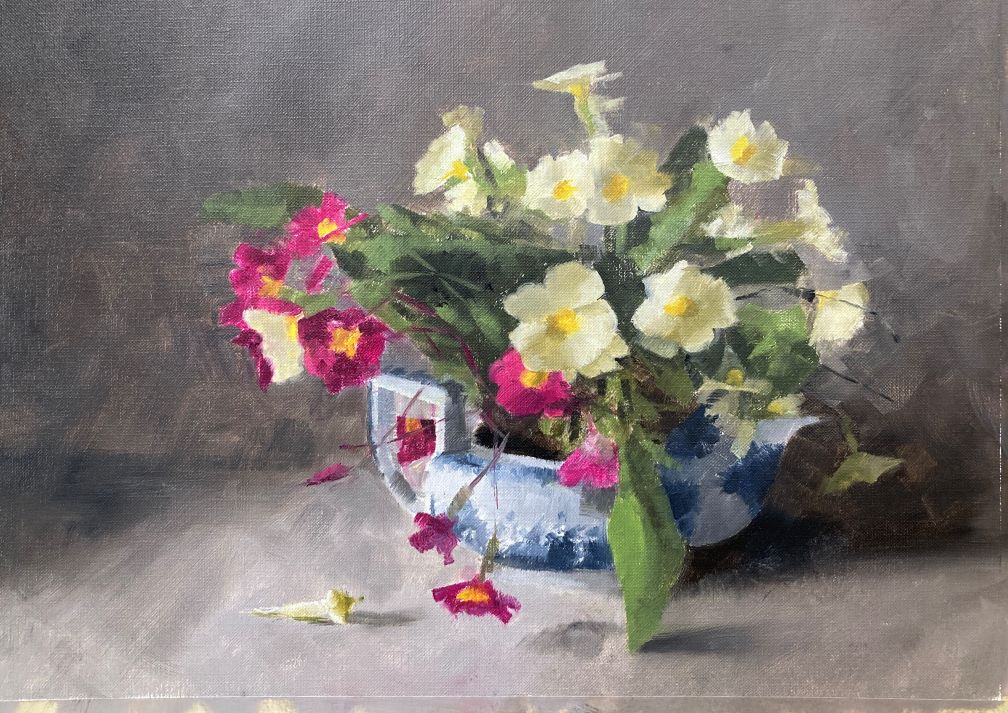
Alla prima primroses were the subject for oil painting today. A very complicated subject and an exhausting painting session. Almost 6 hours to get this to an almost finished state. This was done as part of a Paul Foxton workshop and this was the final subject.
Mixing colors Takes Time
I spent a good portion of the time just mixing the colors. It took around 1.5 hours to mix up colors for the light and shadow sides of the flowers, the leaves, the teapot and the background colors. I dialled back the chroma quite a bit from last week’s study as I thought the yellow flowers were too bright. Definitely a good decision.
Sign up for updates on classes and free livestreams
Small Oil Study
Here is the study for reference:
Alla prima primroses oil study
This was an 8×10 study and was blocked in quite quickly and with only a little drawing. I thought it came out well but wanted a slightly quieter feel to it. I also went larger – 11″x15″ for the final thing. It’s a busy subject and needed a bit more elbow room so took the plunge and went larger. This is always a bit of a risk as relationships can take on more or less impact as you scale up or down.
In Progress Shot
Here is the painting part way through. We spent quite a bit of time on the central 3 flowers. These are the main stars of the show and we wanted to make sure we had the values nailed down here. I think they just about work. Yellow flowers are always tricky especially the shadow colors. We also made sure the values of the teapot were better than the study. The white of the spout in the shadow is really quite dark and we wanted to ensure it really looked like it was in shadow.
alla prima primroses – progress shot
Alla Prima Primroses – Studio Shot
oil painting station studio shot
This is a shot of my easel in the studio. Some people have asked whether I have trouble with distorted drawing as I have my board at an angle. To be honest I keep it like that as I mostly work in watercolor and I’m used to it. I do stand up a lot and I don’t think I get any distortion from the angle. One day I’ll try the vertical easel and see how that feels.
Sign up for updates on classes and free livestreams
Want to paint this watercolor boat painting? Follow the step by step instructions (including video at the end) and see how easy this can be!
I just can’t resist painting boats in watercolor. The colors, the details, the sun and shadow – all come together to make painting these watercolor boats so much fun. In this watercolor boat tutorial I break down all the steps and show you how you can paint this scene. Boat watercolor paintings can seem daunting but if you take things slowly it’s amazing how they come together.
Sign up for updates on classes and free livestreams
Watercolor Materials Needed
Mechanical pencil
Watercolor paper (I like Fabriano Artistco 140lb cold press)
Size 10 round sable or synthetic sable
Permanent rose
Vermillion/pyrrole red/naphthol red
Ultramarine blue
Cobalt blue/cerulean blue
Yellow ochre
Lemon yellow
Burnt Sienna
Black
Value Scale
Color isolator
Palette/paper towels/water pot
Small spray bottle of water
Watercolor Boat Drawing
Watercolor fishing boats drawing
The drawing for this painting is pretty important. Sometimes I won’t put much detail into a drawing and just indicate the main shapes. For instance a landscape with trees can be pretty sparse in the drawing. All the detail and texture goes in by eye with just paint. But for this scene there is a lot going on and we want to indicate the position of a lot of different things.
Using a Grid Helps With Drawing Accuracy
I did this drawing by eye but, if you’re not confident with your drawing, you can grid up your paper lightly with pencil and draw it square by square. That way you can be sure you’re getting everything in the right place. It’s not a foolproof method but it gives you far less room for error. I’ve included a gridded up version of the reference below.
Fishing boat reference photo with grid
The aspect ratio of the photo is the same as for a 10″x14″ piece of watercolor paper. If you mark your paper into quarters on each side and join them up to make a 4×4 grid you can transfer the drawing more easily onto your paper.
Take Some Time to Make a Plan for Your Painting
Before we dive into the painting it always helps to take a few minutes and plan out what you’re going to do. It can be hard to do this – we want to jump straight in and get those brushes moving and paint splashing around. But a few minutes thought at the start always makes for a better painting. We can spot possible problem areas and make sure we know roughly how we’re going to proceed.
Which Direction is the Light Coming From?
I first make note of where the light is coming from and where the shadows fall. In this case the sun is on our right and the shadows are falling on the left. This is always good to keep in the back of your mind. If the reference is unclear in some areas you can work out how the lights and darks should fall even if you can’t make it out from the photo.
Sign up for updates on classes and free livestreams
Where are the Lights and Darks?
The next thing I do is note where my lightest lights are and my darkest darks. Once we’ve located these then we know that everything else has to fall somewhere between those areas. In this case our lightest light is the white hull on the left boat. The darkest darks are in the shadow underneath the boats and possibly inside the cabins. I keep this in mind. Nothing else can be darker or lighter than these areas.
Where are the Main Shapes and Values?
This one is trickier but it pays off giving it some thought. Even though there’s a lot of detail going on in this photo I like to break it down into 4 or 5 main value shapes. In this case I would estimate (or measure using our value scale) the value of the following areas
The sand
The sky
The sea
The hulls of the boats (in light and shadow)
The cabins of the boats (in light and shadow)
This may seem like a lot to work out ahead of time but getting those big value shapes right is an enormous help getting a scene to hang together and getting it to be convincing.
Identify a Few of the Colors
Watercolor Color Swatches
Doing some test mixes of a few of the main colors can also be a good idea. It’s much easier to do this before the painting. When you’re in the middle of the painting there’s so much going on it’s hard to stop and think about this. It’s a bit like prepping for a recipe. Getting all the ingredients measured out ready ahead of time makes putting a meal together much easier. (Not that I ever really do that – but I should!) In this painting I mixed as I went along but it’s a better idea to try out your color mixes at the start. If you think you can’t remember how you mixed your colors then putting a pencil note next to the swatch is a good idea. It’s doesn’t have to be anything complicated – just a list of the colors is enough.
Watercolor Boat Painting – Finally we Paint!
Paint the cabins in the lightest valueContinue with the light colorsMore light colors
So let’s start painting. We’re going to paint this in layers and build up the painting from light to dark. We’re first going to block in all the shapes with their lightest colors. Once those are dry we can go back in and add in the darks. This way of working takes a bit of getting used to. As we’re starting with the light colors of all the shapes things won’t start to look three dimensional until quite late on in the painting.
I have many more step-by-step tutorials and videos!
If we put in too much value variation in the early stages then the darks won’t make as much impact when we put those in. In these early stages try and match the color and value as best you can to the reference. And, most importantly, keep these early washes even. Don’t be tempted to try and make things look right at this stage. It takes a bit of faith but once you get used to it it will all make sense.
Keep Going With the Light Values
The hull of this boat is a stronger colorWork your way across all the different parts of the boats
Keep going across all of the main shapes of the boats. One thing to remember is that we’re putting in the light value of each different shape but these values may vary from shape to shape. For instance, the hull of the red boat is a bright orange-red in the light. The actual value of this is around a 5 i.e. mid-way down the value scale. If we compare this to the beige area above we can see that it’s a little darker. The beige area in the light is around a 7 but it’s still in the light.
Similarly the red stripe on the left hand boat is around a 4 (i.e. darker than a mid-value) in the light. If you have a value scale and a printout of the reference you can measure the values directly. If the color is distracting (and it can be with bright colors like these) squint your eyes and it becomes easier to judge value.
Use the ChromaMagic Tool to Measure Color
chromamagic for fishing boat watercolor painting
Alternatively you can load up the reference in ChromaMagic and click on different areas. It will show you the three components of the color – hue, value and chroma. The color notation is part of the Munsell way of measuring color. It is incredibly useful in painting and makes color very straightforward to analyze.
Paint in the Sea in the Background
Add the sea in a fairly dark blue
The sea in the background goes in next. This is a fairly dark blue and helps to tie the boats in the scene and give us some depth.
As you can see at this point the painting isn’t looking three-dimensional. Don’t panic! This is exactly how it should be looking at this point.
Paint in the Sand Around Your Watercolor Boats
Add a wash for the sand
Next we’re going to put in the sand. I really like this bit as we get to put in some texture with our spray bottle. One thing to be careful of – sand isn’t yellow. Or rather it is yellow but a very grayed out low chroma yellow. In this scene it’s a kind of beige so make sure you add in some black to your mix to take out some of the brightness. I’ve made the mistake of painting sand far too bright in color many times. Again mixing a swatch of color beforehand helps a lot as does using ChromaMagic for checking the chroma.
Sign up for updates on classes and free livestreams
Use a Spray Bottle to Add Texture
While your sand wash is still wet take a spray bottle of water and lightly spritz the surface. If the paper is the right level of dampness the water will add small sparkles and splodges in the paint. It adds some interest and texture to the foreground. This can take a bit of practice to get right. If the paper is too wet the water will just disperse and disappear. If the paper is too dry the water won’t do anything at all.
Watercolor Boat Painting – Add the Sky
Start the watercolor skySmooth the edges of the clouds
Note: I’ve got the order slightly wrong here. I’ve already put in some of the darks on the boats before doing the sky. The order doesn’t really matter. You can put in the sky before the shadows and everything should work out fine.
Let’s put in some sky now. The reference photo doesn’t really have much in the way of clouds and I didn’t really want a big expanse of blue up there. So I’ve invented some cloud shapes. You have a lot of freedom here. Put in some blue around wherever you fancy the clouds to be. While the paint is wet take a clean (very clean) damp brush and soften the edges of the clouds. The blue pigment will diffuse out into the damp areas of paper making lovely soft and convinving clouds.
Watercolor Boat Painting – Second Layer Darks
Add shadows on the cabins and the hullsAdd a lighter shadow on the white hull
Now this bit is where the painting starts to come to life. We’re going to put in the shadow sides of the objects and make them look three-dimensional. Adding in these contrasting areas also helps the visual impact of the scene and it will make the image more interesting as well as more realistic.
Don’t Add Color in the Light!
We’ve already painted in the light sides of our objects so we won’t be putting any color in there at all. We’re just going to paint in the shadow colors on mostly the left sides. Make sure your colors are at least a couple of shades darker than your light sides and things will start to take shape. When you get to the insides of the cabins we’re even darker as very little light is getting in there – you don’t need to paint things – just a few dark shapes at different angles will suggest a lot of detail.
Be careful with the shadow on the white hull. We don’t want to go too dark here and keeping that shadow light will really suggest strong sun.
Add a Cast Shadow to Anchor the Boats to the Ground
Finally add some cast shadows on the sand and right at the bottom of the boats. This will make the boats convincingly anchored to the ground.
The Magic Bit – Details on Your Watercolor Boat Painting
Details – masts and rigging
By this point you should have something that’s looking pretty three-dimensional. This next bit really adds sparkle and interest to your watercolor boat painting! We’re going to put in some lovely details. Put in the masts and rigging with a small synthetic brush. Make sure they’re not too dark – a mid value gray is plenty dark enough here. The other thing to take care with is not to make your lines too continuous. Leave a few gaps here and there as it will make the masts more convincing than if you carefully paint them in one continuous line.
Masts are put in lightly – not too dark
Continue with the masts and smaller details. Add in a few lines for the railings and the ropes holding the buoys. A few light lines on the white hull will also suggest their structure. I hope everything is looking really good by now!
Flags and Signs
Final details in your watercolor boat – flags and signs
We’re right at the end now. A few red marks for the flags will add a pop of color. The signs on the boat go in with an almost black background. The lettering is suggested with a little opaque white.
Final Thoughts on This Watercolor Boat Painting
If you tried this painting I hope it turned out well. I would love to see your results – please feel free to send them to me. I have also videoed the whole process and you can paint along with the full painting.
Watercolor daffodils have been on the docket to paint for a while since the snow has departed. Yesterday’s version wasn’t successful and I pushed it to a mess. But today’s is much better. I’ll leave it on the easel and look at it with fresh eyes tomorrow.
Light and Shadow Were The Main Subject
The main star of the show isn’t really the daffodils but the creamer and the shadows. But I wanted to have the flowers in there for some value contrast and those wonderful subtle shades on the petals. The leaves especially give a strong dark vertical which sets off the very light values in the flowers, the creamer and the surface. The background shadows were a huge challenge. My first version had them far too dark and the washes were grubby and uneven. I vacillated a lot about the color of those back shadows. I didn’t want them to be too dominant but also didn’t want a dull grey back there. In the end I think the slight purple worked well.
Daffodils are Surprisingly Hard to Paint Well
I have to say daffodils are not the easiest of flowers. The colors of the petals are very low chroma and can be hard to mix in watercolor. But I think these work pretty well. I would have liked a little more contrast in the petals between light and shade but didn’t want to destroy the delicacy. But anyway – there’s plenty more in the garden so lots of opportunity to practice
Other Examples of Watercolor Daffodils
It is daffodil season and, although these are the first of this season I’ve had some pretty good success previously. Here are a couple of previous versions:
Daffodils with Paul Foxton
Watercolor daffodils in coffee pot
Both these paintings were from sessions with Paul Foxton. He’s a great fan of painting daffodils and it’s always worthwhile taking one of his workshops.
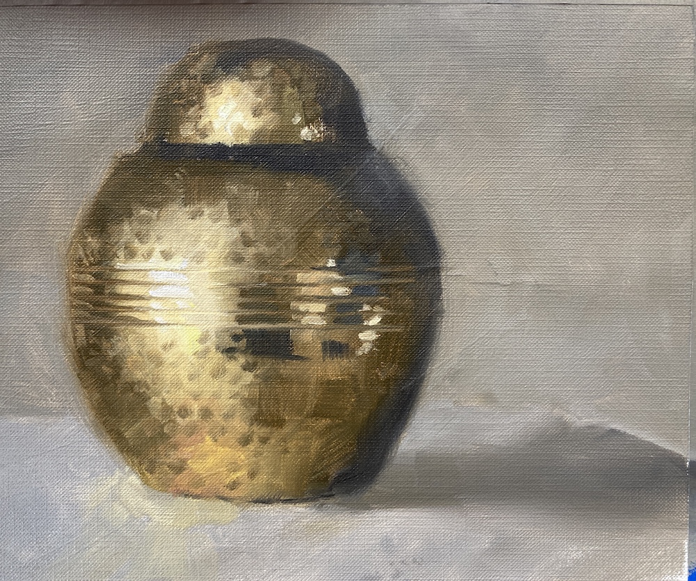
I’ve had this ginger jar in the cupboard for ages and have never painted it. Today was the day. And boy how I regretted getting one with all those divots on it.
Sign up for updates on classes and free livestreams
Watercolor flower painting can be so rewarding. And if you’re looking for flower painting ideas a carnation watercolor is great way to start. Such beautiful colors and lots of twiddly crinkly petals that catch the eye. However, it doesn’t mean they’re easy. As with all flowers we have to get the colors right both in the light and the shadow and we have to get the shadows in the right places. Maybe most importantly we have to pay attention to the edges. All those crinkles! We want to suggest them in our painting but not detail every last one. A perfect subject for a watercolor painting!
Sign up for updates on classes and free livestreams
Watercolor Carnation Tutorial steps
This is one of my step by step watercolor lessons on painting a single carnation. When you start to paint watercolor flowers it’s good to take it slow and follow step-by-step. I take you through identifying the values and mixing the colors. We will then move onto painting the major shapes and then adding in the detail. A lot of the hard work is in the prep and mixing. If we get all that right the details often go in very quickly.
Materials Needed
Mechanical pencil
Watercolor paper (I like Fabriano Artistco)
Size 10 round sable or synthetic sable
Permanent rose
Vermillion/pyrrole red/naphthol red
Lemon yellow
Burnt Sienna
Black
Value Scale
Color isolator
Palette/paper towels/water pot
A solid resolve
How to start painting a watercolor carnation
So how should we think about this watercolor painting? I like to start by first looking at the overall shape and how the light falls on the flower. Which direction is the light coming from? Where on the bloom does it fall into shadow?
Simplify the carnation flower
If we ignore all the little crinkly petals a carnation is pretty spherical. It’s a lot simpler in structure than a watercolor rose (which is a whole different tutorial). And in our reference the light is coming from the left. So the left side of our flower is in the light and the right side is in the shadow. If we strip it back to this we have one color in the light and one color in the shadow. Of course there will be differences in the details. In the deep crevices of the petals it will go darker and some of the outer edges will catch the light. But let’s start there and get those colors right. When you’re working out how to paint a carnation simplifying the basic colors needed is a vital first step.
Use your value scale to find the values of the light and the shadow
We have a pink carnation and you can pretty easily see we have a light pink on the light side and a darker pink on the shadow side. But how light and dark are they? And how can we mix them? It’s a good idea to break out your color isolator and your value scale here.
Identify the light value and color
If you’re working from a printed reference then you can place them directly over the print. I actually recommend this if you’re just starting out with painting or if you’re working on nailing those values. If you’re working from life you can hold them up in front of the flower but be careful! Make sure the light falling on your value scale or isolator is the same as is falling on your flower. If you have your flower backlit you won’t get an accurate reading.
Squinting your eyes helps with values
What makes this slightly tricky with a bright pink flower is that we only have a grey value scale. The best way to cope with this is place your value scale on your reference and squint your eyes. The squinting will take the color out of what you’re looking at and make it easier to judge value. Eventually you’ll be able to make a pretty accurate guess but it’s always useful to check. Move the value scale along the region you’re looking at (pick an ‘average’ region) and find the value where the edge and the region almost merge together. It probably won’t be an exact match but you’ll be able to narrow it down to within a step. Do this for both the light side and the shadow. For my reference I get a value 6 in the light and a value 2 in the shadow.
Make some color swatches
Now I’m going to say something heretical here. Don’t sweat the precise color of the swatches you’re going to make. But really sweat the value! Try and really nail that value.
How to mix pinks in watercolor
So where do we start with color. We know our flower is pink and we have a pinkish red on the palette. I always start with which color on my palette is closest to the one I want to mix. I have two reds on my palette – an orangey red (vermillion) and a pinkish red (permanent rose). We know it’s definitely pink so permanent rose it is.
Pay attention to paint consistency when mixing value
The really annoying thing about watercolor painting is that when we mix colors on the palette they look *nothing* like the colors that end up on the paper. They always look darker until they get placed on the paper and are spread so thin that the paper shines through.
So what should we do? Well we could just test a swatch on some scrap paper and that is always a good idea to check. But while we’re on the palette all we really have to go on is the consistency of the paint. We add water to make a pigment lighter so the consistency of the paint gets thinner. Dark paint – thick paint and light paint – thinner paint. When we’re planning our watercolor carnations painting pay attention to both – the consistency of the paint and how it looks on your scrap paper.
Mix and paint the light value on your rough sketch
Mix the light value for the carnation watercolor
For our value 6 our paint needs to be roughly of the consistency of 2% milk. It will flow around the palette fairly easily. For comparison a value 5 will be light cream consistency and darker will be heavy cream. Try mixing your permanent rose with some water until it feels like a milk consistency. Then try a swatch on some scrap paper. Let it dry a little (watercolor always dries lighter) and bring in your value scale to see how close you are.
Practice makes mixing much easier
This seems like a really awkward process when you first start. And we haven’t even started putting paint on the paper yet! But it gets a lot easier very quickly. And trust me – your paintings will get so much better very quickly. The ability to mix accurate values is a key skill towards getting an effective watercolor.
Sign up for updates on classes and free livestreams
Now mix the dark value
We have a little bit of a problem with the dark value. Take some permanent rose straight from the tube, loosen it with a tiny bit of water, and make the darkest swatch you can. Measure that value with your value scale. Eeek! We need a value 4 but we can only get down to a value 5. We can’t get dark enough!
So what to do? Well – we only need to go slightly darker. Take your permanent rose and mix in a teeny bit of black and burnt sienna and try that swatch again. You should be able to make a darker pink without that black muddying that color too much. It should still be a nice rich pink but at the right value you need.
Measure and mix the dark side colorAndPaint the dark color on the sketch
And just one more color!
We have our main colors but we need just one more color. The leftmost side of the flower is very light – around a value 8.5. And the color is shifted ever so slightly towards blue. This often happens when you have still life subjects lit by daylight. As the object moves into shadow the color shifts towards orange. It’s not an absolute rule but it happens an awful lot! So let’s measure and mix that color. As it turns out our permanent rose diluted to a value 8.5 is pretty bang on that color. So we paint a swatch and just try it out on the edges of our cartoon sketch flower.
Check the very light value on the carnationTest the very light color on the edges
But when do we start painting?
Yes, yes I know we’ve done a *lot* of messing around with mixing and swatches and value scales. But all this prep makes the painting so much easier. Finally – let’s start painting this carnation watercolor!!!
First the Drawing
Ok so I lied about the painting. We’ll get there soon. First we have to draw out the outline of the flower. When drawing the carnation lightly sketch in the oval shape then draw the outline and pay attention to the angles of the petals. Flowers may often look soft and curved but if you look closely they’re often quite choppy and jagged. This really does add to the character of the flower so we should pay attention to it.
watercolor carnation drawing
The final thing in the drawing is to lightly draw in the boundary between the light and the shadow side. This won’t be smooth as in our little cartoon sketch but will be more choppy and angled as the petals go in and out of the light. We need this to remind us where the dark colors stop and the light colors start.
And Now we Paint! Honest!
So we’ve done a whole lot of hard work. We know our colors and how to mix them. This frees up some thinking room to concentrate on putting the paint on the paper.
Paint the lightest color
Paint the lightest color on the left side of your carnation watercolorUse a damp brush to smooth out the inner edges
Mix up and put the lightest color around the edges on the left side. While the paint is still wet clean your brush, dab it a couple of times on a paper towel and smooth the edges out. When you do this you don’t really go into the paint you’ve already put down. What you’re actually doing is wetting the paper right next to the paint and just letting the paint flow into the damp paper. It will do its thing if you let it!
The Mid-Value Layer
Let that lightest layer dry and then we can move onto the next value up. This is the color on the light side (minus those very light edges) but we’re going to paint over the dark side as well. We know we’re going to go over this with an even darker color so it’s fine to do this. In fact as the darker color will still be slightly transparent the color will show through a little and make the flower more luminous.
Put the mid value color on the left sideAnd carry it over to the shadow side. I
Make sure you don’t just fill in the shape. Leave a few gaps to show where the petals are in light. It’s these edges that really give a convincing rendition of a flower. And soften all those edges with a damp brush. Hard edges at this stage will be really jarring on the eye.
Now the Shadow Color!
We can start to see the form of the flower happening but now is time for some of the dark color to go into the shadow side. This is the scary bit!
Put the darker color on the shadow sideAnd soften the edges into the light side
Again it’s not just ‘filling it in’. Leave small areas of the previous layer showing. It will give the impression of petals. And, as always, soften some of the edges. Some of the edges where the petals end will be hard so leave those. But not too many! It will look choppy and jarring otherwise.
And just a reminder – KEEP AWAY FROM THE LIGHT! Don’t let that shadow color get into the light (apart from softening the edges). We’ll lose all the form if that happens and we’ll have a pink splodge. Trust me – I’ve been there.
Sign up for updates on classes and free livestreams
Painting the Stem
Let’s take a bit of a breather while that layer dries and paint the stem. This is much less stressful! Mix up an olive green color with some lemon yellow, black and a touch of ultramarine. You should end up with a mid value yellow-green. Paint in the stem and then, while it’s still wet add in a little black to make the color darker and put in the shadow on the right hand side. I decided to soften a few edges here and there on the stem just to break up that hard line. We want all the focus to be on the flower – the stem is just incidental.
Some greenish yellow on the stemAnd a darker version on the shadow side
Now for some Subtle Shades on the Light Side
Now it’s looking pretty good! We now have to be careful not to ruin it. It’s easily done and this part could be disastrous if we’re not careful. We’re going to put some really, really, subtle definition into the light side. Just a few touches to show where the petals overlap each other. It is so, so easy to overdo this so really err on the light side. Better to do too little here than too much. So it’s a really watery version of our light side color and just touch in some areas to show a few petals. Be careful!!!
VERY subtle light definition on the light sideJust enough – it doesn’t take much
And Now Even Darker! We’re Almost Done!
So we have some really nice form on the flower now. And some indication of petals. But the center still needs to go a little darker. Mix up an even darker mix of your shadow color. This will have very little water in it but just enough so the paint still flows.
Dab pieces of paint into the darkest crevices and soften the edge that’s coming out into the light. You won’t need much here. In mine I also decided to slightly darken the whole shadow side with a watery wash of the dark color. I wanted even more subtle change of value in the petals here as I thought some of them were too light. Skip this step if you’re not sure.
Finish Off by Sharpening up the Outside Edges
Sharpen the edges on the outside slightly
The final step was to sharpen up and make slightly choppier the edges on the shadow side. The edges of a flower often give a lot of character so I like to define them.
And Finished!!!
Finished pink carnation watercolor
And the finished thing! I am pretty pleased with this. I really love those petals in shadow that give real depth to the carnation. We all deserve a lie down now.
Sign up for updates on classes and free livestreams
And Finally…..
If you enjoyed this tutorial and would like to be notified of new ones that come out please sign up for my mailing list. I try and make tutorials that produce a satisfying result but are also easy watercolor paintings for beginners. There will also be a video on this page shortly and also on my youtube channel. If you’d like to see more of my flower watercolors this daffodil watercolor is one I’m particularly pleased with.
Many thanks for reading!! If you try this tutorial I would love to hear from you.