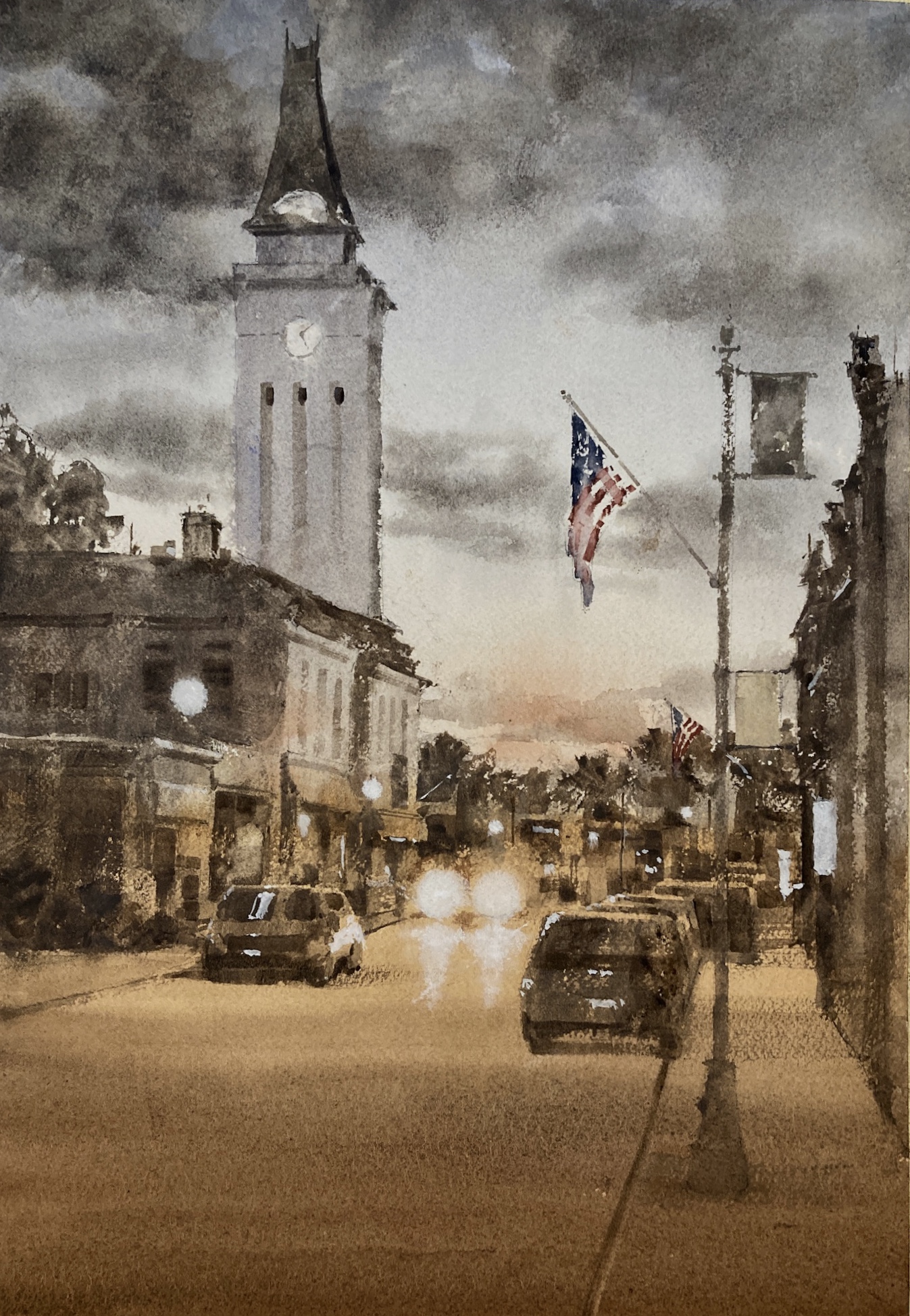
Watercolor Cityscape – Main Street at Dusk

I really like painting a watercolor cityscape. Great shapes, lots of things going on, and I get to interpret my everyday surroundings.

However this was a huge saga. I’m just going to leave this one here for now but the struggle to get to this point was filled with disaster and frustration. But I got there in the end and I’m very happy.

Watercolor Cityscape Reference Photos Need a Lot of Editing

One of the problems was that the reference photo had a lot of problems. The color scheme was a little odd and there was a lot of extraneous detail that had to be edited out. I also had the problem of the time of day. I originally wanted to do a night painting but I couldn’t get the atmosphere right. So I turned it into more of a dusk painting, lightening up the sky and adding in some more clouds.

Don’t Change Materials When You’re Trying Something New

In hindsight one of my problems was that I changed to use Arches watercolor paper rather than my trusty Fabriano Artistico. I knew that this one was going to be a struggle and could have done without having to readjust back to Arches.

Not Every Painting Works Out First Time

I did several versions of this painting. In fact I almost gave up after the first two. But in this case perseverance paid off and the final thing came together very well.

Lessons Learned for Watercolor Cityscape

I think I need some bullets here.

  • Simplify! There’s a lot going on in a city street and you can’t put it all in.
  • Work out your big value shapes ahead of time. If they don’t work the whole painting won’t hang together.
  • Decide on a color scheme and don’t just blindly follow the photo. The original colors are nothing like how it ended up but it’s definitely a better painting for it.
  • Suggest that detail and don’t put in every little thing. Sometimes just some dabs and a little contrast here and there can portray a multitude of things
  • Subtle values changes in a larger value shape add a great deal of depth to a painting. This is starting to become one of my things. If I manage to achieve it in a painting I always think it’s better for it.
  • If it doesn’t work first time think about it first. Do some value studies, reexamine the color scheme. Don’t just blindly try another one – that almost never works for me.

Finally…

Vermont farm watercolor

Online Zoom Classes

I run online zoom courses regularly for both beginners and more advanced students. Please check out my workshop page.
Marlborough at Night – Value Sketch

Marlborough at Night – Value Sketch

Starting to think about the next ‘big’ painting. This is a night view of Marlborough which is going to be challenging to say the least. I’m working up to it with some studies and starting small (3”x5”) with a sketch. This is to work out the value relationships and how the different areas relate to each other. So far so good.

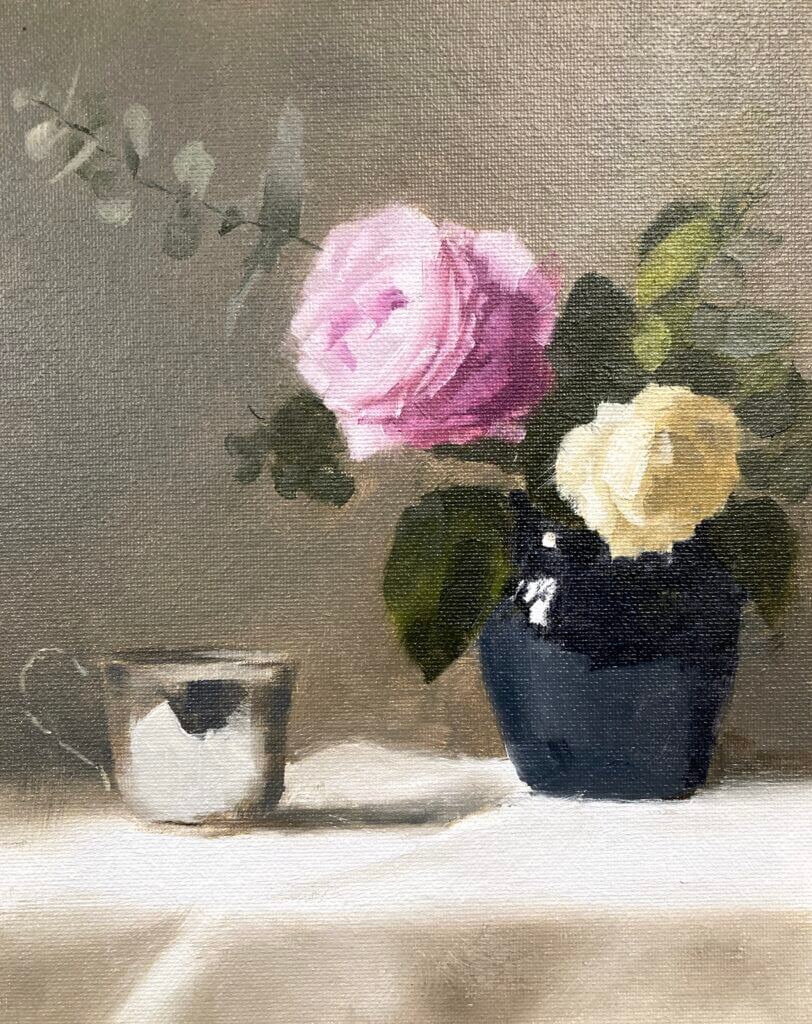
Rose Still Life Color Study

Still working with Paul Foxton’s latest still life workshop. This week was the rose still life color study. It’s not the whole composition but contains the main elements. I went a bit beyond where I intended today as this was just meant to be a color block in. It was a pretty intense session nonetheless. We accurately mixed all the main colors and some were pretty tricky.

Rose Still-Life Color Study – Munsell to the Rescue

I have the big Munsell color book. This contains about 1600 different paint chips covering most of the colors possible in paint. It’s been invaluable in making me more aware of color. Especially how to mix it both for oil painting and watercolor. I hadn’t realized how bad my color perception and mixing skills were before I started using it. If you want to know more about Munsell see this post. It also includes information on the online ChromaMagic tool which helps you see color more accurately.

After mixing everything for the rose still life color study putting the paint on the canvas went pretty quickly. We weren’t meant to put in petals – bad Michele! However, I wanted to see how it would look and how hard it was going to be to get the pink rose to read well. I had to do a lot of single touch strokes with no blending. This was to get the color changes between the edges of the petals and the higher chroma inner parts. I’m very glad I did this – the full thing doesn’t seem so daunting any more.

Sometimes Cheap Surfaces Aren’t the Best Option

The surface was just a cheapo cardboard canvas panel. These are surprisingly good to work on and only cost around $1 a time. As it came out so well I almost wish I’d done it on something more substantial.

The whole session was a long one – around three hours I think. It’s a long time as you’re focusing intently for the full extent . At the end I was glad to put the brushes down at the end. Paul did give us a couple of tea breaks though 🙂