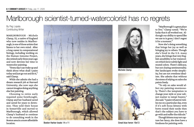
Big news here this past month. Peg Lopata of our local paper The Community Advocate wrote a fantastic article about me, my story, and my art. Very excited to see this and very happy to get the word out locally. The article had a fantastic reaction and I sold a number of paintings. Many thanks to Peg and all at the Community Advocate. Click the image to read the whole thing.
Author: Michele Clamp
Basset Hound Watercolor Painting – Yay!
I don’t paint a lot of dogs. Dogs are tricky and I’ve shied away from them. But yesterday I was feeling in the mood for something different and a picture of a basset hound took my fancy.
I started him yesterday. Here’s the end of day 1.

Now this may not look like much but I was actually really happy at this stage. I’d managed to both get the white fur the right value and the shiny parts of the ears the right value. Once that was done the rest of it pretty much painted itself.
Venice and Watercolor Value Studies
Varying the value range alters a painting’s feel
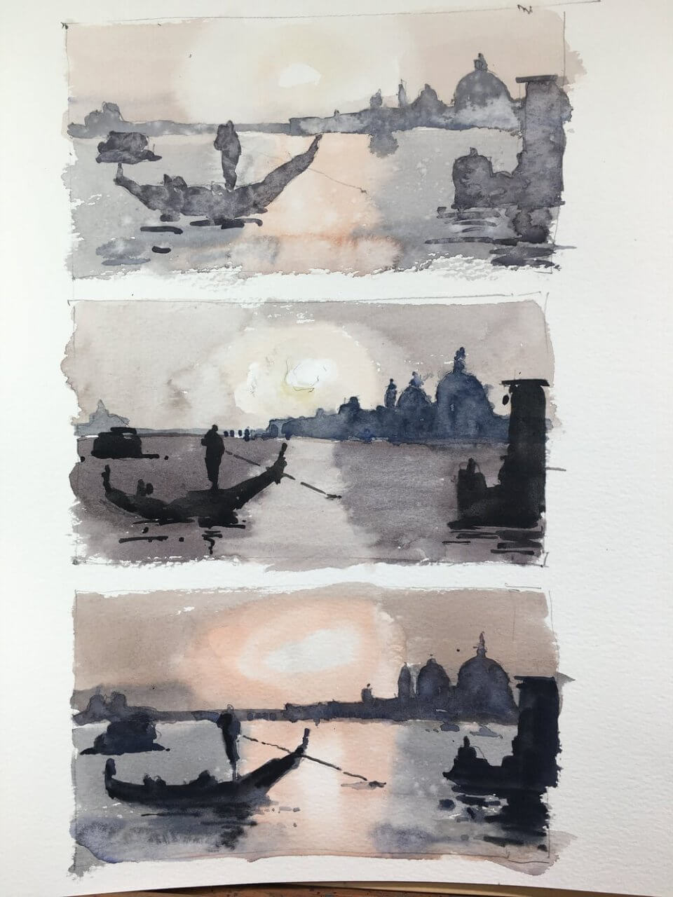
The plan behind venice and watercolor value studies is the following. Take a reference and paint it three times. The middle one is painted as closely to the actual value range in the reference as possible. The top one is shifting and compressing the value range to the top i.e. lighter than the reference. And similarly the bottom one is shifting and compressing the value range to the bottom i.e. darker.
Change the values but keep the value relationships
The first goal with these studies was to see whether we could shift the values but still keep the value relationships. If the relationships are good then the scene will read correctly. And I think they all do. None of them are great paintings but you can see they all represent the same thing.
Shift the values to change the atmosphere
The second goal was to change the feel of a painting by shifting the values. I thought the lighter one might have a more misty, ethereal feel. And the darker one would be more moody. Well I don’t think I succeeded here. Maybe I’m over simplifying the process. But it definitely an exercise worth doing.
Some days nothing really works
Wasn’t really feeling it for this one. Let’s hope I can pull something out of the bag for tomorrow’s class. In any case it was good practice for value studies. I’ve also included a larger version below. Again I’m not really happy with it – just one of those days I suppose.
And a link to someone who can really nail this – Joseph Zbukvic
A lot of you will know of Joseph Zbukvic. His value handling (amongst many other things) is spectacular.

Yes well we’re all depressed now aren’t we? He actually uses quite a narrow range of values here but expertly implemented.
Bamburgh Castle Watercolor Demo
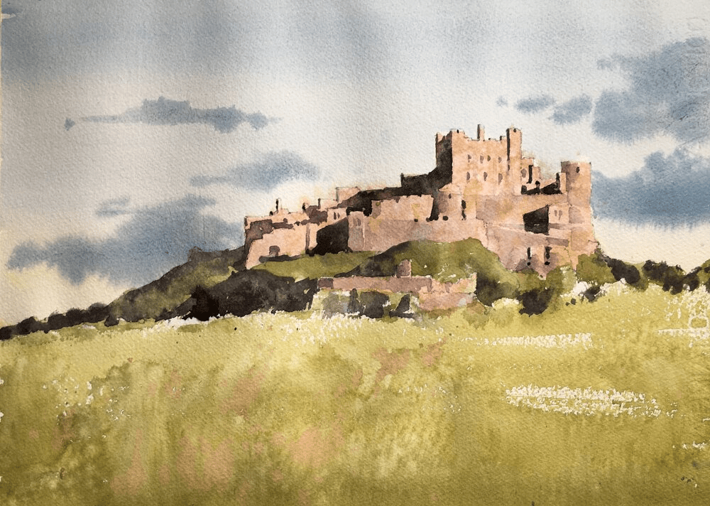
Today’s painting was a Bamburgh Castle watercolor demo. And it was enormous fun to do and came out really well I think.
Put the main shapes in with pencil
I drew the rough shapes first but didn’t include a lot of detail. I left the clouds to be put in purely with paint and similarly left out most of the windows on the castle. The shadows are important though as they create most of the form of the castle. These were carefully placed and, as they’re pretty dark, the graphite lines won’t show in the final painting.
Before putting paint to paper – some careful color mixing.
It’s tempting to just rush in and start splashing paint on the paper. And if you’re that way inclined by all means go ahead. It is fun after all. However, I’ve found over the last couple of years that if I spend some time looking, identifying and mixing the colors I’m going to use the painting goes *much* better.
Try guessing a color just by looking at it first
I start by identifying a few key areas of the painting. In this case it would be the sky, the castle walls, the foreground and the grass/trees around the castle walls. Using my color isolator I take a guess at defining the color and ask myself – what is the hue (blue,green, pinkish-beige), the value (mid, light, dark), and finally the chroma. The chroma is the brightness of the color. The lower the chroma then the grayer the color.
Use the color isolator to check your guess

I then take the color isolator (fancy name for a 3″x5″ piece of gray paper with a 1/2 inch square cut into it) and place it over the color I’m trying to match. This changes how your eye perceives it and it can be a surprise how off you can be. After using this for a while you get experience in how your brain fools you (shadows!!! ) and your guesses get much closer.
Mix a swatch of color to match
Once I’ve checked my guess I draw a 1 inch square on a piece of scrap watercolor paper (doesn’t have to be the good stuff) and mix up the color. If you take a look at the video you’ll be able to see how I get there.
I videoed the whole process of this. Here’s the first part which is a link to my youtube channel. First we have the planning, color matching and drawing stages. (btw if you’re interested in any upcoming demos or livestreams please subscribe to my mailing list).
And finally the painting!
We’ve done all the hard work so now the fun part! The painting goes relatively quickly and we know the main colors and values so we don’t have to fret about that. We can concentrate on putting the paint on the paper, some texture, and generally making it work as a painting.
Enormous fun to do this. Here’s the second video part of the process – the painting.
Rooster Watercolor
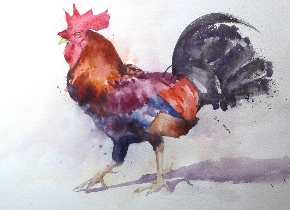
A rooster watercolor is a great subject for a beginner. Lots of color and fabulous shapes can make a wonderful bird painting.

Online Zoom Classes
I run online zoom courses regularly for both beginners and more advanced students. Please check out my workshop page.
However, this watercolor rooster is deceptively tricky. A lot of color but not a lot of value changes so I had to introduce more to get the form of the body. Fun though – the colors came out well and the final result has a lot of life and character. This artist is quite happy with this watercolor painting. I’ve done a number of watercolor roosters and this one is my favorite. Would be quite happy with this rooster art on the wall.
Watercolor Rooster Tutorial
I describe the painting process below. In summary I first make some carefully matched color swatches to the reference. I then draw out the outline of the bird and put in some light washes of color. The next layer puts in darker areas and then I finally put in some detail and slight changes to pull the whole thing together.
Mixing some color swatches help with the final painting
I first mixed up some swatches after matching to Munsell chips. Everything is pretty low in value – highest is a 4 which was surprising. The colors looked good together though which is a good sign. I find that if the main color swatches have harmony the final painting will as well. Watercolor rooster paintings don’t often have this many colors in them so it’s good to get the mixes and values planned out ahead of time.
Draw out the rooster watercolor with a mechanical pencil.

Next the drawing. Careful comparisons across the body both horizontally and vertically to make sure everything lined up. Where possible I use negative shapes to get the right angles. I always use a mechanical pencil for drawing. My favorite is this Faber-Castell one although any other one works just as well. I tend to use a 0.7mm HB lead. Any softer and the graphite smudges which we don’t want with transparent watercolor. Any harder and the lead will leave grooves in the paper. The paint will tend to flow into the grooves and show up darker than the surrounds.
First washes on the rooster watercolor – light and loose around the edges
The first washes. I toyed with the idea of just painting the whole thing in one layer but finally plumped for putting in a light under wash of the main colors and intentionally went outside the lines into the background. When finished this layer is barely visible but gives some visual interest and some depth to the final picture.
Second layer – putting in the mid-tones and darks

Half way through the second layer here. I’ve kept the eye and beak areas clear as they go in at the end. The tail feathers have to go in pretty much in one go – if it goes wrong you have to live with it. Worked out this time thankfully. In general I find with bird watercolors that you don’t need to put too much detail into the feet. In fact too much detail and contrast in this area can draw the eye and detract from the rest of the bird. In rooster watercolor paintings this isn’t so much of a problem. There’s so much going on in the rest of the picture that it’s not as important. But I stuck to keeping them simple and I think it worked out. The shadow on the ground was put in with a mix of ultramarine blue and burnt sienna. This also helped to define the legs and place the bird in space.
Final shot on the easel

The final thing. Pretty handsome I think. I hope this has showed you a little of how to paint a rooster in watercolor and, if you try it yourself, I hope you have as much fun as I did.
And Finally….
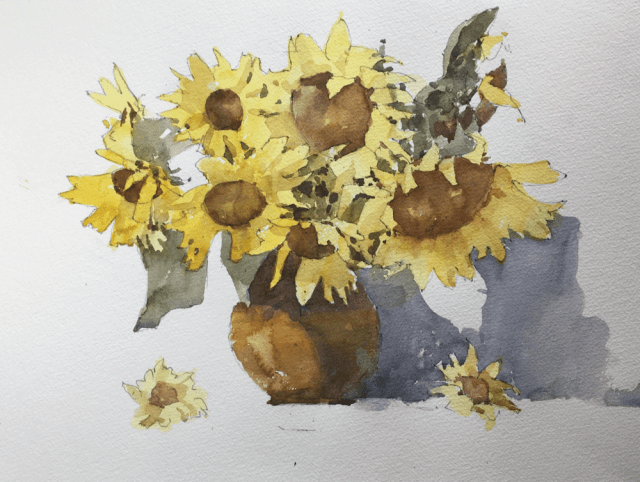
Sunflower Workshop
Mine came out tighter than I would usually do but for me that is always the case when talking through a painting. I may touch this up and finish it off later.
If anyone is interested in joining me online for zoom lessons have a look at my upcoming classes
