Oil Painting Surfaces – A Cautionary Tale

Apple still life oil painting study
Two Apples. Michele Clamp. Oil on panel. 5”x7”

Yes I never thought the title would be ‘oil painting surfaces- a cautionary tale’. Today was supposed to be a set of apple studies with different types of brushwork. It turned into a sorry saga of unsuitable surfaces. With pretty horrible results.

Strathmore Canvas paper – too absorbent for oil paint

As this was just meant to be some studies I first started with a quarter sheet of Strathmore canvas paper. I’ve used this before with good results but what I forgot was that I gessoed the surface first before painting on it. And this time I didn’t. Ugh! The paint just sinks in, you can’t blend it, and it somehow darkens and goes matte on the paper. After struggling for an hour or so trying to get the paint to cover the surface (it soaks in and in!) I gave up. Here’s the result:

Disastrous apple still life oil painting on canvas paper

Blergh. Almost no form on that left hand apple even though I was *so* careful with the values.

Not all ‘gessoboard’ is the same

After a quick stomp around the studio I fished out a small 5”x7” Ampersand gessobord. *Gesso* board so this surface must be ok yes? Hmm. Well it was better but boy so slick! The paint just rides around on the surface as there’s no tooth to speak of. It was definitely better than the paper but only just. Here’s my chunky block-in.

Apple still life oil painting study color block in

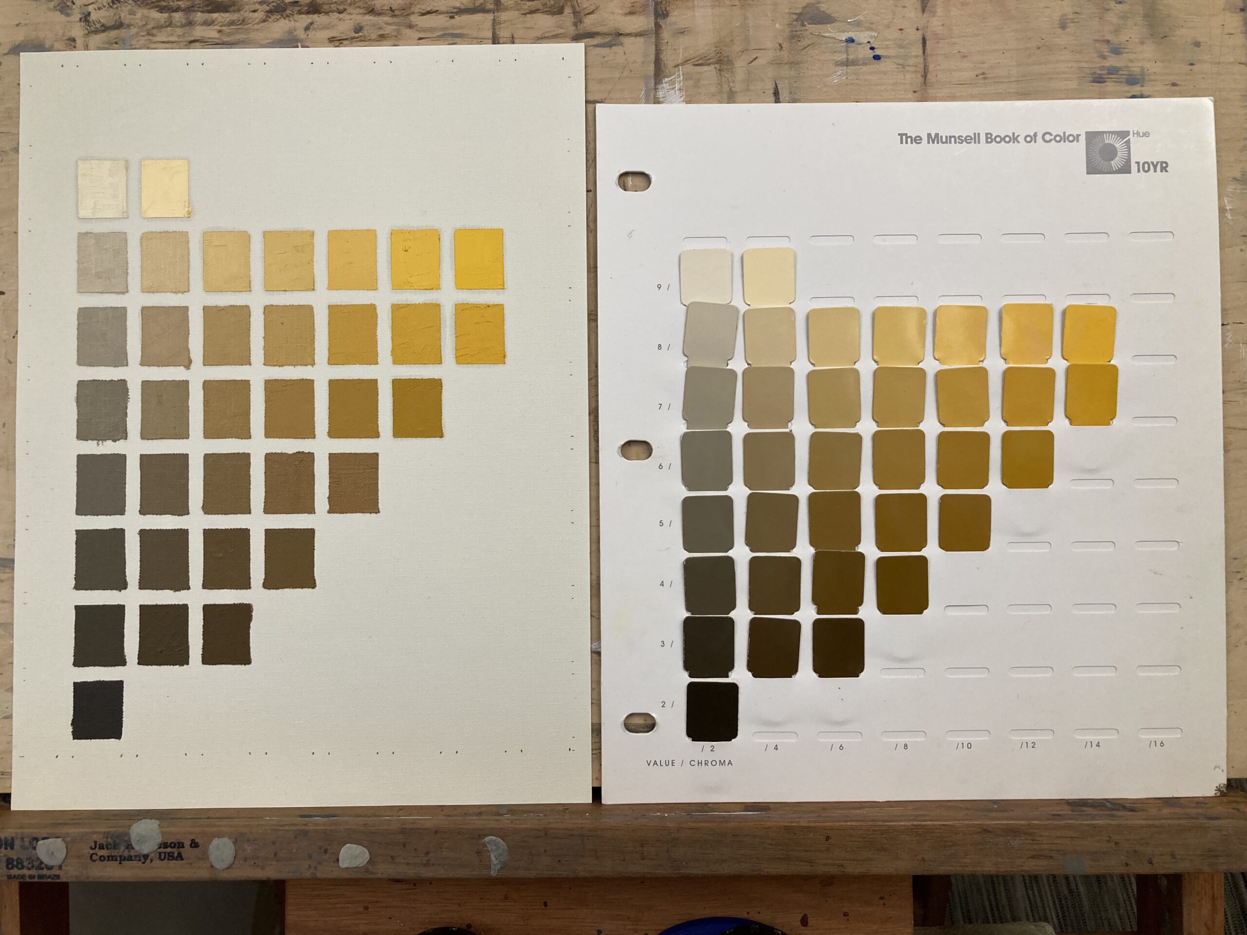
Kinda okay. I had a lot of trouble getting the chroma right on the light side of the apple. I was using Munsell chips but was still struggling. Will try and tweak that tomorrow and see if I can get it right. It has a certain charm but nowhere near what I was aiming for.

Finally I blended some of the edges and beefed up the darks a little. And that was it for the day. 4 hours – 2 apples! I have to get back to watercolor.

Apple still life oil painting study softened edges

10YR Munsell Chart – Can I Match it?

A 10YR Munsell chart wouldn’t have meant anything to me 2 years ago. But learning to think about color in Munsell terms i.e. hue/value/chroma has been game-changing for me. It has been the single thing that has improved my painting over the last couple of years. Not the most exciting thing today but useful nonetheless. I’ve been thinking about how long it would take to reproduce every chart in the Big Munsell Book in oil. This is the gold standard if you’re working with Munsell and is eye-wateringly expensive. The recommendation is to start with the student book which has fewer chips but is only around $100. You can also pick up used editions on Ebay every now and again.

All About The Munsell Color System

If you want to know more about Munsell see my new post about what it is and how to use it. Includes a link to downloadable pdfs and access to the online Munsell tool ChromaMagic.

Munsell wheel at different values

New! ChromaMagic

A free online tool to identify Munsell chips from any photo.

How Easy is it to Mix a 10YR Munsell Chart?

So there are 40 charts and around 1600 colors in total. I thought I’d start with the chart that always seems to be present – 10YR. This is a yellow orange hue and has the full range of colors from light to dark and bright to gray. It took me around 4 hours to exactly mix every swatch. Phew! At one a day this would take me 40 days. Hmm.

Here’s the same thing in grayscale (actually desaturated). Each row should look exactly the same value.

Grayscale Munsell chart and oil painted copy
Munsell Chart 10YR Desaturated.

Not too bad. A couple of wobbles here and there but pretty close.

I did this on Strathmore canvas paper and marked out the swatches with 1/4 inch masking tape. I should have waited until tomorrow to take the tape off but couldn’t wait 🙂

Online Watercolor Classes

I don’t explicity teach Munsell in my watercolor classes but I do use the principles when mixing color. I run regular beginners and intermediate/improvers classes throughout the year. If you are interested please visit my classes page. If you would like to be notified of any upcoming classes please sign up for my mailing list.

Vermont farm watercolor

Online Zoom Classes

I run online zoom courses regularly for both beginners and more advanced students. Please check out my workshop page.

[activecampaign form=10 css=1]

Michele Clamp Studio Wall

(Note: As an Amazon Associate I earn from qualifying purchases. I get commissions for purchases made through links in this post.)

How Important are Value Studies?

Vermont town value study
Vermont Town Value Study. Michele Clamp. Watercolor

How important are value studies? I have to admit that I have only recently started doing them as part of the process. A few years ago I tried to do them but found scaling up to the real painting very difficult. So I stopped. But over the past year I’ve finally found them useful.

After the Marlborough at dusk struggle to a triumph I’m spurred on to another New England street scenes. I really enjoy these but they are hard to design and hard to paint. When they come off though they make really good paintings (IMO of course). Today was value study and color study day. Here is the photo reference:

Vermont town reference image

This is from a visit a few years ago and the strong light and tower caught my eye but, as you can see it’s not an obvious choice for a painting. But if we can make a decent value sketch out of it we may have a chance.

First was some noodling on the ipad. I find this great for trying out ideas. You can work in a small range of values and add new layers if you want to try something out. If it doesn’t work just delete the layer. So what did we find?

Yeah I think there’s something there. I added in some of the buildings on the right hand side to give some balance to the left. I also ruthlessly pushed those dark trees to a lighter value both to push them back and to provide some contrast with the foreground tower and car. The thing I like the most is the pattern of light off the roofs and the car which I need to remember to retain in the final painting.

Ok so far so good – onto some paint value studies. Pretty small with minimal drawing and trying to keep to around 4 values throughout the whole thing.

This is the same sketch at different stages. I was in two minds whether to include the dormer window on the left hand roof so took a photo half way through. I’ve compressed the scene widthways a little so things aren’t too stretched out and made the central car a little more prominent. I think we’re still looking good.

Finally I tried out a very rough color sketch. This was just to try out some colors as the photo colors are not very inspiring but I still want to retain a sense of the hard sunlight.

Watercolor color study for Vermont town

This is teeny – around 2”x4” but I wanted to see if a blue sky would work with some rich browns for the buildings. I’m still in two minds but it looks promising.

Next time – onto a big version!

Watercolor Cityscape – Main Street at Dusk

I really like painting a watercolor cityscape. Great shapes, lots of things going on, and I get to interpret my everyday surroundings.

However this was a huge saga. I’m just going to leave this one here for now but the struggle to get to this point was filled with disaster and frustration. But I got there in the end and I’m very happy.

Watercolor Cityscape Reference Photos Need a Lot of Editing

One of the problems was that the reference photo had a lot of problems. The color scheme was a little odd and there was a lot of extraneous detail that had to be edited out. I also had the problem of the time of day. I originally wanted to do a night painting but I couldn’t get the atmosphere right. So I turned it into more of a dusk painting, lightening up the sky and adding in some more clouds.

Don’t Change Materials When You’re Trying Something New

In hindsight one of my problems was that I changed to use Arches watercolor paper rather than my trusty Fabriano Artistico. I knew that this one was going to be a struggle and could have done without having to readjust back to Arches.

Not Every Painting Works Out First Time

I did several versions of this painting. In fact I almost gave up after the first two. But in this case perseverance paid off and the final thing came together very well.

Lessons Learned for Watercolor Cityscape

I think I need some bullets here.

  • Simplify! There’s a lot going on in a city street and you can’t put it all in.
  • Work out your big value shapes ahead of time. If they don’t work the whole painting won’t hang together.
  • Decide on a color scheme and don’t just blindly follow the photo. The original colors are nothing like how it ended up but it’s definitely a better painting for it.
  • Suggest that detail and don’t put in every little thing. Sometimes just some dabs and a little contrast here and there can portray a multitude of things
  • Subtle values changes in a larger value shape add a great deal of depth to a painting. This is starting to become one of my things. If I manage to achieve it in a painting I always think it’s better for it.
  • If it doesn’t work first time think about it first. Do some value studies, reexamine the color scheme. Don’t just blindly try another one – that almost never works for me.

Finally…

Vermont farm watercolor

Online Zoom Classes

I run online zoom courses regularly for both beginners and more advanced students. Please check out my workshop page.

Marlborough at Night – Value Sketch

Marlborough at Night – Value Sketch

Starting to think about the next ‘big’ painting. This is a night view of Marlborough which is going to be challenging to say the least. I’m working up to it with some studies and starting small (3”x5”) with a sketch. This is to work out the value relationships and how the different areas relate to each other. So far so good.