Another set of Zbukvic and Chien Chung Wei copies today. Only 3 more as time was limited. Some successes (bottom left I was happy with) but struggled a lot.


Watercolor paintings, tutorials, and videos
Another set of Zbukvic and Chien Chung Wei copies today. Only 3 more as time was limited. Some successes (bottom left I was happy with) but struggled a lot.
Stepping it up a bit today and completed 4 paintings. All are from Zbukvic originals. I was hoping that a fast turnaround would speed up the learning process and consolidate some things into muscle memory.
Before the pictures a summary. None of these came out as paintings. They’re obviously sketches or studies but I started to soak in a few things.
Shapes. A few big shapes, more smaller shapes. Make sure the negative space is also an interesting shape.
Anything else? I think I improved as the day went on and was making the paintings more mine than copying the original. No great breakthroughs but definitely worthwhile.
So to the paintings – in reverse order :

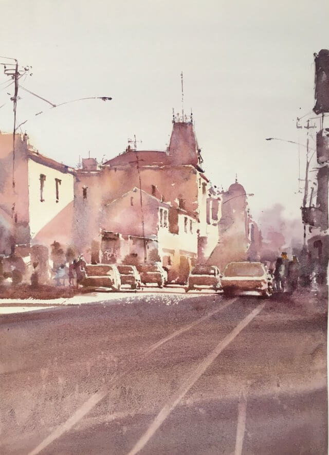
This was the last and I think the most successful. I’d got used to the sequence of washes – lightest in sky and the sunlit parts of the buildings. Second the background and shadows on the buildings. 3rd – cars and dark recesses. 4th and final – people and the foreground and other bits and pieces.
I’d also started to get used to some of the wet in wet for windows and background mistiness.
Next one – number 3 :

Struggled with this one. The original has lots of variation in the darks which I just wasn’t getting. The strong composition makes this one – especially the foreground shadow – which is of course all Mr Z’s doing.
Next one – number 2

This had quite a lot I liked. The color came out well. The combination of dull orange and the purple shadows worked without being too in your face. The center of interest has nice lots of choppy darks and lights which read well without specifically being anything. So not great but not too bad.
Finally – number 1

Again this didn’t come out too badly. I was feeling my way at this point and you can see the background washes are a bit muddy. Nice choppiness in the center of interest and the combination of darks and lights worked well.
So it was a busy day. As usual I’m too close to things to really assess whether it was worthwhile. It’s certainly a different beast copying paintings rather than scenes. The simplification and composition has already been done for you which are two things you don’t have to worry about. Once the drawing is done it’s a case of identifying which value wash goes where and trying not to get too fiddly. I think after another day of these (I have nine in total to have a go at) I’ll concentrate on extreme simplification of some of my own scenes.
After yesterday’s rather glum conclusion it was back to basics again today. I was having a lot of trouble with pretty much everything. The values were either too different or too similar. The colors were not cohesive. The brushstrokes were too heavy handed. The only thing that really held up was the drawing which is one less thing to worry about I suppose.
So what to do? After spending an hour last evening riffling through pinterest I went back to one of the masters – Joseph Zbukvic. His style is deceptive. It looks like he just dashes things off but that masks a mastery of drawing, composition and above all value. Copying one of his paintings is not for the fainthearted but I was ready and had a plan.
Plan :
And here’s the original I was using to paint from :

Okay off we go.
First the thumbnail :

Well I’m not sure what I learned here. Was it worth it? It didn’t really feel like it at the time. Well actually it did help. It made me remember to keep the sunlit portions of the buildings pale and mark in where the shadows fell across the buildings. This got lost in the sketch and it shows.
Second the drawing and first washes :

Fairly happy at this point. Drawing is fine and the first washes are light but have some color. Frankly it’s hard to go wrong for this part.
Next is the tricky bit and I think I learned quite a bit here. The plan was to go to the next darkest value and put in large even areas of the same wash. At this stage this means the roofs and the shadow portions of the buildings. However there is a wrinkle. A lot of the sparkle in Mr Z’s paintings come from the twiddly bits. The little dots and dashes and also the small pieces of white left in between brush strokes. In addition his washes aren’t uniform – they have variation in color and texture and maybe have a couple of layers.
I had to remember all this so I went about it as follows :
Mix up a big purply wash and use a squirrel mop to block in the larger areas but leaving some gaps and not filling in the wash to the edges
Using a smaller synthetic brush (escoda perla) use the same wash mix to put in the edges but giving them some interest and dottiness
Use the small brush to also put in shadow pieces and windows on the sunlit parts of the windows.
After the buildings I had a first pass at the cars. Things to remember about cars :
Things were looking fairly good so I then put in the foreground. It was too light to begin with and I had a couple of goes at it. It’s still a bit light but I felt I’d fiddled too much already. I made sure to get a rough brushstroke at the top where the shadow ended.
So at this point this is what I had :

Frankly I was pretty chuffed at this point. There’s reasonable variation in the washes. The brushstrokes nicely indicate the window and shadows on the buildings and the cars definitely read as cars. A little scrappy in the foreground but you can’t have everything.
Now I was getting worried I was going to screw everything up. All I had left to do was to put in the right hand side darker buildings, the people and the lampposts and telegraph poles. I almost went too dark with all of these but sponged off the worst of it. The final thing has a lot to recommend it :

So what did I learn? Let’s make a list :
Now all I need to do is to carry this over into my own paintings.
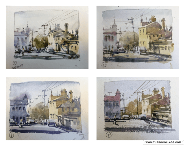
After the french village post-mortem I was musing about how to go about simplifying my buildings paintings. Going smaller was my first thought and all of these are done in a 5″x7″ Strathmore sketchbook. The paper isn’t my favorite by a long chalk but it dries very quickly and forces me to work fast. I wanted to do multiple copies of a fairly simple Joseph Zbukvic painting and see if I could get better at seeing the big shapes and get the values.
So 4 small paintings done in a couple of hours. You can see how things changed over the 4 paintings. The first one is a little bitty. I’m not getting the big value areas well and the colors are a little slapdash. Paintings 2,3, and 4 are much better in both regards. It was a really worthwhile exercise to do. Seeing them all together shows a big difference to me. Strangely I didn’t notice any difference as I was painting them.
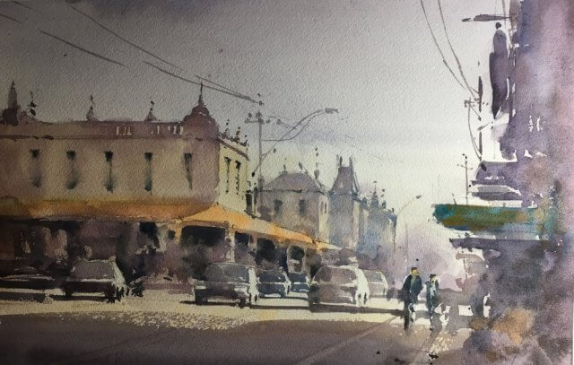
Here’s the original Zbukvic image – lovely isn’t it?