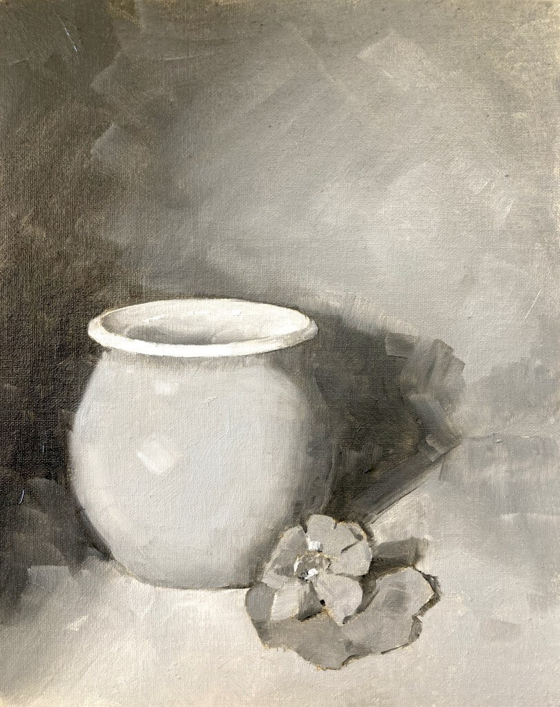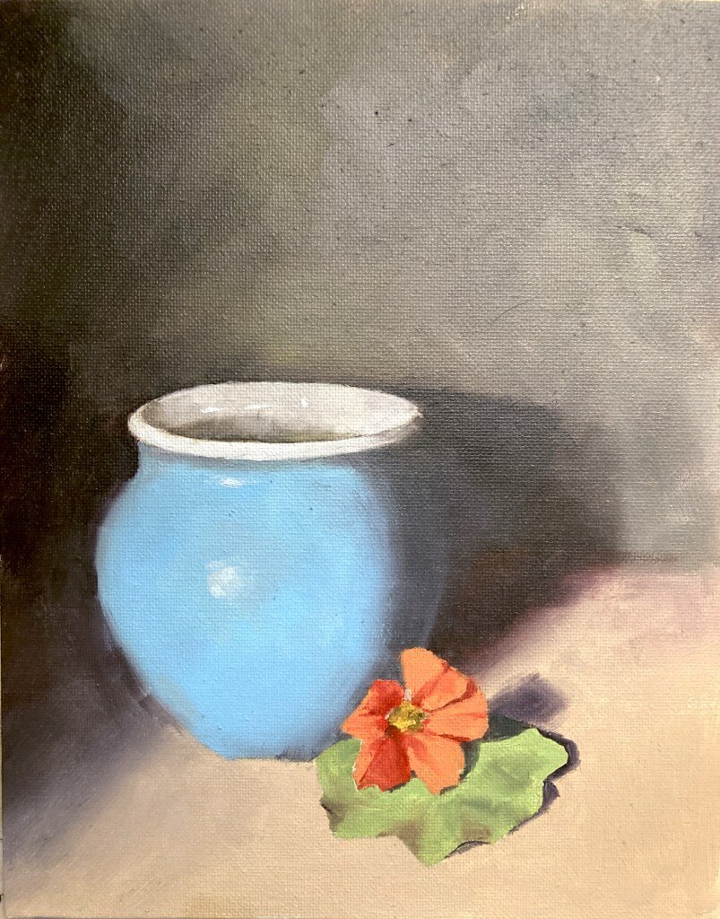
This month it was a limited palette still life. The photo has quite a range of colors so it was going to be tricky to choose the 3 pigments wisely. I take part in a monthly oil painting challenge and we all have a go and compare. The photo has quite a range of colors so it was going to be tricky to choose the 3 pigments wisely.

One of the most famous limited palettes is the Zorn palette. That is cadium red, yellow ochre, and black which obviously wasn’t going to cut the mustard if we wanted accurate color matches.
Choose A Limited Palette Carefully
So for this first version I wanted to choose pigments that gave me the best chance of nailing those colors as accurately as possible. This first meant choosing a good blue in order to mix that pot and a bright red-orange to hit the flower. The final color had to be a yellow that could mix with the red to make the orange and also with the blue to make the green of the leaves.
So what to choose? That blue of the pot is pretty green. I had some winsor blue greenshade (which is a phthalo blue) was a good choice there. For the red I went with the really high chroma naphthol red. This red leans toward orange and is very powerful. Should be able to hit the high chromas with that. For the yellow I went with a greenish yellow so I’d have a chance at hitting the green.
The Results Were Good for this Limited Palette Still Life
As it turned out those colors were good choices. The blue of the pot was fairly easy to hit. I undercooked the chroma a little on the flower but that was more due to my slapdash mixing than a poor choice of paints. Similarly with the green of the leaf I pushed the color more toward yellow than it really ought to have been. There’s no real excuse for this – I had the blue and could easily have nudged it back towards the blue.
[activecampaign form=10 css=1]

But on the whole they were good choices and I’m pretty happy with the results of the limited palette still life exercise.

Online Zoom Classes
I run online zoom courses regularly for both beginners and more advanced students. Please check out my workshop page.