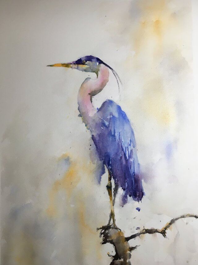
A great blue heron watercolor is a wonderful subject to paint. The shapes are spectacular. The colors are muted yet striking. And it’s a subject that suits watercolor perfectly. Plenty of lost edges, broad brushwork, and plenty of fun sploshy washes. Watercolor art has a freedom and expressiveness unlike any other. It’s unbelievably difficult to pull off but when it does it’s worth it.
Having said that it’s been a while. A lot has been happening here at Cuff and Clamp towers and the paint brushes have been lying idle. I’ve made a resolution to be more attentive to my facebook ‘Paint Colorful Birds for Fun Page’. The page is very laid back and yes, fun, and deserves a bit of love. So this week – herons!
To Plan or Just Paint?
Watercolor painting is a rollercoaster ride at the best of times. There’s so much to think about and often everything has to get done before the paint dries. So a little planning ahead of time can reap huge rewards. If we can make some of the decisions before we even pick up the brush it will leave us time to make more expressive decisions during the actual painting. That isn’t to say that just diving in and painting isn’t allowed. This can be a lot of fun and sometimes I just do that. I call it ‘freestyling’ and it can lead to surprising work that you wouldn’t otherwise produce. It is hit and miss though and I can get more consistent results with a bit of forethought. Try it both ways – painting should be fun and there are no hard and fast rules
Painting the Heron
The first thing I do when painting a heron (or indeed any subject) is to work out where the light is coming from. In this case the light is coming from the right and so our shadows will mostly be on the left. The shape of the neck (which is a large part of the attraction of herons for me) gives some interesting shadows. The neck curves around so the position of the shadows changes. Also the head is casting a shadow on the top curved part of the neck. This is quite useful as it will allow us to bring out the form of that part.
The next thing I do is to identify the main value shapes. I simplified the values on the body – it’s mainly just two values – one for the light side and one for the shadow side. These are two distinct shapes and two distinct colors. It’s generally a bad idea just to take the light color and darken it – treat them as different colors. Once I’ve identified the value shapes and values I then work out a rough color scheme. I wanted to push the main color more towards purple than it was in the reference photo. And I wanted a nice rich color in the shadow side to show the form and give the painting a little intensity.
I didn’t worry too much about the branch. They tend to paint themselves and they’re not the main focus of the picture so they can remain pretty loose. The head needed a bit of planning but pretty much only to identify the location and color of the shadow and a mental note to leave the paper white around the eye so we can make some nice crisp contrasts.
Troublesome Backgrounds
Painting the bird was surprisingly straightforward. Sometimes it just happens like that. Sadly not very often though. I was happy that the painting remained true to the shape and character of the bird with just enough looseness and simplification to make the image visually interesting. The background was a different thing altogether. I didn’t want to put in anything too fussy around the bird. On the other hand I didn’t want to leave it completely stark white. Instead I thought of a light valued washy background picking out the main colors. It also has a slight diagonal thrust to the color. This contrasts well with the straight up and down nature of the bird itself. Well this is easy to say in retrospect. At the time it was a bit of a gamble. But the gamble paid off.
The verdict
So in the end I was very pleased with the result. A bird watercolor poses some subtle problems in showing the form and this simplified approach really paid off. The original is now in a new home but I do have a small number of prints available. An art print is a slightly smaller size than the original and will mat up to fit in a 16”x20” frame. Please contact me if interested. People often buy them as a gift for a bird lover but they’re great just to have on the wall. Looking around I just realized that I don’t have many bird paintings up on the wall. I will have to rectify that I think.

Online Zoom Classes
I run online zoom courses regularly for both beginners and more advanced students. Please check out my workshop page.
Painting 2 – Wading Blue Heron Watercolor
This second wading blue heron watercolor was a real joy to paint. Although it took a couple of false starts before it happened.
Capturing the Character with Edges
The character of the bird was surprisingly hard to capture. The wonderful angled neck and feathered body needed a lot of thought to get right. I wanted to keep this really quite loose. I painted a lot of lost edges but not so many that the form disappears. This is surprisingly tricky and it’s easy to either go too far or not far enough. If you go too far then the painting just looks sloppy. If you are too timid the painting looks stiff.
Choosing the Color
Herons have a very unique coloration. In some lights they look almost grey. At other times they are close to a purple. In this I wanted to go more towards the purple side. In most of my paintings I like very subtle color (although I’ve often struggled to achieve it). For this painting, however, I could punch up the purple a little as there’s little else to clash with it.
Blue Heron Video Demo
I’ve started videoing a lot of my paintings. I try and talk through the process as much as possible. In the early years just sitting and painting was the best way to learn. The second best thing was watching other people paint and hearing them talk through the process. Each painting is a series of decisions and problems and hearing how different people solve them helped me enormously.
In the hope that others might benefit from my struggles I have a heron video demo on my youtube channel. I hope you like it and would love you to subscribe for future videos.
Both these paintings are now sold but I paint a heron a couple of times a year. They are pretty popular but I currently have the following one for sale. I ship to the United States and worldwide and if you’re interested in commissioning artwork please contact me and we can talk further.
