Painting is slowly getting easier in that it doesn’t feel like pulling teeth any more. The results may or may not be getting better but at least the process is getting more familiar and I’m getting some enjoyment out of it.
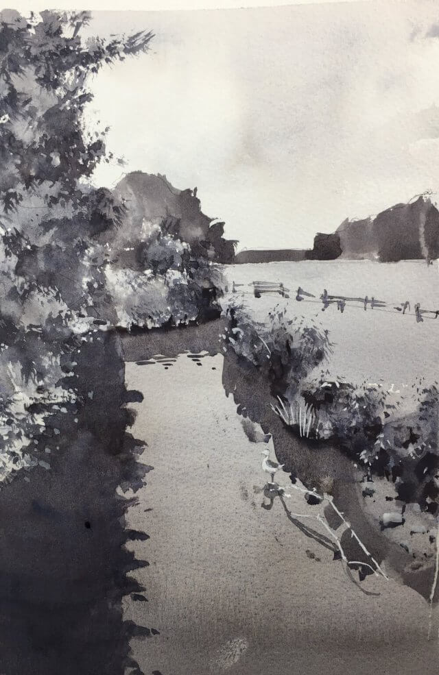
I’m continuing with value studies from my lucky dip photo bag. This one I applied my simplifying technique of stripping everything back to a few value shapes and finally a single detail shape with the bulk of the contrast. This detail shape can be a pretty odd shape and, in this scene, includes the foreground trees as well as the bushes on the other side of the bank. They’re contiguous in 2d if not in 3d.
I think this worked out quite well. It’s not meant to be a finished painting but I think I could work this one up if I wanted to. Onwards!
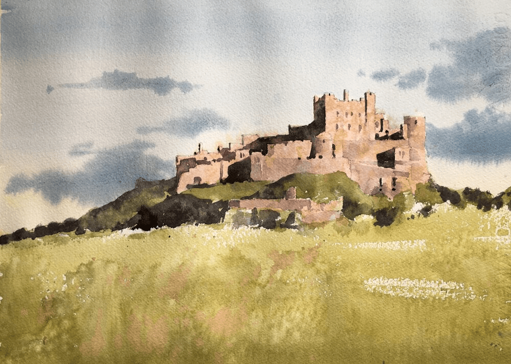
Today’s painting was a Bamburgh Castle watercolor demo. And it was enormous fun to do and came out really well I think.
Put the main shapes in with pencil
I drew the rough shapes first but didn’t include a lot of detail. I left the clouds to be put in purely with paint and similarly left out most of the windows on the castle. The shadows are important though as they create most of the form of the castle. These were carefully placed and, as they’re pretty dark, the graphite lines won’t show in the final painting.
Before putting paint to paper – some careful color mixing.
It’s tempting to just rush in and start splashing paint on the paper. And if you’re that way inclined by all means go ahead. It is fun after all. However, I’ve found over the last couple of years that if I spend some time looking, identifying and mixing the colors I’m going to use the painting goes *much* better.
Try guessing a color just by looking at it first
I start by identifying a few key areas of the painting. In this case it would be the sky, the castle walls, the foreground and the grass/trees around the castle walls. Using my color isolator I take a guess at defining the color and ask myself – what is the hue (blue,green, pinkish-beige), the value (mid, light, dark), and finally the chroma. The chroma is the brightness of the color. The lower the chroma then the grayer the color.
Use the color isolator to check your guess
gray color isolator
I then take the color isolator (fancy name for a 3″x5″ piece of gray paper with a 1/2 inch square cut into it) and place it over the color I’m trying to match. This changes how your eye perceives it and it can be a surprise how off you can be. After using this for a while you get experience in how your brain fools you (shadows!!! ) and your guesses get much closer.
Mix a swatch of color to match
Once I’ve checked my guess I draw a 1 inch square on a piece of scrap watercolor paper (doesn’t have to be the good stuff) and mix up the color. If you take a look at the video you’ll be able to see how I get there.
I videoed the whole process of this. Here’s the first part which is a link to my youtube channel. First we have the planning, color matching and drawing stages. (btw if you’re interested in any upcoming demos or livestreams please subscribe to my mailing list).
And finally the painting!
We’ve done all the hard work so now the fun part! The painting goes relatively quickly and we know the main colors and values so we don’t have to fret about that. We can concentrate on putting the paint on the paper, some texture, and generally making it work as a painting.
Enormous fun to do this. Here’s the second video part of the process – the painting.
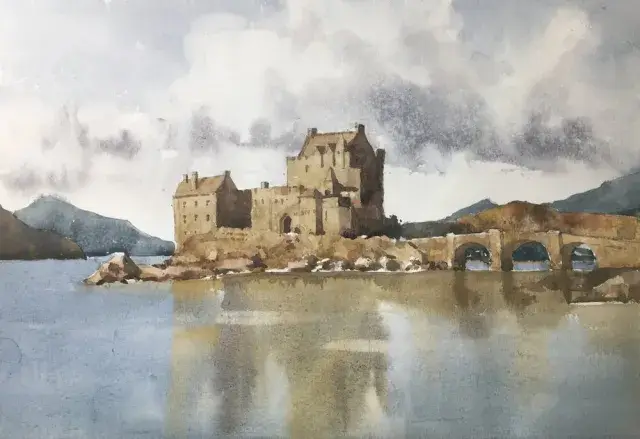
This step by step Eilean Donan Castle watercolor painting is in muted tones. It’s always a favorite and there isn’t a view of this that isn’t worth painting. I especially loved the warm ochres of the castle contrasting with the blues of the sky and water. This watercolor castle tutorial was great fun to do. If you try it I’d love to see what you do!
The Castle Drawing is Simple and in Outline
We only want an indication of the castle and its surroundings on the paper. So no detail in the walls and very few windows or twiddly bits. There are also no pencil marks in the sky or the water. We’ll put the clouds and the reflections in as we paint.
Eilean Donan castle drawing
Work out your color mixes ahead of time
Before even starting to paint the castle watercolor I did some color swatches on a piece of scrap paper. This allows me to do some planning and thinking ahead of time. When you’re in the middle of a watercolor painting there’s very little time to waste. The paint is drying and you have to get those marks right before they dry. So anything we can work out before we get the brushes wet the better.
Color swatches for Eilean Donan watercolor painting
I’ve also included Munsell notation for the colors. This isn’t really necessary (although I find it very useful) as long as you try and match that color as close as you can from the reference.
My process is I match the important areas to the Munsell system and practice hitting the right hue, value, and chroma. I can always tell if the color palette will result in a harmonious picture from the result. Definitely looked good for this one.
I you want to know more about how the Munsell color system can help click through to this post. It also includes information about the online ChromaMagic tool which helps you see color more accurately.
Start your Castle Watercolor Painting with the Sky
Castle Watercolor Sky
I started with the sky and worked it wet in wet. This keeps the edges of the clouds soft. While the paper is still wet you can drop in slightly darker color to indicate the shadows on the undersides of the clouds.
The background mountains went in next. These are suprisingly dark but I kept the colors muted towards grey. They form a good backdrop to the castle itself and the dark color provides a nice contrast.
Castle Watercolor Painting – First Layer for the Walls
Castle watercolor first layer
We’re going to paint the castle itself in layers. I’ve painted a few watercolor castles and I find this gives a great effect. So we don’t want any detail in this first layer. This will be the base layer of the walls. You can add some texture into this by using a water spray bottle or splattering some water with your brush.
Painting the Water and Reflections
Water and reflections
The water and reflections needs to be soft so I made the paper wet with a clean brush full of water. I then brushed in the reflections of the sky and the castle walls and dragged them down slightly to get the reflection effect. As the paper is wet when we do this the colors meld together. This isn’t the final step in the reflections yet but I wanted to get something on the paper to be able to judge the rest of it more easily.
Now the Magic Happens! The Shadows
This is where the magic happens! It’s the best bit! The painting has been looking a little flat up to this point. We’ve put all the first layers in but we have no darks in there! These are what will give a sense of three dimensions to the castle and add some interest to the painting.
Second layer castle watercolor – darks
The shadows are put in simply with a darker wash of ultramarine and burnt sienna. The darks go in on the side of the castle away from the light (the right) and also under the arches of the bridge. I also start to put in some shadows for the rocks at the base of the building.
Things are looking a lot better now. Phew! Now the main shadows are in and working I can put in the details for the windows, chimneys and doors. Note that if the previous step hasn’t worked and you don’t have something that’s reading as three-dimensional no amount of detail will fix it. I know – I’ve been there many times.
Castle details
And go careful with the details. The windows may look dark but they only need to be a shade or two darker than the walls. They’ll really stand out and catch the eye if you put them in close to black.
Final Steps in your Castle Watercolor Painting
Darken the water and reflections
I was fairly happy at this point but I knew that the water and reflections were too light. I washed over the water again with a glaze of blue, light and dark brown. This gives the water a definite value change compared to the sky and makes the painting’s composition more harmonious. As a final touch I took a very dry synthetic brush and dragged horizontally through the reflection area. This has to be done while the paint is still wet and gives an effect of ripples on the water.
Final Thoughts….
This was a really enjoyable watercolor painting to paint. There were a few hairy moments along the way (aren’t there always) but it all came together in the end. I still really like the color scheme. Only a few colors used but they work together well.
[activecampaign form=10 css=1]
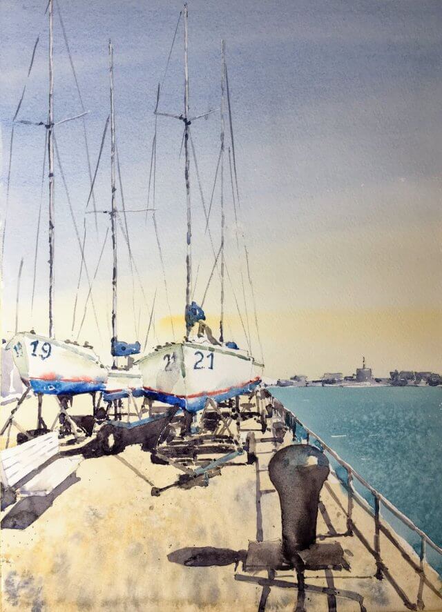
And Before You Go – Another Castle Watercolor Painting!
I’ve been saving this scene for a bit since our painting trip to the Naval Yard in Boston. I had a disastrous outing with a previous scene but couldn’t resist the boats for any longer. I’m pretty happy – the effect of strong sunlight is there and the composition is pleasing. A good days work.
Don’t let anyone ever tell you painting is relaxing. I’ve been suffering a bit of mojo deflation recently and nothing has been coming out well. Until today that is!
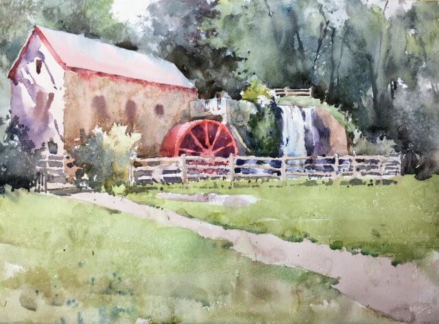
This is a scene of the Grist Mill in Sudbury which was built as an ‘improved’ mill by Henry Ford (yes that one) in 1924. After spending some time on site earlier this year I’ve held off painting a full painting as I wasn’t sure how to attack such a traditional scene. But I think it came out pretty well. Very happy and the mojo is restored.
Some intermediates :
Grist Mill Sudbury Watercolor Painting in progressGrist Mill Sudbury watercolorpainting almost finished
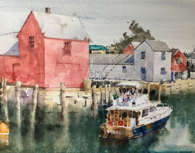
This scene is almost too familiar to paint and I’ve avoided it until now. Apart from the familiarity of the subject I’ve also avoided it because it didn’t really grab me compositionally. It is just a big red shed after all.
Yesterday, however I thought ‘why not?’ and set to work from a shot I took about 5 years ago. After much cropping I settled on what I thought was a simple arrangement. In practice, however, this turned out to be pretty complicated and ended up being a two day affair.
I started with hot press paper which had worked out so well with the Orchard Beach painting. The drawing went well – kept things pretty loose and undefined :
Next comes the hard bit – initial washes. I’m keeping away from the darks right now and wanted to keep the values close together. I especially didn’t want to overdo the shadow on the red building. Just dark enough to show it’s in sunlight but not so dark it ruins the effect. I was also trying hard to get some texture and variation into the broad areas of color. Spraying with water and some judicious light glazing kept these areas interesting.
Putting the windows in is always tricky. It never ceases to amaze me how little detail you need for an area to say ‘I’m a window’. In fact if you get too accurate it looks odd and pasted on. Pretty happy all round at this point.
motif #1 rockport watercolor initial washes
Next was going in with the darker areas around the waterline. This is always tricky and it could go horribly wrong at this point.
Adding in darks around the waterline
Phew. Got away with it. It’s starting to come together now. There was a sticky moment when the boat wasn’t tied into the water and had that painted on look. Some carefully placed darks and blending of color between boat and water saved the day.
At this point as long as I don’t do anything really stupid I should be ok.
Almost finished
Almost home here. The boat is in with just enough detail and contrast to be interesting but not overdefined. The stone wall is suggested with a few lines. Just some touching up and we’re done.
Final motif #1 watercolor
The final thing. I think I’m ok with it. As always it’ll take a couple of days to reveal the stuff I really like and also the stuff I hate. Fingers crossed.