Boston Common Watercolor Painting

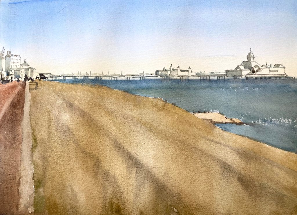
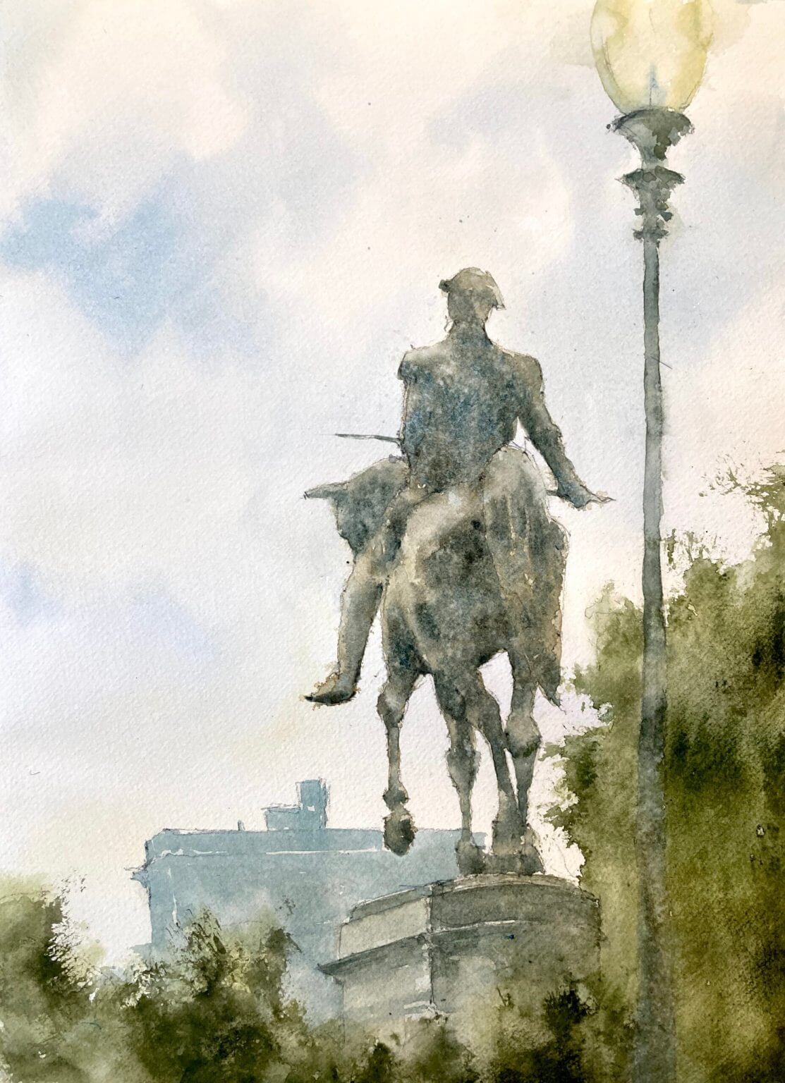
Boston Common watercolor painting – day 13 of 30 in 30. I used to walk through the Common on my way to get my hair cut at a fancy Newbury St salon. This was back when we both had the fancy jobs and I hadn’t had any mad ideas of giving everything up and painting full time. Can’t say I miss the hair cuts but I do miss Boston Common. I wanted to focus on the statue and keep the buildings (probably a hotel?) misty and in the background.

Intersecting shapes attracted me to the composition

One of the things that really attracted me to this composition was the way the horse’s legs intersect giving an abstract pattern. As the statue is against the light the values are very close on the figure and the horse. This gives it a subtle, misty feel which I really like. The added texture due to granulating paint (mostly cerulean blue) and some water splattering adds to the effect.

Verticals are vertical – do I really have to say this again?

But oh that lamppost! It’s gone past loose to sloppy and I didn’t keep it straight. Lost edges are fine here (in fact probably essential) but I didn’t keep my eye on the ball here and the painting suffers.

On balance a good outcome

But on the whole this came out rather well I think. I love the texture on the statue and the muted colors. I’m getting behind on a painting a day so they’re coming thick and fast right now. Helps in some ways as you don’t worry too much over details.

A video to end with

I didn’t record this one (wish I had done now!) but here’s a link to a another Boston painting which was livestreamed in November. If you want to be notified of any upcoming videos or livestreams please subscribe to my youtube channel and join my mailing list.

YouTube player

Beach Watercolor Painting

A beach watercolor painting is always popular and fun to paint. There are some gotchas to look out for however, and this is what you need to do.

Beach Paintings – Sand Isn’t Often Yellow

It’s really tempting to look at a sandy beach and confidently reach for the yellow or the yellow ochre. However if we look closely that isn’t the case. If we isolate the color we can suddenly see that sand is actually often a very grayed out almost beige color. It’s only when it’s painted next to the blue of the sea that it starts to read as yellow. Now in this painting I’ve somewhat overdone the yellow even though I tried not to! Have a look at these paintings of Manchester by-the-sea to see what I mean.

Don’t Overcomplicate Water in your Watercolor Beach Painting

Now there are lot of really good seascape painters. Fredrick Judd Waugh is one of my faves. And they really do go to town on waves and breakers and spray. But in a scene like this it’s really not necessary. Now if the sea was the main element in the picture then that would be a different matter. But here we have the sand, the pier (which is really the main focus), and the buildings. All of these have a lot of detail and fiddly bits. Trying to put waves and hundreds of different value changes into the sea would just overwhelm the painting.

Daily Painting Doesn’t Always End in Success

Well this Eastbourne watercolor painting was meant to be a quick and easy one but it didn’t turn out that way. It’s great on these daily paintings to try new things but that also means the failure rate increases. Day 12 of 30 in 30 – almost half way through!

[activecampaign form=10 css=1]

Michele Clamp Studio Wall

Motif #1, Rockport Watercolor Painting

Another one from the archives and a view of the very popular Motif #1 that has a bit more compositional interest than most. As usual I’m not sure about this. I’m rushing these in order to get them done in one day so there’s some areas that I should have thought through more. But on the whole it hangs together well. Day 8 of 30 in 30 – long way to go.

New England Coast Watercolor Painting

A New England coast watercolor painting today. Lots of very close values. It is a surprisingly tricky view to paint and I’m fairly happy with it. Day 6 of 30 in 30.

Some thoughts:

Keep The Main Shapes Large

Although there’s a lot going on in the center of the painting I didn’t want to overwhelm the viewer with lots of choppy detail. If you stand back from the painting you can see there are 3 main shapes: the sky, the water, and the jetty. I kept the values of those around an average value. The sky is light, the water is slightly darker, and the jetty is much darker still.

Vary the Value Within the Main Shapes

The interest in the painting happens within that big dark shape. Even though at a distance it looks uniform when you get closer in there’s a lot going on there. A lot of detail and activity is just suggested by slight changes in value. It gives the eye something to focus on but still keeps the ‘big look’ of the painting as a whole. Stapleton Kearns writes about this a lot (and he should know!) and his blog is well worth a look.

Don’t have Detail Everywhere in your Coast Watercolor Painting

This isn’t a hard and fast rule but I find I like paintings where the following happens. I like a painting where some areas left pretty empty and some areas have lots going on. Or some regions have a lot of color change and others have very little. Or some regions have contrast or texture and others have none. You get the idea. I intentionally kept both the sky and the water with minimal detail. This allowed the central portion to have all the action. If you do this carefully and provide a few connecting areas – the boats and the reflections in this case – it stops the detail overwhelming the viewer. And, frankly, I just like the way it looks!

While I’m Here

Vermont farm watercolor

Online Zoom Classes

I run online zoom courses regularly for both beginners and more advanced students. Please check out my workshop page.

Oregon Mountain Landscape Watercolor Painting

For this week’s class Lisa provided us with a great photo of an Oregon mountain landscape watercolor painting.

Examine The Photo Composition

The photo was pretty well composed and had a good range of big shapes an values. There wasn’t a strong directional light but that wasn’t so much of a problem. One possibility could be to invent some light and put in some shadows. However, there was quite a lot of contrast in the photo already. There was the strong foreground, the lighter water, and the light to mid-valued mountains. So we left the light as it was.

[activecampaign form=10 css=1]

Michele Clamp Studio Wall

Have a Well-Defined Center of Interest

Another positive for this photo is that it had a really good well-defined center of interest. The boats and the wooden poles give the viewer something to look at but don’t draw too much attention away from the rest of the picture. And the poles themselves provide a nice connection point from the foreground to the background. That way things are held together and don’t look too separate

Texture and Values Add Interest to the Landscape Painting

When it came to actually painting we concentrated on getting each of the big shapes the right value. Light for the sky and water, mid-tones for the foreground, and darks for the boats and poles. But if we’d left it too even there wouldn’t be much interesting to look at. So we added in slight value variations in the sky and mountains. For the sky we added in some clouds and softened the edges using a damp brush. For the mountains we varied the value with water to show some slight undulations in the terrain. We also varied the color slightly by dropping in slightly different hues. The final effect is slightly shimmering which I like.

Vermont farm watercolor

Online Zoom Classes

I run online zoom courses regularly for both beginners and more advanced students. Please check out my workshop page.

The Foreground Needs Stronger Variation and Texture

The foreground also needed a little bit more interest. It’s closer to us so we should be able to see a bit more detail. Even if we don’t want to paint every blade of grass (which we definitely don’t) we needed to put some variation in there. Like the mountains we varied the value and color a little to show some lumps and bumps and tufts. We also used the spray bottle to lightly add in some water drops. They leave a mottled effect on the surface when they dry which is a really good way to add some texture. Don’t overdo it though – it can look a little gimmicky if overdone.

The Boats Are Put in Broadly

The final things we put were the boats and poles at the center of interest. These were put in very broadly with only a few strokes. As we wanted the most contrast here we also left little sparkles of white paper showing through here and there.

Final Thoughts on the Mountain Landscape Watercolor Painting

I’m actually pretty happy with this although I might just tweak the foreground values a little tomorrow to create more of a lead in.