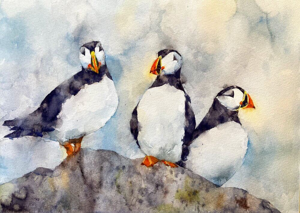
Puffin original watercolor painting: watercolor on 100% cotton cold press Fabriano Artistico.
A few years ago I sold a lovely painting of 5 puffins and, to be honest, I’ve never managed to quite capture again the looseness and lightness of touch with this subject. So today was the day to kill this once and for all.
For me this was quite a long painting. Even though the style is loose and sploshy it was very carefully planned and painted in several layers. I think I’m happy although I could possibly pushed it a little more to the sploshy side.
Here we go with the stages:
First stage after the drawing was to put light washes of color roughly where the darks and colors were going to go. I’m pushing through the edges as much as possible just being careful to keep away from areas of detail like the faces. Blossoms, drips and sploshes are welcomes at this stage. It will al add interest to the final painting.
Next layer is to start just indicating some of the darks and bringing some of the edges in. Nothing too defined at this point so we can keep that lovely shimmering image.
We’re sharpening up the image here. Going darker where it needs it on the black parts of the birds and being quite crisp on the face and beak.
The final thing. I beefed up the background a little to bring out the whites of the birds but without making it a subject in itself. A few more darks on the black feathers, a little shading on the faces and we’re done!
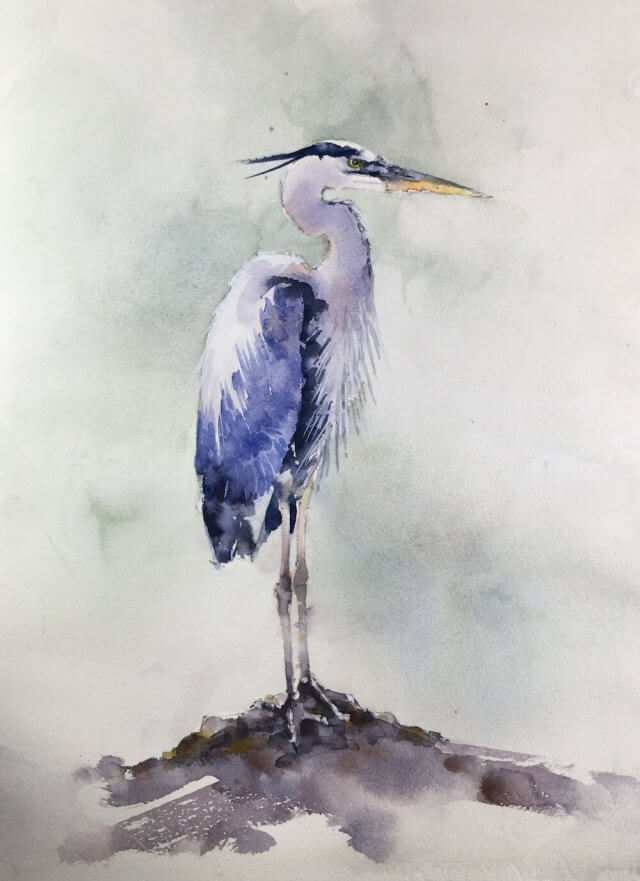
Time for another heron. These are always popular but they are very tricky to do and never seem to get easier. Very happy with this one right now. Some nice detail in the feathers and the background brings out the lighter colors without overwhelming the bird. Let’s see if it still passes muster tomorrow morning.
If it does there’s also video which I’ll upload later.
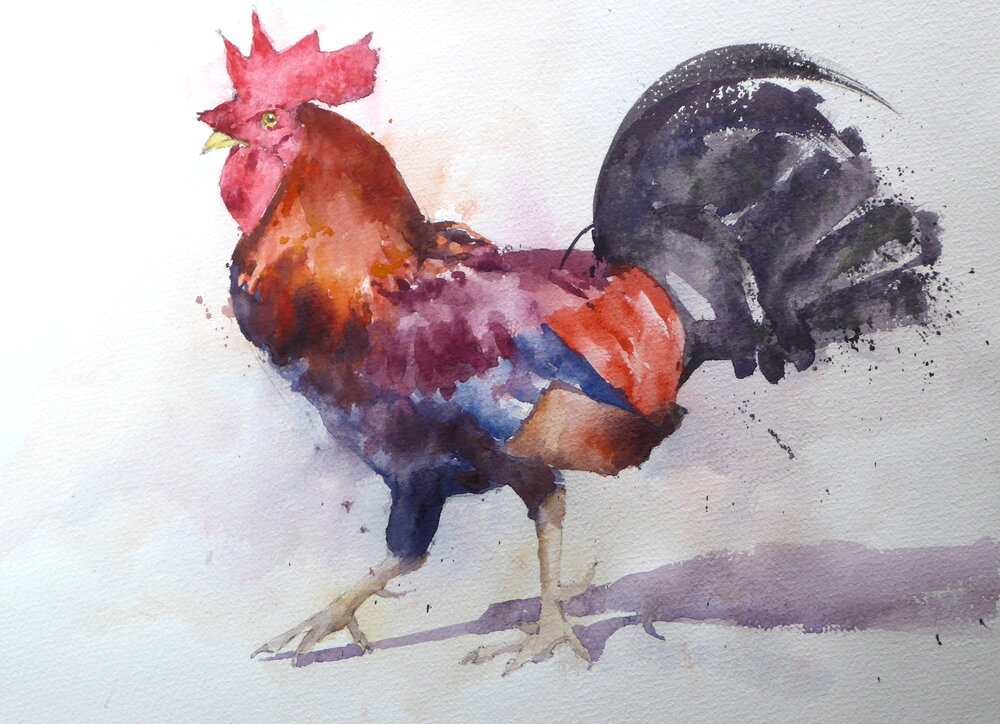
However, this watercolor rooster is deceptively tricky. A lot of color but not a lot of value changes so I had to introduce more to get the form of the body. Fun though – the colors came out well and the final result has a lot of life and character. This artist is quite happy with this watercolor painting. I’ve done a number of watercolor roosters and this one is my favorite. Would be quite happy with this rooster art on the wall.
Watercolor Rooster Tutorial
I describe the painting process below. In summary I first make some carefully matched color swatches to the reference. I then draw out the outline of the bird and put in some light washes of color. The next layer puts in darker areas and then I finally put in some detail and slight changes to pull the whole thing together.
Mixing some color swatches help with the final painting
Rooster color swatches
I first mixed up some swatches after matching to Munsell chips. Everything is pretty low in value – highest is a 4 which was surprising. The colors looked good together though which is a good sign. I find that if the main color swatches have harmony the final painting will as well. Watercolor rooster paintings don’t often have this many colors in them so it’s good to get the mixes and values planned out ahead of time.
Draw out the rooster watercolor with a mechanical pencil.
Rooster drawing Michele Clamp
Next the drawing. Careful comparisons across the body both horizontally and vertically to make sure everything lined up. Where possible I use negative shapes to get the right angles. I always use a mechanical pencil for drawing. My favorite is this Faber-Castell one although any other one works just as well. I tend to use a 0.7mm HB lead. Any softer and the graphite smudges which we don’t want with transparent watercolor. Any harder and the lead will leave grooves in the paper. The paint will tend to flow into the grooves and show up darker than the surrounds.
First washes on the rooster watercolor – light and loose around the edges
Rooster watercolor first washes
The first washes. I toyed with the idea of just painting the whole thing in one layer but finally plumped for putting in a light under wash of the main colors and intentionally went outside the lines into the background. When finished this layer is barely visible but gives some visual interest and some depth to the final picture.
Second layer – putting in the mid-tones and darks
Second layer watercolor darks
Half way through the second layer here. I’ve kept the eye and beak areas clear as they go in at the end. The tail feathers have to go in pretty much in one go – if it goes wrong you have to live with it. Worked out this time thankfully. In general I find with bird watercolors that you don’t need to put too much detail into the feet. In fact too much detail and contrast in this area can draw the eye and detract from the rest of the bird. In rooster watercolor paintings this isn’t so much of a problem. There’s so much going on in the rest of the picture that it’s not as important. But I stuck to keeping them simple and I think it worked out. The shadow on the ground was put in with a mix of ultramarine blue and burnt sienna. This also helped to define the legs and place the bird in space.
Final shot on the easel
Rooster watercolor easel shot
The final thing. Pretty handsome I think. I hope this has showed you a little of how to paint a rooster in watercolor and, if you try it yourself, I hope you have as much fun as I did.
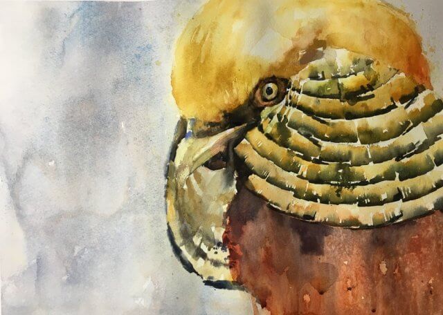
Why not do a bird I thought. It’s been quite a while since I’ve done a bird and they’re so much easier than complicated city scenes. Well I was wrong on the last part. This gave me all sorts of trouble but a lot of it came together at the end.
I’ve been working larger on the last couple of paintings. Having seen my sunflowers up on the wall at Post Road Art and visiting the North East Watercolor Exhibition I can certainly afford some more paper real estate.
Going large has it’s own problems. Getting too tight and detailed is one. Not using a big enough brush and ending up with lots of little dabby strokes is another. Also the larger space allows you to put in much stronger color. In fact it needs it otherwise things look very washed out.
So this eagle looks pretty good to me. I may revisit and soften up some edges but it’ll depend what it looks like in the morning.
Edit: Great news! This won the People’s Choice award at Marlborough’s Post Road Art Center Open Exhibit. A nice Christimas present for me and I’m sure I’ll be stocking up on supplies from them with the prize money. Many thanks to all who voted and Randi et al at the Center.