Vermont Landscape Watercolor

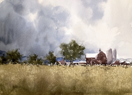
The Vermont Landscape is quite special in this region. Fields and farms and wonderful skies. I’ve painted this farm once before and wanted to do another version with a slightly different feel. I recently took part in a Dan Marshall challenge of a Colorado landscape. It had a wonderful stormy sky so I took inspiration from that.

Sign up for updates on classes and free livestreams


Reference Photos are Often Not Perfect – so Change Them!

Vermont Farm Reference Photo

The original reference photo had a rather uninspiring almost cloudless blue sky so that came out and I put in some dramatic clouds and gave them some interesting shapes. I wanted to keep the bright sunlight on the roofs so I kept the sky clearer to the right so the whole thing read well. Doing this also helped focus the painting on the farm as center of interest. I went back and forth about the road. Sometimes roads can help a composition but, in this case, I couldn’t make it work without it looking a little hackneyed. So out it went. I ended up with a composition I like. Most of the detail is in a band across the middle with large areas above and below with relatively little going on.

A Value Study can Often Help Solve Problems

I didn’t do a value study this time. In most cases this really helps. If a painting doesn’t work in black and white and in a 5×7″ format it’s unlikely to work on a larger scale and in color. But in this case I’d had a warm up with the previous landscape. I’d also painted this subject before and so knew my way around it. So I took a chance and it paid off.

Portraying the Character in a Vermont Landscape

The sky is the main character in this work. The farm buildings still in sunlight contrast with the approaching storm clouds. I felt that this highlights the vulnerability of humans and our abilities to control our environment with the sheer power of earth’s climate whims. The buildings are put in broadly with broad strokes of color and minimal detail. The sky is, in contrast, painted wet in wet in multiple layers.

Landscape Video Demo

I often video my paintings for teaching purposes but in this case I didn’t. If you’re interested in the nitty gritty please have a look on my youtube video channel or have a look at the videos on my site. I’ve included a landscape done in a similar manner below.

YouTube player

Sign up for updates on classes and free livestreams


Singing Beach Watercolor Take 2

I was pretty happy with yesterday’s sketch but wanted to get closer on the colors. The sand especially was a little too *pow* for me so back to the color swatches to get closer. The changes I made were to push the sky a little more towards green, the water a little darker and the sand with way less chroma. It’s still the same color which is mostly yellow ochre with a little permanent rose. But to take the chroma down I added some lamp black and a little water to bring the value back to where I wanted it.

Here’s today’s and yesterday’s side by side.

Now personally I prefer today’s version. However other members of the household prefer yesterday’s.

It was definitely worthwhile doing the same scene twice. It takes the pressure off when you’re doing the first one and you can experiment with a few things that you might not otherwise.

Singing Beach Watercolor Sketch

Singing beach watercolor sketch today. Just about an hour and this is a scene I’ve done before but I was never really satisfied. This is getting there but not quite where I want it.

Vermont Town Watercolor

Vermont town main street watercolor painting in progress
Initial washes for Vermont Main Street

Enough with the apples. Let’s get back to some watercolor. I’m really enjoying the street scenes recently. They need a lot of tweaking to design them into something that works. But you also have to keep the sense of place in there. And also make a decent painting out of them. It’s tricky – but rewarding.

So this is the reference image

Reference image for Vermont town watercolor painting

The tower is great of course. But there’s a lot of space in there not doing a whole lot. I toyed with keeping this in – maybe a wider format – and making it more of the subject. But after noodling with some value studies in paint and on the ipad I plumped for compressing the road and keeping the tower and the car as central. Of prime importance are the light roofs leading down to the car. Great arrangement of darks and lights.

Initial value sketch for Vermont town watercolor painting

Those three lights and the car on the left hand side hold everything together. Well that’s the plan. The initial washes went in ok. Some light and dark but I’ve still got half the value scale to play with so a long way to go.

Vermont Main Street watercolor by Michele Clamp

Well here he is finished. I managed to screw up at the last minute (not telling where) but on the whole I’m pretty happy with this. Time will tell of course.

How Important are Value Studies?

Vermont town value study
Vermont Town Value Study. Michele Clamp. Watercolor

How important are value studies? I have to admit that I have only recently started doing them as part of the process. A few years ago I tried to do them but found scaling up to the real painting very difficult. So I stopped. But over the past year I’ve finally found them useful.

After the Marlborough at dusk struggle to a triumph I’m spurred on to another New England street scenes. I really enjoy these but they are hard to design and hard to paint. When they come off though they make really good paintings (IMO of course). Today was value study and color study day. Here is the photo reference:

Vermont town reference image

This is from a visit a few years ago and the strong light and tower caught my eye but, as you can see it’s not an obvious choice for a painting. But if we can make a decent value sketch out of it we may have a chance.

First was some noodling on the ipad. I find this great for trying out ideas. You can work in a small range of values and add new layers if you want to try something out. If it doesn’t work just delete the layer. So what did we find?

Yeah I think there’s something there. I added in some of the buildings on the right hand side to give some balance to the left. I also ruthlessly pushed those dark trees to a lighter value both to push them back and to provide some contrast with the foreground tower and car. The thing I like the most is the pattern of light off the roofs and the car which I need to remember to retain in the final painting.

Ok so far so good – onto some paint value studies. Pretty small with minimal drawing and trying to keep to around 4 values throughout the whole thing.

This is the same sketch at different stages. I was in two minds whether to include the dormer window on the left hand roof so took a photo half way through. I’ve compressed the scene widthways a little so things aren’t too stretched out and made the central car a little more prominent. I think we’re still looking good.

Finally I tried out a very rough color sketch. This was just to try out some colors as the photo colors are not very inspiring but I still want to retain a sense of the hard sunlight.

Watercolor color study for Vermont town

This is teeny – around 2”x4” but I wanted to see if a blue sky would work with some rich browns for the buildings. I’m still in two minds but it looks promising.

Next time – onto a big version!

Watercolor Cityscape – Main Street at Dusk

I really like painting a watercolor cityscape. Great shapes, lots of things going on, and I get to interpret my everyday surroundings.

However this was a huge saga. I’m just going to leave this one here for now but the struggle to get to this point was filled with disaster and frustration. But I got there in the end and I’m very happy.

Watercolor Cityscape Reference Photos Need a Lot of Editing

One of the problems was that the reference photo had a lot of problems. The color scheme was a little odd and there was a lot of extraneous detail that had to be edited out. I also had the problem of the time of day. I originally wanted to do a night painting but I couldn’t get the atmosphere right. So I turned it into more of a dusk painting, lightening up the sky and adding in some more clouds.

Don’t Change Materials When You’re Trying Something New

In hindsight one of my problems was that I changed to use Arches watercolor paper rather than my trusty Fabriano Artistico. I knew that this one was going to be a struggle and could have done without having to readjust back to Arches.

Not Every Painting Works Out First Time

I did several versions of this painting. In fact I almost gave up after the first two. But in this case perseverance paid off and the final thing came together very well.

Lessons Learned for Watercolor Cityscape

I think I need some bullets here.

Finally…

Vermont farm watercolor

Online Zoom Classes

I run online zoom courses regularly for both beginners and more advanced students. Please check out my workshop page.