The Zbukvic Emulation Experience

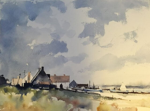
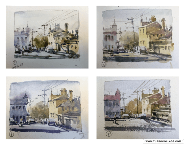
After the french village post-mortem I was musing about how to go about simplifying my buildings paintings.    Going smaller was my first thought and all of these are done in a 5″x7″ Strathmore sketchbook.    The paper isn’t my favorite by a long chalk but it dries very quickly and forces me to work fast.    I wanted to do multiple copies of a fairly simple Joseph Zbukvic painting and see if I could get better at seeing the big shapes and get the values.

So 4 small paintings done in a couple of hours.  You can see how things changed over the 4 paintings.   The first one is a little bitty.   I’m not getting the big value areas well and the colors are a little slapdash.  Paintings 2,3, and 4 are much better in both regards.   It was a really worthwhile exercise to do.   Seeing them all together shows a big difference to me.  Strangely I didn’t notice any difference as I was painting them.

Here’s the original Zbukvic image  – lovely isn’t it?
Original Joseph Zbukvic street scene watercolor painting

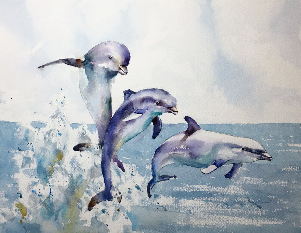
Dolphins Sketch and Painting

A commission came in a couple of weeks ago for a painting of dolphins.   Now I haven’t painted dolphins before and I knew as soon as heard the request that I wanted to have them jumping and lots of water splashing around.   My next thought was – yeah and splashing water is really hard.

But I was excited to try this and spent a fair while looking at pictures of dolphins and water and made some sketches of how to group them

Sketches of dolphins Michele Clamp

I knew as soon as I’d done the sketch that capturing the dolphin character wasn’t going to cause too much trouble.  They’re such lovely shapes and are a pleasure to draw.   The water however….

But in the end the water came out well.   I wanted to contrast the loose splashiness of the sea with the smooth lines of the dolphins and I think that comes across well in the finished painting.

Very happy with this.   


(Original now sold)

Kittery Point – Day 2. Portsmouth Harbor

It’s pretty warm here and I’m discovering that choosing something to paint depends a lot on finding somewhere to sit that isn’t roasting hot but still has something interesting in view.   I know that some people have umbrellas that they attach to their easels/ground/themselves and maybe they’re worth it but it’s yet another thing to lug around.   I’ve also seen people spend more time fiddling with the umbrella than painting and I have enough trouble keeping my easel under control.   But I found a shady spot on a wall where I could sit out of the sun and still have my easel up.    Not the perfect scene but good enough.

Frankly it came out very differently and better than I originally thought.   The first aim was to just paint the boats and leave most of the foliage out.   (Foliage is hard!).   However it turned out that a lot of the foliage crept in and came out pretty well.    Boats came together well – not too much detail, just enough to make sure you know it’s a boat.      As always there are a couple of things annoying me . I put that boat smack bang in the center of the picture which I shouldn’t have.   Also the sea needs a bit more punch – it’s pretty much the same color as the sky and I could have given it more color.

But on the whole – pretty chuffed.

Resting on the porch after a hard afternoon’s work.

Watercolor Landscape After Seago

Back to basics with Seago and we’re now at day 20 of 30 in 30.   Not that Seago is basic mind you.  Far from it.   But after losing my way a bit on the last Venice effort it was time to back off and regroup a little.

Up early for this one – 6am start and it was still dark so the colors were a little hit and miss but it felt good.

Seago landscape copy - sky washes
Seago landscape copy – sky washes

Purely ultramarine and burnt sienna and put in very quickly with a squirrel mop

Original Seago landscape

This is the original.    Beautiful yes?