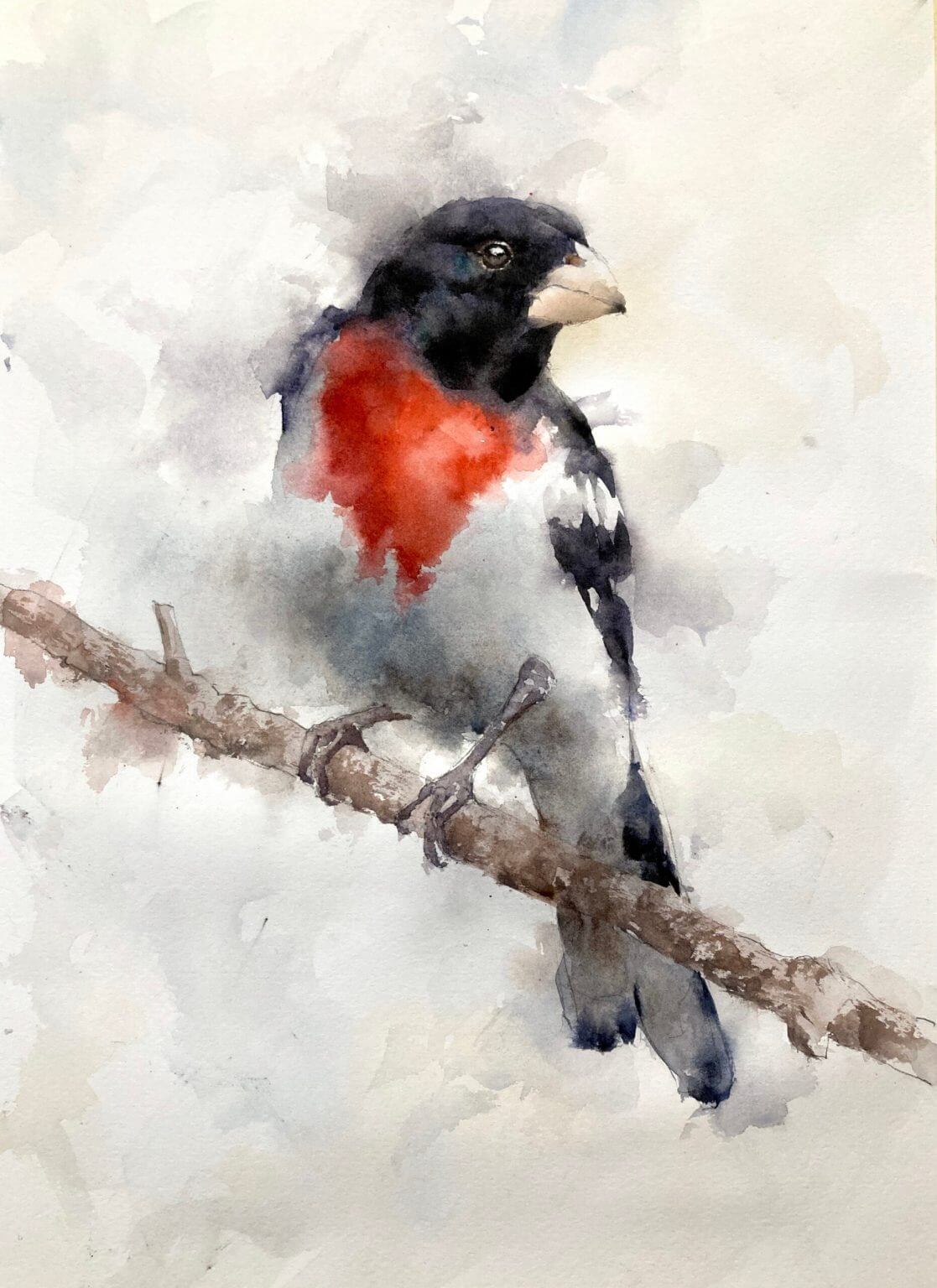
This rose-breasted grosbeak watercolor is painted loosely and is all about the edges. The full process is shown in these videos of a cardinal and a toucan but I’ll describe it briefly here.
Start with a Drawing for the Rose-Breasted Grosbeak Watercolor
First draw out the grosbeak in pencil. Nothing too soft as we don’t want the graphite to smudge and muddy up the painting. I find an HB in a mechanical pencil is good for this. While I’m drawing I’ll be thinking about which areas I want to keep sharp and which areas won’t need as much definition. In this case the face and beak will be sharp and will be the main focus of the painting.
Other areas like the belly region and the tail aren’t quite so important to define. I’ll put these in lightly with the pencil, or, in the case of the belly area maybe not draw them in at all. I’ll also be careful of the feet. It’s tempting to go nuts here and draw in every talon but I find it’s better to keep them simple. Draw the feet in a single shape if possible and only lightly indicate the claws.
The First Layer of Watercolor is Light and Watery
The first layer in this watercolor grosbeak is to put in some color but not to define any edges whatsoever. I mix up light valued (8 or 9) washes of the underlying colors and put them in roughly in the relevant regions. In this case some dabs of red on the breast, some gray underneath the belly where it’s in shadow and some slightly darker grey on the tail and wings and head. Once the dabs of color go down I take a clean brush with some water and *really* pull that color out into surrounding areas. I go right through the edges of the bird and keep adding water so the color fades to nothing.
This First Layer Feels Like You’re Going Wrong – You’re Not!
This layer really feels odd. Pulling all that color through the edges feels like you’re destroying all the drawing but trust me – you’re not. As long as that color is at the top of the value scale and all the edges are softened with water you’ll be fine. It may look dark when you put it down but it will dry back much lighter and will hardly register once you’re done.
But Keep Away from the Face!
While you’re doing all this make sure you don’t go through the face by accident. We want to keep the contrast high in this region so make sure you leave the paper white here. If you do brush through this by accident (it’s easy to do) just take some paper towel when the paper is wet and lift some of the paint. If you catch it quickly enough most should lift off.
The Second Layer we Define the Form of the Bird
Once the first layer is dry we can go in and put in our stronger colors. In this layer we’re going to define the shape and form of the bird. Using stronger colors (about a value 5 for the red and a 2 or 3 for the darks) go in and start defining some of the edges. But we don’t need to define them all! We leave the belly pretty undefined and also parts of the shoulder and wing. Start by putting in a couple of edges and see what it looks like. Keep adding in color until the bird starts to appear.
Don’t Add Too Many Edges in your Rose-Breasted Grosbeak Watercolor
Keep standing back and looking at your painting after every edge you put in. Once the bird starts to appear be careful! We don’t want to overdefine things. Don’t make the outline too sharp-edged. Your painting will be more realistic, convincing and, frankly, better if you stop before everything is filled in. It’s tricky – better to stop too early than too late.
Define the Face and the beak.
We not put in the face, eye and beak for our rose-breasted grosbeak watercolor. When we do this the whole thing usually comes alive. We need a little contrast here and leaving some light sparkles of paper showing through helps give the whole painting life. I always like to leave a small piece of paper showing through for the highlight of the eye – it gives the bird some life and personality. The beak is a tricky color. It’s very light and a grayed down peach color. Try not to make it too bright orange. Add in a little black with some water to gray down the color.
The Feet and Branch
I have to admit I have a problem with bird feet. I tend to paint them with too much contrast and they draw the eye and make the whole thing rather jarring. so try and keep them muted. Not too much light and shadow and don’t make them that much darker than the branch. And the branch itself shouldn’t draw the eye. We use a brownish mixture of ultramarine and burnt sienna for the branch but there are a lot of soft edges. Again, sharply defined lines draw the eye. Keeping things soft and a little ill-defined makes the painting more interesting and convincing.
Final Touches for your Rose-Breasted Grosbeak Watercolor
Now is the time to sharpen up some areas that need it. The head usually needs a little darkening and this can emphasize some subtle value changes around the face. The feet may need a little extra definition and some areas may need some extra color to emphasize the form. But the changes should be small. And again, much better to stop early than keep on and ruin the whole thing with an ill-advised change.


