Blue Diamond Rose Oil Painting

Blue diamond rose oil painting
Blue Diamond Rose (from a Paul Foxton reference). Michele Clamp. Oil on panel board. 8″x10″

A blue diamond rose oil painting is on the easel today. I’m gearing up for another Paul Foxton workshop and we had a free livestream paintalong today. Really pleased with this one and I’m loathe to touch it any more even though I can see areas where it needs it.

Canvas panels are great for studies

The painting is on a cheap 8×10 canvas panel. I doubt these have great longevity as they’re made of cardboard but they’re good for studies. We mixed up light and dark values for both of the roses, the background, the vase and the leaves. This took a while. It was probably 90 minutes of just mixing but it’s worth it.

The problem with mixing is actually a problem with seeing

The problem of mixing can be split into two parts. The first part (and the hardest) is identifying exactly which color you need to mix. We are constantly fooled by our eyes when looking at subjects. If a subject is in strong light or strong shadow our brain compensates and makes it hard for use to know exactly what the color is. For instance, the white rose on the right definitely reads as white. Even in the shadow area at the top it still looks white. But if we isolate that color we see that it’s actaully a value 5. And 5 is exactly half way down the value scale. It’s so easy to overstate the values in these regions and make them much lighter than they appear. And then the painting doesn’t work.

Once we’ve identified the color correctly mixing it is relatively straightforward. If we know the color we know the hue (orange, red, blue etc), the value (dark to light on a 1-10 scale), and the chroma (how bright or gray the color is).

Putting the paint on the canvas

When we finally got to putting the paint on the canvas it all went pretty quickly. We had already mixed the main colors. We then blocked in the areas and blended between them to get smooth transitions where needed. The petals were trickier. We had to mix between the main values to get the more subtle value shifts. We also needed deft brushwork to get the petals to read well.

But on the whole this was a great success. I could clean my brushes happy after a good day’s painting.

Here it is alongside the reference.

Blue diamond rose oil painting and reference

Rose-Breasted Grosbeak Watercolor

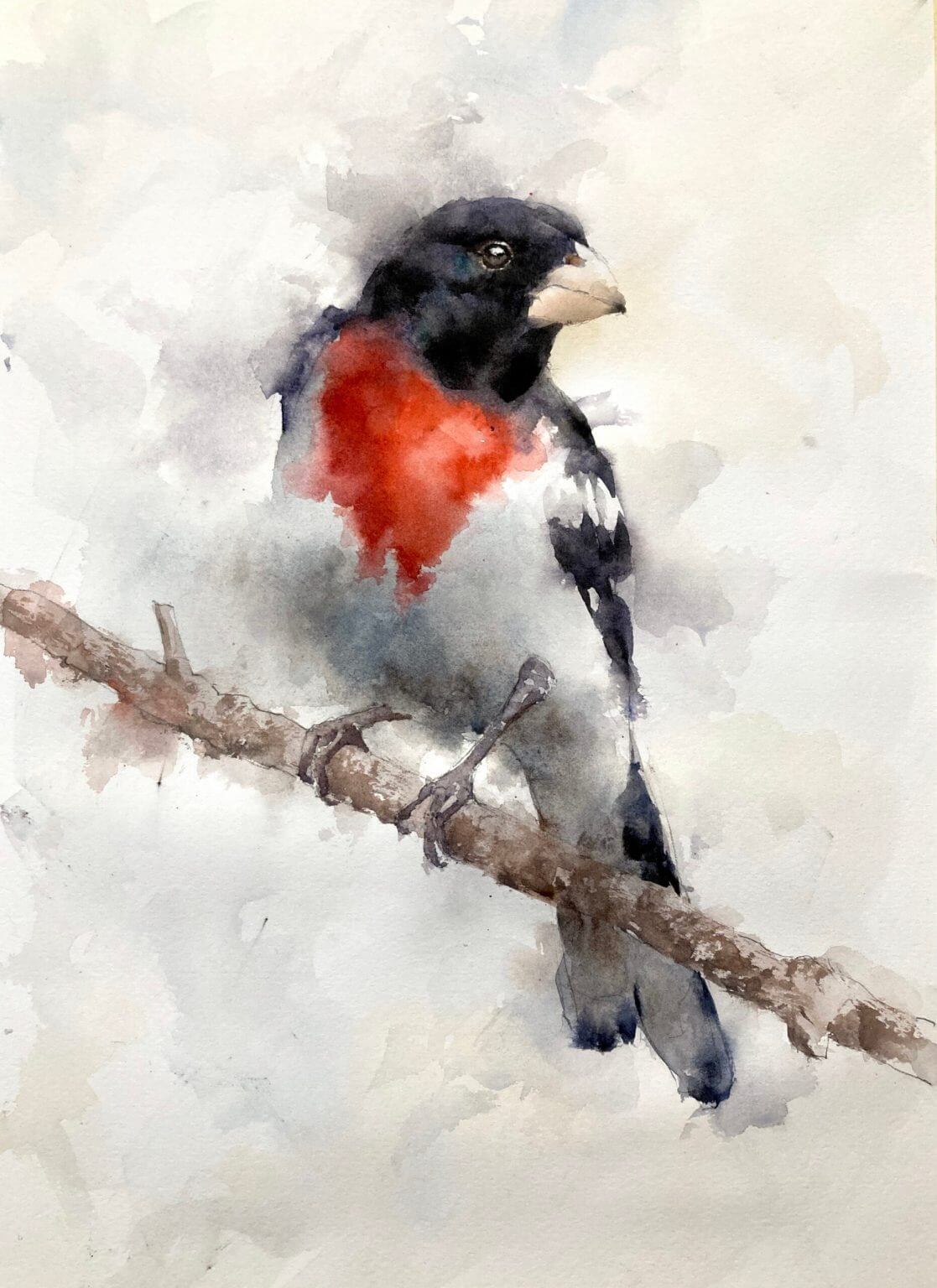
This rose-breasted grosbeak watercolor is painted loosely and is all about the edges. The full process is shown in these videos of a cardinal and a toucan but I’ll describe it briefly here.

Start with a Drawing for the Rose-Breasted Grosbeak Watercolor

First draw out the grosbeak in pencil. Nothing too soft as we don’t want the graphite to smudge and muddy up the painting. I find an HB in a mechanical pencil is good for this. While I’m drawing I’ll be thinking about which areas I want to keep sharp and which areas won’t need as much definition. In this case the face and beak will be sharp and will be the main focus of the painting.

Other areas like the belly region and the tail aren’t quite so important to define. I’ll put these in lightly with the pencil, or, in the case of the belly area maybe not draw them in at all. I’ll also be careful of the feet. It’s tempting to go nuts here and draw in every talon but I find it’s better to keep them simple. Draw the feet in a single shape if possible and only lightly indicate the claws.

The First Layer of Watercolor is Light and Watery

The first layer in this watercolor grosbeak is to put in some color but not to define any edges whatsoever. I mix up light valued (8 or 9) washes of the underlying colors and put them in roughly in the relevant regions. In this case some dabs of red on the breast, some gray underneath the belly where it’s in shadow and some slightly darker grey on the tail and wings and head. Once the dabs of color go down I take a clean brush with some water and *really* pull that color out into surrounding areas. I go right through the edges of the bird and keep adding water so the color fades to nothing.

This First Layer Feels Like You’re Going Wrong – You’re Not!

This layer really feels odd. Pulling all that color through the edges feels like you’re destroying all the drawing but trust me – you’re not. As long as that color is at the top of the value scale and all the edges are softened with water you’ll be fine. It may look dark when you put it down but it will dry back much lighter and will hardly register once you’re done.

But Keep Away from the Face!

While you’re doing all this make sure you don’t go through the face by accident. We want to keep the contrast high in this region so make sure you leave the paper white here. If you do brush through this by accident (it’s easy to do) just take some paper towel when the paper is wet and lift some of the paint. If you catch it quickly enough most should lift off.

The Second Layer we Define the Form of the Bird

Once the first layer is dry we can go in and put in our stronger colors. In this layer we’re going to define the shape and form of the bird. Using stronger colors (about a value 5 for the red and a 2 or 3 for the darks) go in and start defining some of the edges. But we don’t need to define them all! We leave the belly pretty undefined and also parts of the shoulder and wing. Start by putting in a couple of edges and see what it looks like. Keep adding in color until the bird starts to appear.

Don’t Add Too Many Edges in your Rose-Breasted Grosbeak Watercolor

Keep standing back and looking at your painting after every edge you put in. Once the bird starts to appear be careful! We don’t want to overdefine things. Don’t make the outline too sharp-edged. Your painting will be more realistic, convincing and, frankly, better if you stop before everything is filled in. It’s tricky – better to stop too early than too late.

Define the Face and the beak.

We not put in the face, eye and beak for our rose-breasted grosbeak watercolor. When we do this the whole thing usually comes alive. We need a little contrast here and leaving some light sparkles of paper showing through helps give the whole painting life. I always like to leave a small piece of paper showing through for the highlight of the eye – it gives the bird some life and personality. The beak is a tricky color. It’s very light and a grayed down peach color. Try not to make it too bright orange. Add in a little black with some water to gray down the color.

The Feet and Branch

I have to admit I have a problem with bird feet. I tend to paint them with too much contrast and they draw the eye and make the whole thing rather jarring. so try and keep them muted. Not too much light and shadow and don’t make them that much darker than the branch. And the branch itself shouldn’t draw the eye. We use a brownish mixture of ultramarine and burnt sienna for the branch but there are a lot of soft edges. Again, sharply defined lines draw the eye. Keeping things soft and a little ill-defined makes the painting more interesting and convincing.

Final Touches for your Rose-Breasted Grosbeak Watercolor

Now is the time to sharpen up some areas that need it. The head usually needs a little darkening and this can emphasize some subtle value changes around the face. The feet may need a little extra definition and some areas may need some extra color to emphasize the form. But the changes should be small. And again, much better to stop early than keep on and ruin the whole thing with an ill-advised change.

Nankeen Kestrel Watercolor

A fabulous nankeen kestrel watercolor from a Dave Nightingale photo reference. The bird’s pose is spectacular and makes for a fantastic painting.

Birds Are a Great Subject for Loose Watercolor Painting

Even though the photo is fantastic we don’t want to transcribe it exactly. There is a lot of movement in the photo and we want to capture that in the kestrel watercolor painting. A good way to do this is not to paint the whole bird rigidly with sharp lines. If we keep a lot of the edges soft and roughly defined we can then just emphasize the important ones. This gives visual interest to the painting. It also allows us to suggest movement and prioritize the edges that we feel are important to the watercolor. In this image the face is obviously important and we’ll keep that sharp. But other areas can almost be lost completely.

[activecampaign form=10 css=1]

Michele Clamp Studio Wall

Start By Painting No Edges At All

I started the painting by putting in a light wash of all the colors and softening all the edges. This means that you paint completely through the drawn outline. It feels wrong when you first start doing this but the result is so effective that it’s worth pushing through the discomfort.

The only thing you need to be careful of is to *really* soften all the edges. Especially when you’re painting out into the background. Leaving a hard edge out there and letting it dry will be really distracting when you put in the rest of the kestrel.

Vermont farm watercolor

Online Zoom Classes

I run online zoom courses regularly for both beginners and more advanced students. Please check out my workshop page.

Kestrel Watercolor – Put In Some Edges – But Not Too Many

The next stage is to start adding some definition to the bird. But only in some places. Stand back and pick and choose where you want to add color. Less is more here. Overdefining things can destroy the whole effect. In this painting I decided not to define the belly area of the kestrel at all. I just it fade away into the background and it gives a lovely airy, floating effect.

The Face is Crisp and Sharp

The final thing was the face. Some crisp, dark lines for the eyes and beak. And lastly the branch and feet. Not too much detail in here – it’s easy to overdo feet and give them too much contrast.

Final Thoughts on the Nankeen Kestrel Watercolor Painting

This nankeen kestrel watercolor turned out really well. I didn’t video this one but I have a couple of video demos showing a similar technique:

Summer Roses – Final Session

Summer Roses Final Session. Michele Clamp. Oil on Panel. 16″x20″

The final (ish) session on the summer roses with Paul Foxton. Hard to say how I feel about this right now. There are a few things I’d like to work on still but it’s very close to being done. Highly recommend Paul’s workshops. I learn a lot, the people are great and it’s enormous fun.