A slight intermission in my 30 in 30 but I’m back to it now for day 15. This is again a local view of a church in Somerville. I always liked the geometric arrangement of shapes and values and the contrast with the more organic shapes of the trees and the background. This is also on Fabriano Artistico soft press paper which I quite like. Smoother than cold press but still absorbent. It shows up the blossoms which I’m liking more and more.
Month: July 2021
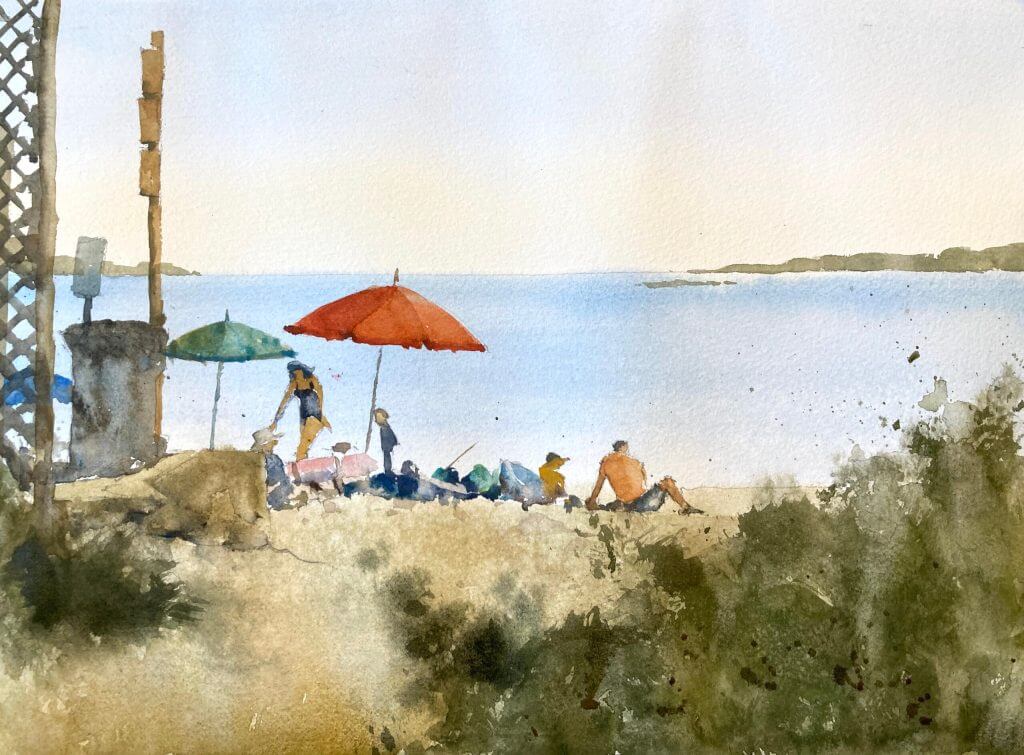
Maine Beach Watercolor
Not as successful as the previous one I don’t think but I did enjoy this enormously. Sometimes you just need a bit of color. Day 14 of 30 in 30.
Boston Common Watercolor Painting
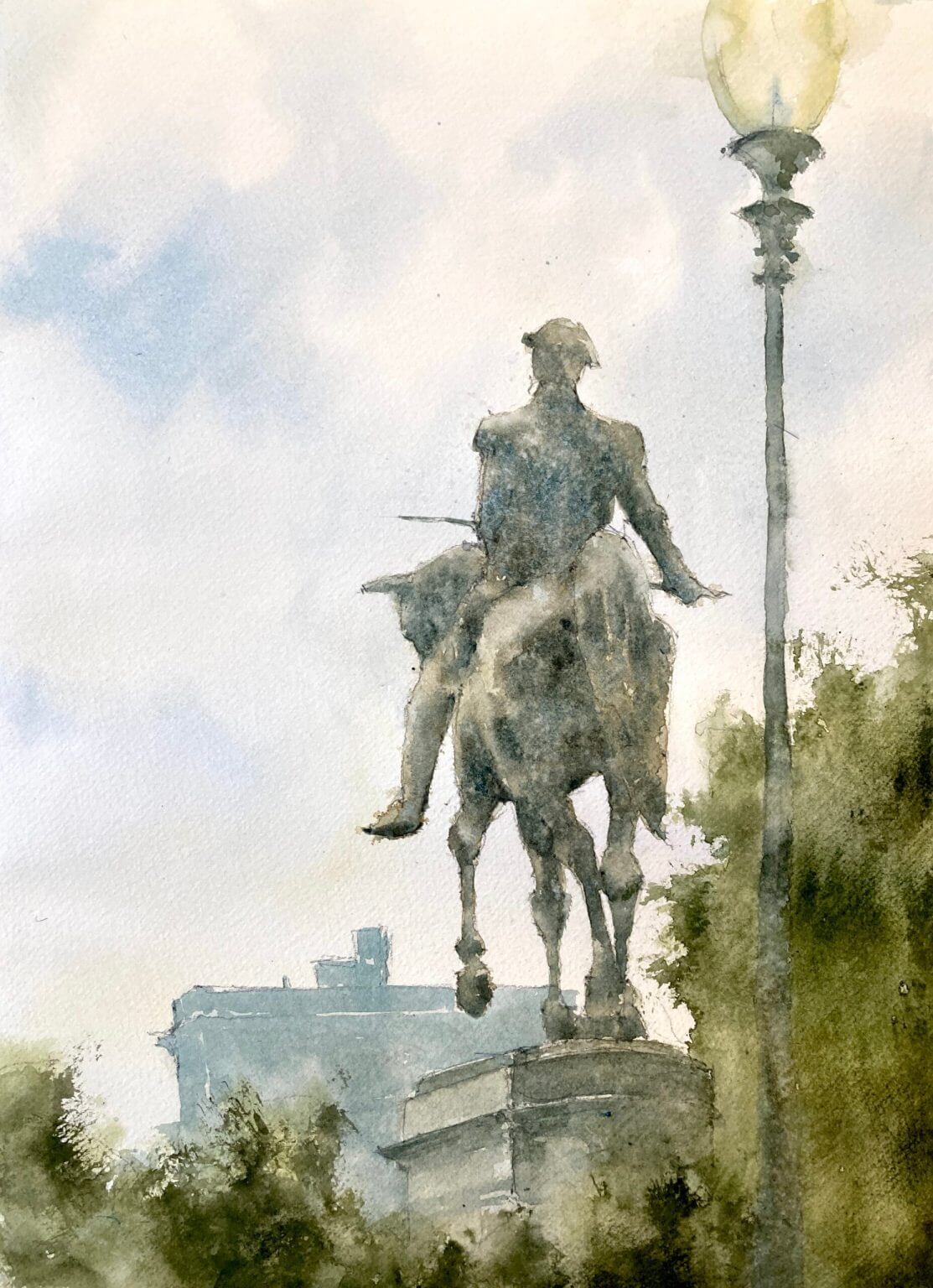
Boston Common watercolor painting – day 13 of 30 in 30. I used to walk through the Common on my way to get my hair cut at a fancy Newbury St salon. This was back when we both had the fancy jobs and I hadn’t had any mad ideas of giving everything up and painting full time. Can’t say I miss the hair cuts but I do miss Boston Common. I wanted to focus on the statue and keep the buildings (probably a hotel?) misty and in the background.
Intersecting shapes attracted me to the composition
One of the things that really attracted me to this composition was the way the horse’s legs intersect giving an abstract pattern. As the statue is against the light the values are very close on the figure and the horse. This gives it a subtle, misty feel which I really like. The added texture due to granulating paint (mostly cerulean blue) and some water splattering adds to the effect.
Verticals are vertical – do I really have to say this again?
But oh that lamppost! It’s gone past loose to sloppy and I didn’t keep it straight. Lost edges are fine here (in fact probably essential) but I didn’t keep my eye on the ball here and the painting suffers.
On balance a good outcome
But on the whole this came out rather well I think. I love the texture on the statue and the muted colors. I’m getting behind on a painting a day so they’re coming thick and fast right now. Helps in some ways as you don’t worry too much over details.
A video to end with
I didn’t record this one (wish I had done now!) but here’s a link to a another Boston painting which was livestreamed in November. If you want to be notified of any upcoming videos or livestreams please subscribe to my youtube channel and join my mailing list.

Beach Watercolor Painting
A beach watercolor painting is always popular and fun to paint. There are some gotchas to look out for however, and this is what you need to do.
Beach Paintings – Sand Isn’t Often Yellow
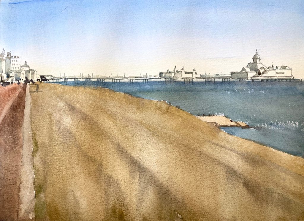
It’s really tempting to look at a sandy beach and confidently reach for the yellow or the yellow ochre. However if we look closely that isn’t the case. If we isolate the color we can suddenly see that sand is actually often a very grayed out almost beige color. It’s only when it’s painted next to the blue of the sea that it starts to read as yellow. Now in this painting I’ve somewhat overdone the yellow even though I tried not to! Have a look at these paintings of Manchester by-the-sea to see what I mean.
Don’t Overcomplicate Water in your Watercolor Beach Painting
Now there are lot of really good seascape painters. Fredrick Judd Waugh is one of my faves. And they really do go to town on waves and breakers and spray. But in a scene like this it’s really not necessary. Now if the sea was the main element in the picture then that would be a different matter. But here we have the sand, the pier (which is really the main focus), and the buildings. All of these have a lot of detail and fiddly bits. Trying to put waves and hundreds of different value changes into the sea would just overwhelm the painting.
Daily Painting Doesn’t Always End in Success
Well this Eastbourne watercolor painting was meant to be a quick and easy one but it didn’t turn out that way. It’s great on these daily paintings to try new things but that also means the failure rate increases. Day 12 of 30 in 30 – almost half way through!
Day 11 of 30 in 30 – Nesting Herons
Day 10 of 30 in 30 – Dundee Disaster
Well the luck had to run out some time and this will remain unfinished and in the reject pile. I was mostly interested in the light on the buildings and wanted to keep the color muted. Neither of those things really worked out. The light doesn’t pop and the color is just drab. I’d like to do the scene justice at some point so it will remain in the to do pile.


