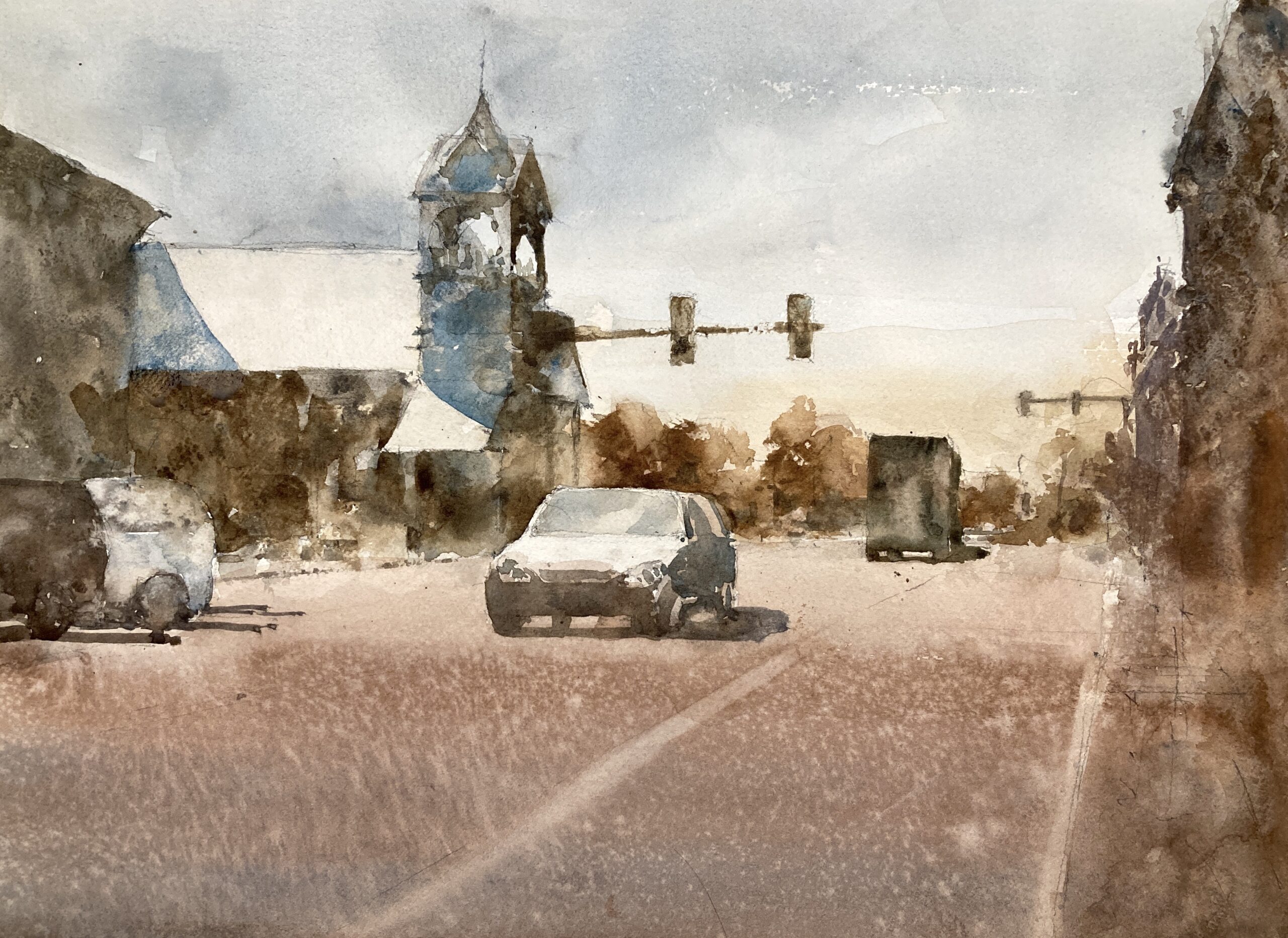
Enough with the apples. Let’s get back to some watercolor. I’m really enjoying the street scenes recently. They need a lot of tweaking to design them into something that works. But you also have to keep the sense of place in there. And also make a decent painting out of them. It’s tricky – but rewarding.
So this is the reference image

The tower is great of course. But there’s a lot of space in there not doing a whole lot. I toyed with keeping this in – maybe a wider format – and making it more of the subject. But after noodling with some value studies in paint and on the ipad I plumped for compressing the road and keeping the tower and the car as central. Of prime importance are the light roofs leading down to the car. Great arrangement of darks and lights.

Those three lights and the car on the left hand side hold everything together. Well that’s the plan. The initial washes went in ok. Some light and dark but I’ve still got half the value scale to play with so a long way to go.

Well here he is finished. I managed to screw up at the last minute (not telling where) but on the whole I’m pretty happy with this. Time will tell of course.
