Kathy Speranza Roses – Online Course

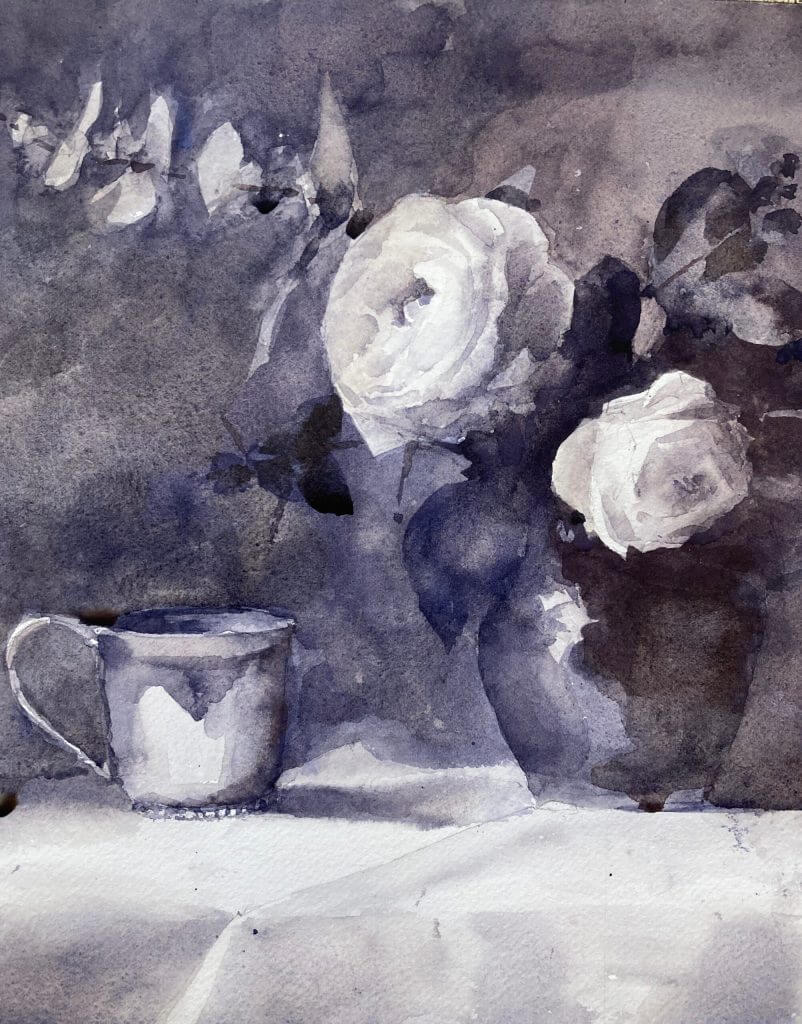
Kathy Speranza roses are spectacular and I was watching her online rose course yesterday and thought I’d have a go. She makes it look so easy! And boy can she paint. I’ve done a number of flower paintings with Paul Foxton but it’s always good to see how others approach things.

Pass 1 on Kathy Speranza Roses

Kathy Speranza Rose Workshop – First Pass

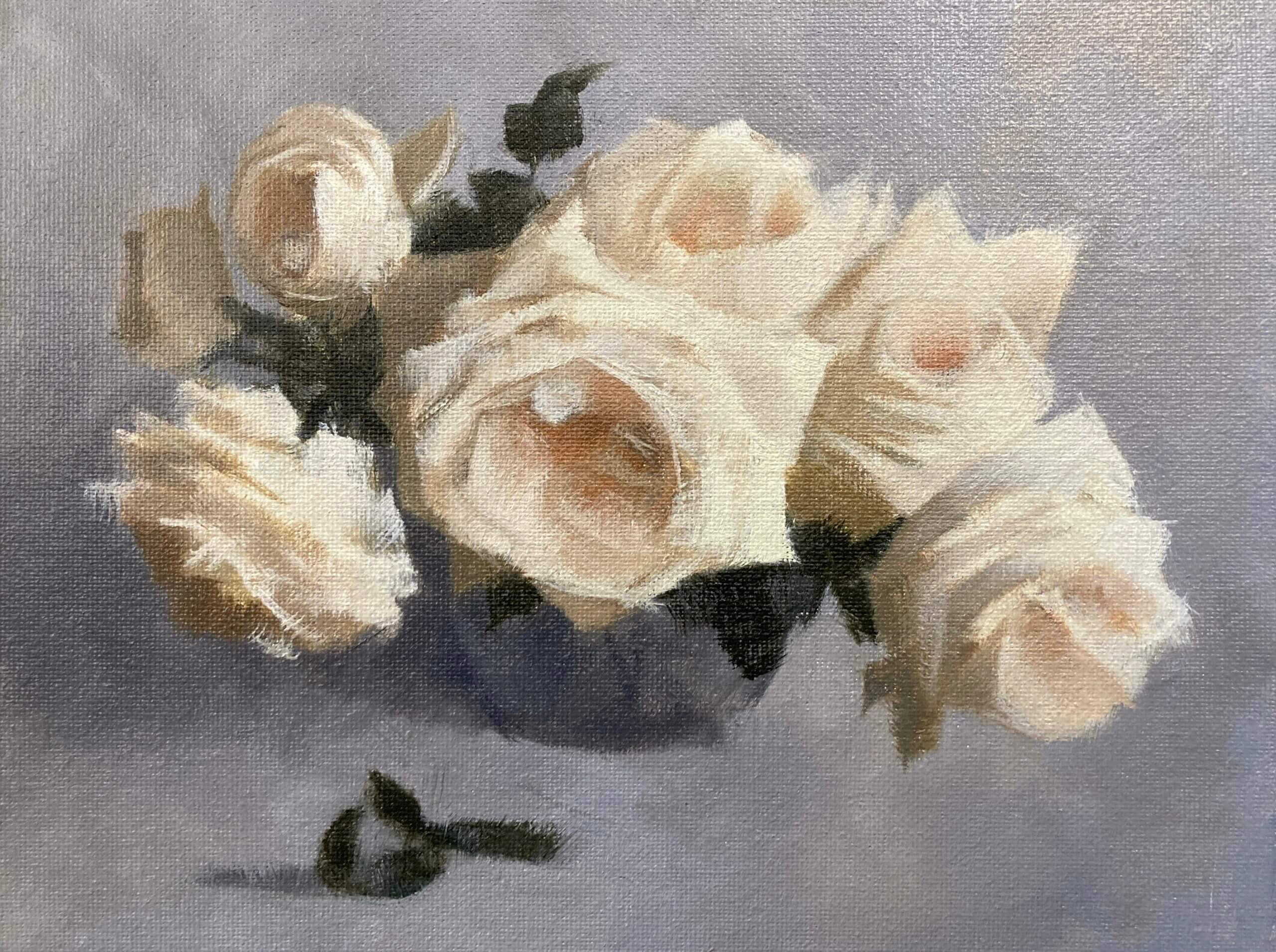
Above is the result of the first pass. It’s oil on a 9″x12″ canvas board. I have to admit that I’m not doing her exact method. She does an underpainting first and a number of preliminary drawings but I thought I’d have a go at the block in to see what happened. Pretty happy so far.

Pass 2 – Refining the Color and Form

Kathy Speranza Rose Painting Class - Pass 2
Kathy Speranza Rose Painting Class – Pass 2

Pass 2 on the Kathy Speranza rose workshop. This is lesson 6 and the second pass putting on color. I’m finding this tricky but slowly getting into the slow pace of things. Usually I would be finishing up by now but I think there are a few more steps to go. Each with a week’s drying in between so we’re in for the long haul. This one was refining the background, values and edges. I also introduced some more chroma into the centers. A very little paint goes a long way with this method and I’m starting to enjoy it very much.

Next Steps – Pass Three on Kathy Speranza Roses

I still need to finish this painting. I’m a bit nervous – don’t want to ruin it. I’ve watched her final video and it gets pretty philosophical. Interesting though and makes a change from more practical approaches. Both are needed of course and it’s been really worthwhile looking at flowers from a different perspective.

Rose Watercolor Value Study

Value studies are often associated with landscapes but they’re very useful in still life. This rose watercolor value study was hugely instructive for the follow up painting.

Yesterday’s Paul Foxton workshop session was cancelled but I thought I’d go mad and do a watercolor value study instead. Sheesh!!! So hard getting those close values in watercolor and still keep the form and light. But I think I did pretty darn well .

Here are some intermediates :

Blue Diamond Rose Oil Painting

Blue diamond rose oil painting
Blue Diamond Rose (from a Paul Foxton reference). Michele Clamp. Oil on panel board. 8″x10″

A blue diamond rose oil painting is on the easel today. I’m gearing up for another Paul Foxton workshop and we had a free livestream paintalong today. Really pleased with this one and I’m loathe to touch it any more even though I can see areas where it needs it.

Canvas panels are great for studies

The painting is on a cheap 8×10 canvas panel. I doubt these have great longevity as they’re made of cardboard but they’re good for studies. We mixed up light and dark values for both of the roses, the background, the vase and the leaves. This took a while. It was probably 90 minutes of just mixing but it’s worth it.

The problem with mixing is actually a problem with seeing

The problem of mixing can be split into two parts. The first part (and the hardest) is identifying exactly which color you need to mix. We are constantly fooled by our eyes when looking at subjects. If a subject is in strong light or strong shadow our brain compensates and makes it hard for use to know exactly what the color is. For instance, the white rose on the right definitely reads as white. Even in the shadow area at the top it still looks white. But if we isolate that color we see that it’s actaully a value 5. And 5 is exactly half way down the value scale. It’s so easy to overstate the values in these regions and make them much lighter than they appear. And then the painting doesn’t work.

Once we’ve identified the color correctly mixing it is relatively straightforward. If we know the color we know the hue (orange, red, blue etc), the value (dark to light on a 1-10 scale), and the chroma (how bright or gray the color is).

Putting the paint on the canvas

When we finally got to putting the paint on the canvas it all went pretty quickly. We had already mixed the main colors. We then blocked in the areas and blended between them to get smooth transitions where needed. The petals were trickier. We had to mix between the main values to get the more subtle value shifts. We also needed deft brushwork to get the petals to read well.

But on the whole this was a great success. I could clean my brushes happy after a good day’s painting.

Here it is alongside the reference.

Blue diamond rose oil painting and reference

Summer Roses – Working up the Color Study

Color study take 2. Michele Clamp. Oil on paper. 8″x10″

Inspired by Marilyn on the Summer Roses group I decided to work up the color study a little. This gives me a little practice in readiness for the bigger version on Monday. Although softening the edges was tricky I think I’m fully prepared to dive into the real thing.

Here it is before I worked on it

Color study for Summer Roses first pass.