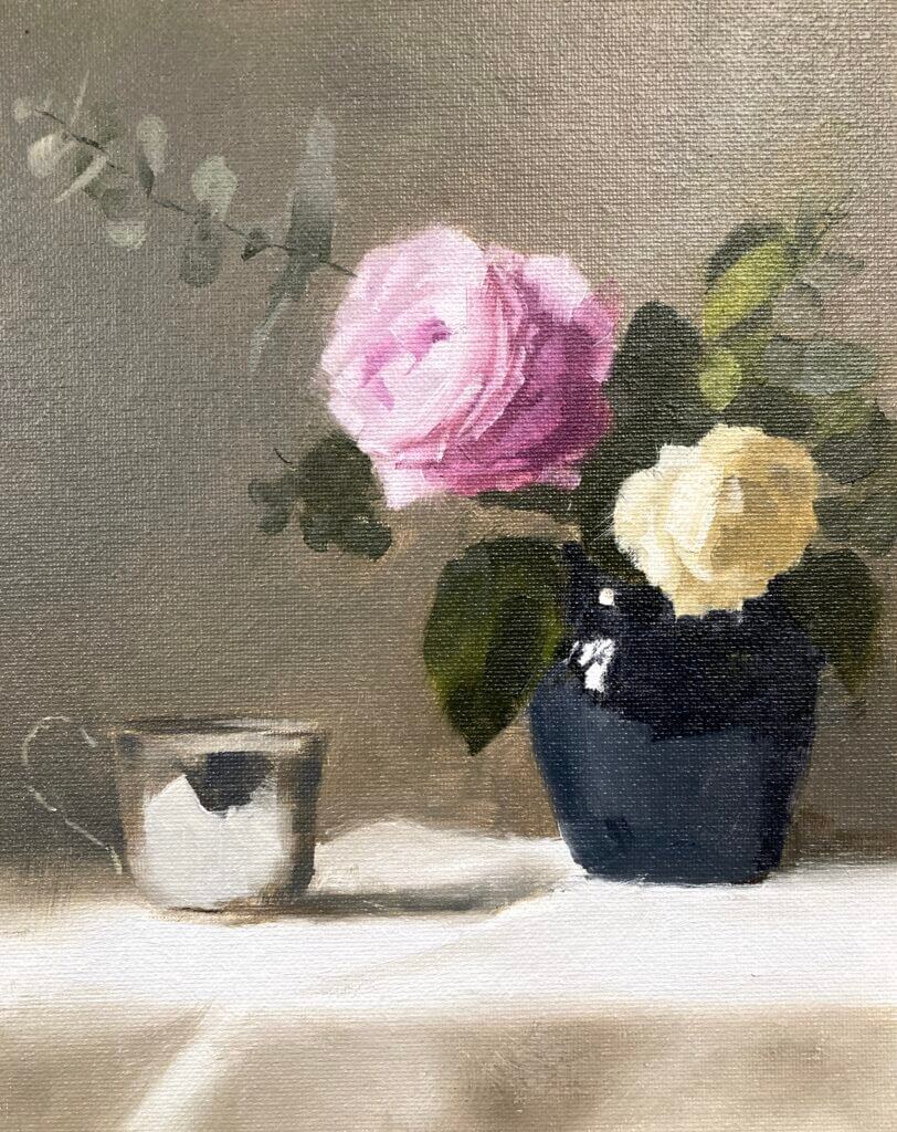
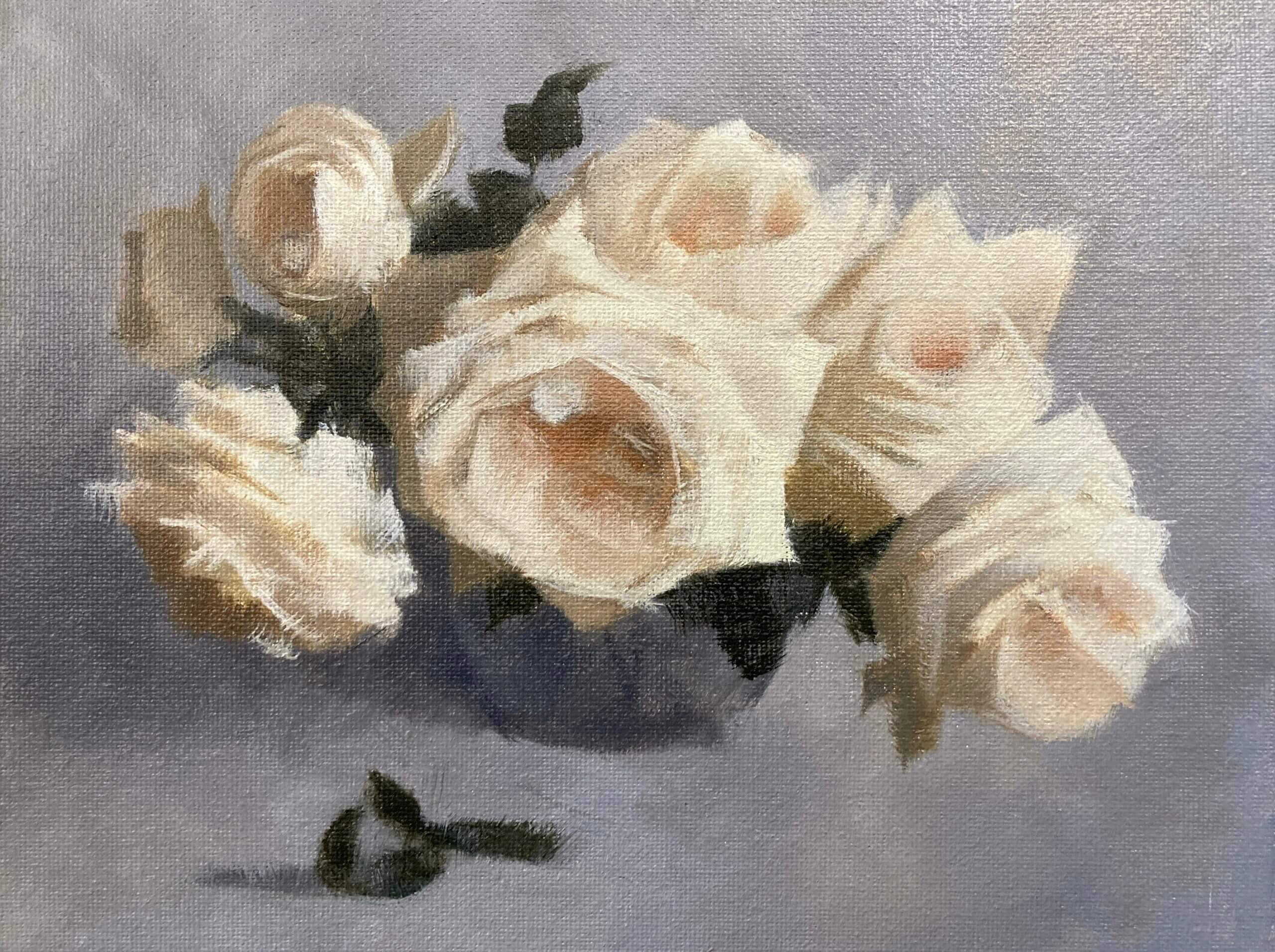
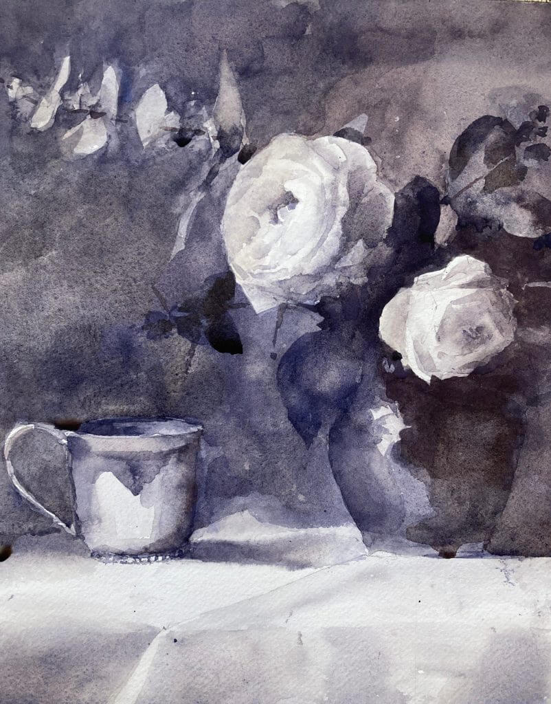
Still working with Paul Foxton’s latest still life workshop. This week was the rose still life color study. It’s not the whole composition but contains the main elements. I went a bit beyond where I intended today as this was just meant to be a color block in. It was a pretty intense session nonetheless. We accurately mixed all the main colors and some were pretty tricky.
Rose Still-Life Color Study – Munsell to the Rescue
I have the big Munsell color book. This contains about 1600 different paint chips covering most of the colors possible in paint. It’s been invaluable in making me more aware of color. Especially how to mix it both for oil painting and watercolor. I hadn’t realized how bad my color perception and mixing skills were before I started using it. If you want to know more about Munsell see this post. It also includes information on the online ChromaMagic tool which helps you see color more accurately.
After mixing everything for the rose still life color study putting the paint on the canvas went pretty quickly. We weren’t meant to put in petals – bad Michele! However, I wanted to see how it would look and how hard it was going to be to get the pink rose to read well. I had to do a lot of single touch strokes with no blending. This was to get the color changes between the edges of the petals and the higher chroma inner parts. I’m very glad I did this – the full thing doesn’t seem so daunting any more.
Sometimes Cheap Surfaces Aren’t the Best Option
The surface was just a cheapo cardboard canvas panel. These are surprisingly good to work on and only cost around $1 a time. As it came out so well I almost wish I’d done it on something more substantial.
The whole session was a long one – around three hours I think. It’s a long time as you’re focusing intently for the full extent . At the end I was glad to put the brushes down at the end. Paul did give us a couple of tea breaks though 🙂


