See how to paint a lighthouse in this step by step lighthouse watercolor tutorial. Includes access to the ChromaMagic color tool.
It’s a bit of a guilty pleasure but I just love painting a lighthouse. Luckily here in New England we have a lot to choose from. Lighthouse paintings have a lot of things I like about painting with watercolor. I love the sunlight on white walls and how they curve into shadow. I also really love hos the white looks against the blue sky, And the small details of windows and railings just give enough interest to make the painting convincing.
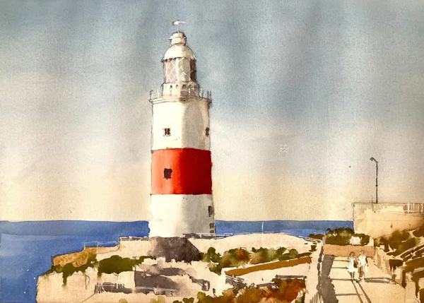
A Lighthouse watercolor painting is a good choice for a beginner
If you’re looking for an easy subject to paint in watercolor then lighthouses are a great option. They’re easy to draw and are fairly simple to make convincingly three-dimensional. In this subject the foreground is a little trickier (although I really enjoyed painting it). If you’re at the beginning of your painting journey then simplifying or leaving out the foreground might be a a good option.
Sign up for updates on classes and free livestreams
Here is the reference I’ve chosen. It’s from pixabay.com and was drawn to the strong sunlight and the red and white stripes on the lighthouse itself. The foreground has quite a lot of detail which I’ve simplified and kept to just a few values.
Start your watercolor lighthouse with a pencil drawing.
Lighthouse watercolor pencil drawing
I started with a line pencil drawing. There is no shading on here as we’ll be putting in light and shadow with paint. I aim to put in just enough detail to outline everything important but not go overboard with every single little thing. This was trickiest in the foreground as there is a lot going on there. I tried to keep the lines that separated regions of light and dark and keep everything else to a minimum
If you’ve been painting for a while then you’ve probably heard or read people saying that good values are the key to a good painting. You’re not going to hear me say anything different – if you can get a good handle on your values then you’re well on your way to a successful painting. To help us with this I recommend a couple of different things. The first is a good (as in accurate) value scale. I recommend Paul Centore’s one pictured above. It’s laminated and has 20 steps from darkest to lightest. It’s great for watercolor and oil or acrylic painting.
Estimate the values for the sky using the value scale
Using the value scale to check the skyUsing the value scale to check the sky near the horizon
If you have a printout of the reference you can use the value scale to first estimate, and then measure the values of the sky. Even though the value scale is gray and the sky is blue squinting your eyes can take the color out of a scene and make it easier to measure.
Use ChromaMagic to Get the Color *AND* The Value
Using chromamagic to check the sky valueUsing chromamagic to check the sky value near the horizon
We realize that people don’t always have printed reference handy so here at Clamp Watercolor Towers we have built a tool that can tell you the value of any region of a photo just by clicking on it. Additionally it will tell you the exact color and chroma of a color so you know exactly what your color is. From the screenshots ChromaMagic says that the sky is a value 8 at the top and a fairly bright blue. At the bottom it is still a value 8 but now it’s a much grayer blue. Find out more about ChromaMagic here and try it out now here. You’ll need to download the reference photo and load it up into the tool using the ‘load file’ button.
Fabulous tool to find the color and value in *any* reference photo. Basic version is free to use.
Paint the sky using a light cobalt blue wash
Graduated wash for the watercolor lighthouse sky
I paint in the sky using a cobalt blue wash that fades out as it goes towards the horizon. I change the color by first adding in a little water as I go down the page. At the bottom I add in a little cadmium yellow orange to neutralize the blue a little and make it grayer. I actually made this sky a little too light – it’s more like a value 9 rather than an 8. But never fear! We can darken this a little later to correct this. We just need to wait until the first wash is completely dry before tacking it.
Check the values on the lighthouse
Checking the value of the lighthouse watercolor shadow
We’re now going to paint the lighthouse. Or at least the main values – the details will come later. If you have a printout and a value scale you can measure the value of the shadow side or you can use ChromaMagic with the reference photo.
Using ChromaMagic to check colors and valuesUsing ChromaMagic to check colors and valuesUsing ChromaMagic to check colors and values
The white part of the lighthouse is around a value 6 in the shadow. The red band, however is much darker in the shadow – around a 2 or 3. And in the light the color goes to a value 7 orange color – quite a big swing in value there. We’ll need to get this right to make sure the lighthouse reads correctly.
Lighthouse watercolor shadow side
I put the value 6 grey on the whole of the shadow side of the lighthouse. The gray is mixed using burnt sienna and cerulean blue (ultramarine blue can also be used). The transition from shadow to light is softened with a clean damp brush to make the lighthouse look round.
Sign up for updates on classes and free livestreams
Watercolor lighthouse light red
I mix a mid value 5 red for the mid part of the red band. I use damp brush to soften the transition out into the light and hit that value 8 we found earlier. This is used to carry the mid value into the shadow side. It won’t be dark enough for the shadow yet but we can layer on a darker color later.
Watercolor lighthouse dark red and sea
While I’m waiting for the red strip to dry I put in a wash of a mid-value blue (ultramarine with a dash of lemon yellow) for the sea. I also use a fairly thick mix of ultramarine and burnt sienna to start putting in some details and windows.
After that I mix up a dark red value 3 mix of vermillion, permanent rose, burnt sienna and just a *touch* of black if I need to hit that value 3. I try not to use black if I can avoid it to keep that dark red rich and vibrant. After softening the transition from shadow to light you can see how that color really sings out.
Use a light brown wash for the initial foreground wash
Light first wash for foreground
The foreground looks complicated but we’re going to simplify as much as we can. The base layer is just a light wash (probably around value 9) of burnt sienna with a little yellow ochre. This goes over the whole foreground regardless of any detail drawn in.
The green foliage in the foreground is pretty dark – probably around a 4 or even darker. I mix an olive green using lemon yellow and black and add just enough water to get it to the right value. I then roughly put in the foliage and try and leave the edges choppy to suggest vegetation.
At this point I adjust the sky color and layer over another wash of blue which fades out to orange at the horizon. This brings the sky value more in line with the reference and *really* brings out the white on the lighthouse!!!
I continue to add in more foreground detail for the foliage and the shadows. This is all pretty rough. It just has to suggest what’s there as the main attraction of the painting is the lighthouse itself.
Final Touches with Opaque White
opaque white for detail on watercolor lighthouse
For the final touches I use a little of Dr Ph. Martin’s Bleed-Proof White paint to add in some railings and detail on the lighthouse window. A little gray to indicate the lamppost and I’m done!!!
Final Thoughts
Well I hope you enjoyed that. Not everything went to plan but most things could be fixed. As usual if you do have a go at this scene I’d love to see what you do!