Apple Color Study – Session 2

Apple still life oil painting study
Apple Study. Michele Clamp. Oil on panel. 5”x7”

This is the apple color study – session 2 (session 1 is here). After the struggle with surfaces last time this was never going to be a masterwork. But it’s been interesting (never thought apples could be that interesting). The painting is never going to hang on a wall but I wanted to work more on this and really try to get the colors as close as I could. It’s really good training in mixing but more importantly in just looking. Getting closer I think.

Munsell Chips to the Rescue

Munsell chart 10YR and oil painted copy

A couple of years ago I was really struggling with color in my watercolor painting. After googling a little I found Paul Foxton’s site learning-to-see.uk. He is an oil painter and, after a workshop with Anthony Waichulis weeas a convert to using the Munsell classification for color. He found it transformed his color work and, I’m now a convert too.

I won’t go into details here. If you go to Paul’s site and/or youtube channel he has a lot of free videos describing his process. It has been a godsend for me. I’m now able to see, mix and use color much better. I can now be much more accurate in my mixes but that’s not the main thing. The fact that color identification and mixing is no longer a lottery for me I can now be *much* more expressive color-wise. Gaining a skill in this area has increased my powers of expression through paint and is much more enjoyable as a result.

I will likely go into more detail about Munsell and watercolor in upcoming posts.

So I used Munsell chips extensively in this apple painting. You can buy (at great expense sadly) a large book of 1600 painted chips which cover the gamut of all the colors you can reach in paint. Identifying the colors you need in you setup you can then pluck out the relevant chips and mix to those.

Thanks to Munsell chips the apple study – session 2 was a success!

Oil Painting Surfaces – A Cautionary Tale

Apple still life oil painting study
Two Apples. Michele Clamp. Oil on panel. 5”x7”

Yes I never thought the title would be ‘oil painting surfaces- a cautionary tale’. Today was supposed to be a set of apple studies with different types of brushwork. It turned into a sorry saga of unsuitable surfaces. With pretty horrible results.

Strathmore Canvas paper – too absorbent for oil paint

As this was just meant to be some studies I first started with a quarter sheet of Strathmore canvas paper. I’ve used this before with good results but what I forgot was that I gessoed the surface first before painting on it. And this time I didn’t. Ugh! The paint just sinks in, you can’t blend it, and it somehow darkens and goes matte on the paper. After struggling for an hour or so trying to get the paint to cover the surface (it soaks in and in!) I gave up. Here’s the result:

Disastrous apple still life oil painting on canvas paper

Blergh. Almost no form on that left hand apple even though I was *so* careful with the values.

Not all ‘gessoboard’ is the same

After a quick stomp around the studio I fished out a small 5”x7” Ampersand gessobord. *Gesso* board so this surface must be ok yes? Hmm. Well it was better but boy so slick! The paint just rides around on the surface as there’s no tooth to speak of. It was definitely better than the paper but only just. Here’s my chunky block-in.

Apple still life oil painting study color block in

Kinda okay. I had a lot of trouble getting the chroma right on the light side of the apple. I was using Munsell chips but was still struggling. Will try and tweak that tomorrow and see if I can get it right. It has a certain charm but nowhere near what I was aiming for.

Finally I blended some of the edges and beefed up the darks a little. And that was it for the day. 4 hours – 2 apples! I have to get back to watercolor.

Apple still life oil painting study softened edges

Rose Still Life Color Study

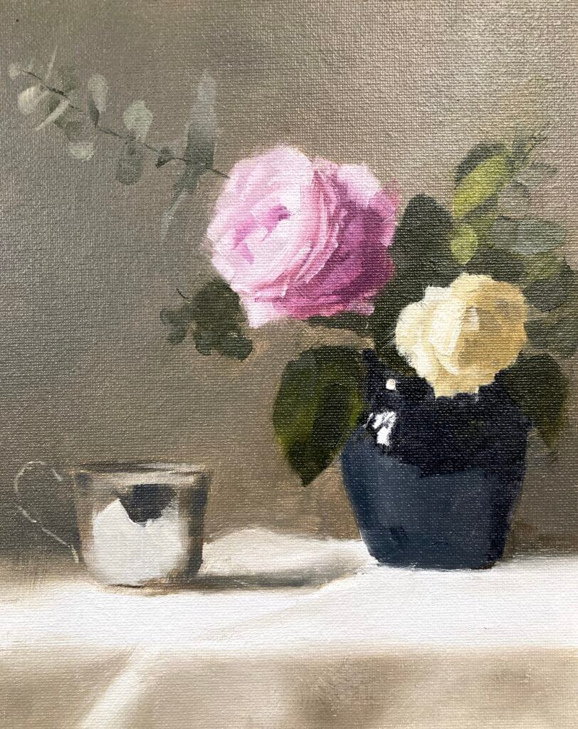
Still working with Paul Foxton’s latest still life workshop. This week was the rose still life color study. It’s not the whole composition but contains the main elements. I went a bit beyond where I intended today as this was just meant to be a color block in. It was a pretty intense session nonetheless. We accurately mixed all the main colors and some were pretty tricky.

Rose Still-Life Color Study – Munsell to the Rescue

I have the big Munsell color book. This contains about 1600 different paint chips covering most of the colors possible in paint. It’s been invaluable in making me more aware of color. Especially how to mix it both for oil painting and watercolor. I hadn’t realized how bad my color perception and mixing skills were before I started using it. If you want to know more about Munsell see this post. It also includes information on the online ChromaMagic tool which helps you see color more accurately.

After mixing everything for the rose still life color study putting the paint on the canvas went pretty quickly. We weren’t meant to put in petals – bad Michele! However, I wanted to see how it would look and how hard it was going to be to get the pink rose to read well. I had to do a lot of single touch strokes with no blending. This was to get the color changes between the edges of the petals and the higher chroma inner parts. I’m very glad I did this – the full thing doesn’t seem so daunting any more.

Sometimes Cheap Surfaces Aren’t the Best Option

The surface was just a cheapo cardboard canvas panel. These are surprisingly good to work on and only cost around $1 a time. As it came out so well I almost wish I’d done it on something more substantial.

The whole session was a long one – around three hours I think. It’s a long time as you’re focusing intently for the full extent . At the end I was glad to put the brushes down at the end. Paul did give us a couple of tea breaks though 🙂