Rose Still Life Color Study

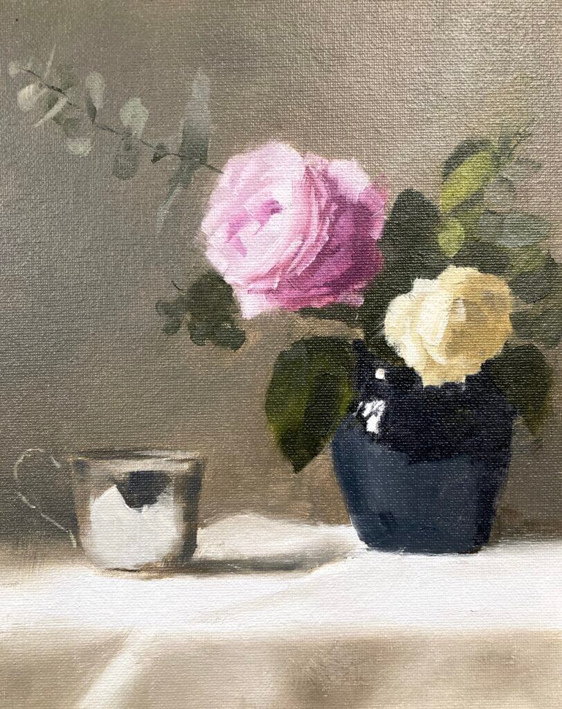
Still working with Paul Foxton’s latest still life workshop. This week was the rose still life color study. It’s not the whole composition but contains the main elements. I went a bit beyond where I intended today as this was just meant to be a color block in. It was a pretty intense session nonetheless. We accurately mixed all the main colors and some were pretty tricky.

Rose Still-Life Color Study – Munsell to the Rescue

I have the big Munsell color book. This contains about 1600 different paint chips covering most of the colors possible in paint. It’s been invaluable in making me more aware of color. Especially how to mix it both for oil painting and watercolor. I hadn’t realized how bad my color perception and mixing skills were before I started using it. If you want to know more about Munsell see this post. It also includes information on the online ChromaMagic tool which helps you see color more accurately.

After mixing everything for the rose still life color study putting the paint on the canvas went pretty quickly. We weren’t meant to put in petals – bad Michele! However, I wanted to see how it would look and how hard it was going to be to get the pink rose to read well. I had to do a lot of single touch strokes with no blending. This was to get the color changes between the edges of the petals and the higher chroma inner parts. I’m very glad I did this – the full thing doesn’t seem so daunting any more.

Sometimes Cheap Surfaces Aren’t the Best Option

The surface was just a cheapo cardboard canvas panel. These are surprisingly good to work on and only cost around $1 a time. As it came out so well I almost wish I’d done it on something more substantial.

The whole session was a long one – around three hours I think. It’s a long time as you’re focusing intently for the full extent . At the end I was glad to put the brushes down at the end. Paul did give us a couple of tea breaks though 🙂

Beginning Watercolor Session of Sunflowers

Sunflower watercolor progress photos by Michele Clamp
Progression Photos of a Sunflower Painting Class

Keep those darks in reserve until the lights are in

Today was the Beginning Watercolor Session of sunflowers. Here are few progression shots of today’s class painting. As you can see things always look flat and almost cartoonish until quite a way through the painting. Then the darks go in and everything comes together. It’s one of the most difficult things to do in watercolor – holding back with the detail and getting the basic shapes and values right. It takes faith and a bit of experience but always reaps rewards.

New Direction for Watercolor Classes

Today was the last zoom class in my Beginning Watercolor Workshop for the Newton NewArts center. It’s been a fun 6 weeks and I always enjoy these classes. It’s good to get back to basics and go slowly through mixing colors, values, washes. However, I’ve decided to rethink this set of lessons. There’s a lot to get through in 6 weeks. I’m going to break it down into shorter 1 or two hour sessions based around techniques. These are going to be available in the next few weeks via YouTube and facebook livestreams. People will be able to buy them one by one depending on what they’re interested in.

I still love doing the whole painting demos and I will be offering these in parallel. This way you can take a technique class or two followed by a painting class or vice versa. I’m hoping this will work well and we had a great discussion in class today. We talked about what works when you’re starting out with watercolor that reflects these decisions.

Video Demos

As this was a private group class I don’t have video of this painting. If you’re thinking of taking classes (or just want to see how I go about things) please have a look at my youtube channel. Alternatively you can have a look at my video page on this site. I don’t have any sunflower painting currently. Howeve, there are a couple of other flower videos that may be of interest.

YouTube player

Original Sunflower Painting for Sale

A final note. After having this up in the studio for a while I decided I iiked a previous version of this enough to put it up for sale.

Blue Diamond Rose Oil Painting

Blue diamond rose oil painting
Blue Diamond Rose (from a Paul Foxton reference). Michele Clamp. Oil on panel board. 8″x10″

A blue diamond rose oil painting is on the easel today. I’m gearing up for another Paul Foxton workshop and we had a free livestream paintalong today. Really pleased with this one and I’m loathe to touch it any more even though I can see areas where it needs it.

Canvas panels are great for studies

The painting is on a cheap 8×10 canvas panel. I doubt these have great longevity as they’re made of cardboard but they’re good for studies. We mixed up light and dark values for both of the roses, the background, the vase and the leaves. This took a while. It was probably 90 minutes of just mixing but it’s worth it.

The problem with mixing is actually a problem with seeing

The problem of mixing can be split into two parts. The first part (and the hardest) is identifying exactly which color you need to mix. We are constantly fooled by our eyes when looking at subjects. If a subject is in strong light or strong shadow our brain compensates and makes it hard for use to know exactly what the color is. For instance, the white rose on the right definitely reads as white. Even in the shadow area at the top it still looks white. But if we isolate that color we see that it’s actaully a value 5. And 5 is exactly half way down the value scale. It’s so easy to overstate the values in these regions and make them much lighter than they appear. And then the painting doesn’t work.

Once we’ve identified the color correctly mixing it is relatively straightforward. If we know the color we know the hue (orange, red, blue etc), the value (dark to light on a 1-10 scale), and the chroma (how bright or gray the color is).

Putting the paint on the canvas

When we finally got to putting the paint on the canvas it all went pretty quickly. We had already mixed the main colors. We then blocked in the areas and blended between them to get smooth transitions where needed. The petals were trickier. We had to mix between the main values to get the more subtle value shifts. We also needed deft brushwork to get the petals to read well.

But on the whole this was a great success. I could clean my brushes happy after a good day’s painting.

Here it is alongside the reference.

Blue diamond rose oil painting and reference