See how to paint a lighthouse in this step by step lighthouse watercolor tutorial. Includes access to the ChromaMagic color tool.
It’s a bit of a guilty pleasure but I just love painting a lighthouse. Luckily here in New England we have a lot to choose from. Lighthouse paintings have a lot of things I like about painting with watercolor. I love the sunlight on white walls and how they curve into shadow. I also really love hos the white looks against the blue sky, And the small details of windows and railings just give enough interest to make the painting convincing.
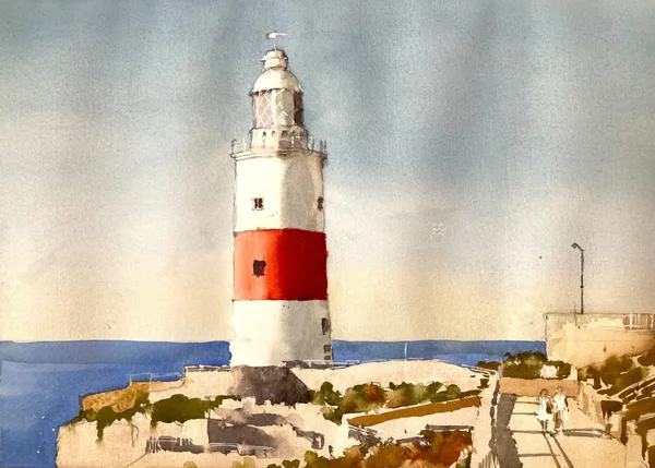
A Lighthouse watercolor painting is a good choice for a beginner
If you’re looking for an easy subject to paint in watercolor then lighthouses are a great option. They’re easy to draw and are fairly simple to make convincingly three-dimensional. In this subject the foreground is a little trickier (although I really enjoyed painting it). If you’re at the beginning of your painting journey then simplifying or leaving out the foreground might be a a good option.
Sign up for updates on classes and free livestreams
Here is the reference I’ve chosen. It’s from pixabay.com and was drawn to the strong sunlight and the red and white stripes on the lighthouse itself. The foreground has quite a lot of detail which I’ve simplified and kept to just a few values.
Start your watercolor lighthouse with a pencil drawing.
Lighthouse watercolor pencil drawing
I started with a line pencil drawing. There is no shading on here as we’ll be putting in light and shadow with paint. I aim to put in just enough detail to outline everything important but not go overboard with every single little thing. This was trickiest in the foreground as there is a lot going on there. I tried to keep the lines that separated regions of light and dark and keep everything else to a minimum
If you’ve been painting for a while then you’ve probably heard or read people saying that good values are the key to a good painting. You’re not going to hear me say anything different – if you can get a good handle on your values then you’re well on your way to a successful painting. To help us with this I recommend a couple of different things. The first is a good (as in accurate) value scale. I recommend Paul Centore’s one pictured above. It’s laminated and has 20 steps from darkest to lightest. It’s great for watercolor and oil or acrylic painting.
Estimate the values for the sky using the value scale
Using the value scale to check the skyUsing the value scale to check the sky near the horizon
If you have a printout of the reference you can use the value scale to first estimate, and then measure the values of the sky. Even though the value scale is gray and the sky is blue squinting your eyes can take the color out of a scene and make it easier to measure.
Use ChromaMagic to Get the Color *AND* The Value
Using chromamagic to check the sky valueUsing chromamagic to check the sky value near the horizon
We realize that people don’t always have printed reference handy so here at Clamp Watercolor Towers we have built a tool that can tell you the value of any region of a photo just by clicking on it. Additionally it will tell you the exact color and chroma of a color so you know exactly what your color is. From the screenshots ChromaMagic says that the sky is a value 8 at the top and a fairly bright blue. At the bottom it is still a value 8 but now it’s a much grayer blue. Find out more about ChromaMagic here and try it out now here. You’ll need to download the reference photo and load it up into the tool using the ‘load file’ button.
Fabulous tool to find the color and value in *any* reference photo. Basic version is free to use.
Paint the sky using a light cobalt blue wash
Graduated wash for the watercolor lighthouse sky
I paint in the sky using a cobalt blue wash that fades out as it goes towards the horizon. I change the color by first adding in a little water as I go down the page. At the bottom I add in a little cadmium yellow orange to neutralize the blue a little and make it grayer. I actually made this sky a little too light – it’s more like a value 9 rather than an 8. But never fear! We can darken this a little later to correct this. We just need to wait until the first wash is completely dry before tacking it.
Check the values on the lighthouse
Checking the value of the lighthouse watercolor shadow
We’re now going to paint the lighthouse. Or at least the main values – the details will come later. If you have a printout and a value scale you can measure the value of the shadow side or you can use ChromaMagic with the reference photo.
Using ChromaMagic to check colors and valuesUsing ChromaMagic to check colors and valuesUsing ChromaMagic to check colors and values
The white part of the lighthouse is around a value 6 in the shadow. The red band, however is much darker in the shadow – around a 2 or 3. And in the light the color goes to a value 7 orange color – quite a big swing in value there. We’ll need to get this right to make sure the lighthouse reads correctly.
Lighthouse watercolor shadow side
I put the value 6 grey on the whole of the shadow side of the lighthouse. The gray is mixed using burnt sienna and cerulean blue (ultramarine blue can also be used). The transition from shadow to light is softened with a clean damp brush to make the lighthouse look round.
Sign up for updates on classes and free livestreams
Watercolor lighthouse light red
I mix a mid value 5 red for the mid part of the red band. I use damp brush to soften the transition out into the light and hit that value 8 we found earlier. This is used to carry the mid value into the shadow side. It won’t be dark enough for the shadow yet but we can layer on a darker color later.
Watercolor lighthouse dark red and sea
While I’m waiting for the red strip to dry I put in a wash of a mid-value blue (ultramarine with a dash of lemon yellow) for the sea. I also use a fairly thick mix of ultramarine and burnt sienna to start putting in some details and windows.
After that I mix up a dark red value 3 mix of vermillion, permanent rose, burnt sienna and just a *touch* of black if I need to hit that value 3. I try not to use black if I can avoid it to keep that dark red rich and vibrant. After softening the transition from shadow to light you can see how that color really sings out.
Use a light brown wash for the initial foreground wash
Light first wash for foreground
The foreground looks complicated but we’re going to simplify as much as we can. The base layer is just a light wash (probably around value 9) of burnt sienna with a little yellow ochre. This goes over the whole foreground regardless of any detail drawn in.
The green foliage in the foreground is pretty dark – probably around a 4 or even darker. I mix an olive green using lemon yellow and black and add just enough water to get it to the right value. I then roughly put in the foliage and try and leave the edges choppy to suggest vegetation.
At this point I adjust the sky color and layer over another wash of blue which fades out to orange at the horizon. This brings the sky value more in line with the reference and *really* brings out the white on the lighthouse!!!
I continue to add in more foreground detail for the foliage and the shadows. This is all pretty rough. It just has to suggest what’s there as the main attraction of the painting is the lighthouse itself.
Final Touches with Opaque White
opaque white for detail on watercolor lighthouse
For the final touches I use a little of Dr Ph. Martin’s Bleed-Proof White paint to add in some railings and detail on the lighthouse window. A little gray to indicate the lamppost and I’m done!!!
Final Thoughts
Well I hope you enjoyed that. Not everything went to plan but most things could be fixed. As usual if you do have a go at this scene I’d love to see what you do!
What colors make brown? Find out many ways to mix colors for brown. One of these might surprise you. It certainly did me.
What colors make brown – ways to mix brown
What is the color brown?
Now have you ever really thought about the color brown? To be honest until a couple of years ago I hadn’t given it much thought. I just really thought of it as another color. We have reds, yellows, blues, greens, purples etc and I tucked it in with all of those. But it’s not like those colors. We tend to think of it as a separate color. Personally I almost never find myself mixing brown paint. My color palette always contains burnt sienna (a close second behind ultramarine blue) which I use a lot. However, I very often use burnt sienna to mix colors and don’t use it straight from the tube. But back to our browns – if we’re mixing brown paint we need to know exactly what brown is before we can create it!
Sign up for updates on classes and free livestreams
Where is Brown on the Color Wheel?
Color wheel what colors make brown
So let’s take a look at our color wheel. Around the outside we have all our different colors (or hues). Where is brown? Hmmm it’s not there. But the color wheel has all of the colors so it must be there somewhere.
If we take a closer look at our color wheel all of the colors are very saturated. They’re the brightest we can get to in paint. We know that brown isn’t bright so let’s redraw our color wheel and darken each of the colors on the outside.
color wheel what colors make brown
Aha! So there are our brown colors! And if we place the wheels together which color is it the darker version of?
Orange! Brown is a dark orange!
Wow! I’d never thought of brown that way. Brown is a dark orange! But if you think about it it makes sense. We know brown is a ‘warm’ color so it makes sense it would be over near the reds and oranges. So now we know where brown sits on the color wheel we can answer the question ‘what colors do you mix to make brown?’.
Sign up for updates on classes and free livestreams
What Colors Make Brown? Orange and Black make Brown!
So one way to mix brown is to take an orange and darken it with a little black. Let’s try it.
what colors make brown – orange and black
Yup. That looks brown. And if we put it next to our trusty burnt sienna they look almost identical. Now in practice I would never actually mix brown this way. If I needed a brown the color of burnt sienna I would get out some burnt sienna. But it’s handy to know that it can be done.
Red and Yellow and Black make Brown
Now if orange and black make brown can we mix brown with red, yellow and black? We know red and yellow make orange and orange and black make brown so will this work? Let’s try it out.
red plus yellow plus black make brown
Yes indeedy it works. Good to know but it’s a pretty roundabout way of mixing so probably not too useful in real life.
Are there any other ways to mix brown? Let’s go back to our color wheel and look again.
Join Colors Across the Color Wheel to Find Out What They Make
A good rule of thumb with color mixing is that if you have two paint colors around the outside or your color wheel and draw a line between them you’ll end up with the color somewhere along that line. It’s not a hard and fast rule as pigments sometimes interact differently when they mix together but it’s a rough guide.
What colors make brown – blue and orange
So looking at the color wheel we should be able to mix brown by picking two colors across from each other that cross through the brown section. The first one we’re going to try is red + yellow + blue. We know red and yellow make orange and if we join orange and blue the line goes through the brown wedge. This is the ‘classic’ recipe for brown so we’re pretty sure it’s going to work and the color wheel also says this. How well does it work in practice?
What Colors Make Brown? Red Blue Yellow Make Brown!
red yellow and blue make brown
Pretty good! Yup that’s definitely a brown mix and it’s pretty close to our trusty burnt sienna.
Orange and Blue Make Brown
Back to the wheel? What other combinations could we try. Well let’s try blue and orange directly. We’ve kind of done this already with the red + yellow + blue but let’s see if this will work.
What colors make brown – orange and blue!
Another brown!
Red and Green Make Brown
Red and Green Make Brown
What else can we try? Taking another look at our wheel we see that both red and green are the same distance from orange. So according to our rule if we mix them they’ll meet in the middle and make brown. And they do!
Red-orange and green make brown
What colors make brown – red and green
Yellow and Purple make Brown
Yellow and violet make brown
Now things get little weird. If we look at our wheel then yellow + purple shouldn’t really make brown. They should make gray as they’re almost directly opposite each other. But let’s try them and see.
Yellow and violet make brown
Well. At first sight they shouldn’t make brown but they do. Another one for the list. Let’s think a little bit more about this combination. We’re using our wheel as a guide but it’s not perfect. If we were combining different colored lights (different wavelengths) then yes, we’d get a perfect mix. But we’re not – we’re using paint. Paint is made up of ‘stuff’ that absorbs some wavelengths of light and reflects others and it does it in different proportions. An orange paint in theory should only reflect orange light and absorb everything else. In practice it reflects small amounts of all colors of light. Our brains then interpret these different wavelengths and call it ‘orange’.
So pigment mixing is complicated. And the reason yellow and purple can make brown is due to the slight bias of the yellow and purple towards orange. If you take a greenish yellow and and bluish purple you won’t get brown you’ll get something slightly the other side of the wheel.
What Two Colors Make Brown?
So now we know. We have a number of answers to the question ‘what 2 colors make brown’. We have
Orange and black
Orange and blue
Red and green
Orange and green
Yellow and violet
Oh and for the answer to ‘what 3 colors make brown’ we have
Red blue and yellow
Sign up for updates on classes and free livestreams
What Colors Make Brown – Different Shades of Brown
We’ve found a number of ways to mix a standard burnt sienna color but brown comes in many shades and variations. How do we mix those?
What Colors Make Dark Brown
Well let’s start with the obvious. Black is the darkest color so if you want to make dark brown then add some extra black. And this does work. Let’s try it with all our orange and black mix and our yellow and violet mix:
what colors make brown – vermilion and black
yellow violet and black make dark brown
Yes that works. But black tends to gray down colors so are there other ways? What about our blue and orange combination? If we add a little more blue to our orange than before that should pull it darker. But our blue probably isn’t dark enough to make a really dark brown. What other blues could we try?
How about Payne’s gray? I know it’s called gray but it’s really a dark blue.
Orange and dark blue make dark brown
Actually that last one was a bit of a cheat. Payne’s gray is a combination of pigments – often ultramarine and black. That’s why it appears blue. So we’re really just using orange + blue + black for a dark brown. Just like we did in the previous section.
Similarly using a dark blue in our red+yellow+blue combination will also make a dark brown
red, yellow, dark blue make dark brown
What Colors Make Light Brown – Light Brown Color
That’s the darks dealt with. What about the lighter browns? In other words what colors make tan or beige?
For most of our mixes we should just be able to add water (for watercolor) or white (for acrylics or oils) to lighten all of our browns. With watercolor the color hue shouldn’t shift when you add water. With oils and acrylics adding white can push the color to a slightly different hue. It’s something to watch out for and can be quite noticeable if you’re mixing a very red brown. Here’s the results:
orange, black and water/white make light brown
What Colors Make Brown – Gray Browns
We can think about color as having 3 properties. These are hue, value and chroma. I’ll describe these briefly below
Hue – The Name of the Color
The hue is the name of the color and corresponds to the colors on the outside of our first color wheel. These are generally the ‘name’ of the color red, green, yellow etc.
Value – How Light or Dark the Color is
Value is the name for how light or dark the color is. Conventions vary but I use the Munsell notation and measure value from dark – 0 to light – 10. You can think of this as how light or dark a color would appear if we viewed it in black and white. Black would be 0 and white would be 10.
Different Pigments have Different Values
Our colored pigments straight out of the tube don’t all have the same value. Some are very light. For instance yellow, even a very bright yellow is often a value 9. A blue on the other hand can be much darker. Ultramarine in watercolor is about a value 4. In oil paint it is even darker – about a value 2.
Chroma – How Saturated or Bright a Color is
This is the one that everybody goes huh? when we first encounter it. Chroma is how bright or intense a color is. A high chroma color would be something like a napthol red which hits a chroma number of 14 or 16. A lower chroma color would be something like yellow ochre which comes in around a chroma 6. And a completely neutral gray would have a chroma 0.
A Diversion into Defining Colors
I just want to take a minute here and lay something out. And this is the thing that takes a while to get your head around. But it all makes sense once you think about it for a minute.
Hue, Value and Chroma are independent
What I mean to say is that you can have a lower chroma color *of the same value*. You can gray out a color without it becoming darker. Of course you can also do both – you can lower the chroma and lower the value but you can do either one independent of each other. That was a confusing sentence – I think a picture is needed.
10R Value 4 strip
These red/browns in the strip are all a value 4 (there’s a black and white picture of them to prove it).
10R value 4 in black and white
And they’re all the same hue (orange/red). But the chroma is changing from 2 to 12. And you can see that the color gets more saturated as it goes from left to right.
Low Chroma Colors are Very Common in Nature
This is important because in painting we often need lower chroma colors. A lot of colors in nature are low chroma – sometimes surprisingly so. An example I often come across is the color of sand. If you ask anyone what the color of sand is they’d likely say ‘yellow’. If you take a look at the picture below and ask yourself what the color of the sand is you’d also say ‘that’s yellow sand’.
how to make brown – the color of sand
But let’s isolate that color and take a look at it without its surroundings.
Color of sand is a low chroma yellow
Hmmm. Doesn’t look quite so yellow now.
But it’s still a yellow! It’s just a very low chroma yellow. That’s our color of sand. It’s definitely in the yellow part of the wheel but it’s just very very grayed out (or low chroma if you want to use the proper lingo).
Sign up for updates on classes and free livestreams
Paints Straight From the Tube are Often High Chroma
Part of the reason I’m bringing this whole chroma thing up is this. A lot of the paints that we buy are extremely high chroma straight from the tube.
We need to be careful of the chroma when painting because our paints can be much higher chroma than the objects or scenes that we’re painting. We often need to tone them down (or lower their chroma) for them to be convincing.
You Can’t Mix Higher Chroma!
And all this was for this point.
You can’t mix a higher chroma color from 2 lower chroma colors
If you need a higher chroma color than you have on your palette you can’t mix it. (I’m sure there is an exception to this rule but it’s very rare and I can’t think of one off the top of my head) This is why all our favorite pigments have such high chroma. You can’t mix them!
Back to the Subject – What Colors Make Brown?
All that digression was for this: browns aren’t just high or low value – they can be high or low *chroma*. And we need them more often that you’d think. A lot of the colors we’ve mixed so far have been high chroma. But how do we mix the low chroma ones?
Complementary Colors
We know that if we mix complements (reds and greens, blues and oranges, yellows and purples) we should get a gray. We know that brown is a dark orange so we *should* be able to lower the chroma by adding in its complement – blue. Let’s try it – to the brushes!
Well. Yes it’s possible but it’s a bit hit and miss. Adding a complement in can swing the hue quite a lot and we probably don’t want that. Now don’t get me wrong using complements in painting is a great technique to have in your armory as they, well, complement each other. But we’re talking about mixing a specific color here and adding in complements can get fiddly.
Adding Black or Gray to Lower Chroma
We want to make a color grayer don’t we. So why not just add gray? If we have say a value 5 brown (like burnt sienna) we could add in a value 5 gray and it will get grayer yes? Sounds plausible – to the palette!
So we now can mix a whole range of low chroma browns!
Well that does work quite well. For the watercolor swatches we don’t have gray of course. I’ve added in a little black (which makes the color darker) and then a little water to bring the value back up again.
A Note About Primary Colors
You may have noticed that I haven’t mentioned primary colors, secondary colors, or tertiary colors. The standard thing that we were all taught at school is that red blue and yellow are the three primary colors. We then have the secondary colors – orange, green, and purple. And the tertiary colors are mixtures of all three. It’s the standard color theory but we don’t need to think about colors this way. There’s nothing special about red, yellow, and blue. They’re just light of different combinations of wavelengths.
Well this was fun. I learned a lot here. The subject was a lime wedge against different colored backgrounds. In the end I used pretty much the same colors for the wedge itself but the background (obviously) and the foreground and reflection changed color. In particular that reflection, even though it looks yellow/orange is in real life a pure grey. Who’d have thought? In hindsight I should have known as a yellow reflection on a gray background will result in a neutral gray!
Two limited palette studies. The left hand one is with quin magenta, cadmium yellow, cobalt teal. The right hand one is with naphthol red, cadmium lemon and winsor blue (green shade). Really surprised how close the colors are between the two sets.
This one is with the Zorn palette of cadmium red (actually naphthol), yellow ochre and black. Lovely muted colors and really surprised how blue that pot looks with only ivory black and white.


