Want to know how to paint this watercolor still life? Follow along with the step-by-step watercolor still life tutorial and create your own version.
Is Still Life an Easy Option for Watercolor?
Still life painting might seem like an easy option when choosing something to paint. In some ways it is. For example things stay where you put them, you can arrange objects the way you want and have control over the lighting. However, I find that you need to increase your observational skills and really nail the values and colors for the result to be convincing. In this post I take you through this fruit watercolor painting. We start with making some value and color swatches. This helps us think through our color choices ahead of time. We then go through the painting in layers from light to dark. In between each layer we let things dry so we don’t disturb the color when the next layer goes down.
Fruit is an ideal subject if you’re looking for still life painting ideas. Most people will have fruit in the pantry and they are lovely bright colors which are always fun to paint. I think this tutorial is suited for all levels but, if you’re looking for a watercolor still life for beginners, you might be interested in my apple and pear tutorial.
Sign up for updates on classes and free livestreams
Watercolor Materials Needed.
My full list of materials is here but these are the things you will need for this still life watercolor painting.
11″x15″ 100% cotton watercolor paper. I use Fabriano Artistico 140lb cold press.
Size 10 and 12 round watercolor brushes. My favorites are Escoda Reserva.
Mechanical pencil
Kneaded eraser
Masking tape
Reference photo (see below)
Artists quality paint in the following colors
Lemon yellow
Vermillion or an orangey red like naphthol red, cad red light, or pyrrole red
Yellow ochre
Permanent rose or a pinkish red (permanent alizarin or quinacridone red)
Burnt sienna
Ultramarine blue
Cobalt blue
Black. I use lamp black but ivory black is fine.
A white palette for your paints and mixing
Paper towels
Water pot
Still life Reference Photo
Fruit Still Life Photo Reference
This is the pixabay photo reference we’re going to use. I chose this for a couple of reasons. First the lighting is quite strong and from the side. This gives us a clear separation of light and dark on all of the fruit. This also gives us some nice rich cast shadows on the oranges. Secondly, the background is plain and white. When I’m painting still life in watercolor I like to keep the paintings light and airy. A dark background gives a very different feel and mood.
Sign up for updates on classes and free livestreams
Color Mixing Preparation for our Watercolor Still Life
Before we start on our main painting we’re going to do some analysis and prep. I like to work out the main colors for the objects ahead of time and do some color swatches. Watercolor is a fast moving medium and, when we’re in the middle of a painting, we might not have time to stop and think about colors. Doing some prep beforehand almost always helps with this and results in a better painting.
Pay Attention to Values and Colors
Watercolor still life color swatches
These are my color swatches for the light and shadow sides of most of the fruit. I treat the light and shadow colors as independent. Sometimes a shadow color will just be a darker version of the light color but often it has very subtle hue shifts. Paying attention to these will result in a more convincing watercolor painting.
Colors are Different in the Light and Shadow
While mixing these colors I pay attention to the values on the light and shadow sides. These values will vary depending on the local color of each fruit. For instance a red apple is often around a mid value on the light side (see the watercolor pear and apple tutorial for an example of this). In contrast a banana will have a very high value in the light – probably around a 9 (0 = black, 10=white). In this reference the fruit are mostly around an 8 or 9 in the light. When we look at the shadows they go from a 5 down to a 3 and the colors are quite rich or high in chroma.
Use ChromaMagic to Help Identifying Colors
ChromaMagic for Still Life Watercolor
If you have a printed reference a color isolator can help identifying the different colors. This is just a piece of mid-value grey card with a 1/2″ square cut out. Placing it over different areas of the photo helps enormously in judging colors without surrounding areas leading us astray. At the end of this post is another reference and some guidance on how to practice this.
Alternatively you can load the reference photo into ChromaMagic and click on different areas to show you the colors. I always like to make a guess myself before clicking and checking how close I am. It’s the best way to get better at seeing color accurately and you’ll be surprised how fast you improve.
First do a Pencil Drawing
Still life watercolor drawing
I first spend time doing a fairly careful line drawing of the setup. I start by lightly marking out the topmost, bottommost and left and right regions of the setup. This helps me get the proportions correct and makes sure everything is placed correctly on the paper. I then go in and start drawing the fruit. I pay careful attention to when and how the fruits intersect and make sure things line up horizontally and vertically.
The grapes were a pain to draw. I didn’t go overboard with accuracy here but made sure enough shapes were down to give a convincing representation and that they made some interesting shapes. One thing I didn’t draw in were the cast shadow shapes. These will have mostly very soft edges and any graphite lines would probably show through. As I didn’t want this, and the shapes are pretty simple, I left them out and will put them in directly with paint.
The First Layer – Light Values
Now I have to warn you that this first stage will result in something very unimpressive. We’re going to start with just the lightest values on the fruit but paint over the whole fruit including the shadow side. This will result in something very flat. But that’s good! That’s exactly what we want! In subsequent layers we’ll go darker and darker and the painting will become more and more three dimensional. It’s almost like magic! Keep the faith at this stage. Keep the washes light and try and make them as even as possible. Don’t be tempted to try and make things look realistic at this point.
Still Life Watercolor First WashesPainting the lightest color for all the fruitKeep going through all the fruitThe oranges go slightly darker
Moving from left to right I paint in the lightest values and colors on each of the fruit. This isn’t going to be a loose painting so I don’t lose any edges between the fruits but keep them nice and crisp. For the light highlights on the fruit I leave a little region of white paper showing and soften the edges a little with a clean, damp brush.
I darken the oranges a little with a slightly darker orange to start to give them shape. I make sure the edges are softened with a damp brush as they fade out into the light.
Second Layer – Mid Values
Wait for everything to dry before moving onto the next stage. We don’t want our next layer to disturb anything we’ve already put down. This stage we’ll start to see things take shape. When you’re done you’ll start to see things look more three dimensional.
Second layer mid values on the shadow sidesGray cast shadows have soft edgesOrange shadows are brownThe right apple has two different colors in the shadowSecond layer – mid values on the shadow side
Again working from left to right we refer back to our color swatches and see that we have mid to dark values on the shadow sides. The left apple is around a value 5 red and the oranges go right down to a value 3 brown in the shadows. I paint the mid values on the shadow sides of the fruit and use a clean damp brush to soften the transition between light and shadow. This helps show the round form of the fruit. Don’t worry about making them look like fruit right now. Aim to soften those edges to make them look round.
Paint the Grape Shadows – They’re Fiddly!
Leave parts of the previous layer showing in the lightPaint the grape shadows inThe green grape shadows are pretty lightShadow of the banana is quite brown
These grapes look great when they’re done but they’re fiddly! Try to resist painting each one individually. If you can join shadow shapes together and paint them as one do so! We aim to leave a little of the light side of the grape showing and soften the edge with a damp brush to make them look round. It’s the same procedure that we did for the apples and oranges but just at a smaller scale!
Green Grapes Have Light Shadows
The green grapes are a little deceptive. Their shadows are much lighter than for the purple ones so be careful with your mixing. Again, if you want to check the values have a look in ChromaMagic and it will tell you exactly how dark they are.
Add Some Cast Shadows
Using a mixture of burnt sienna and ultramarine I add in some cast shadows under and next to the fruit. I make sure to soften all of the edges with a clean, damp brush.
We’re Almost Done!
Well I hope you have something that’s looking pretty good by now! We’re almost done and we’ve done most of the hard work. All we have to do now is put in the darkest darks and a few details. These are the things that really bring the painting to life and make it look convincing.
Add the dark cast shadow on the orangeDarken the crevices in the green grapesModify the shadow on the right appleGo a little darker in the cast shadows
Some of our shadows aren’t quite dark enough yet. We’re going to go through the fruit again and try and hit the correct value for each shadow. This is the point where you will want to make things look as convincing as possible. Depending on how your first two layers went you might have big adjustments to make or smaller ones. You’ll have to compare your painting to the photo and judge.
Paint And Adjust the Cast Shadows
In mine I first painted on the dark cast shadow on the oranges. These are pretty dark brown and I made careful comparisons to the reference to make sure I got them as close as possible. I also modified and deepened the shadow on the right apple just to take it a shade darker.
Darken the cast shadows near the fruitDarken and add some green to the banana shadow
I adjust the shadows on the banana and the cast shadows under the fruit. The banana shadow has a little green in it so I blend the green color into the brown while the paint is wet.
Sign up for updates on classes and free livestreams
Smaller Touches – The Super Darks!
Darkest darks in the crevices
We’re looking pretty good now but there’s still some darks we’ve missed. The crevices of the grapes go right down to a value 1 or 2 so I mix up a very dark value for the purple grapes and add small darks where there isn’t much light. I do the same for the green ones but, as the grapes themselves are lighter, I don’t go quite as dark.
Final Details
Final adjustments and details
The final touches are to add the stalks on the grapes and the apples and to darken a few of the purple grapes even further. A few tweaks to the shadows and we’re done!
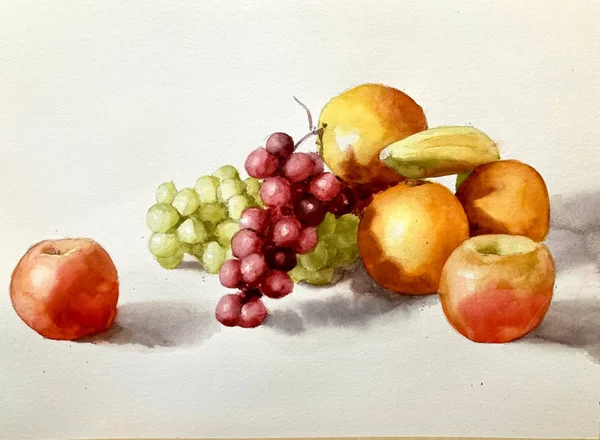
Final Painting
Fruit Watercolor Still Life by Michele Clamp
Here’s the final thing. I’m pretty happy on the whole. Looking at it a couple of days later I could probably go a little darker in the shadows on the green grapes but there’s not much else I would change.
Bonus Video Still Life Watercolor
As a bonus here is a video of another still life on my youtube channel that follows a similar method.
Bonus Color Matching Exercise
This exercise is to give you practice in assessing and mixing colors. I always find these quite revealing and fun to do.
Still life color matching reference
Here we have the photo reference. I’ve chosen this for a number of reasons. First it has clearly defined areas of light and dark – no wishy-washy flat lighting. Second the shapes are very clear – the apple, lime, and bananas all have clearly defined edges. Finally the colors are nice and bright. There’s nothing gray and muted about this setup.
A good learning photo does not make a good painting
Now all of these reasons are because I want to get across how to identify and mix color. If I were choosing a setup for a ‘real’ painting I would not choose this. Everything is a bit plainly stated and matter of fact. There’s no nuance, subtlety, or atmosphere here. But what isn’t great for a painting is perfect for learning! And the technique I’m going to describe can translate easily into any painting you like.
The numbered squares are the colors we’ll match
You’ll notice that I’ve marked out a series of numbered squares on the photo. Before we start painting we’ll go through each of these and try and identify and mix the color as accurately as we can. This will feel laborious to start with. And it will take a long time – much longer than you think. But every one of these swatches that you make is worth it. We will go through the hard work of identifying the colors we’ll need ahead of time. The final painting itself will be made easier and we’ll paint it relatively quickly.
A color isolator is a very useful tool for color identification
Gray color isolator
I strongly recommend you have a color isolator handy if you’re painting from a printed photo reference. This is just a small (say 3″x5″) piece of mid-gray card with a 1/2″ square cut out of the middle. I have a number of these handy and there’s always one close to the easel.
Your brain lies to you about color
One of the many problems we face as painters is that our brains are constantly translating what we see into what it thinks we need. If we look at a white cup in shadow our brains helpfully disregard the shadow and will be insistent that what we’re seeing is white. In practice of course it’s likely a dark blue gray and, if we want to paint it so it reads realistically, that’s the color we should paint it. We have to constantly remind ourselves that we can’t trust that little brain voice and think and look harder.
Context also makes seeing color harder
The other problem we have when identifying color is that what is around a shape affects how we see it. A mid-value gray can look lighter than it is next to black. But when it’s put next to white paper it will look darker than it is. This is where the color isolator helps us.
Use the isolator as a learning tool not a crutch
The color isolator is very useful but we need to be conscious that it’s a learning tool not something we need to rely on. So we need to use it in the following multi-step way
Look at the color you’re trying to match and identify it. e.g. it’s a mid-value bright pinkish red.
Use the color isolator by placing it over the color and see how close you are.
If you’re correct (or close) pat yourself on the back and have a biscuit.
If you’re wrong try and imprint in your memory why you were wrong so you’ll be closer next time.
The first step is the hardest! Thinking – it takes soooo much effort. But it’s really worth it. And you’ll be amazed how quickly you get a lot better at seeing color. And maybe more importantly you’ll start to learn which types of colors you get consistently wrong. For me (and I suspect most of us) it’s shadow colors and especially shadow colors of light objects. After a while when you come across these when you’re painting a little alarm will go off in your head reminding you to pay extra attention to these regions.
Color match each swatch
watercolor color matching swatches
Here’s my version of these swatches. You can see that I’ve put test swatches by each box until I’m satisfied that I’ve got it as close as I can. Only then do I put the final color in the box. And you can see that some of these colors are very different to what we consider a fruit color. Number 2, for example is the shadow on the bananas. It’s a sludgy dark green. Not bananaish at all! And the shadow sides of both the apple and the lime are really quite dark even though they are still identifiably green and red.
I’m going to be making some more videos on how I go about this. It’s hard to describe in text and much easier to show and learn from a video. I warn you that the process feels awkward at first but has huge rewards. And you’ll be going around identifying colors everywhere you go!
Livestreams and Videos
If you’re interested in this process (and have I mentioned how much it’s helped me? 🙂 I livestream paintings and techniques. If you want to know when these are coming up please sign up on my mailing list. I’d love for you to join me.