After yesterday’s rather glum conclusion it was back to basics again today. I was having a lot of trouble with pretty much everything. The values were either too different or too similar. The colors were not cohesive. The brushstrokes were too heavy handed. The only thing that really held up was the drawing which is one less thing to worry about I suppose.
So what to do? After spending an hour last evening riffling through pinterest I went back to one of the masters – Joseph Zbukvic. His style is deceptive. It looks like he just dashes things off but that masks a mastery of drawing, composition and above all value. Copying one of his paintings is not for the fainthearted but I was ready and had a plan.
Plan :
- Do a preliminary thumbnail sketch and work out the big shapes and values.
- Draw carefully but not too rigidly detailed. Make sure all the shapes work – especially the negative ones.
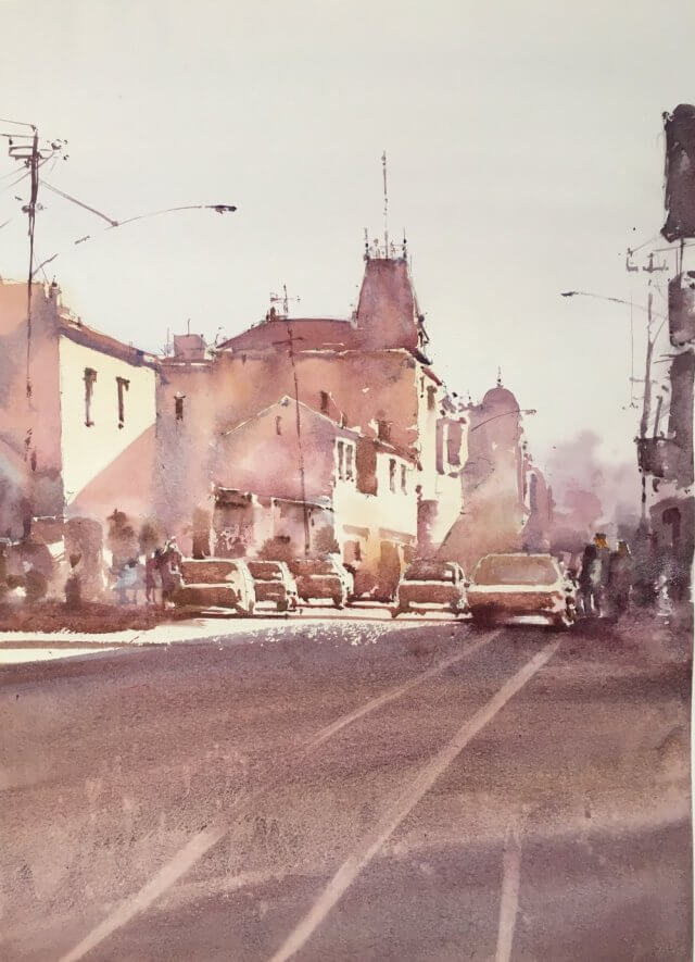
- Work out the large shapes ahead of time and values they are
- Lightest = sky
- 2nd = sunlit portions of the buildngs
- 3rd = shadow portions of buildings and parts of the cars
- 4th = foreground
- 5th – cars and middle portion of the picture
- 6th and darkest = foreground buildings at the sides and the poles/wires
- Phew – that turned into quite a lot of values. Was only really planning on 3 or 4.
- Keep the values fairly close. No stark changes and keep the highest contrast in the middle area of the painting
- Keep an eye on color. Use a restricted palette (ultramarine, perylene maroon, yellow ochre)
- Don’t rush!!! Simplification doesn’t mean slapping the paint around willy nilly.
And here’s the original I was using to paint from :

Okay off we go.
First the thumbnail :

Well I’m not sure what I learned here. Was it worth it? It didn’t really feel like it at the time. Well actually it did help. It made me remember to keep the sunlit portions of the buildings pale and mark in where the shadows fell across the buildings. This got lost in the sketch and it shows.
Second the drawing and first washes :

Fairly happy at this point. Drawing is fine and the first washes are light but have some color. Frankly it’s hard to go wrong for this part.
Next is the tricky bit and I think I learned quite a bit here. The plan was to go to the next darkest value and put in large even areas of the same wash. At this stage this means the roofs and the shadow portions of the buildings. However there is a wrinkle. A lot of the sparkle in Mr Z’s paintings come from the twiddly bits. The little dots and dashes and also the small pieces of white left in between brush strokes. In addition his washes aren’t uniform – they have variation in color and texture and maybe have a couple of layers.
I had to remember all this so I went about it as follows :
Mix up a big purply wash and use a squirrel mop to block in the larger areas but leaving some gaps and not filling in the wash to the edges
Using a smaller synthetic brush (escoda perla) use the same wash mix to put in the edges but giving them some interest and dottiness
Use the small brush to also put in shadow pieces and windows on the sunlit parts of the windows.
After the buildings I had a first pass at the cars. Things to remember about cars :
- Keep those horizontals really horizontal. No scrappiness there.
- The highlighted portionsof cars need to be really quite small.
- Don’t be too accurate about the rest of the car once the windows and the wheels are in.
- Shadows under the cars are essential for the brain to read something as a car.
- Don’t go too dark too early. Good advice in general.
Things were looking fairly good so I then put in the foreground. It was too light to begin with and I had a couple of goes at it. It’s still a bit light but I felt I’d fiddled too much already. I made sure to get a rough brushstroke at the top where the shadow ended.
So at this point this is what I had :

Frankly I was pretty chuffed at this point. There’s reasonable variation in the washes. The brushstrokes nicely indicate the window and shadows on the buildings and the cars definitely read as cars. A little scrappy in the foreground but you can’t have everything.
Now I was getting worried I was going to screw everything up. All I had left to do was to put in the right hand side darker buildings, the people and the lampposts and telegraph poles. I almost went too dark with all of these but sponged off the worst of it. The final thing has a lot to recommend it :

So what did I learn? Let’s make a list :
- Take your time over those twiddly bits. They look dashed off but they’re not. Why do I never remember this?
- Remember the big shapes – keep the value within a small range in these. This is painting 101 – why do I have such a hard time remembering this?
- Kepp those large washes moist by spraying them and add in color/water to add some variation but not so much it changes the value too much.
- Don’t go too dark too early. A small value change over a large fraction of the painting reads so much better than chopping and changing from light to dark all over the place. I think this is the thing that I mainly took away from this piece. I can also see the regions where I strayed from this concept and they suffer.
- Horizontals are horizontal. Verticals are vertical. Should be covered by following point one really.
- A restricted palette really helps.
Now all I need to do is to carry this over into my own paintings.
How do you decide between a warm or a cool scheme and which color scheme scheme for a particular painting?
I am so pleased to have come across this article. I have been struggling with doing he Josephy style but met with all the problems that you mentioned in the beginning of this article. Why don’t I remember all the points that you mentioned. Thank you so much for the article and illustrations.
Thank you Frank – and I hope your experiments bear fruit. It’s easy to be seduced by his lovely calligraphic marks. But the essence of his success seems to be based around his masterful control of values. He seems to compress his value range quite a lot which is very tricky to do.