Watercolor Portrait Sketches

Watercolor portrait sketches are something I haven’t done in a while. A lot of other watercolor painting but very rarely faces. Portrait painting takes the difficulties of watercolor to another level. Getting the facial features right, the skin color, how the light reflects off the planes of the face – everything needs to be right. And that doesn’t even touch on how hard it is to get a good likeness.

Portraits over zoom are great!

Today was the life session courtesy of the Newton Watercolor Society. We had our wonderful model Andrea who I think I’ve painted before at a Charles Reid workshop. I was pleasantly surprised how successful it was to paint at home from the screen image. Almost made me forget I wasn’t actually in front of the model. Of course there are differences. You have one point of view (although everybody has the same view which is nice) and the camera does odd things with the exposure and the color. But on the whole I got a lot out of it.

My Portrait Skills need some work

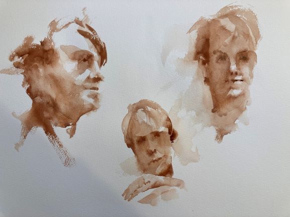
Now you may be wondering from my portrait results where the other two models were. Actually these three faces are all of the same person. I’ve managed to not only paint people who look nothing like each other but also are of completely different ages and indeed gender. Obviously need a little practice here.

The Process

I was working on Fabriano Artistico 140lb cold press paper and worked entirely with burnt sienna. Using a round brush I initially washed in the main values leaving the paper white for the light parts of the face. Initally I just put shadow in the eye areas and around the mouth and left any details until later. We only had a time of 15 minutes per portrait so things had to go fast. This meant any detailed treatment of the eyes or hair had to be skipped over. I worked wet in wet mostly – partly due to time and partly to not end up with any hard edges. It was extremely enjoyable and the time just whizzed by. On the whole I’m pretty happy although I obviously need to work on doing more observation of those fine feature distinctions.
Barn Watercolor

Easy Steps to Create a Painting

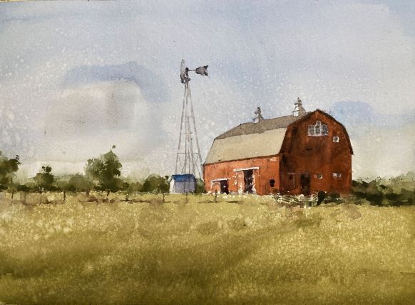
I had a good session painting a barn watercolor this week. Starting with a value study is a great path to a successful painting. I chose to do a watercolor painting of this old barn as it had clear areas of different values that show the form and make the scene look three dimensional. This was a session on values so there wasn’t much finesse in the final study we did. My painting hand was itching to have another go at it so I did a quick sketch this afternoon. A watercolor barn is a great subject for learning how values create form with paint. If you’re looking for watercolor painting ideas it’s a good place to start.

This was never going to be a finished piece as the paper was a bit damaged where the printer ink got smeared on it which actually frees you up a bit as it’s not as precious. Quite happy with this. If I were to do it again I’d take a little more care on the sky and tone down the blue a little. I was trying to cover up the nasty smear but to no avail.

Below I outline what we did in the lesson:

First a Value Study

Barn landscape watercolor study

We started by practicing mixing up values. Knowing how to mix the right consistency of paint for a middle value is one of the most valuable skills to have. With watercolor it’s pretty much impossible to know how the paint will look just by looking at a mix on the palette. We have to judge by the consistency of the paint and it takes a bit of practice. Well worth it though. We used pretty much 3 values to paint this value study. The forms and the light are all there and it reads well visually. We’re good to go with the color version!

How not to paint a barn watercolor

How not to paint a barn in watercolor

This was me demonstrating how I used to paint before I discovered how important values are. I’ve pretty much identified the colors – sky blue, grass green, barn red – but none of the values are right. The sky is too dark, the grass too light and there’s no difference between the light and the shadow side of the barn.

Values First – Color Second

Where I went wrong is that I focused too much on color and not enough (if at all) on value. If the value is right then you have a lot of leeway with the color. The next version paid much more attention to the value.

Barn landscape watercolor color study by Michele Clamp
Barn watercolor color study

This was our final study of the day. Keeping the areas pretty simple but really trying to nail the values. The sky is still blue but much paler. The grass is now a much more realistic green and now a darker value. The shadow side of the barn has a much better contrast with the light side and shows the form.

Everyone did really well with this. This is a beginner’s class so people are very new to watercolor. It’s a lot to take in but so fundamental and rewarding when it works.

I always enjoy it when I do a barn painting. A scene out in the country with farm buildings is always a pleasure for a watercolor artist. If there’s a wall or a fence around to include so much the better. It’s true that a barn painting like this is not the most original of subjects but it’s great for teaching and has a timeless quality that is always a pleasure.

Demo Video Available

I have a number of real-time demo videos on my youtube channel (and you can access them from this site here).

A similar barn painting (also part of a lesson) can be watched below:

YouTube player

Online Watercolor Classes

I run weekly watercolor classes regularly. If you would like to join me please check out my teaching page.

Available Original Barn Art

The original painting is also available from ugallery who are offering a number of my paintings online

Framing Day

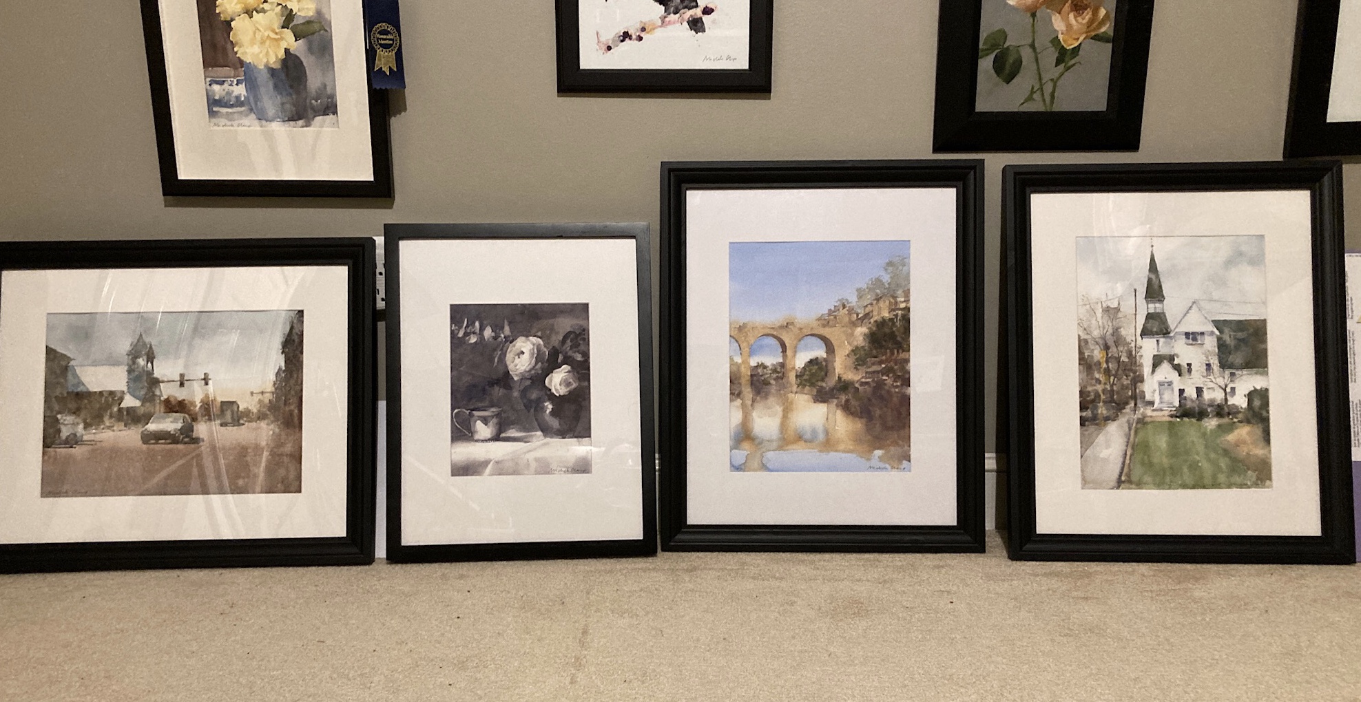
No painting today as it was framing day. Four paintings going to two shows in the next week. The left hand two are in the North East Watercolor Society members show. The right hand two are going to the Newburyport Art Association on Wednesday. A small crisis when I almost ran out of hinging tape but all well in the end.

Singing Beach Watercolor Take 2

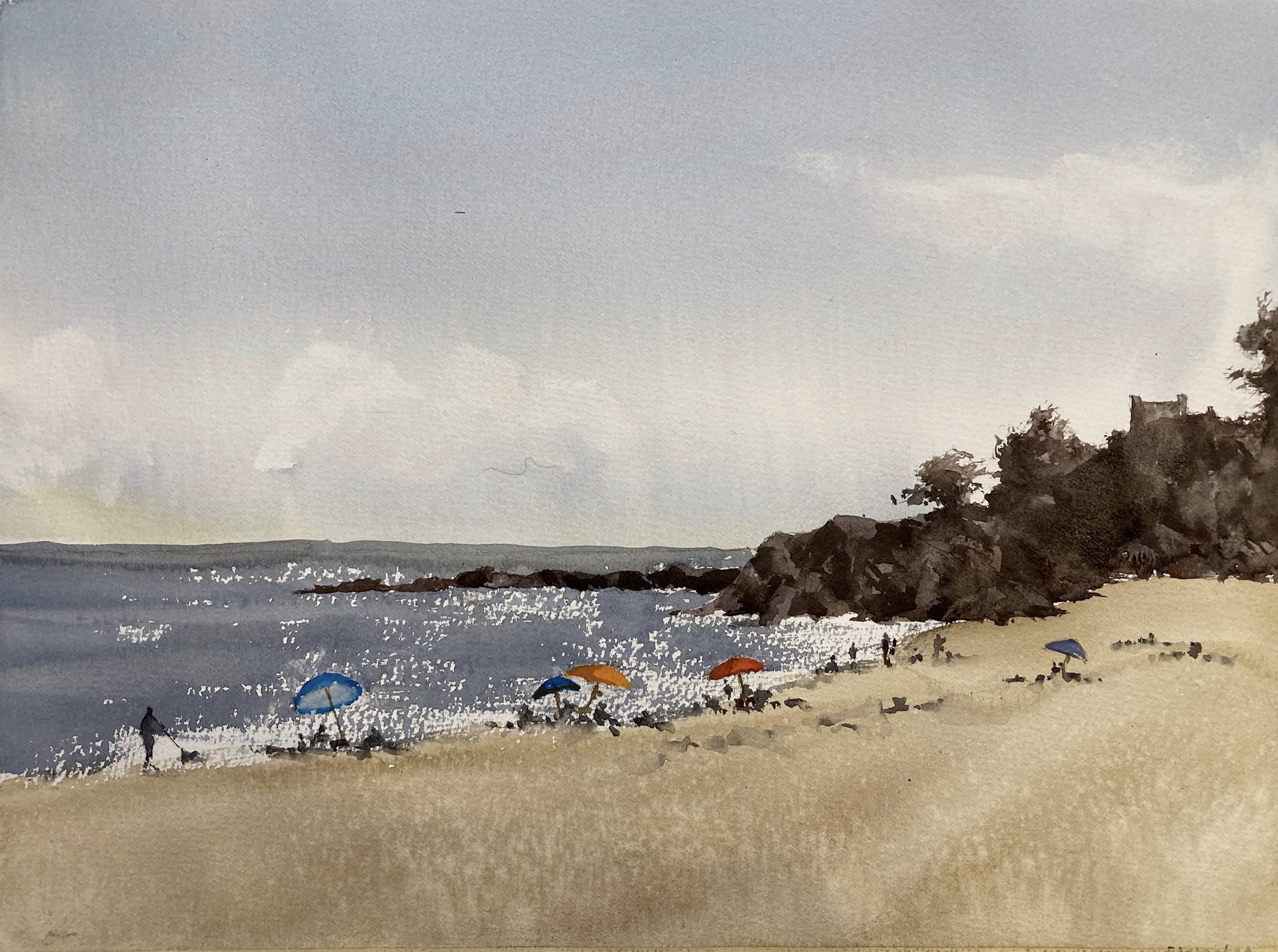
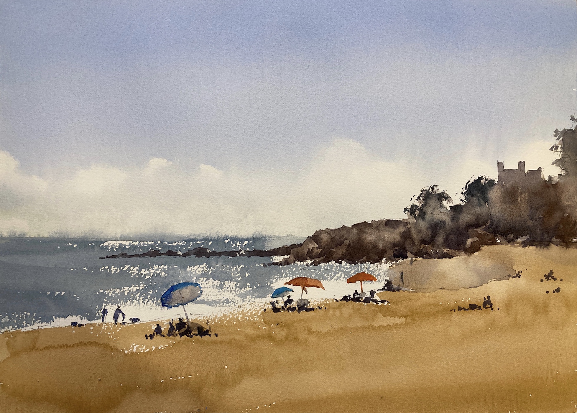
I was pretty happy with yesterday’s sketch but wanted to get closer on the colors. The sand especially was a little too *pow* for me so back to the color swatches to get closer. The changes I made were to push the sky a little more towards green, the water a little darker and the sand with way less chroma. It’s still the same color which is mostly yellow ochre with a little permanent rose. But to take the chroma down I added some lamp black and a little water to bring the value back to where I wanted it.

Here’s today’s and yesterday’s side by side.

Now personally I prefer today’s version. However other members of the household prefer yesterday’s.

It was definitely worthwhile doing the same scene twice. It takes the pressure off when you’re doing the first one and you can experiment with a few things that you might not otherwise.