Zakim Bridge Watercolor Study

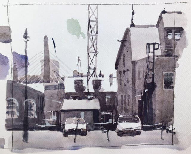
I’ve been wrestling with this view of the Zakim bridge from Boston Naval Yard for a while. It has a lot of contrast and my first try I overdid the value range completely. So after finishing the heron this morning I thought I’d just do a quick freehand value sketch with no prior drawing and see how it came out. I think I might finally be onto something. Going in with the mid values first, then the darks and then the lighter values helped enormously to tie this together. Let’s see how it turns out with a full size attempt.

Standing Blue Heron Watercolor Painting

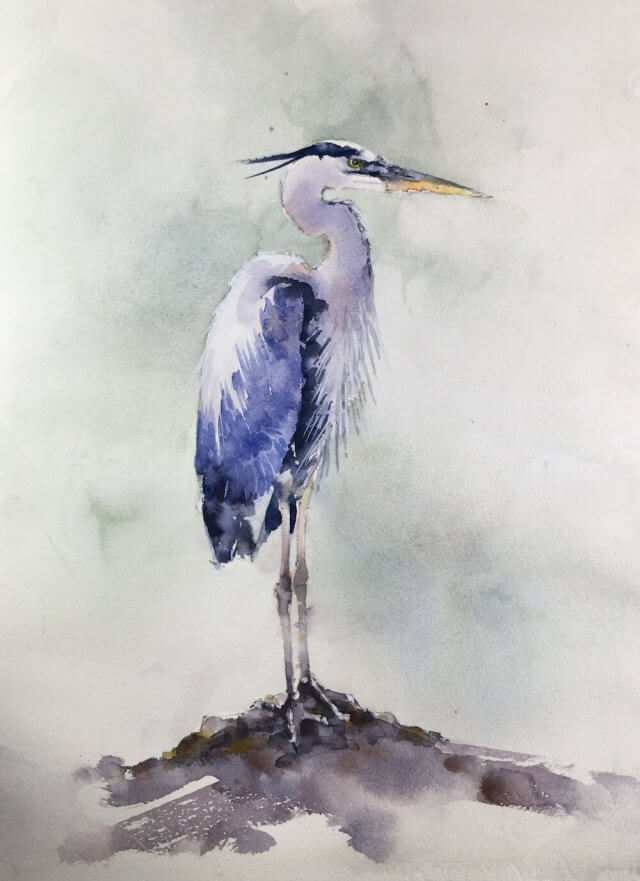
Time for another heron. These are always popular but they are very tricky to do and never seem to get easier. Very happy with this one right now. Some nice detail in the feathers and the background brings out the lighter colors without overwhelming the bird. Let’s see if it still passes muster tomorrow morning.

If it does there’s also video which I’ll upload later.

Still life Watercolor Color Matching Study

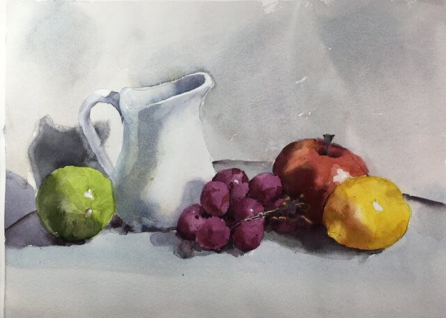
Although everything came out ok in the end I made the classic mistake of being overconfident going into this. As it is a study I was concentrating hard on getting the colors and values as close as I could (apart from some of the grey shadows which were too drab) and I almost lost my way. Lesson learned – never let down your guard or watercolor will bite you.

Here is the original photo.


And finally I made a video of the painting process for those interested.

Bouquet of Red Roses Watercolor Painting

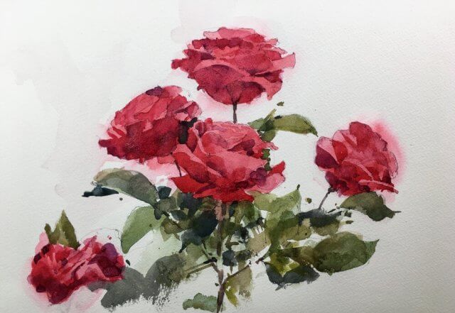
A delivery arrived today with some new (to me) paper. This is on Kilimanjaro paper (140lb CP) and I really quite liked it. I seem to remember I tried it years ago and didn’t like it but I’ve obviously got more tolerant in the mean time. I will probably buy again.

The subject was roses today and although the result is just a sketch I’ve finally got back into the swing of things.

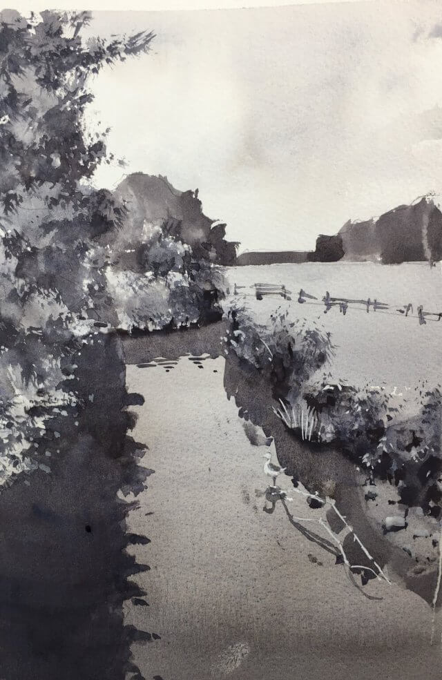
Value Study Landscape

Painting is slowly getting easier in that it doesn’t feel like pulling teeth any more. The results may or may not be getting better but at least the process is getting more familiar and I’m getting some enjoyment out of it.

I’m continuing with value studies from my lucky dip photo bag. This one I applied my simplifying technique of stripping everything back to a few value shapes and finally a single detail shape with the bulk of the contrast. This detail shape can be a pretty odd shape and, in this scene, includes the foreground trees as well as the bushes on the other side of the bank. They’re contiguous in 2d if not in 3d.

I think this worked out quite well. It’s not meant to be a finished painting but I think I could work this one up if I wanted to. Onwards!