Sargent Portrait Watercolor Study

First Attempt at Sargent Watercolor Portrait

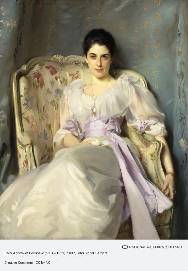
This portrait watercolor study is from an amazing Sargent painting of Lady Agnew and can be seen at the Scottish National Gallery. Well if you’re ever feeling over confident about your painting abilities try doing a Sargent watercolor portrait study. It definitely cut me down to size. I wasn’t attempting a likeness (and definitely didn’t achieve that) but wanted to see how I could do with the skin tones. All in all not a bad attempt but will definitely need more work before next week.

sargent portrait watercolor study

It’s quite surprising how low chroma a lot of the colors are in this. I had to be very careful to tone everything down a little to get anywhere near the right colors. Even the blue in the background has quite a lot of black in it. And the folds in the dress are a *very* low chroma purple which is almost indistinguishable from gray when it’s on the palette.

Second Attempt at Lady Agnew Portrait copy

Lady Agnew Watercolor Portrait Study

Trying again with this Lady Agnew Sargent watercolor study. Smaller this time which may have been a bad idea as I had to break out the smaller brushes. Better take on the face shape but still a way to go. The likeness is still nowhere near of course but, at least, this one does look like an actual human being. I got more form into the eye socket area and more contrast where it needed it. In both paintings I rather liked the hair. Nice and dark but with subtle value changes to show the sheen of the waves.

Next Steps

My final goal with these studies is to do an oil master copy at a much larger size. As it stands I need to do some more work before attempting this. The main thing is to get more of a likeness and for that I’ll need to brush up on my face drawing. Some careful pencil studies will likely be the order of the day.
Limited Palette – Final(ish) Results

Two limited palette studies. The left hand one is with quin magenta, cadmium yellow, cobalt teal. The right hand one is with naphthol red, cadmium lemon and winsor blue (green shade). Really surprised how close the colors are between the two sets.

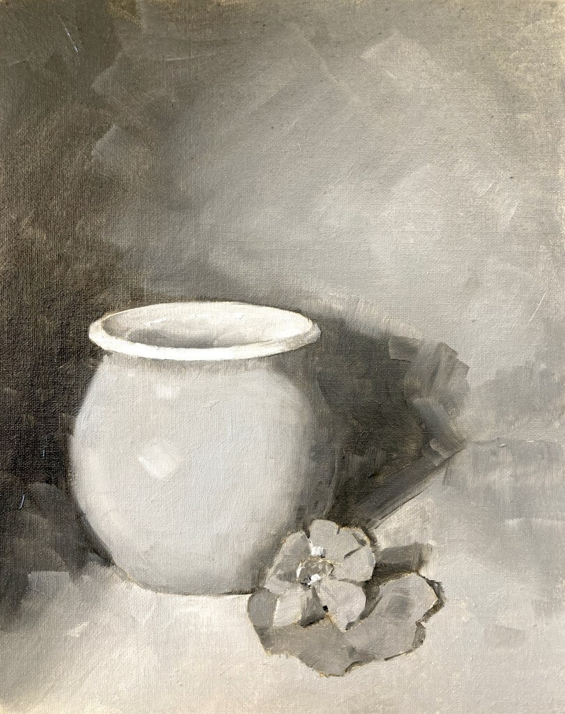
This one is with the Zorn palette of cadmium red (actually naphthol), yellow ochre and black. Lovely muted colors and really surprised how blue that pot looks with only ivory black and white.

Iris Painting

Iris. Michele Clamp. Watercolor. 14″x11″

Phew! Flowers are so stressful and I’m still in two minds about this one. The shapes of irises always have a lot of energy to them but the subtle value changes are crucial and easy to mess up.

Limited Palette Still Life

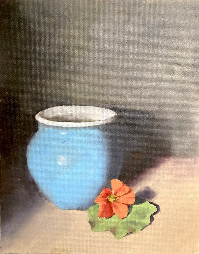
This month it was a limited palette still life. The photo has quite a range of colors so it was going to be tricky to choose the 3 pigments wisely. I take part in a monthly oil painting challenge and we all have a go and compare. The photo has quite a range of colors so it was going to be tricky to choose the 3 pigments wisely.

Limited Palette Still Life -  Painting and Reference
Limited Palette Still Life – Painting and Reference

One of the most famous limited palettes is the Zorn palette. That is cadium red, yellow ochre, and black which obviously wasn’t going to cut the mustard if we wanted accurate color matches.

Choose A Limited Palette Carefully

So for this first version I wanted to choose pigments that gave me the best chance of nailing those colors as accurately as possible. This first meant choosing a good blue in order to mix that pot and a bright red-orange to hit the flower. The final color had to be a yellow that could mix with the red to make the orange and also with the blue to make the green of the leaves.

So what to choose? That blue of the pot is pretty green. I had some winsor blue greenshade (which is a phthalo blue) was a good choice there. For the red I went with the really high chroma naphthol red. This red leans toward orange and is very powerful. Should be able to hit the high chromas with that. For the yellow I went with a greenish yellow so I’d have a chance at hitting the green.

The Results Were Good for this Limited Palette Still Life

As it turned out those colors were good choices. The blue of the pot was fairly easy to hit. I undercooked the chroma a little on the flower but that was more due to my slapdash mixing than a poor choice of paints. Similarly with the green of the leaf I pushed the color more toward yellow than it really ought to have been. There’s no real excuse for this – I had the blue and could easily have nudged it back towards the blue.

[activecampaign form=10 css=1]

Michele Clamp Studio Wall

But on the whole they were good choices and I’m pretty happy with the results of the limited palette still life exercise.

Vermont farm watercolor

Online Zoom Classes

I run online zoom courses regularly for both beginners and more advanced students. Please check out my workshop page.

Oregon Mountain Landscape Watercolor Painting

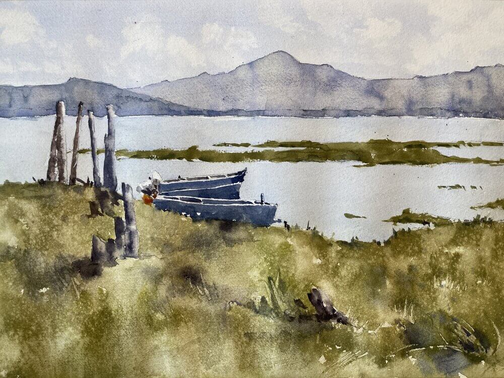
For this week’s class Lisa provided us with a great photo of an Oregon mountain landscape watercolor painting.

Examine The Photo Composition

The photo was pretty well composed and had a good range of big shapes an values. There wasn’t a strong directional light but that wasn’t so much of a problem. One possibility could be to invent some light and put in some shadows. However, there was quite a lot of contrast in the photo already. There was the strong foreground, the lighter water, and the light to mid-valued mountains. So we left the light as it was.

[activecampaign form=10 css=1]

Michele Clamp Studio Wall

Have a Well-Defined Center of Interest

Another positive for this photo is that it had a really good well-defined center of interest. The boats and the wooden poles give the viewer something to look at but don’t draw too much attention away from the rest of the picture. And the poles themselves provide a nice connection point from the foreground to the background. That way things are held together and don’t look too separate

Texture and Values Add Interest to the Landscape Painting

When it came to actually painting we concentrated on getting each of the big shapes the right value. Light for the sky and water, mid-tones for the foreground, and darks for the boats and poles. But if we’d left it too even there wouldn’t be much interesting to look at. So we added in slight value variations in the sky and mountains. For the sky we added in some clouds and softened the edges using a damp brush. For the mountains we varied the value with water to show some slight undulations in the terrain. We also varied the color slightly by dropping in slightly different hues. The final effect is slightly shimmering which I like.

Vermont farm watercolor

Online Zoom Classes

I run online zoom courses regularly for both beginners and more advanced students. Please check out my workshop page.

The Foreground Needs Stronger Variation and Texture

The foreground also needed a little bit more interest. It’s closer to us so we should be able to see a bit more detail. Even if we don’t want to paint every blade of grass (which we definitely don’t) we needed to put some variation in there. Like the mountains we varied the value and color a little to show some lumps and bumps and tufts. We also used the spray bottle to lightly add in some water drops. They leave a mottled effect on the surface when they dry which is a really good way to add some texture. Don’t overdo it though – it can look a little gimmicky if overdone.

The Boats Are Put in Broadly

The final things we put were the boats and poles at the center of interest. These were put in very broadly with only a few strokes. As we wanted the most contrast here we also left little sparkles of white paper showing through here and there.

Final Thoughts on the Mountain Landscape Watercolor Painting

I’m actually pretty happy with this although I might just tweak the foreground values a little tomorrow to create more of a lead in.