Oil study – Lime Wedges and Backgrounds

Oil study for Threads

Well this was fun. I learned a lot here. The subject was a lime wedge against different colored backgrounds. In the end I used pretty much the same colors for the wedge itself but the background (obviously) and the foreground and reflection changed color. In particular that reflection, even though it looks yellow/orange is in real life a pure grey. Who’d have thought? In hindsight I should have known as a yellow reflection on a gray background will result in a neutral gray!

Here’s a closeup of the result

Lime wedge oil study

Rose Watercolor with Paul Foxton

Roses from Paul Foxton’s Reference Image. Michele Clamp. Watercolor.

It’s been a while since Paul Foxton has done a streaming demo but I was extremely pleased that today was today. Now Paul is a wonderful teacher and paints exclusively in oils. I usually do oils in his sessions too but today I thought as it was mid 30 in 30 I would break out the watercolors.

This was very tough and tricky as you have to continually modify what you’re doing to fit with watercolor. You have to leave the light areas for instance so block ins have to be modified and putting in large areas of darks take forever and need multiple layers. But, although this isn’t going to win any awards I was quite pleased with this.

Somerville Church Watercolor

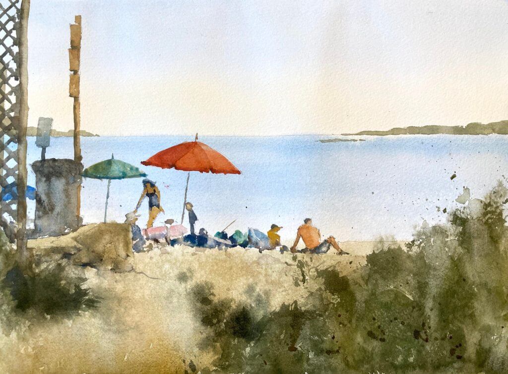
A slight intermission in my 30 in 30 but I’m back to it now for day 15. This is again a local view of a church in Somerville. I always liked the geometric arrangement of shapes and values and the contrast with the more organic shapes of the trees and the background. This is also on Fabriano Artistico soft press paper which I quite like. Smoother than cold press but still absorbent. It shows up the blossoms which I’m liking more and more.

Boston Common Watercolor Painting

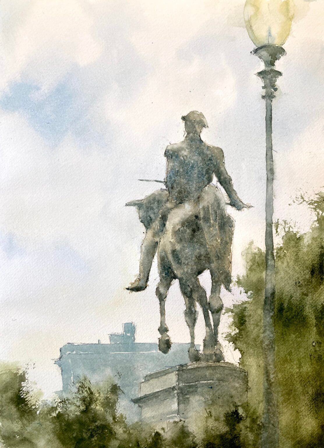
Boston Common watercolor painting – day 13 of 30 in 30. I used to walk through the Common on my way to get my hair cut at a fancy Newbury St salon. This was back when we both had the fancy jobs and I hadn’t had any mad ideas of giving everything up and painting full time. Can’t say I miss the hair cuts but I do miss Boston Common. I wanted to focus on the statue and keep the buildings (probably a hotel?) misty and in the background.

Intersecting shapes attracted me to the composition

One of the things that really attracted me to this composition was the way the horse’s legs intersect giving an abstract pattern. As the statue is against the light the values are very close on the figure and the horse. This gives it a subtle, misty feel which I really like. The added texture due to granulating paint (mostly cerulean blue) and some water splattering adds to the effect.

Verticals are vertical – do I really have to say this again?

But oh that lamppost! It’s gone past loose to sloppy and I didn’t keep it straight. Lost edges are fine here (in fact probably essential) but I didn’t keep my eye on the ball here and the painting suffers.

On balance a good outcome

But on the whole this came out rather well I think. I love the texture on the statue and the muted colors. I’m getting behind on a painting a day so they’re coming thick and fast right now. Helps in some ways as you don’t worry too much over details.

A video to end with

I didn’t record this one (wish I had done now!) but here’s a link to a another Boston painting which was livestreamed in November. If you want to be notified of any upcoming videos or livestreams please subscribe to my youtube channel and join my mailing list.

YouTube player

Beach Watercolor Painting

A beach watercolor painting is always popular and fun to paint. There are some gotchas to look out for however, and this is what you need to do.

Beach Paintings – Sand Isn’t Often Yellow

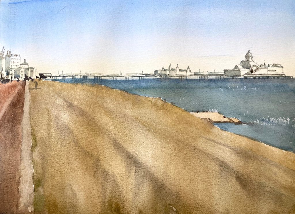
It’s really tempting to look at a sandy beach and confidently reach for the yellow or the yellow ochre. However if we look closely that isn’t the case. If we isolate the color we can suddenly see that sand is actually often a very grayed out almost beige color. It’s only when it’s painted next to the blue of the sea that it starts to read as yellow. Now in this painting I’ve somewhat overdone the yellow even though I tried not to! Have a look at these paintings of Manchester by-the-sea to see what I mean.

Don’t Overcomplicate Water in your Watercolor Beach Painting

Now there are lot of really good seascape painters. Fredrick Judd Waugh is one of my faves. And they really do go to town on waves and breakers and spray. But in a scene like this it’s really not necessary. Now if the sea was the main element in the picture then that would be a different matter. But here we have the sand, the pier (which is really the main focus), and the buildings. All of these have a lot of detail and fiddly bits. Trying to put waves and hundreds of different value changes into the sea would just overwhelm the painting.

Daily Painting Doesn’t Always End in Success

Well this Eastbourne watercolor painting was meant to be a quick and easy one but it didn’t turn out that way. It’s great on these daily paintings to try new things but that also means the failure rate increases. Day 12 of 30 in 30 – almost half way through!

[activecampaign form=10 css=1]

Michele Clamp Studio Wall