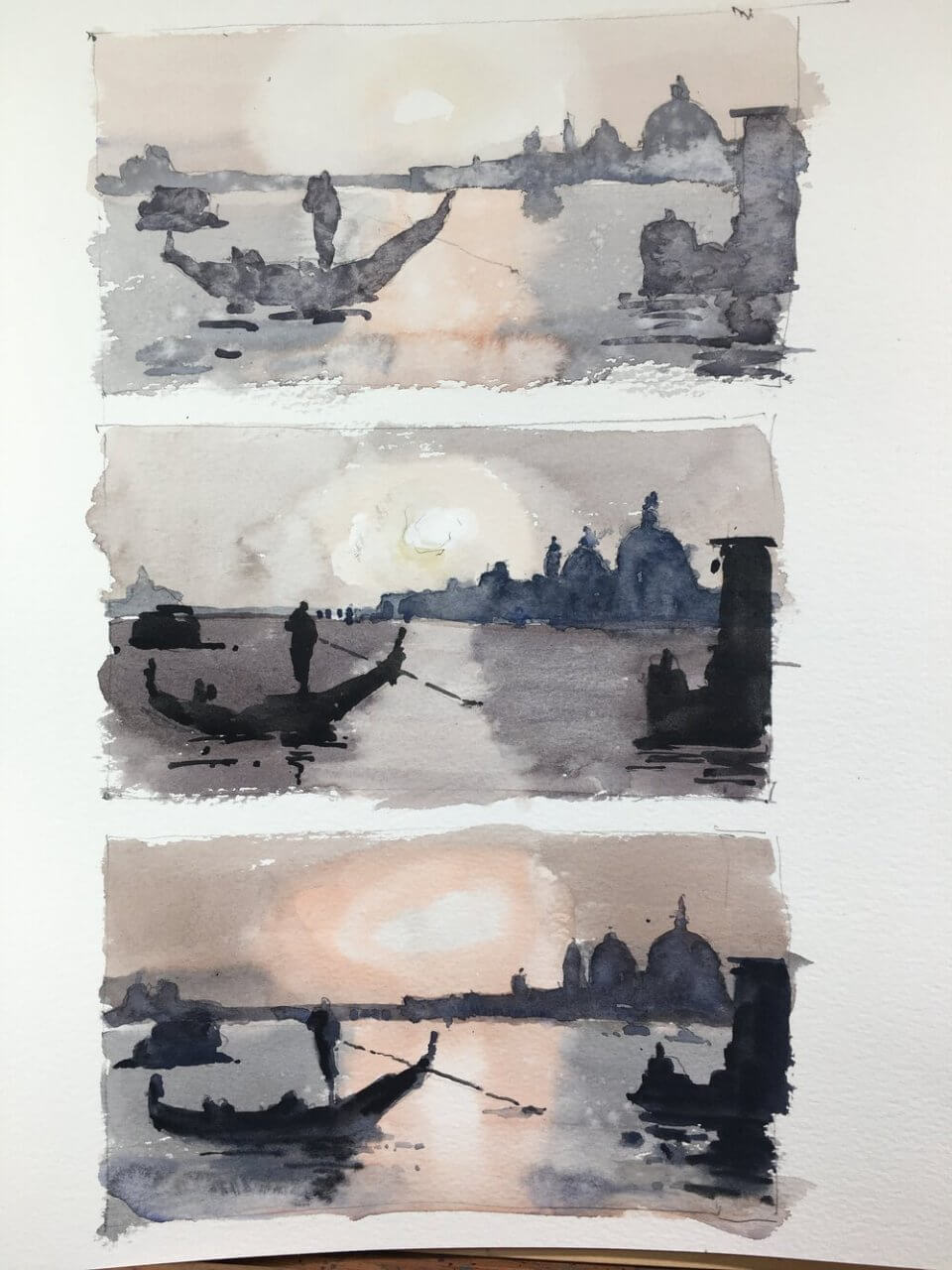
Varying the value range alters a painting’s feel
The plan behind venice and watercolor value studies is the following. Take a reference and paint it three times. The middle one is painted as closely to the actual value range in the reference as possible. The top one is shifting and compressing the value range to the top i.e. lighter than the reference. And similarly the bottom one is shifting and compressing the value range to the bottom i.e. darker.
Change the values but keep the value relationships
The first goal with these studies was to see whether we could shift the values but still keep the value relationships. If the relationships are good then the scene will read correctly. And I think they all do. None of them are great paintings but you can see they all represent the same thing.
Shift the values to change the atmosphere
The second goal was to change the feel of a painting by shifting the values. I thought the lighter one might have a more misty, ethereal feel. And the darker one would be more moody. Well I don’t think I succeeded here. Maybe I’m over simplifying the process. But it definitely an exercise worth doing.
Some days nothing really works
Wasn’t really feeling it for this one. Let’s hope I can pull something out of the bag for tomorrow’s class. In any case it was good practice for value studies. I’ve also included a larger version below. Again I’m not really happy with it – just one of those days I suppose.
And a link to someone who can really nail this – Joseph Zbukvic
A lot of you will know of Joseph Zbukvic. His value handling (amongst many other things) is spectacular.

Yes well we’re all depressed now aren’t we? He actually uses quite a narrow range of values here but expertly implemented.

