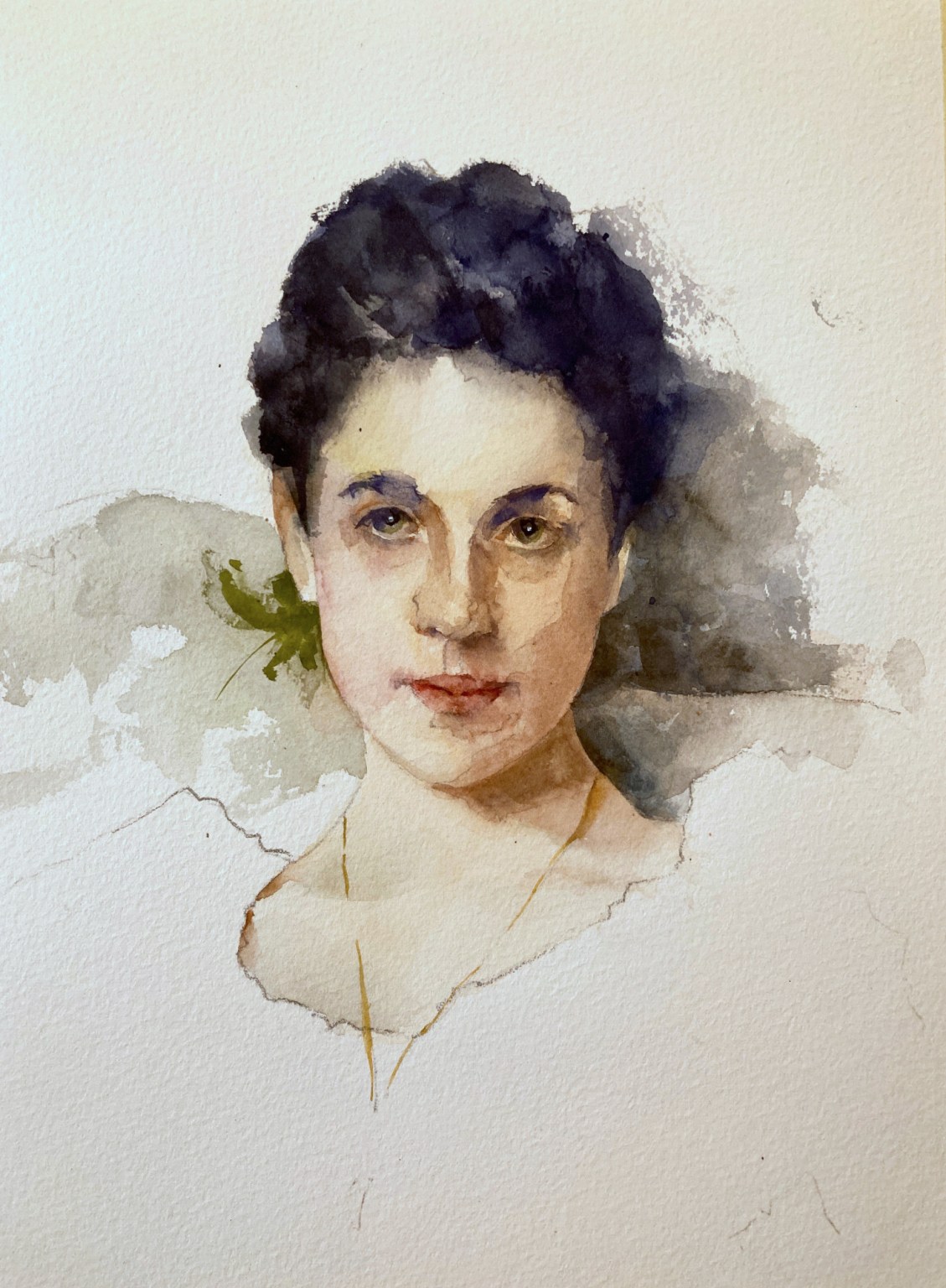
Trying again with this Lady Agnew Sargent watercolor study. Smaller this time which was probably a mistake and I had to break out the smaller brushes. Better take on the face shape but still a way to go.
Month: June 2021
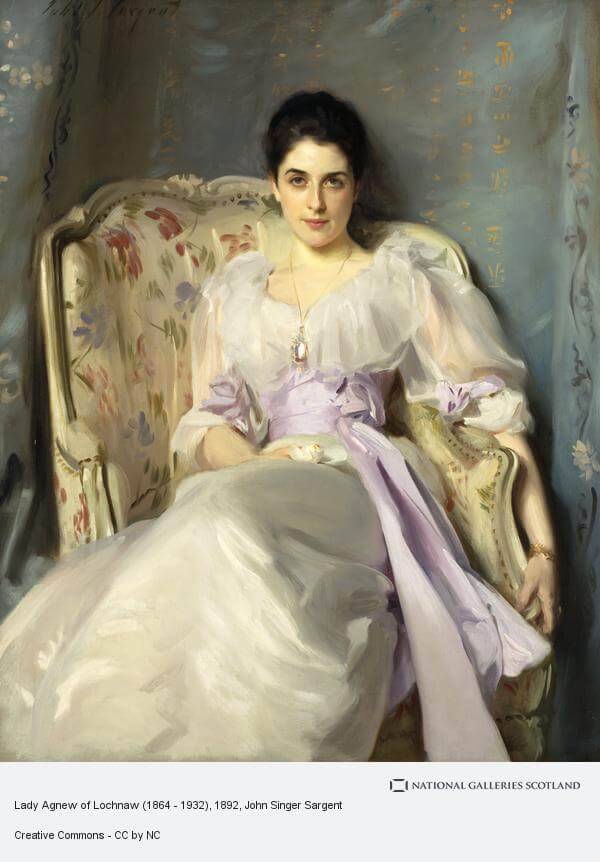
Sargent Portrait Watercolor Study
First Attempt at Sargent Watercolor Portrait
This portrait watercolor study is from an amazing Sargent painting of Lady Agnew and can be seen at the Scottish National Gallery. Well if you’re ever feeling over confident about your painting abilities try doing a Sargent watercolor portrait study. It definitely cut me down to size. I wasn’t attempting a likeness (and definitely didn’t achieve that) but wanted to see how I could do with the skin tones. All in all not a bad attempt but will definitely need more work before next week.

It’s quite surprising how low chroma a lot of the colors are in this. I had to be very careful to tone everything down a little to get anywhere near the right colors. Even the blue in the background has quite a lot of black in it. And the folds in the dress are a *very* low chroma purple which is almost indistinguishable from gray when it’s on the palette.
Second Attempt at Lady Agnew Portrait copy

Trying again with this Lady Agnew Sargent watercolor study. Smaller this time which may have been a bad idea as I had to break out the smaller brushes. Better take on the face shape but still a way to go. The likeness is still nowhere near of course but, at least, this one does look like an actual human being. I got more form into the eye socket area and more contrast where it needed it. In both paintings I rather liked the hair. Nice and dark but with subtle value changes to show the sheen of the waves.
Next Steps
My final goal with these studies is to do an oil master copy at a much larger size. As it stands I need to do some more work before attempting this. The main thing is to get more of a likeness and for that I’ll need to brush up on my face drawing. Some careful pencil studies will likely be the order of the day.
Limited Palette – Final(ish) Results


Two limited palette studies. The left hand one is with quin magenta, cadmium yellow, cobalt teal. The right hand one is with naphthol red, cadmium lemon and winsor blue (green shade). Really surprised how close the colors are between the two sets.

This one is with the Zorn palette of cadmium red (actually naphthol), yellow ochre and black. Lovely muted colors and really surprised how blue that pot looks with only ivory black and white.
Iris Painting

Phew! Flowers are so stressful and I’m still in two minds about this one. The shapes of irises always have a lot of energy to them but the subtle value changes are crucial and easy to mess up.
Limited Palette Still Life
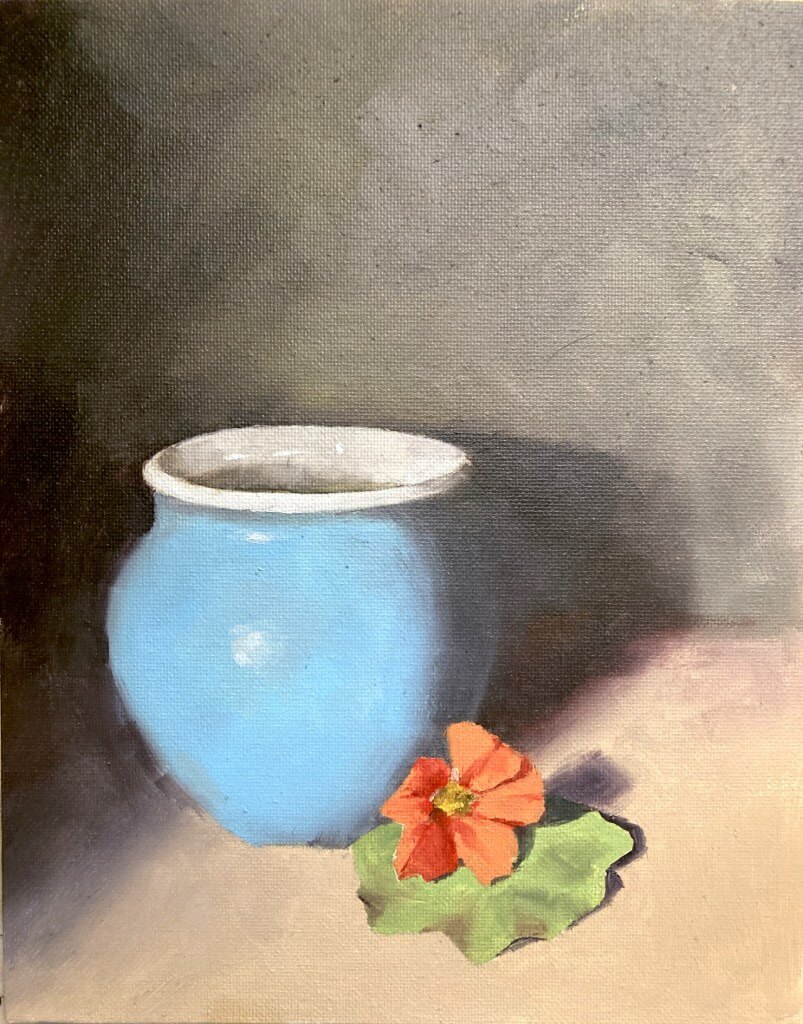
This month it was a limited palette still life. The photo has quite a range of colors so it was going to be tricky to choose the 3 pigments wisely. I take part in a monthly oil painting challenge and we all have a go and compare. The photo has quite a range of colors so it was going to be tricky to choose the 3 pigments wisely.

One of the most famous limited palettes is the Zorn palette. That is cadium red, yellow ochre, and black which obviously wasn’t going to cut the mustard if we wanted accurate color matches.
Choose A Limited Palette Carefully
So for this first version I wanted to choose pigments that gave me the best chance of nailing those colors as accurately as possible. This first meant choosing a good blue in order to mix that pot and a bright red-orange to hit the flower. The final color had to be a yellow that could mix with the red to make the orange and also with the blue to make the green of the leaves.
So what to choose? That blue of the pot is pretty green. I had some winsor blue greenshade (which is a phthalo blue) was a good choice there. For the red I went with the really high chroma naphthol red. This red leans toward orange and is very powerful. Should be able to hit the high chromas with that. For the yellow I went with a greenish yellow so I’d have a chance at hitting the green.
The Results Were Good for this Limited Palette Still Life
As it turned out those colors were good choices. The blue of the pot was fairly easy to hit. I undercooked the chroma a little on the flower but that was more due to my slapdash mixing than a poor choice of paints. Similarly with the green of the leaf I pushed the color more toward yellow than it really ought to have been. There’s no real excuse for this – I had the blue and could easily have nudged it back towards the blue.
[activecampaign form=10 css=1]

But on the whole they were good choices and I’m pretty happy with the results of the limited palette still life exercise.

Online Zoom Classes
I run online zoom courses regularly for both beginners and more advanced students. Please check out my workshop page.
Oil Still Life Value Study
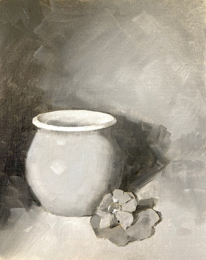
The ex members of Paul Foxton’s Threads are carrying on with monthly exercises and this month’s is ‘limited palette’. I’m going to introduce color for the next one but wanted to start with a value study first. Pretty tricky – there are a lot of close values in there