Oh the Puffins! Puffin Watercolor Painting

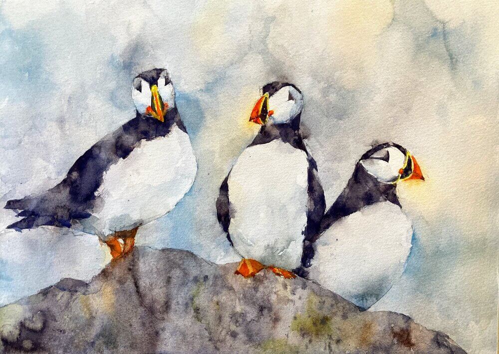
Puffin original watercolor painting: watercolor on 100% cotton cold press Fabriano Artistico.

A few years ago I sold a lovely painting of 5 puffins and, to be honest, I’ve never managed to quite capture again the looseness and lightness of touch with this subject. So today was the day to kill this once and for all.

For me this was quite a long painting. Even though the style is loose and sploshy it was very carefully planned and painted in several layers. I think I’m happy although I could possibly pushed it a little more to the sploshy side.

Here we go with the stages:


IMG_2274.jpg

First stage after the drawing was to put light washes of color roughly where the darks and colors were going to go. I’m pushing through the edges as much as possible just being careful to keep away from areas of detail like the faces. Blossoms, drips and sploshes are welcomes at this stage. It will al add interest to the final painting.


IMG_2275.jpg

Next layer is to start just indicating some of the darks and bringing some of the edges in. Nothing too defined at this point so we can keep that lovely shimmering image.


IMG_2279.jpg

We’re sharpening up the image here. Going darker where it needs it on the black parts of the birds and being quite crisp on the face and beak.


IMG_2281.jpg

The final thing. I beefed up the background a little to bring out the whites of the birds but without making it a subject in itself. A few more darks on the black feathers, a little shading on the faces and we’re done!

Loomis Watercolor Sketch

I’ve been rooting around for something that really tickles my fancy to get me back into painting again. One of my Christmas presents was Andrew Loomis’ Creative Illustration book which has a lot of top notch painting advice and I highly recommend. One of his example paintings is of the lovely lady above and, as I haven’t done much figure work recently, I thought I’d have a go.

She’s done entirely in a combination of ultramarine and burnt sienna. I wanted to try and combine the granularity and washiness of the watercolor with the subtle range of tones in the flesh and face. Pretty happy with the result although the facial likeness to the original is not that close.

Here are some intermediates:


A6DC54DC-91F1-4224-9DE8-87F481AF4F39.jpeg

Started off with a rough pencil drawing and a fairly light wash to put in the main areas of light and dark. I was careful to not leave hard edges where they would draw attention to themselves but also lose edges where the values were similar.


BDE4C25C-EE33-4056-8CBA-47BC44C16E9F.jpeg

Next I went in with some darks to define the arms and shoulders and the hair around the face. I put some detail in the face but was careful to keep the values light.


CDFFB3B5-C08C-44BB-8ED4-22BB7D2E7418.jpeg

Next was putting some detail in the dress, defining some of the folds but leaving other areas quite in distinct. Some subtle shading for the hands but kept them with low value contrast so they don’t detract from the face. The face went in next and was almost a disaster as I was working quite small here.


65F59299-D633-44D1-BFE7-C9099A2C4FDA.jpeg

The final thing and managed to stop before I ruined it. A little more definition in the face and some more interest in the background to frame the face. A little more detail in the hands and a few tweaks to the dress more to aid the composition than anything. Phew!