Carnation Watercolor

Watercolor flower painting can be so rewarding. And if you’re looking for flower painting ideas a carnation watercolor is great way to start. Such beautiful colors and lots of twiddly crinkly petals that catch the eye. However, it doesn’t mean they’re easy. As with all flowers we have to get the colors right both in the light and the shadow and we have to get the shadows in the right places. Maybe most importantly we have to pay attention to the edges. All those crinkles! We want to suggest them in our painting but not detail every last one. A perfect subject for a watercolor painting!

Sign up for updates on classes and free livestreams


Watercolor Carnation Tutorial steps

This is one of my step by step watercolor lessons on painting a single carnation. When you start to paint watercolor flowers it’s good to take it slow and follow step-by-step. I take you through identifying the values and mixing the colors. We will then move onto painting the major shapes and then adding in the detail. A lot of the hard work is in the prep and mixing. If we get all that right the details often go in very quickly.

Materials Needed

  • Mechanical pencil
  • Watercolor paper (I like Fabriano Artistco)
  • Size 10 round sable or synthetic sable
    • Permanent rose
    • Vermillion/pyrrole red/naphthol red
    • Lemon yellow
    • Burnt Sienna
    • Black
  • Value Scale
  • Color isolator
  • Palette/paper towels/water pot
  • A solid resolve

How to start painting a watercolor carnation

So how should we think about this watercolor painting? I like to start by first looking at the overall shape and how the light falls on the flower. Which direction is the light coming from? Where on the bloom does it fall into shadow?

Simplify the carnation flower

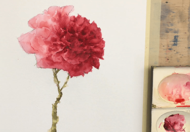
If we ignore all the little crinkly petals a carnation is pretty spherical. It’s a lot simpler in structure than a watercolor rose (which is a whole different tutorial). And in our reference the light is coming from the left. So the left side of our flower is in the light and the right side is in the shadow. If we strip it back to this we have one color in the light and one color in the shadow. Of course there will be differences in the details. In the deep crevices of the petals it will go darker and some of the outer edges will catch the light. But let’s start there and get those colors right. When you’re working out how to paint a carnation simplifying the basic colors needed is a vital first step.

Use your value scale to find the values of the light and the shadow

We have a pink carnation and you can pretty easily see we have a light pink on the light side and a darker pink on the shadow side. But how light and dark are they? And how can we mix them? It’s a good idea to break out your color isolator and your value scale here.

How to make carnation watercolor
Identify the light value and color

If you’re working from a printed reference then you can place them directly over the print. I actually recommend this if you’re just starting out with painting or if you’re working on nailing those values. If you’re working from life you can hold them up in front of the flower but be careful! Make sure the light falling on your value scale or isolator is the same as is falling on your flower. If you have your flower backlit you won’t get an accurate reading.

Squinting your eyes helps with values

What makes this slightly tricky with a bright pink flower is that we only have a grey value scale. The best way to cope with this is place your value scale on your reference and squint your eyes. The squinting will take the color out of what you’re looking at and make it easier to judge value. Eventually you’ll be able to make a pretty accurate guess but it’s always useful to check. Move the value scale along the region you’re looking at (pick an ‘average’ region) and find the value where the edge and the region almost merge together. It probably won’t be an exact match but you’ll be able to narrow it down to within a step. Do this for both the light side and the shadow. For my reference I get a value 6 in the light and a value 2 in the shadow.

Make some color swatches

Now I’m going to say something heretical here. Don’t sweat the precise color of the swatches you’re going to make. But really sweat the value! Try and really nail that value.

How to mix pinks in watercolor

So where do we start with color. We know our flower is pink and we have a pinkish red on the palette. I always start with which color on my palette is closest to the one I want to mix. I have two reds on my palette – an orangey red (vermillion) and a pinkish red (permanent rose). We know it’s definitely pink so permanent rose it is.

Pay attention to paint consistency when mixing value

The really annoying thing about watercolor painting is that when we mix colors on the palette they look *nothing* like the colors that end up on the paper. They always look darker until they get placed on the paper and are spread so thin that the paper shines through.

So what should we do? Well we could just test a swatch on some scrap paper and that is always a good idea to check. But while we’re on the palette all we really have to go on is the consistency of the paint. We add water to make a pigment lighter so the consistency of the paint gets thinner. Dark paint – thick paint and light paint – thinner paint. When we’re planning our watercolor carnations painting pay attention to both – the consistency of the paint and how it looks on your scrap paper.

Mix and paint the light value on your rough sketch

Mix the light value for the carnation watercolor

For our value 6 our paint needs to be roughly of the consistency of 2% milk. It will flow around the palette fairly easily. For comparison a value 5 will be light cream consistency and darker will be heavy cream. Try mixing your permanent rose with some water until it feels like a milk consistency. Then try a swatch on some scrap paper. Let it dry a little (watercolor always dries lighter) and bring in your value scale to see how close you are.

Practice makes mixing much easier

This seems like a really awkward process when you first start. And we haven’t even started putting paint on the paper yet! But it gets a lot easier very quickly. And trust me – your paintings will get so much better very quickly. The ability to mix accurate values is a key skill towards getting an effective watercolor.

Sign up for updates on classes and free livestreams


Now mix the dark value

We have a little bit of a problem with the dark value. Take some permanent rose straight from the tube, loosen it with a tiny bit of water, and make the darkest swatch you can. Measure that value with your value scale. Eeek! We need a value 4 but we can only get down to a value 5. We can’t get dark enough!

So what to do? Well – we only need to go slightly darker. Take your permanent rose and mix in a teeny bit of black and burnt sienna and try that swatch again. You should be able to make a darker pink without that black muddying that color too much. It should still be a nice rich pink but at the right value you need.

And just one more color!

We have our main colors but we need just one more color. The leftmost side of the flower is very light – around a value 8.5. And the color is shifted ever so slightly towards blue. This often happens when you have still life subjects lit by daylight. As the object moves into shadow the color shifts towards orange. It’s not an absolute rule but it happens an awful lot! So let’s measure and mix that color. As it turns out our permanent rose diluted to a value 8.5 is pretty bang on that color. So we paint a swatch and just try it out on the edges of our cartoon sketch flower.

But when do we start painting?

Yes, yes I know we’ve done a *lot* of messing around with mixing and swatches and value scales. But all this prep makes the painting so much easier. Finally – let’s start painting this carnation watercolor!!!

First the Drawing

Ok so I lied about the painting. We’ll get there soon. First we have to draw out the outline of the flower. When drawing the carnation lightly sketch in the oval shape then draw the outline and pay attention to the angles of the petals. Flowers may often look soft and curved but if you look closely they’re often quite choppy and jagged. This really does add to the character of the flower so we should pay attention to it.

watercolor carnation drawing

The final thing in the drawing is to lightly draw in the boundary between the light and the shadow side. This won’t be smooth as in our little cartoon sketch but will be more choppy and angled as the petals go in and out of the light. We need this to remind us where the dark colors stop and the light colors start.

And Now we Paint! Honest!

So we’ve done a whole lot of hard work. We know our colors and how to mix them. This frees up some thinking room to concentrate on putting the paint on the paper.

Paint the lightest color

Mix up and put the lightest color around the edges on the left side. While the paint is still wet clean your brush, dab it a couple of times on a paper towel and smooth the edges out. When you do this you don’t really go into the paint you’ve already put down. What you’re actually doing is wetting the paper right next to the paint and just letting the paint flow into the damp paper. It will do its thing if you let it!

The Mid-Value Layer

Let that lightest layer dry and then we can move onto the next value up. This is the color on the light side (minus those very light edges) but we’re going to paint over the dark side as well. We know we’re going to go over this with an even darker color so it’s fine to do this. In fact as the darker color will still be slightly transparent the color will show through a little and make the flower more luminous.

Make sure you don’t just fill in the shape. Leave a few gaps to show where the petals are in light. It’s these edges that really give a convincing rendition of a flower. And soften all those edges with a damp brush. Hard edges at this stage will be really jarring on the eye.

Now the Shadow Color!

We can start to see the form of the flower happening but now is time for some of the dark color to go into the shadow side. This is the scary bit!

Again it’s not just ‘filling it in’. Leave small areas of the previous layer showing. It will give the impression of petals. And, as always, soften some of the edges. Some of the edges where the petals end will be hard so leave those. But not too many! It will look choppy and jarring otherwise.

And just a reminder – KEEP AWAY FROM THE LIGHT! Don’t let that shadow color get into the light (apart from softening the edges). We’ll lose all the form if that happens and we’ll have a pink splodge. Trust me – I’ve been there.

Sign up for updates on classes and free livestreams


Painting the Stem

Let’s take a bit of a breather while that layer dries and paint the stem. This is much less stressful! Mix up an olive green color with some lemon yellow, black and a touch of ultramarine. You should end up with a mid value yellow-green. Paint in the stem and then, while it’s still wet add in a little black to make the color darker and put in the shadow on the right hand side. I decided to soften a few edges here and there on the stem just to break up that hard line. We want all the focus to be on the flower – the stem is just incidental.

Now for some Subtle Shades on the Light Side

Now it’s looking pretty good! We now have to be careful not to ruin it. It’s easily done and this part could be disastrous if we’re not careful. We’re going to put some really, really, subtle definition into the light side. Just a few touches to show where the petals overlap each other. It is so, so easy to overdo this so really err on the light side. Better to do too little here than too much. So it’s a really watery version of our light side color and just touch in some areas to show a few petals. Be careful!!!

And Now Even Darker! We’re Almost Done!

So we have some really nice form on the flower now. And some indication of petals. But the center still needs to go a little darker. Mix up an even darker mix of your shadow color. This will have very little water in it but just enough so the paint still flows.

Dab pieces of paint into the darkest crevices and soften the edge that’s coming out into the light. You won’t need much here. In mine I also decided to slightly darken the whole shadow side with a watery wash of the dark color. I wanted even more subtle change of value in the petals here as I thought some of them were too light. Skip this step if you’re not sure.

Finish Off by Sharpening up the Outside Edges

The final step was to sharpen up and make slightly choppier the edges on the shadow side. The edges of a flower often give a lot of character so I like to define them.

And Finished!!!

Finished pink carnation watercolor

And the finished thing! I am pretty pleased with this. I really love those petals in shadow that give real depth to the carnation. We all deserve a lie down now.

Sign up for updates on classes and free livestreams


And Finally…..

If you enjoyed this tutorial and would like to be notified of new ones that come out please sign up for my mailing list. I try and make tutorials that produce a satisfying result but are also easy watercolor paintings for beginners. There will also be a video on this page shortly and also on my youtube channel. If you’d like to see more of my flower watercolors this daffodil watercolor is one I’m particularly pleased with.

Many thanks for reading!! If you try this tutorial I would love to hear from you.

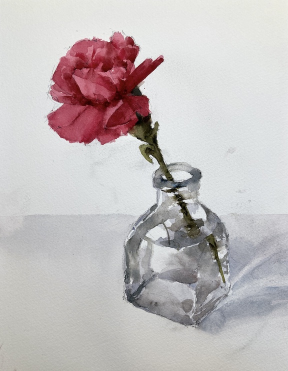
Single Carnation

Just a quickie today. I’m working on a flower class coming up in a couple of weeks. Trying a very simplified and somewhat tight bloom to show people how to show the form on a flower. Getting there. I like the image a lot but the process might need work.

Sign up for updates on classes and free livestreams