Find out about the Munsell color system and how easy it is to use. Includes access to free pdfs and the online Munsell tool ChromaMagic.
ChromaMagic 2.0 – Now with fantastic new color modes
Want to see how I transformed my color skills? Try out the ChromaMagic app.
Brand new interface and lots of new features!
How I Discovered the Munsell Color System
If there’s one thing that took my painting to the next level it was understanding and using the Munsell color system. I’d known about it for a long time but hadn’t really studied it in detail. To be honest I’d looked at it and thought ‘oh that looks far too complicated for my needs’. Reader, I was wrong. If I’d used this way of thinking about color years ago I would be far more advanced in watercolor painting than I am. There are a number of different color standards out there but Munsell is definitely the best one to study for painting.
Sign up for updates on ChromaMagic
My Color Was All Wrong
Just before I really got into Munsell I’d been flailing around trying to work out why my color wasn’t working in my paintings. I knew something was wrong and I kind of knew what it was but I didn’t know how to fix it. My problem was that color wasn’t really working in my paintings. They were all coming out really garish and the colors weren’t working in harmony. I tried various things – really trying to get the values right, graying down all my colors so they were more muted, really trying to simplify shapes. A lot of ‘really trying’ but not a lot of ‘really working’.
Munsell to the Rescue
I knew my color wasn’t working and I knew that I wasn’t really seeing color as value. But I’d missed a big part of color and that’s where Munsell came to the rescue.
Munsell is Increasingly Popular Amongst Artists
A growing number of people are using or starting to use Munsell. Off the top of my head these include Kathy Speranza, Graydon Parrish, Anthony Waichulis, and Richard Murdock. But I want to give a shout-out to Paul Foxton. He introduced me to Munsell through his website and his fabulous YouTube videos. Especially if you’re an oil painter I highly recommend you check him out.
Sign up for updates on classes and free livestreams
What we’ll cover about the Munsell System
In this post we’ll be learning about color as defined by the Munsell color system. This breaks down colors into three components – hue, value, and chroma. We’ll be defining each one and seeing how they look on a color wheel and in individual Munsell color charts. We’ll then look at how we can use this to really sharpen our perception of color. This, rather than the application of paint to paper, was the thing that is transformational about Munsell.
History of Munsell Color
I won’t go into detail about how the Munsell color theory came about. There are some great pages elsewhere that can tell you much more than I can. They also have a set of Munsell color project stories about how different people have used Munsell.
What is the Munsell System?
Munsell gives us a straightforward, reproducible and easily learned way to think about color. It breaks color into three components and we can classify any color according to those components. This Munsell color notation lets us define almost any color we want. To see how this notation system works let’s start with the first (and easiest) component.
Munsell System First Component – Hue
In the Munsell color system hue is the first component. At its simplest this is the name of the color. Red, Yellow, Blue, Purple etc. There’s a slight wrinkle in the way Munsell denotes these that can feel a little weird to begin with. Instead of saying red – in Munsell it is R. Yellow is Y, green is G, blue is B and purple is P.
So far so good. The intermediate hues which we might call orange, yellowy green, pink etc are denoted as follows:
Orange YR (Yellow Red)
Yellowish green GY (Green yellow)
Greenish blue BG (Blue green)
Purplish blue PB (purple blue)
Pinkish purple RP (red purple)
It takes a while to get used to this (especially the orange = YR) but becomes second nature pretty quickly. If we put them all in order we get
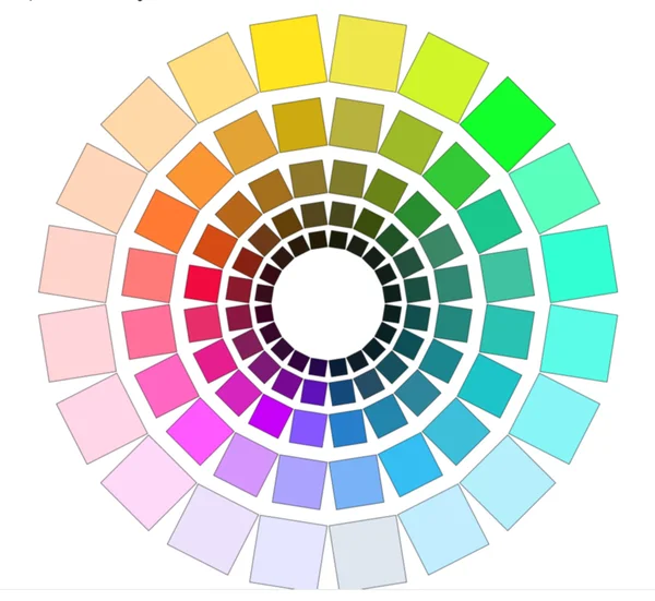
R – YR – Y – GY – G – BG – B – PB – P – RP
Munsell hue notation
I keep this Munsell color order in my head. The hues flow naturally from one to another so it’s good to memorize it. Let’s have a look at these main hues on a wheel.
Munsell Color Wheel – 10 Hues
10 hue Munsell color wheel
You’ll notice that this differs from the traditional painters wheel. The traditional painters wheel is organized around the ‘primaries’ (red yellow blue) and the secondaries (orange, green,purple) and has the primaries opposite the secondaries.
Each Hue is Divided into Four
Now these main hues aren’t really enough for us to describe the colors we see. So Munsell color theory breaks each of these main hues into 4 and gives them numbers.
2.5Y 5Y 7.5Y 10Y
Munsell hue components for yellow
Each hue ranges from 2.5 to 10 and the hue changes slightly from each number to the next. So we end up with 40 different hues. Now, this seems like a lot. But in practice you really only need to remember the 10 main ones and just estimate whereabouts in that hue we are. For instance consider this color :
Example Munsell Chip
We can immediately see it’s an orange so we’re in the YR hue. But is it a reddish orange (and so maybe 2.5YR) or is it a yellowish orange (in which case we’d be maybe 7.5YR or 10YR)? That’s pretty easy to estimate so we can work out which part of the wheel we’re in quite quickly. In this case it’s leaning slightly more towards yellow than orange so we’re likely to be 7.5YR or 10YR (it is actually 7.5YR)
Painting From Nature is Concentrated in a Small Part of the Hue Wheel
In practice when painting (especially painting from nature) we spend a lot of time in a fairly small part of the wheel. The reds, oranges, yellows and greenish yellows and parts of blue are where we spend 90% of our time. If you’re painting flowers or a lot of manufactured things then we can venture into the turquoises (BG) and purples (P and RP).
So how do all of these hues look on the wheel?
Munsell Color Wheel – 40 Hues
Munsell Color System – 40 hue color wheel
Isn’t that pretty?
Munsell Color System Second Component – Value
So we have our hues but of course we don’t just work with these very bright colors. In the Munsell Color System value is the next component. That is to say how light or dark the color is.
Munsell Value Scale – Dark = 0, Light = 10
Munsell measures value in 11 steps where black = 0 and white = 10. For our colors that means we’ll have values ranging from 1 to 9. This is what they look like in gray.
Munsell Value Scale
We can change all our hues to have different values. Here’s what the color wheel looks like if we darken (value 4) or lighten (value 8) our hues.
Munsell Color Wheel – dark values (value 4)Munsell Color Wheel – light values (value 8)Munsell Color Chart Hue Wheels
Pretty cool yes?
Munsell Color System Final Component – Chroma
Now this bit can take a bit of time to get your head around. We can’t describe all the colors we see just by hue and value. There’s one vital piece missing and it makes a very important difference.
If you look at all the wheels we’ve seen so far the colors are all very bright. Even on the dark wheel they have a lot of intensity to them. But a lot (and it’s a LOT) of the color we see around us isn’t that bright. Let’s bring out an example:
Scene with low chroma colors
Look at the sunlit beach, the beautiful blue sky, the intense blue sea. Surely all the colors in this will be as bright as we can make them? But no. I’ve isolated a few areas and extracted the colors. They’re pretty muted. In fact the brightest color in the whole thing is the sky (top right swatch) and even that isn’t close to maximum intensity. And this is a pretty intense scene! Imagine what a grey overcast day would do to colors.
Munsell uses Chroma to Describe How Saturated or Intense a Color is.
Hmm. So we need a way of describing how intense or saturated our color is. And Munsell quantifies this and calls this chroma. Chroma in color can be low or high. A low chroma color (chroma 2) is very desaturated and grayed out. A high chroma color (e.g. 12 and above) is very bright and saturated. And chroma 0 colors have no color at all and are completely gray. The chroma of color is easy to overlook but Munsell makes it easy to consider. Let’s see some more examples!
Sand is Not Bright Yellow!
Sand and sea chroma strips
For the bottom three colors in the beach scene I’ve taken the strip of colors at the same value from the relevant Munsell card. Each of these strips has colors at different chromas but the same value. In each case the colors are way down the chroma scale. Two are chroma 2 and the other is chroma 4. And yet they look pretty vibrant in the photo! We obviously need to pay attention to chroma.
Munsell Notation System
We have our three components of color but how do we represent them? The hue we represent by the number and the hue letter or letters. This means things like 10R, 2.5YR, 5PB. The value and chroma follow afterwards separated by a slash. So a high chroma mid-value orange could be something like 2.5YR 5/12. A low chroma low value blue would be something like 5PB 2/4. It takes a bit of getting used to how this color notation works but it’s so useful to be able to precisely define colors that it’s worth it.
Now let’s say we have a bright red color (5R) at a value 5. If it’s a bright color (i.e. high chroma) it might have a chroma 12 say. If it’s a dull color it might have a chroma 2. But both these colors have the same value. We can keep the value the same and change the chroma. Let’s see some examples and check:
Munsell chroma strip for 10R value 6
Black and white version of Munsell chroma strip 10R value 5
This can be a bit weird to get straight. It’s easy to think ‘oh I’m making this color grayer then it must be darker’. Not necessarily! We can absolutely keep the value the same and reduce the chroma. And a lot of time we need to if we want convincing color. Let’s see some charts to see how this works.
Full Munsell Color Chart – 5R
This is the full range of values and chromas for one of our hues 5R. I know it looks like a lot of information but these get very familiar very quickly. We have chroma going left to right (high chroma on the right) and value going up and down (high value at the top).
Munsell Color System – Munsell Chart 5R
Now the first thing you notice about this is that it’s not rectangular! The highest chromas are in the middle and there are fewer high chroma colors as we go higher or lower in value. This is typical – high and low values have maximum chromas around 2 or 4. And the shape of these charts is not the same for each hue! Some colors have their highest chromas at a high value. For instance here is the 5Y chart:
Full Munsell Hue Chart – 5Y
Munsell Color System – Munsell Chart 5Y
Wow. So the brightest yellow we can get has the highest value! And as it gets darker it goes green!!! Yellow is a weird one I admit. Mostly the charts have their highest chroma around a mid value.
If we look at a few more charts we’ll notice something else. The highest chroma we can get varies between the hues. If we look at purple for instance we can get really high chromas but a blue only reaches an 8! Seems counterintuitive as blue and purple are pretty close on the color wheel but there it is!
Munsell chart 5BMunsell chart 5P
Recap of the Three Components of Color
So for any color we come across we can define it in terms of 3 components – hue, value, chroma. We could do it in any order – hue, chroma, value or chroma, value, hue – but it’s generally easiest to go hue, value, chroma.
Hue – the name of the color Value – how light or dark the color is Chroma – how saturated or gray the color is
The conversion from screen colors (rgb) to Munsell notation is freely available online. The ChromaMagic team has generated a pdf from these that is available to download. If you sign up for these you’ll also gain access to the fantastic ChromaMagic Munsell tool described below.
ChromaMagic – Munsell Color System Online
ChromaMagic Munsell Tool
It can be really useful as a learning tool and a checking tool to see which Munsell chips match different parts of a photo. The ChromaMagic tool is free to use and lets you upload your own photo to see the diffrerent Munsell notations. See here for signups and access.
Munsell Color System Book
The gold standard for Munsell colors is the Munsell color book (or the Munsell book of color). It is fabulous, contains 40 color charts with removable chips, and costs an eye-watering amount of money. I managed to buy mine second hand from ebay. The person selling it was a Canadian gemologist who was retiring and I was happy to take it off his hands. If you’re feeling flush then this is definitely the thing to get.
However, if you’re just getting into Munsell or just want to try it and see if you like it (you will!) there are other options. None of these are perfect but they will get you on your way.
Munsell Student Book
This is a great little book and has lots of exercises and history and stuff which is well worth going through. But the main reason for buying this is it has a set of Munsell charts for a subset of the hues. It has charts and chips for all the 5 hues (5Y,5YR,5Y,5GY,5G,5BG,5B,5PB,5P).
However, for these charts to be really useful you need some intermediate hues as well. I find that if you have the 5 hues and the 10 hues you can get a pretty good match to most colors. The 5 charts in the student book aren’t quite enough to work with. But it will get you a long way and definitely be useful. Again older versions sometimes come up on ebay and can be pretty cheap.
Paul Centore Book
Paul has done a lot of work producing a number of products that are very useful to us Munsellites. His value scale is well worth getting even if you have no interest in Munsell color. He’s also worked at getting the best printed version of Munsell color charts and has produced a binder of all 40 charts. The caveat is that printing will never get you perfect matches to paint colors.
The big Munsell color book has painted chips and they are guaranteed to be accurate. I’ve compared Paul’s chips to the Munsell book chips and they’re very close. And for the price it’s a really good option. The only thing is you can’t remove the chips like you can in the big book and the student book. You could laminate the pages and cut out the chips by hand but that may be overkill.
Munsell Color Tree
Now I don’t own one of these but I have seen one at a workshop. It looks very cool but it does only have the 5 hues (5R, 5Y etc). I would suggest the student book or the Paul Centore book would be more useful. I will probably end up getting one though 🙂
Print Your Own Chips
I wouldn’t recommend this and there’s a catch-22 here. You need to cailbrate your printer to get anywhere near usable accuracy. I tested a page just with the default printer settings and the hue was off by a couple of charts which is huge. After calibrating (my printer is an Epson 7750) I got very close (as close as the Centore book) but here’s the thing. You need the real chips to compare to to make sure your printer is doing the right thing. And if you have the real chips then you don’t need the printed version.
How to Work with Munsell
Okay enough of the theory and charts and stuff. How do we actually use this to make our paintings better? This is the way I look at it and the way I use it. I use Munsell to analyze what I see and improve my color perception. When I start a new painting I identify a set of colors that will make up the painting, work out their Munsell colors and mix up swatches for each color. This may sound like a lot of work but even with a fairly complicated painting I don’t mix up too many colors. It’s usually around 6 or 7.
How to Identify a Color
If you’re working from a screen with a photo I would recommend using the online ChromaMagic tool. I prefer to work from a printout but either one will work. Of course photos don’t make the best paintings but for learning they’re the best method. If you’re working from life there are a lot more variables in play but practicing the process with printed or screen references will transfer over to real scenes.
Color Isolator
gray color isolator
If you’re working with a printout and chips a color isolator is a handy tool. This is just a piece of value 5 card with a 1/2 inch square cut out. When placed over a section of a photo the gray surround isolates the region from its surroundings. This removes the effect of any surrounding colors and makes it easier for us to judge the color.
How to Practice Seeing Color Accurately
Take your reference and either load it up into ChromaMagic or print it out and have your isolator and chips handy. Follow the 4 steps for a variety of regions on your reference. You’ll soon find that some colors are much easier to match than others.
Pick a spot on your reference.
First estimate the hue.
Estimate the value.
Estimate the chroma
Check your estimates!!! This is the bit that really improves your skills. Once you’ve made your guess check it with your chips or ChromaMagic. You’ll probably be off and maybe quite a lot off when you first start. But the immediate feedback will improve your guesses really quickly. It’s the ability to guess and check in quick succession that hones your skills. You can use your own references for this but I’ve put together a set of exercises that will take you through a range of the hues, values and chromas.
(Note: As an Amazon Associate I earn from qualifying purchases.I get commissions for purchases made through links in this post.)
A 10YR Munsell chart wouldn’t have meant anything to me 2 years ago. But learning to think about color in Munsell terms i.e. hue/value/chroma has been game-changing for me. It has been the single thing that has improved my painting over the last couple of years. Not the most exciting thing today but useful nonetheless. I’ve been thinking about how long it would take to reproduce every chart in the Big Munsell Book in oil. This is the gold standard if you’re working with Munsell and is eye-wateringly expensive. The recommendation is to start with the student book which has fewer chips but is only around $100. You can also pick up used editions on Ebay every now and again.
All About The Munsell Color System
If you want to know more about Munsell see my new post about what it is and how to use it. Includes a link to downloadable pdfs and access to the online Munsell tool ChromaMagic.
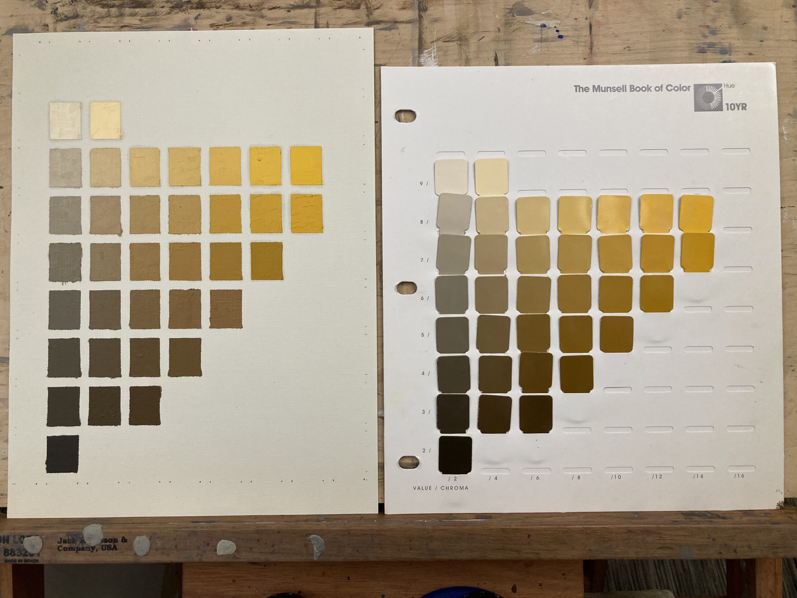
So there are 40 charts and around 1600 colors in total. I thought I’d start with the chart that always seems to be present – 10YR. This is a yellow orange hue and has the full range of colors from light to dark and bright to gray. It took me around 4 hours to exactly mix every swatch. Phew! At one a day this would take me 40 days. Hmm.
Here’s the same thing in grayscale (actually desaturated). Each row should look exactly the same value.
Munsell Chart 10YR Desaturated.
Not too bad. A couple of wobbles here and there but pretty close.
I did this on Strathmore canvas paper and marked out the swatches with 1/4 inch masking tape. I should have waited until tomorrow to take the tape off but couldn’t wait 🙂
Masking tape used to mark out chip boundariesClose up of painted chips in progress
Online Watercolor Classes
I don’t explicity teach Munsell in my watercolor classes but I do use the principles when mixing color. I run regular beginners and intermediate/improvers classes throughout the year. If you are interested please visit my classes page. If you would like to be notified of any upcoming classes please sign up for my mailing list.
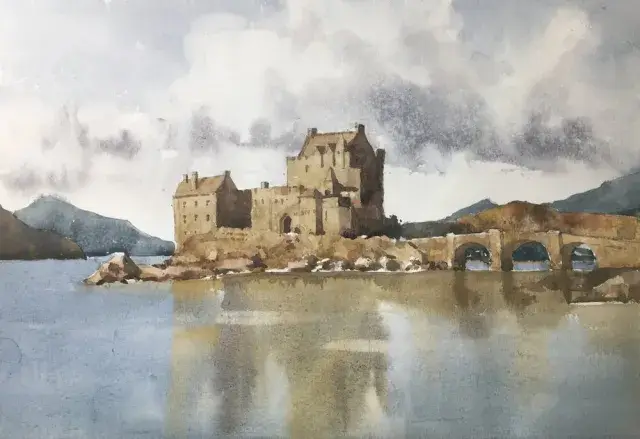
This step by step Eilean Donan Castle watercolor painting is in muted tones. It’s always a favorite and there isn’t a view of this that isn’t worth painting. I especially loved the warm ochres of the castle contrasting with the blues of the sky and water. This watercolor castle tutorial was great fun to do. If you try it I’d love to see what you do!
The Castle Drawing is Simple and in Outline
We only want an indication of the castle and its surroundings on the paper. So no detail in the walls and very few windows or twiddly bits. There are also no pencil marks in the sky or the water. We’ll put the clouds and the reflections in as we paint.
Eilean Donan castle drawing
Work out your color mixes ahead of time
Before even starting to paint the castle watercolor I did some color swatches on a piece of scrap paper. This allows me to do some planning and thinking ahead of time. When you’re in the middle of a watercolor painting there’s very little time to waste. The paint is drying and you have to get those marks right before they dry. So anything we can work out before we get the brushes wet the better.
Color swatches for Eilean Donan watercolor painting
I’ve also included Munsell notation for the colors. This isn’t really necessary (although I find it very useful) as long as you try and match that color as close as you can from the reference.
My process is I match the important areas to the Munsell system and practice hitting the right hue, value, and chroma. I can always tell if the color palette will result in a harmonious picture from the result. Definitely looked good for this one.
I you want to know more about how the Munsell color system can help click through to this post. It also includes information about the online ChromaMagic tool which helps you see color more accurately.
Start your Castle Watercolor Painting with the Sky
Castle Watercolor Sky
I started with the sky and worked it wet in wet. This keeps the edges of the clouds soft. While the paper is still wet you can drop in slightly darker color to indicate the shadows on the undersides of the clouds.
The background mountains went in next. These are suprisingly dark but I kept the colors muted towards grey. They form a good backdrop to the castle itself and the dark color provides a nice contrast.
Castle Watercolor Painting – First Layer for the Walls
Castle watercolor first layer
We’re going to paint the castle itself in layers. I’ve painted a few watercolor castles and I find this gives a great effect. So we don’t want any detail in this first layer. This will be the base layer of the walls. You can add some texture into this by using a water spray bottle or splattering some water with your brush.
Painting the Water and Reflections
Water and reflections
The water and reflections needs to be soft so I made the paper wet with a clean brush full of water. I then brushed in the reflections of the sky and the castle walls and dragged them down slightly to get the reflection effect. As the paper is wet when we do this the colors meld together. This isn’t the final step in the reflections yet but I wanted to get something on the paper to be able to judge the rest of it more easily.
Now the Magic Happens! The Shadows
This is where the magic happens! It’s the best bit! The painting has been looking a little flat up to this point. We’ve put all the first layers in but we have no darks in there! These are what will give a sense of three dimensions to the castle and add some interest to the painting.
Second layer castle watercolor – darks
The shadows are put in simply with a darker wash of ultramarine and burnt sienna. The darks go in on the side of the castle away from the light (the right) and also under the arches of the bridge. I also start to put in some shadows for the rocks at the base of the building.
Things are looking a lot better now. Phew! Now the main shadows are in and working I can put in the details for the windows, chimneys and doors. Note that if the previous step hasn’t worked and you don’t have something that’s reading as three-dimensional no amount of detail will fix it. I know – I’ve been there many times.
Castle details
And go careful with the details. The windows may look dark but they only need to be a shade or two darker than the walls. They’ll really stand out and catch the eye if you put them in close to black.
Final Steps in your Castle Watercolor Painting
Darken the water and reflections
I was fairly happy at this point but I knew that the water and reflections were too light. I washed over the water again with a glaze of blue, light and dark brown. This gives the water a definite value change compared to the sky and makes the painting’s composition more harmonious. As a final touch I took a very dry synthetic brush and dragged horizontally through the reflection area. This has to be done while the paint is still wet and gives an effect of ripples on the water.
Final Thoughts….
This was a really enjoyable watercolor painting to paint. There were a few hairy moments along the way (aren’t there always) but it all came together in the end. I still really like the color scheme. Only a few colors used but they work together well.
[activecampaign form=10 css=1]
And Before You Go – Another Castle Watercolor Painting!