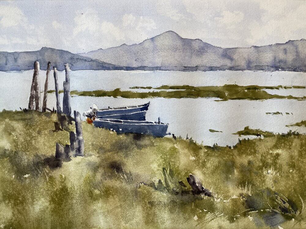
For this week’s class Lisa provided us with a great photo of an Oregon mountain landscape watercolor painting.
Examine The Photo Composition
The photo was pretty well composed and had a good range of big shapes an values. There wasn’t a strong directional light but that wasn’t so much of a problem. One possibility could be to invent some light and put in some shadows. However, there was quite a lot of contrast in the photo already. There was the strong foreground, the lighter water, and the light to mid-valued mountains. So we left the light as it was.
[activecampaign form=10 css=1]

Have a Well-Defined Center of Interest
Another positive for this photo is that it had a really good well-defined center of interest. The boats and the wooden poles give the viewer something to look at but don’t draw too much attention away from the rest of the picture. And the poles themselves provide a nice connection point from the foreground to the background. That way things are held together and don’t look too separate
Texture and Values Add Interest to the Landscape Painting
When it came to actually painting we concentrated on getting each of the big shapes the right value. Light for the sky and water, mid-tones for the foreground, and darks for the boats and poles. But if we’d left it too even there wouldn’t be much interesting to look at. So we added in slight value variations in the sky and mountains. For the sky we added in some clouds and softened the edges using a damp brush. For the mountains we varied the value with water to show some slight undulations in the terrain. We also varied the color slightly by dropping in slightly different hues. The final effect is slightly shimmering which I like.

Online Zoom Classes
I run online zoom courses regularly for both beginners and more advanced students. Please check out my workshop page.
The Foreground Needs Stronger Variation and Texture
The foreground also needed a little bit more interest. It’s closer to us so we should be able to see a bit more detail. Even if we don’t want to paint every blade of grass (which we definitely don’t) we needed to put some variation in there. Like the mountains we varied the value and color a little to show some lumps and bumps and tufts. We also used the spray bottle to lightly add in some water drops. They leave a mottled effect on the surface when they dry which is a really good way to add some texture. Don’t overdo it though – it can look a little gimmicky if overdone.
The Boats Are Put in Broadly
The final things we put were the boats and poles at the center of interest. These were put in very broadly with only a few strokes. As we wanted the most contrast here we also left little sparkles of white paper showing through here and there.
Final Thoughts on the Mountain Landscape Watercolor Painting
I’m actually pretty happy with this although I might just tweak the foreground values a little tomorrow to create more of a lead in.