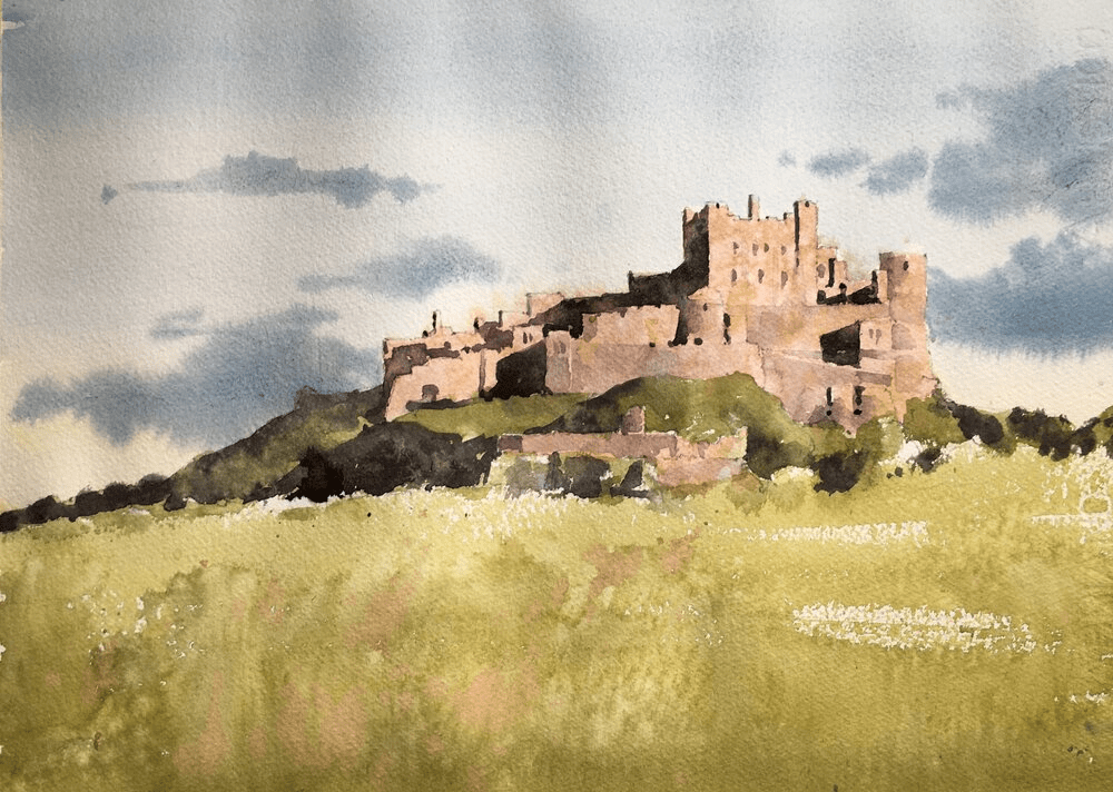
Today’s painting was a Bamburgh Castle watercolor demo. And it was enormous fun to do and came out really well I think.
Put the main shapes in with pencil
I drew the rough shapes first but didn’t include a lot of detail. I left the clouds to be put in purely with paint and similarly left out most of the windows on the castle. The shadows are important though as they create most of the form of the castle. These were carefully placed and, as they’re pretty dark, the graphite lines won’t show in the final painting.
Before putting paint to paper – some careful color mixing.
It’s tempting to just rush in and start splashing paint on the paper. And if you’re that way inclined by all means go ahead. It is fun after all. However, I’ve found over the last couple of years that if I spend some time looking, identifying and mixing the colors I’m going to use the painting goes *much* better.
Try guessing a color just by looking at it first
I start by identifying a few key areas of the painting. In this case it would be the sky, the castle walls, the foreground and the grass/trees around the castle walls. Using my color isolator I take a guess at defining the color and ask myself – what is the hue (blue,green, pinkish-beige), the value (mid, light, dark), and finally the chroma. The chroma is the brightness of the color. The lower the chroma then the grayer the color.
Use the color isolator to check your guess

I then take the color isolator (fancy name for a 3″x5″ piece of gray paper with a 1/2 inch square cut into it) and place it over the color I’m trying to match. This changes how your eye perceives it and it can be a surprise how off you can be. After using this for a while you get experience in how your brain fools you (shadows!!! ) and your guesses get much closer.
Mix a swatch of color to match
Once I’ve checked my guess I draw a 1 inch square on a piece of scrap watercolor paper (doesn’t have to be the good stuff) and mix up the color. If you take a look at the video you’ll be able to see how I get there.
I videoed the whole process of this. Here’s the first part which is a link to my youtube channel. First we have the planning, color matching and drawing stages. (btw if you’re interested in any upcoming demos or livestreams please subscribe to my mailing list).
And finally the painting!
We’ve done all the hard work so now the fun part! The painting goes relatively quickly and we know the main colors and values so we don’t have to fret about that. We can concentrate on putting the paint on the paper, some texture, and generally making it work as a painting.
Enormous fun to do this. Here’s the second video part of the process – the painting.
Michele,
Will you be putting the peacock up for sale? Best, Roberta
Hi Roberta – I’ve sent you an email.