This watercolor tutorial is about how to see color. It shows us just how flawed our vision is but also how we can overcome it and improve our paintings.
Materials Needed
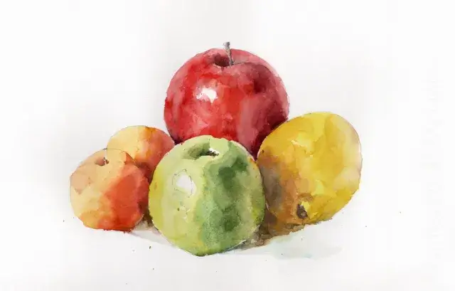
- Reference photo – see below
- A 9×12 sheet of watercolor paper for the color mixes (doesn’t need to be the best quality. I like the Fabriano Artistico fat pad)
- A size 10 round watercolor brush (I like the Escoda versatil or the Princeton Aqua Elite)
- Mechanical pencil (I like this Faber-Castell one)
- A color isolator – a piece of gray card with a 1/2 inch square hole cut in the middle. You can find a template image below.
- A palette (plastic is fine) to squeeze out paints and mix colors
- Tube paints :
- Cadmium red (or an orangey red like vermillion, naphthol red, or pyrrole red)
- Permanent alizarin crimson (or a pinkish red like permanent rose, quinacridone red)
- Lemon yellow
- Yellow ochre
- Cadmium orange
- Cerulean blue
- Ultramarine blue
- Burnt sienna


Find the Lightest Lights and Darkest Darks

The darks are slightly harder. They’re likely to be in the crevices between the fruits.
Assess the Mid-Values
This part is always the trickiest. Let’s start with just the left sides of the fruit – the parts in the light. We need to ask ourselves – is the light part of the lemon lighter than the light part of the green apple? What about the apricots? Is the red apple darker than the green apple?
It’s helpful as a learning tool to convert this photo into grayscale :

Wow! Were you expecting that? I was expecting it and it still surprised me. The apricots, the green apple, and the lemon are all roughly the same value. It’s only the red apple that stands out as darker.
Things with bright yellow and orange colors (high chroma if you want to be technical about it) easily confuse our eyes as being darker in value than we think.
Red is different – it has high color (chroma) but a relatively low value.
But what about the shadows on the fruits. How dark are they? Let’s again use our black and white photo and separate it into value areas.

There’s are few things to note here.
- The right hand shadow side on the lightest fruit (the lemon) is the lightest shadow of all.
- The apricots and the green apple have a darker shadow.
- The red apple is darker in value as a whole but the shadow side isn’t much darker than the light side.
- The edges between the fruits merge together in value. You can see this most distinctly in the apricots on the left hand side.
Color-Match 2 Points on Each Fruit.
Now we come to actually use some paint. We’re going to try and mix up paint that matches both the color and the value for two points on each fruit on a separate piece of paper. One point will be on the light side of each fruit and one on the shadow side. As a bonus there’s also a point where the green apple casts a shadow on the lemon.

For each numbered region I’d like you to do the following for each point :
- Identify which pigment on your palette is closest. For example point 1 is likely lemon yellow or cadmium yellow light. The apricots are cadmium orange and the apple is cadmium red. For the green apple a mixture of cerulean blue and lemon yellow is a good start.
- Is the color on the photo lighter or darker than your palette or mixed color? This might take a bit of experimentation. If it’s lighter then add water to your mixed color until you think you’re close. If it’s darker then another pigment will need to be mixed in. For orange/red colors burnt sienna will make the color darker. For yellow adding yellow ochre (and a smidge of ultramarine) will darken. And for the green adding ultramarine will darken.
- Of course with watercolor the kicker is that the color on the palette isn’t what the color will look like on the paper. And the further kicker is that wet paint will look darker than dry paint.

- For each point paint a small square on a piece of watercolor paper. If it makes it easier draw out the squares in pencil beforehand. Keep some space to the right for later.

First attempt at color matching the still life
This is my attempt. I’ve tried to hit the color and value with the first mix. If when it’s on the paper it looks off I allow myself one more go into the paint while it’s wet and no more. We’re trying to train our eyes to see color and value just by looking at the subject.

Assessing how we did – the Color Isolator
Now comes the revealing bit. Take your color isolator (fancy name for a hole in a mid-grey piece of card) and place it over each color point that you tried to match. Compare to your own swatch and see how well you did. You can move the isolator from the photo to your swatch to get a better idea of how similar the colors are. I didn’t do too badly with this one. Slightly too light and needed a tad more orange.

I was quite a way off here. Not dark enough and needed to be more yellow. In general the darker values are harder to hit.

Now we go back and paint the swatches again. This time, however, instead of just eyeballing the photo use the color isolator over each point to isolate the color. I think you’ll agree it makes it much easier to judge the color and value. When doing this cover up your original attempts with the photo so you’re not influenced by your first go.
Isolating the Color is Very Revealing
I always find this very revealing. Even though I know beforehand what I’m trying to show I still have difficulty hitting the lower values. The power of this exercise is that you try first without the color isolator. The feedback comes when you go back in and check your work and see how the surrounding colors and the local color of the object affect your judgement. With time you get a feel for which things will throw your judgement off and you can take more care over these.
Final Thoughts on Watercolor Tutorial – How to See Color
In putting this lesson together I’ve found it quite fun to take the color isolator and just hold it up against things to judge their color. White objects such as walls and doors are surprisingly dark valued (i.e. not white) when you do this.