This mode is a real eye-opener. Transform your reference image into a grayscale representation of the chroma (intensity or brightness). Really helps focus the difference between value and chroma in your subjects.
Accessing Chroma Mode

Click the ‘Chroma’ button on the left hand side to access the value display mode. Or if you’re on a desktop you can use the keyboard shortcut ‘c’.
Chroma Mode Example 1 – Daffodils in Sunlight

This is the photo I’ve used. You can click the image and download it if you want to try this example yourself.
Converting Your Photo to Chroma Display


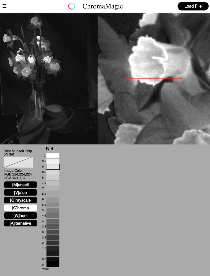
After loading your photo the display will show the default Munsell color display. Clicking the Chroma button will convert the photo to chroma only. High chroma is in white and low chroma in black.
You can see the huge difference between the color version and the chroma version. The daffodil blooms in color look very similar in value but the chroma display really brings out the bright, bright yellow of the trumpets.
It makes them look like they’ve been lit from inside!
And of course you can still click around your photo to display the exact chroma in the bottom panel as you can for all modes.
Chroma Display Mode Example 2 – Roses

Example 2 – roses. Again I chose this example to highlight the difference between the values and the chroma in a subject.


In this example you can see the subtle colors of the roses darken in value as they get towards the center. But when you move into chroma mode the chroma curve is reversed. The highest chroma (more intense colors) are in the center and deep into the shadows. Use the reference photo above to check this yourself. Looks kind of freaky no?
ChromaMagic Chroma Panel

The information panel at the bottom for the ChromaMagic grayscale mode is pretty simple. Clicking anywhere in the photo will show you the value of that color in 1/2 steps.